
Does Studio Weaves Thai Silk Tradition into a Tri-Lobed Restaurant in Nakhon Ratchasima
Kopihub Restaurant draws on the geometry of silk weaving to shape 350 square meters of curvilinear dining rooms and planted courtyards in Thailand.


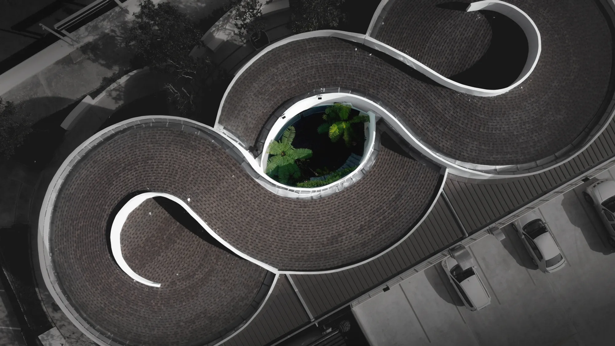
A restaurant that looks like a cloverleaf from the air and feels like a garden passage at ground level: that is Kopihub, a 350-square-meter dining project completed in 2024 in Nakhon Ratchasima, Thailand. Designed by Does Studio, the building takes its formal cues from Mud-Mai, the Thai silk weaving tradition that is a cultural hallmark of the Korat region. The plan splits into three lobed volumes arranged around planted courtyards, a shape the architects liken to the infinity symbol and to the act of reeling silk threads into bundled "jai mai."
What makes the project more than a themed interior is its commitment to spatial consequence. The silk metaphor is not wallpaper; it genuinely organizes the plan. Each of the three lobes serves a different programmatic role, from reception to semi-outdoor seating, and the curving walls between them create pockets of landscape that bring daylight, water, and greenery deep into the section. On a narrow, elongated site surrounded by neighboring buildings, the result is a restaurant that feels far larger and far greener than its footprint suggests.
Three Lobes, One Continuous Movement
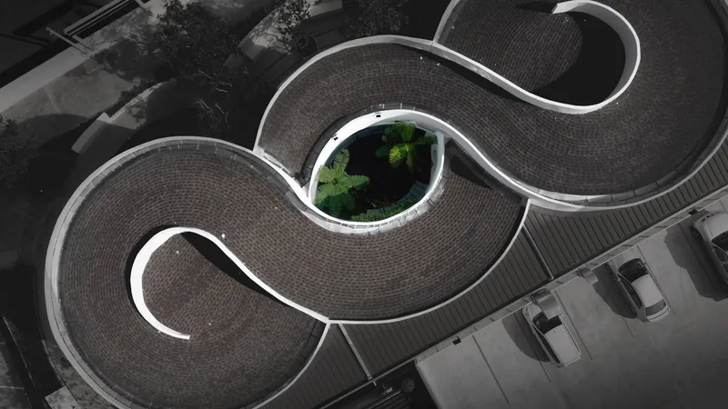
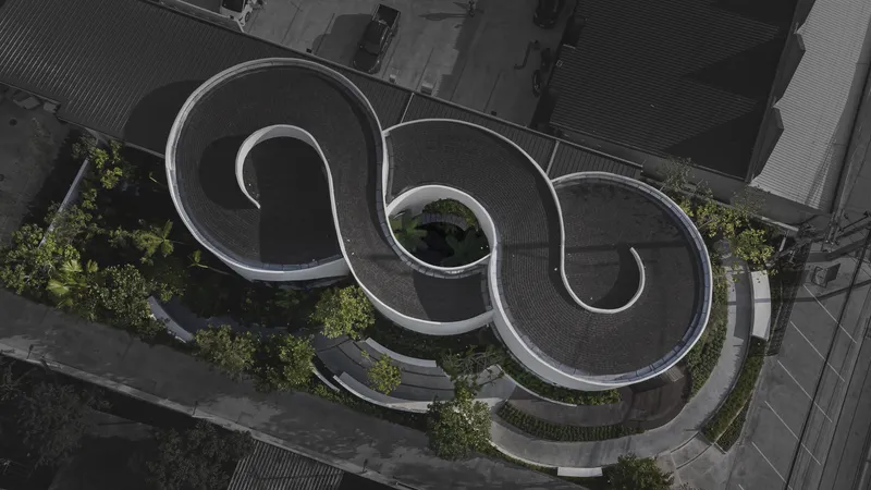
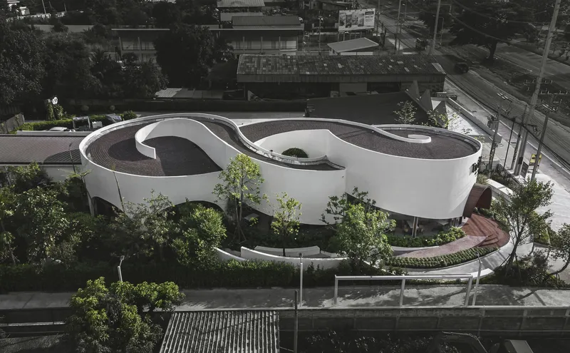
Seen from above, the building reads as three interlocking spirals, each enclosing its own pocket of planting. The roof surfaces flow into one another with no hard corners, reinforcing the silk-thread analogy at an urban scale. The massing strategy is also pragmatic: by breaking what could be a single rectangular volume into curved segments, Does Studio opens up sightlines to the sky and surrounding trees on a site that would otherwise feel hemmed in.
The gaps between the lobes become the project's real luxury. Courtyards, ponds, and vertical gardens fill these interstitial zones, turning what is essentially leftover space into the primary source of atmosphere. From the street the building appears compact and white. Once inside, the landscape takes over.
A White Curve Meets Arched Timber
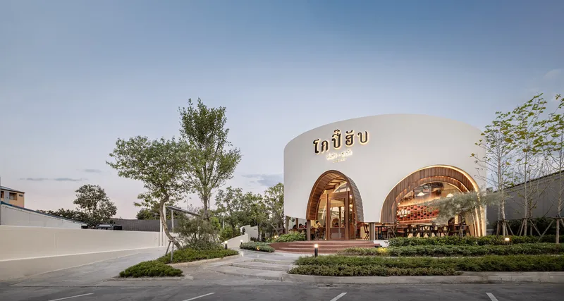
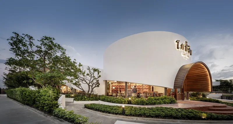
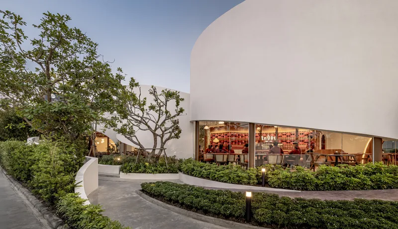
The exterior facade is a study in restraint. Smooth white walls rise in gentle curves, punctuated by arched openings framed in timber. Young trees and low planting beds soften the base, and at dusk the warm glow from the arches makes the building read almost like a series of lanterns set along the street. The decision to keep the palette simple, white render above a planted edge, allows the curvilinear geometry to do all the expressive work.
The timber-framed arches deserve attention. They reference the loom frames of silk weaving while performing a straightforward architectural job: channeling visitors from the landscaped perimeter into the interior. The scale of each arch is generous enough to blur the threshold between inside and out, a quality the semi-outdoor third zone relies on entirely.
Red Threads and the Reception Counter
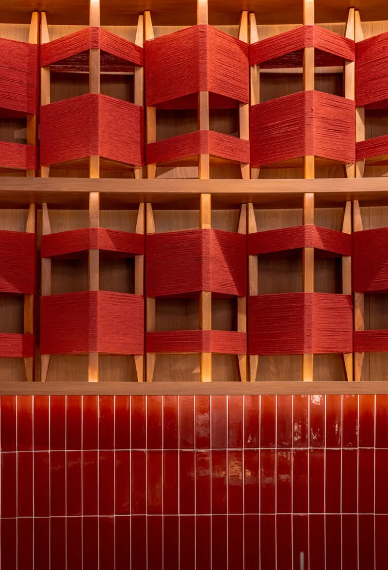
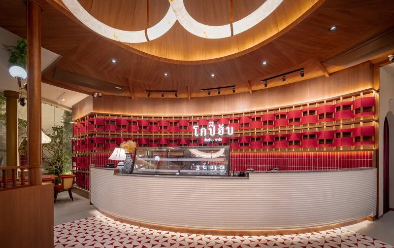
Color arrives in controlled bursts. The most striking instance is a facade panel where woven red textile is stretched across timber frames above a red tiled base. It is an almost literal translation of the Mud-Mai technique into an architectural surface, and it signals the brand's identity before a visitor even steps inside. The red reads as confident rather than decorative because it occupies a tightly bounded area within the otherwise neutral white envelope.
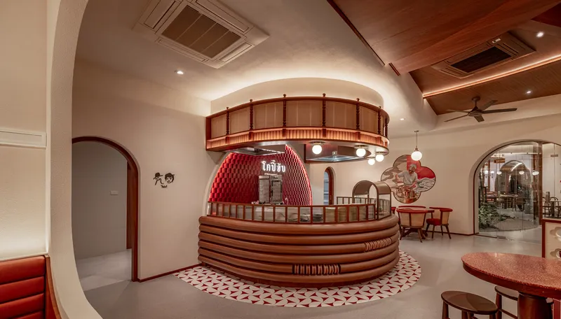
Inside Zone 1, the circular reception counter picks up the timber language of the exterior. Horizontal slats wrap the counter beneath a suspended timber ring, while the coffered ceiling above creates a compressed, welcoming scale. A second counter variation elsewhere features ribbed white cladding and a domed wood-paneled ceiling with a circular skylight. Both counters use geometry, the circle and the dome, to mark arrival without resorting to signage.
Courtyard as Heart: Water, Ferns, and Open Sky
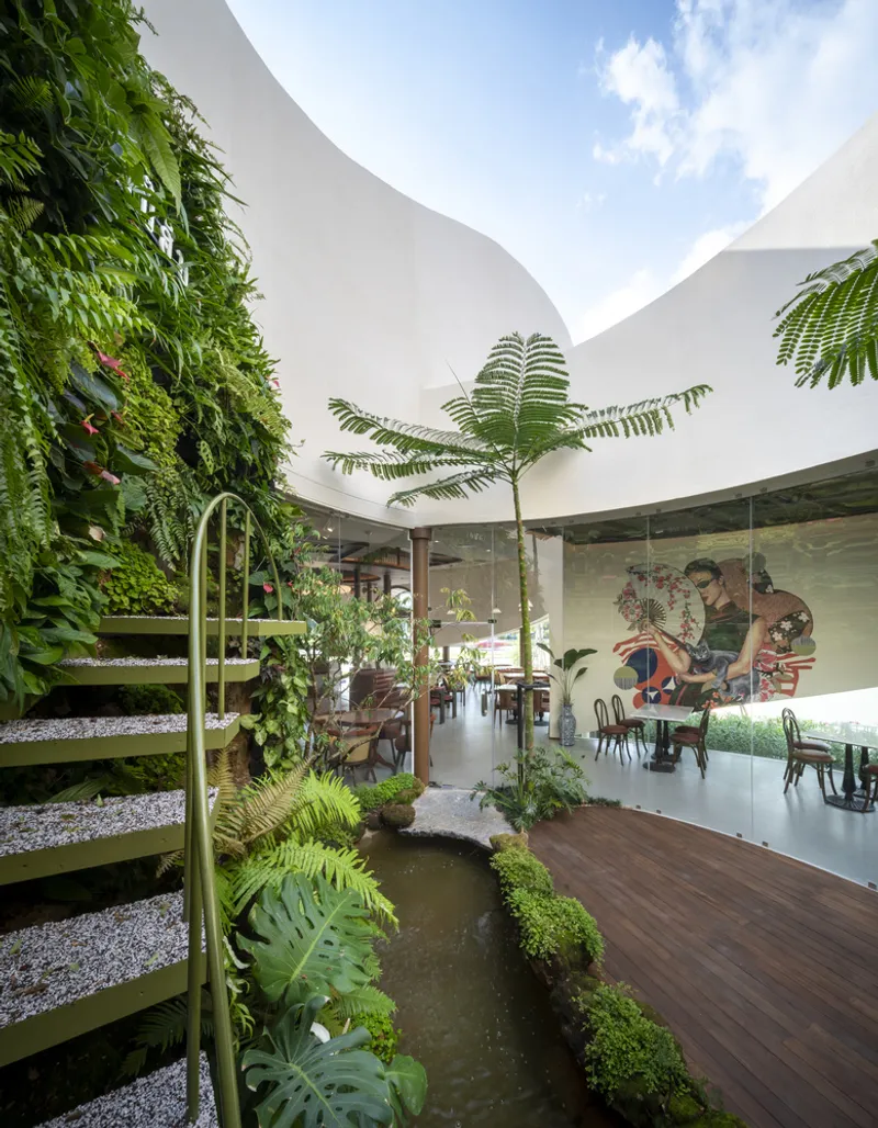
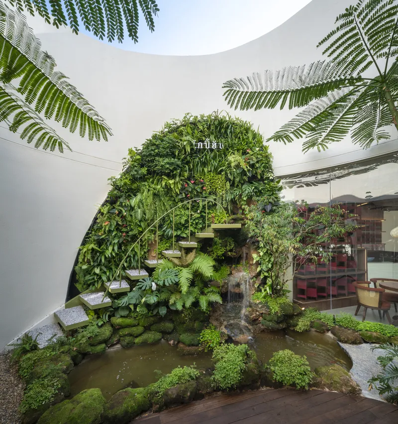
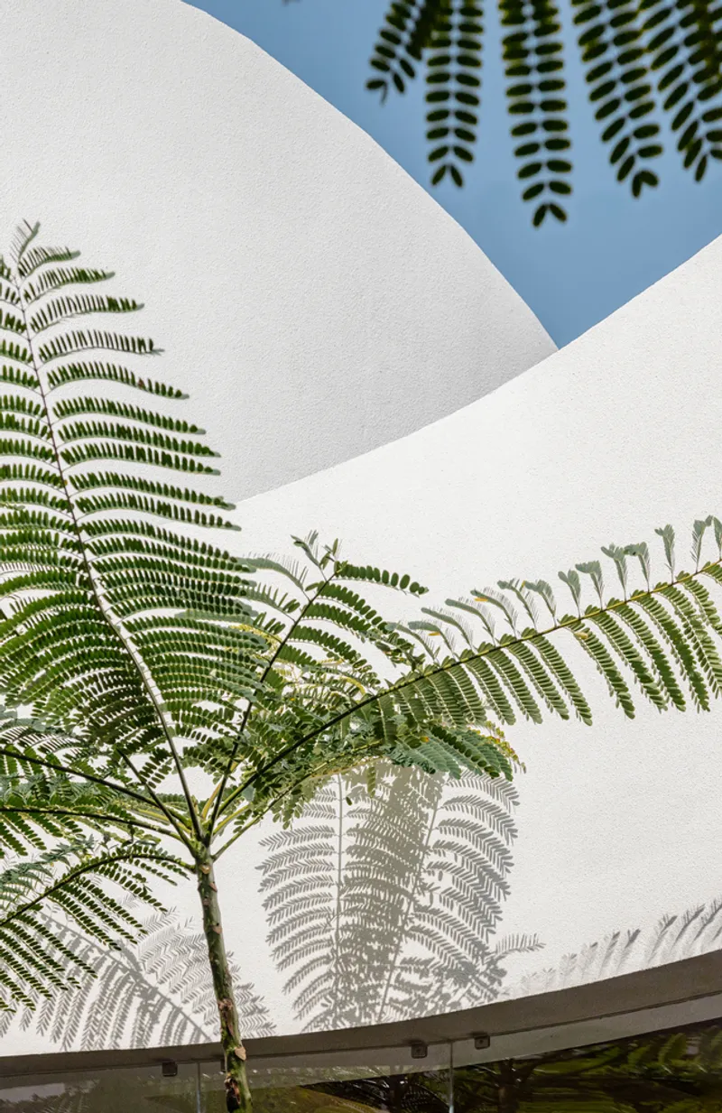
The central courtyard in Zone 2 is the emotional center of the project. A vertical green wall rises behind a small pond fringed with ferns, all open to the sky through a triangular gap between curving white walls. Looking straight up, the composition of fern fronds against white plaster and blue sky is almost painterly. The courtyard works as a climate device too: the open void draws warm air upward and pulls cooler air through the dining spaces on either side.
A second courtyard features a waterfall cascading into a koi pond, surrounded by more ferns and small trees. Sunlight filters through the canopy and plays across the water surface, producing the kind of ambient movement that no artificial fixture can replicate. These planted voids make clear that the landscape is not garnish. It is co-equal with the built volume.
Dining Between Murals and Garden Glass
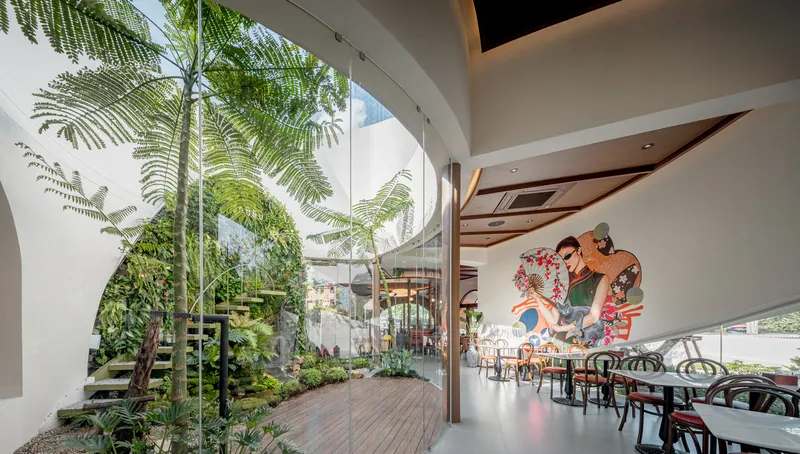
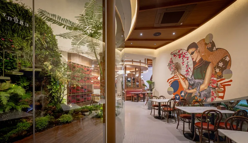
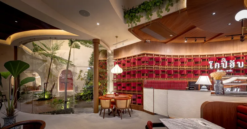
The dining rooms wrap around the courtyards, drawing their character from the views inward rather than outward. In Zone 2, a large mural depicting figures in traditional dress, reportedly referencing the Korat Cat (Si Sawat), anchors one wall while a floor-to-ceiling glass partition opens onto the planted courtyard opposite. The juxtaposition of painted surface and living green gives diners two very different things to look at, cultural narrative on one side, biophilic calm on the other.
Potted palms and timber columns further soften the boundaries. The furniture layout follows the building's curves, which means no two tables share quite the same orientation. The effect is a sense of privacy within a communal space, an achievement that rectangular floor plans struggle to deliver.
The Semi-Outdoor Edge
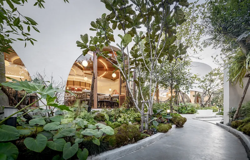
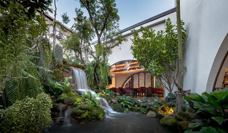
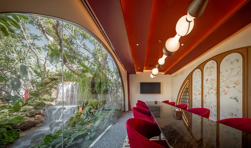
Zone 3 pushes the dining experience closer to the garden. Arched timber-framed pavilions line a curving pathway lit warmly in the evening, and seating follows the building's outer edge so that guests face into the landscape rather than into each other. A red-slatted ceiling over one lounge area recalls the textile motif and casts patterned shadows across red upholstery and a glazed waterfall wall. The Mud-Mai partition dividers here serve double duty: they define a VIP room while maintaining visual transparency.
At dusk, the pathway between pavilions becomes the restaurant's most photogenic sequence, a garden promenade bracketed by warm light and dense planting. It is also the functional spine that connects the Pa Thong Ko kiosk to the main dining areas, so the scenographic quality is earned through circulation logic rather than imposed as decoration.
Landscape and Exterior Detail
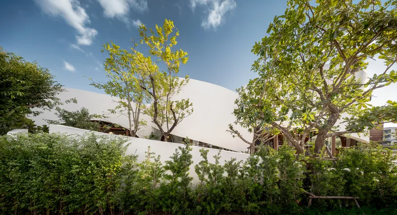
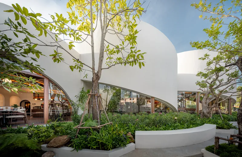
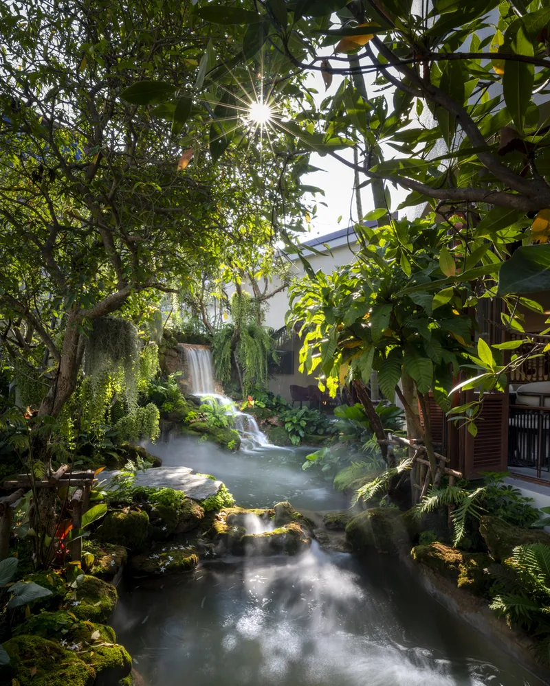
The garden strategy is dense and layered. Mature trees, curved white planter beds, ferns, and ground cover create a thick green buffer between the street and the interior. In daylight the white facade walls rise above this green mat like sculptural objects, their curves casting shifting shadows across the planting below. The waterfall courtyard, visible through gaps in the canopy, adds an auditory dimension that carries into the surrounding seating areas.
The planting choices are deliberate. Tropical ferns and palms tolerate the Thai climate with minimal irrigation, and the vertical green walls exploit the courtyard's trapped humidity. The landscape is doing real environmental work here: shading hard surfaces, cooling air before it enters the building, and absorbing road noise from the adjacent street.
Plans and Drawings
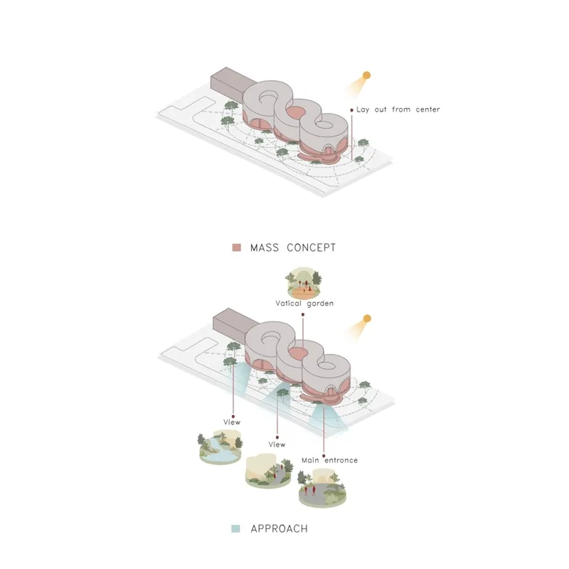
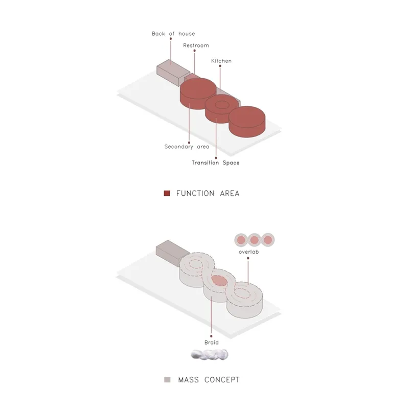
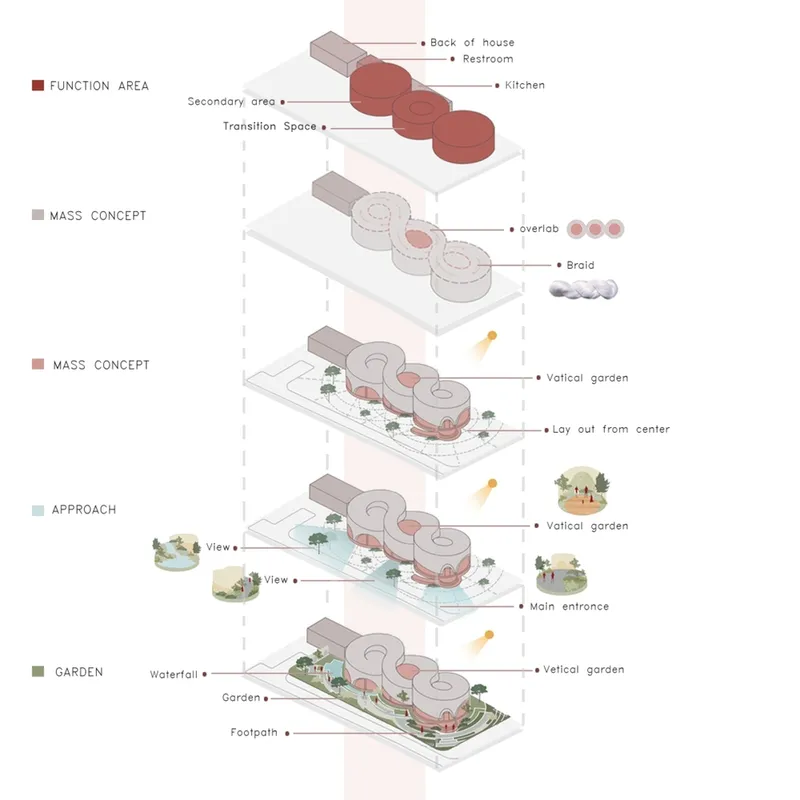
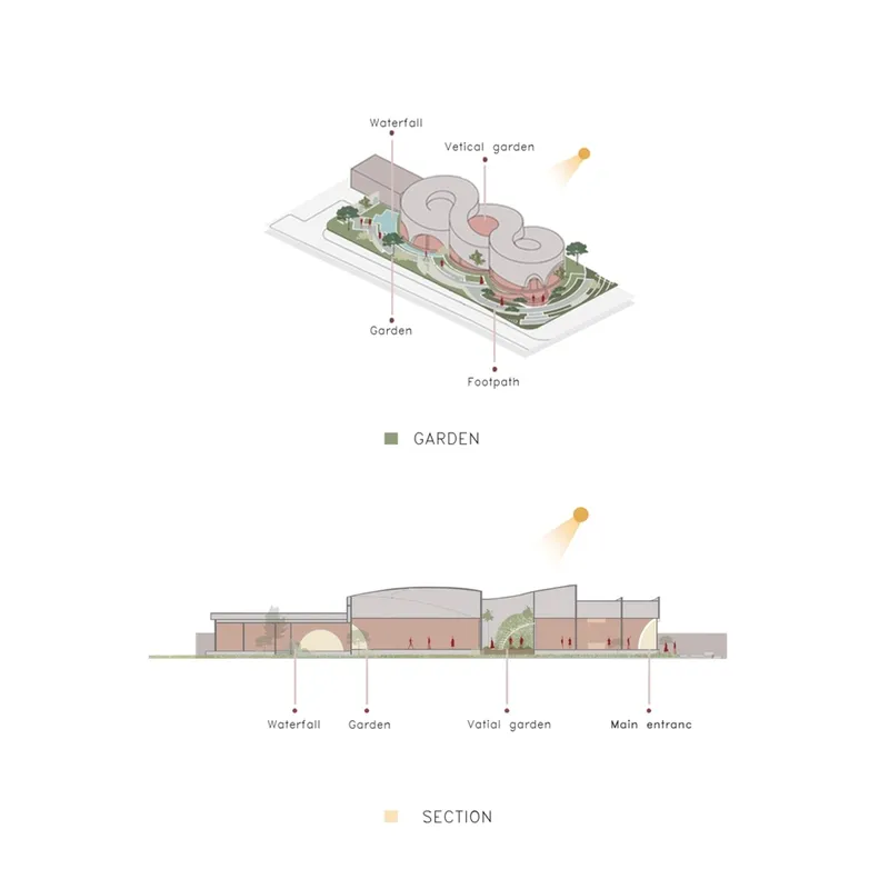
The axonometric diagrams reveal the generative logic behind the plan. The massing concept begins with three overlapping circular volumes, which are then carved and rotated to create the lobed footprint. Functional zoning diagrams show how the entrance, dining zones, kitchen, and kiosk are distributed across the three lobes, with landscape occupying the connective tissue between them. An exploded axonometric peels the project apart layer by layer, from the garden level through the functional areas to the roof, making visible the vertical relationships that the curved walls conceal at eye level.
The section drawing is particularly useful. It shows how the curvilinear roof volumes vary in height, creating clerestory gaps that admit light and air into the courtyards. Water features sit at the lowest point of the section, collecting runoff and establishing visual anchors. The drawings confirm that the project's organic appearance is the product of precise geometric operations, not free-form gestures.
Why This Project Matters
Kopihub demonstrates that cultural reference in architecture does not have to be literal or nostalgic. Does Studio took a textile tradition, Thai silk weaving, and extracted its organizational logic rather than its surface pattern. The result is a building whose plan, section, and material palette are all informed by the same generative idea. That consistency is rare in restaurant design, where themed interiors often operate independently of the building envelope.
The project also offers a convincing model for hospitality architecture in tropical climates. By breaking a compact footprint into three lobed volumes separated by planted courtyards, Does Studio achieves natural ventilation, daylight penetration, and acoustic variety without relying on mechanical systems for atmosphere. It is a 350-square-meter building that feels like a garden with rooms in it, and that inversion of the typical restaurant formula is the most valuable idea here.
Kopihub Restaurant, designed by Does Studio. Nakhon Ratchasima, Thailand. 350 square meters. Completed 2024. Photography by Shootative.
About the Studio
Share Your Own Work on uni.xyz
If projects like this are the kind of work you want to make, uni.xyz is a place to publish your own, find collaborators, and enter design competitions.



Popular Articles
Popular articles from the community

The Earth Pod: 3D Printed Homes for Resilient Refugee Communities
The Earth Pod reimagines refugee housing through 3D printed homes made from clay, combining resilience, self-sufficiency, and rapid shelter.

The Ocean Hive: Sustainable Architecture for a Self-Sufficient Civilization at Sea
The Ocean Hive imagines sustainable architecture at sea, where modular habitats, algae, wave power and ocean waste sustain a growing colony.

Co-Life: Senior Housing Design That Reconnects Older Adults With the City
Co-Life reimagines senior housing design through healing gardens, shared streets, workshops, and a sustainable community across generations.

Play: Fragments of Their World
Familiar architecture becomes modular playground design, creating safe spaces where displaced children can learn, connect, imagine and play.


Similar Reads
You might also enjoy these articles

Hodi-Mandai Geram
Project Function: Preservation and revitalization of the Intangible heritage and socio-spatial identity of the Hodi by Housing, Cultural Memory Center, Sacred Grove, landscape, local tourism economy

Olio Towers: A Mid-Rise for Performers That Fuses Housing, Rehearsal, and Stage
Located blocks from Houston's Theater District, this modular tower stacks living units around a central performance atrium.
Oasis: Modular Green Housing Carved into Dhaka's Urban Fabric
A shortlisted Plugin Housing entry reclaims unauthorized settlements in Dhaka with stepped concrete volumes, green roofs, and ventilation-driven design.

Black Hole: A Floating Megastructure for the Post-Physical Era
Emiliano Mazzarotto envisions a spherical, self-scaling arena where e-sports, digital hotels, and holographic stadiums replace traditional public space.

Explore Architecture Competitions
Discover active competitions in this discipline



Challenge to reimagine the Iron Throne


Photograph architecture without architects


Illustrate the lost glory of Angkor Wat - Render Challenge


Design challenge to reuse E-waste
Comments (0)
Please login or sign up to add comments
No comments yet. Be the first to comment!