
Billard Leece Partnership Wraps a 14-Storey Children's Hospital in River-Inspired Geometry
The Wattle Building at Westmead replaces institutional severity with biophilic warmth across 57,000 square metres of paediatric care in western Sydney.

Children's hospitals carry a burden that most building types do not. They must perform at the highest clinical standard while simultaneously persuading their youngest occupants that the place they have entered is not frightening. The Wattle Building at Westmead, completed in 2026 by Billard Leece Partnership, takes that brief seriously across 57,000 square metres and 14 storeys, housing surgical theatres, neonatal and paediatric intensive care, an oncology treatment centre, a statewide burns service, and specialist cardiology and radiology labs. It is the centrepiece of a $659 million redevelopment of the Children's Hospital at Westmead campus in New South Wales, sitting at the corner of Hawkesbury Road and Hainsworth Street, roughly three kilometres northwest of Parramatta CBD.
What makes the project worth studying is not its scale, which is impressive enough, but the consistency of its design argument from the outermost cladding panel to the last ceiling baffle in the deepest corridor. BLP drew on the river landscape surrounding the site, near the confluence of the Parramatta River, Toongabbie Creek, and Darling Mills Creek, and translated its colour, movement, and ecological texture into a building that reads as curvilinear, warm, and deliberately non-institutional at every scale. The result is a hospital where wayfinding, play, and clinical efficiency are not competing agendas but different expressions of a single spatial logic.
A Facade That Shifts with the Light
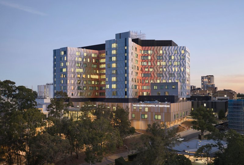
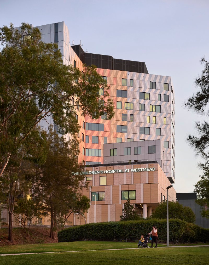
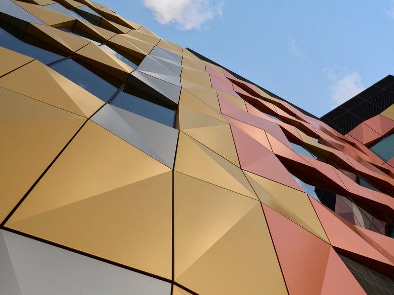
The tower's most immediately legible gesture is its cladding: triangular metal panels in gold, pink, copper, and cooler neutral tones arranged in a chevron pattern that wraps the building. Seen from street level at dusk, the panels catch ambient light unevenly, producing a shimmering effect that recalls the surface of water far more than the skin of a hospital. The geometry is assertive without being aggressive, giving the building a civic presence within the dense Westmead Health and Education Precinct while signalling to arriving families that they are not entering a generic institutional box.

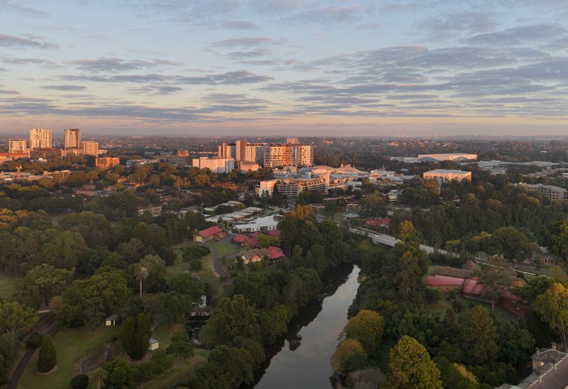
In close-up, the chevron panelling reveals a layered quality: horizontal window bands punctuate the triangular field, ensuring that clinical spaces behind receive generous daylight. The aerial view confirms how the tower sits within a broader campus of existing buildings and mature tree canopy, with a winding waterway visible nearby. The facade's warm palette mediates between the greenery at ground level and the open sky above, a calibrated middle register that avoids both starkness and whimsy.
KidsPark and the Threshold Sequence
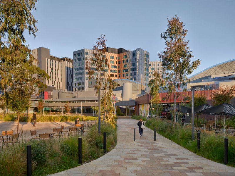
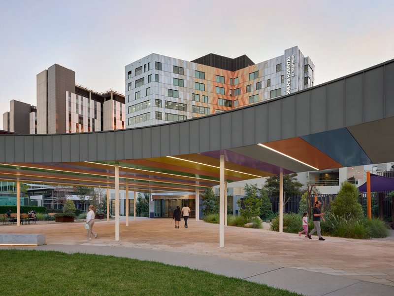
Arrival matters more at a children's hospital than at almost any other public building. BLP and landscape architect McGregor Coxall designed KidsPark, a landscaped civic forecourt that functions as both public space and hospital threshold. The paved pedestrian pathway threads through birch trees and planted beds, turning what could be an anxious approach into something closer to a walk through a park. A canopy structure supported by white columns shelters families near the entry, providing seating and shade alongside retail and play areas.
The sequence is gradual by design. Rather than a single revolving door marking the transition from public to clinical, the landscape eases visitors through a series of spatial compressions and openings: garden, canopy, forecourt, interior. For a child arriving for treatment, the cumulative effect is an environment that never abruptly announces "you are in a hospital now."
The Atrium as Civic Heart
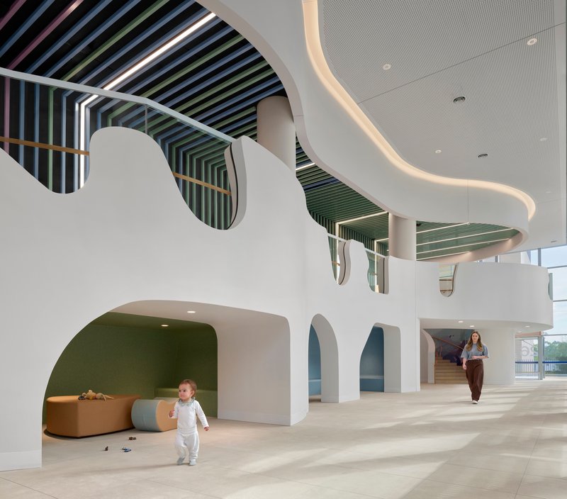
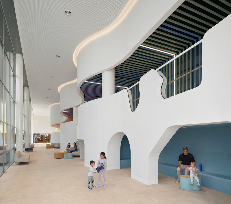
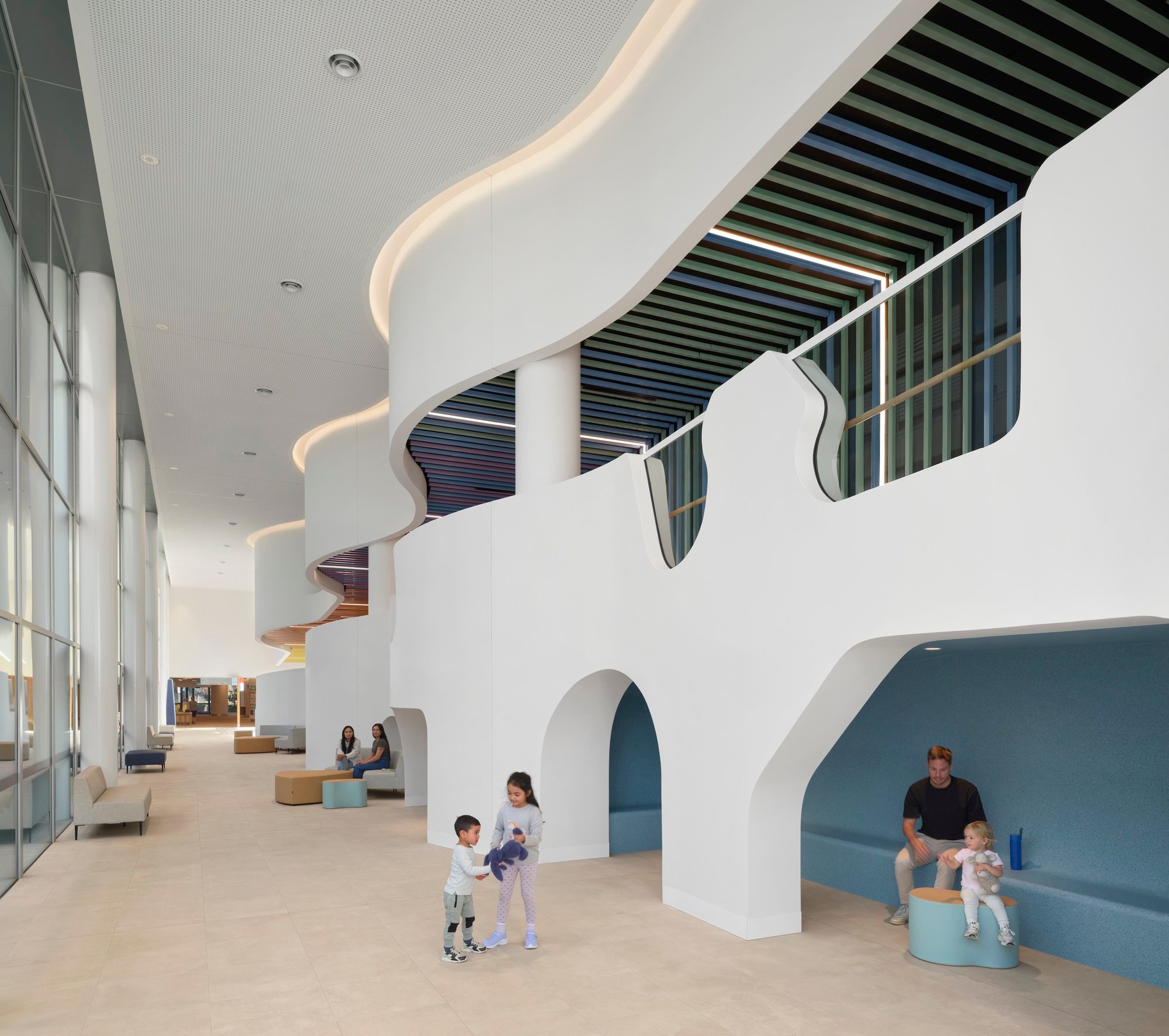
Inside, the spatial logic shifts from landscape to river. The main atrium is a double-height volume defined by curved white walls, arched openings, and a ceiling of rainbow-striped baffles that cast coloured light across the floor. The curves are not decorative flourishes; they structure movement, pulling visitors along organic pathways that avoid the long, dead-end corridors typical of hospital planning. Arched alcoves at ground level provide seating niches where families can pause, read, or simply watch the activity of the atrium, a rare moment of civic generosity inside a clinical building.
The baffled ceiling deserves attention. Its colour gradient is precise, not random, and it functions as both an acoustic strategy and a wayfinding device. The layered approach to colour and materials that BLP uses throughout the building begins here, establishing a legible hierarchy: warm timber tones for domestic comfort, bright colour for orientation, and white curved surfaces for spatial expansion. A child running across the atrium floor, as captured in the photographs, is the best test of the design's success. The space invites movement, not hesitation.
Corridors Built for Walking, Not Waiting
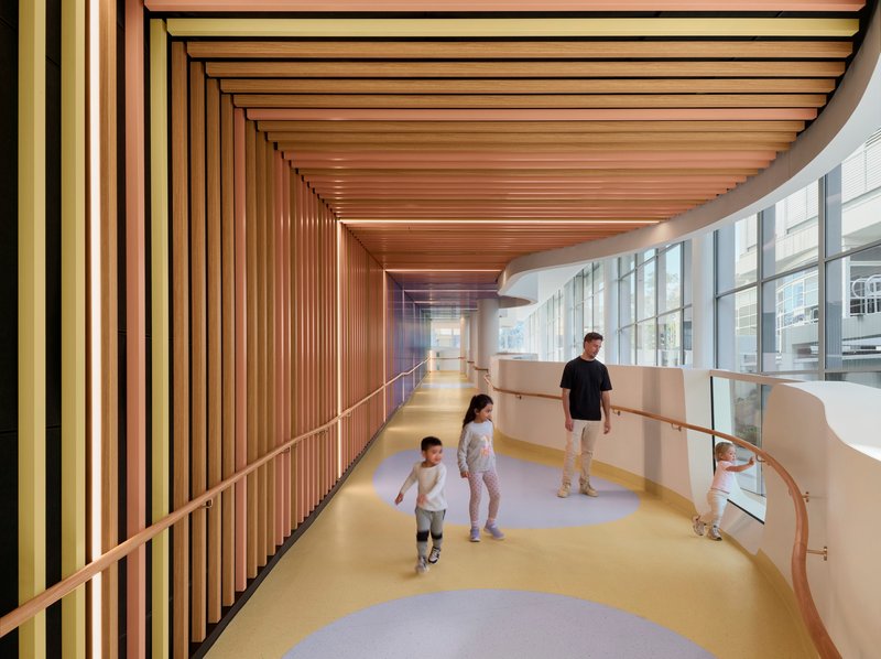
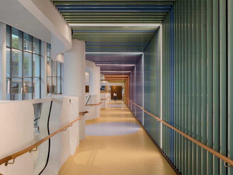
Hospital corridors are traditionally the weakest link in any healthcare design: fluorescent-lit tunnels lined with handrails and signage. BLP's approach at Westmead treats the corridor as a designed environment in its own right. One circulation route features timber slatted ceilings, yellow flooring, and full-height glazing onto courtyards, creating a passage that feels closer to a gallery than a ward connector. Another corridor deploys colourful vertical metal fins on one wall, establishing a rhythmic visual texture that gives patients and visitors a sense of distance covered.
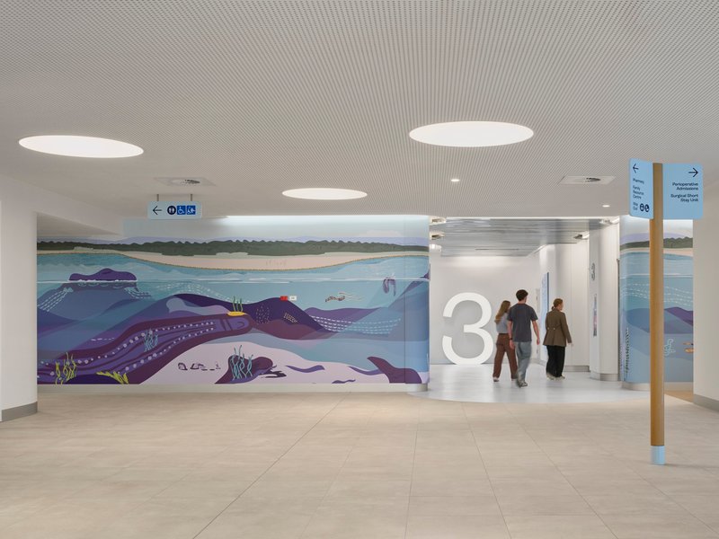
The most striking corridor intervention is a painted underwater mural featuring octopi and marine creatures beneath a perforated metal ceiling punctuated by large circular skylights. It is a bold choice, and it works because it is committed. The mural is not a token gesture of child-friendliness pasted onto an otherwise clinical surface; it occupies the entire visual field, ceiling included, transforming a necessary passageway into an immersive environment. These are the corridors of KidsWay, the elevated circulation spine connecting the new building to the broader campus, and their intensity of finish reflects their importance as the building's primary internal street.
Play, Comfort, and the Domestic Scale
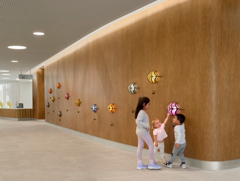
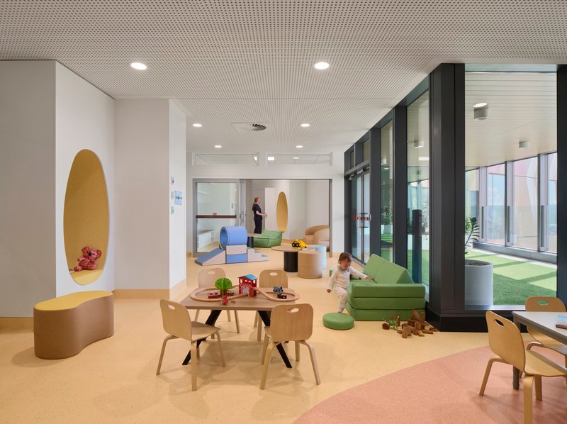
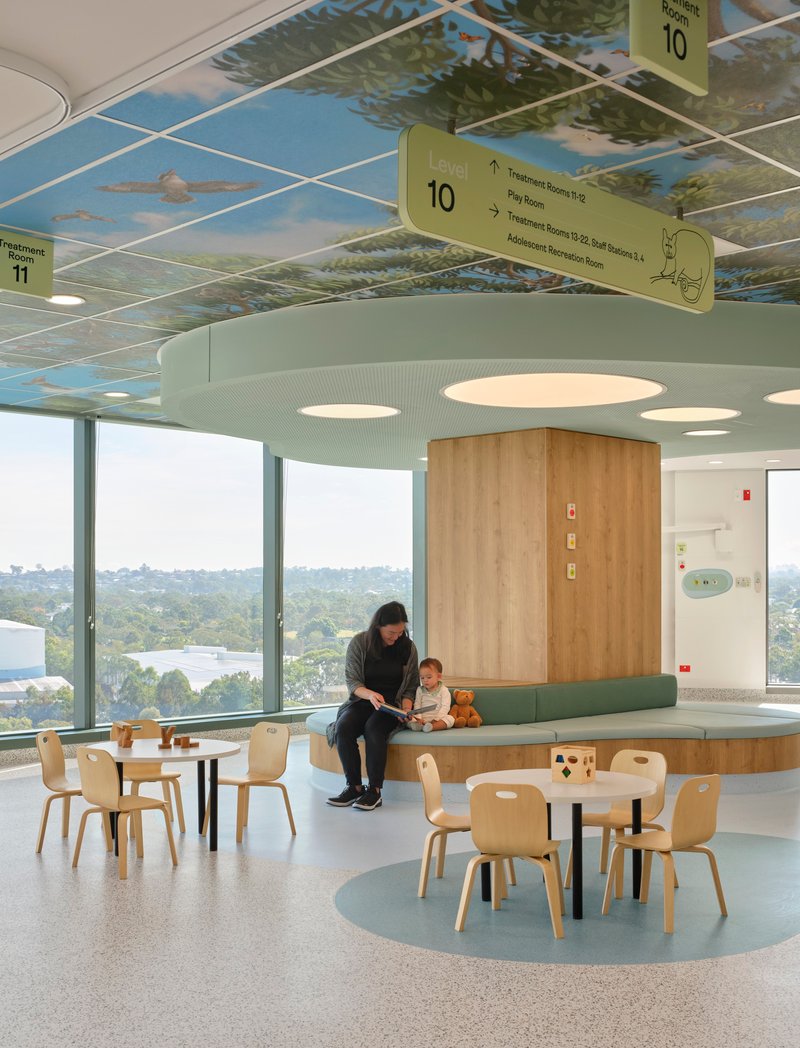
Throughout the building, BLP inserts moments of domestic warmth that interrupt the scale of the institution. A curved timber wall with colorful wall-mounted lights becomes a point of interaction for children reaching up to touch and explore. Play areas with timber furniture and oval wall alcoves offer enclosed, secure spaces where young patients can sit on the floor and simply be children. Waiting zones feature plywood furniture beneath ceiling murals of tree canopies, with wayfinding signs hanging like leaves.
The material palette in these zones is consistent: timber, terrazzo, plywood, and saturated colour accents. There is no plastic, no cartoon character wallpaper, none of the condescending cheerfulness that plagues so many paediatric facilities. The design trusts that warmth of material and generosity of space are enough to signal safety. Frost*Collective's wayfinding and environmental graphics reinforce this approach, using colour coding and spatial cues rather than overwrought signage to orient visitors.
Patient Rooms and the Staircase
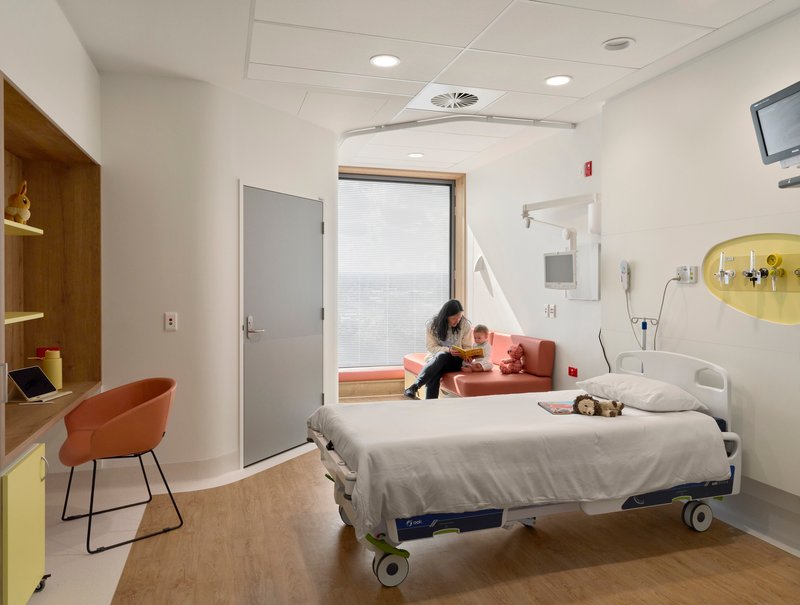
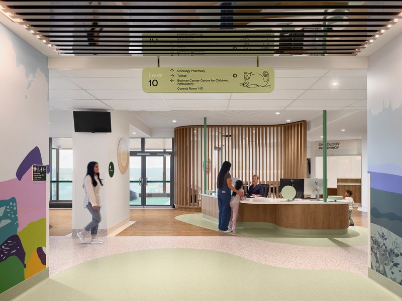
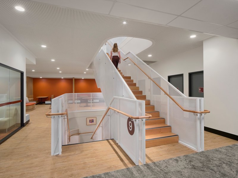
The patient room shown is restrained but considered. A hospital bed sits alongside a window seat that brings daylight deep into the room, while a wooden desk provides space for a parent to work or a child to draw. The ceiling is suspended with recessed lighting that avoids the clinical glare of exposed fluorescents. It is a room that acknowledges the reality of long stays without surrendering to their bleakness.
At the reception area, a curved timber slat screen wraps the desk, softening what is typically a transactional moment into something more welcoming. Terrazzo flooring grounds the space in a material that is both durable and visually rich. The curved staircase connecting levels is one of the building's quieter achievements: timber treads, white perforated balustrades, and timber handrails create a vertical connection that feels generous and calm. In a building this large, stairs are often afterthoughts. Here, they are designed spaces that reward use.
Why This Project Matters
Healthcare architecture in Australia has improved markedly over the past decade, but children's hospitals remain a special case. The clinical demands are extreme: surgical theatres, intensive care units, robotic pharmacy dispensing, specialist burns and oncology services. The emotional demands are equally extreme: every surface, every threshold, every corridor is experienced by families in states of acute vulnerability. The Wattle Building at Westmead succeeds because BLP did not treat these demands as contradictions to be balanced but as dimensions of a single design problem. The biophilic references to the river landscape are not applied decoration; they structure the plan, the section, the material palette, and the wayfinding strategy.
At 57,000 square metres across 14 storeys, the building also demonstrates that biophilic and child-centred design principles can operate at institutional scale without descending into sentimentality or losing operational rigour. The separate car park generating solar energy, the elevated KidsWay spine, the layered entry sequence through KidsPark: these are infrastructural decisions, not cosmetic ones. Billard Leece Partnership has delivered a hospital that respects its youngest patients enough to give them architecture, not just a building.
Children's Hospital at Westmead (Wattle Building), designed by Billard Leece Partnership, Westmead, New South Wales, Australia. 57,000 m². Completed 2026. Photography by Tom Roe.
About the Studio
Share Your Own Work on uni.xyz
If projects like this are the kind of work you want to make, uni.xyz is a place to publish your own, find collaborators, and enter design competitions.




Popular Articles
Popular articles from the community

Stanton Architects Sculpts a Curving Family Home into Sydney's Inner West Fabric
Five Dock House uses cantilevers, curved concrete, and layered courtyards to carve out privacy on a tight suburban lot in Sydney.
Inside a Timeless Mumbai Residence by Aether Studio
Aether Studio's 2,250 sq ft apartment in Malad, Mumbai uses marble, brass, boucle, and disciplined restraint to build a quiet retreat from the city.
Pinto Builds a Faceless Pavilion Beneath Casuarina Trees on Thailand's Rayong Coast
SON Restaurant refuses a front door or a back wall, treating all four facades equally in a 260-square-meter brick and stucco grid.
Eco Chapel: A Green Architecture Pavilion Designed in Symbiosis with the Forest
Eco Chapel uses green architecture to weave prayer, learning and reuse into a forest pavilion shaped by modular hexagonal canopies for life.


Similar Reads
You might also enjoy these articles

Freebird Residence by Alexis Dornier: A Tropical Modernist Sanctuary in Bali
Floating living pavilion above pool anchors H-shaped tropical villa, blending Japanese minimalism, sustainable strategies, lush landscape, and sculptural interiors.
127af Flips a Tiny Bagnolet Rowhouse Upside Down with a Handcrafted Roof Extension
A 55-square-meter terraced house on the edge of Paris gains a luminous upper living floor through lightweight timber and steel.
1.61 Design Workshop Wraps a 600-Square-Meter Café in Vietnam in Sculptural Burgundy Drama
Reden Café & Bistro pairs a helical staircase, mosaic floors, and deep red interiors to rethink Vietnamese hospitality space.

The Unbound Brain: A School Shaped by Cognitive Architecture
Cylindrical learning pods radiate like neurons from a central cortex, turning the floor plan into a spatial model of human thought.

Explore Public Building Competitions
Discover active competitions in this discipline




The International Standard for Design Portfolios


The Global Benchmark for Architecture Dissertation Awards


The Global Benchmark for Graduation Excellence


Challenge to design locus for the upliftment of human rights
Comments (0)
Please login or sign up to add comments
No comments yet. Be the first to comment!