
KARO Architects Splits a Korean Office Tower Around an Open-Air Courtyard Spine
Re-summit Tower carves a central atrium through a 12-story commercial block in Yongin-si, linking retail life to quiet office corridors above.
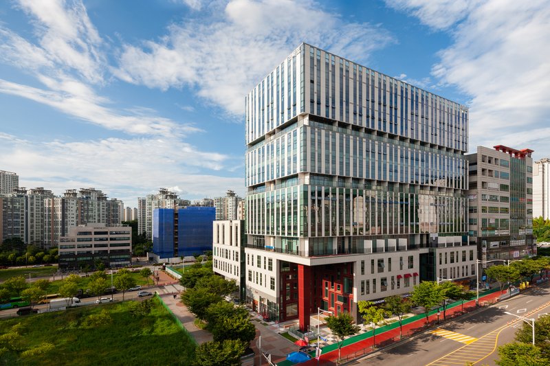
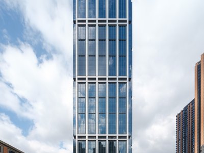
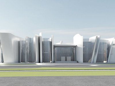
Most speculative office towers in South Korea's new development districts arrive as sealed boxes, optimized for leasable area and indifferent to the street. Re-summit Tower, designed by KARO Architects under lead architect Kim Kijoong, rejects that formula. Sited in the Heungdeok Housing Site Development District adjacent to Gwanggyo, the 23,947 square meter building splits its mass around a central courtyard, then connects the halves with glazed bridges and open corridors that make the gap between volumes the most compelling space in the project.
The interesting move here is organizational, not decorative. Working within a 12-story height cap and a 600% floor area ratio on a nearly square plot, KARO carved a cross-shaped circulation route through the site and stacked retail on the lower levels facing the street while arranging all office floors from the fourth to twelfth stories with south-facing rooms and single-loaded corridors that open north toward the low-rise shopping volumes below. The corridor is not just a hallway; it is a viewing gallery where workers can see and hear the commercial life happening beneath them. That deliberate porosity, visual and auditory, is what separates Re-summit from its neighbors.
A Fractured Mass on a New Street
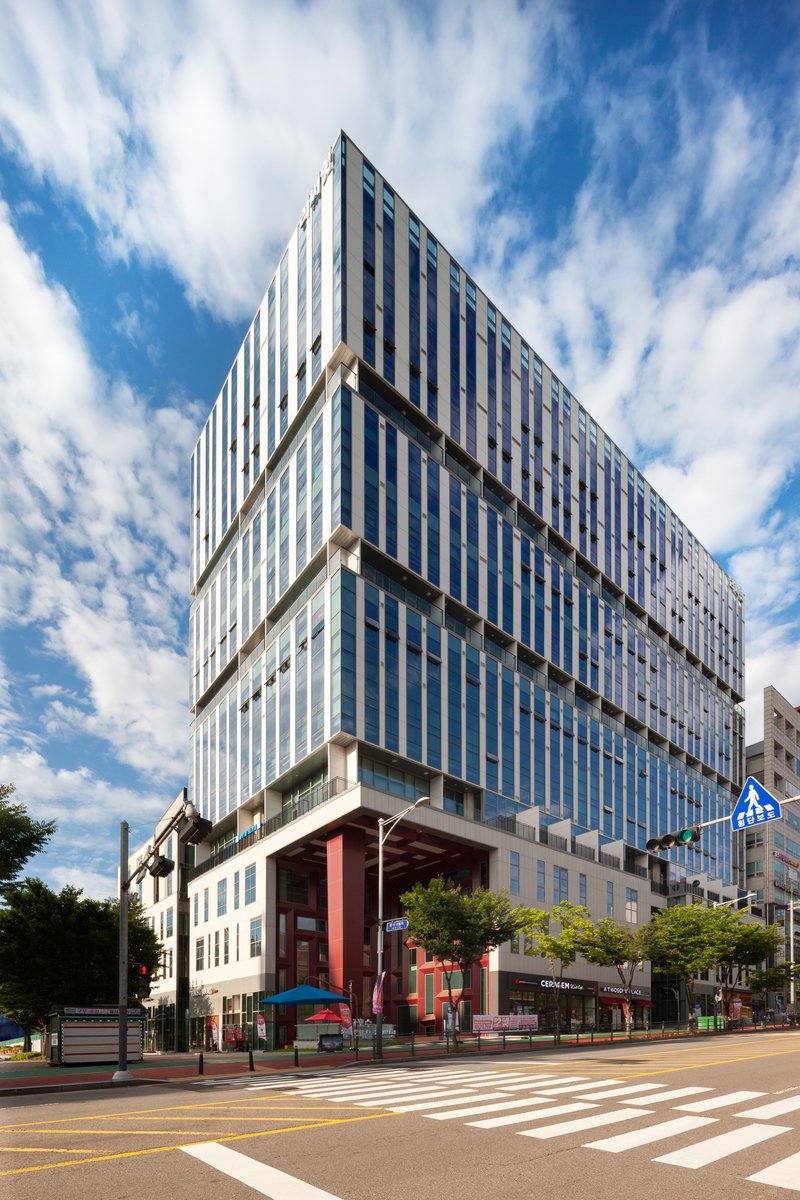
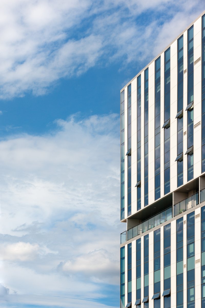
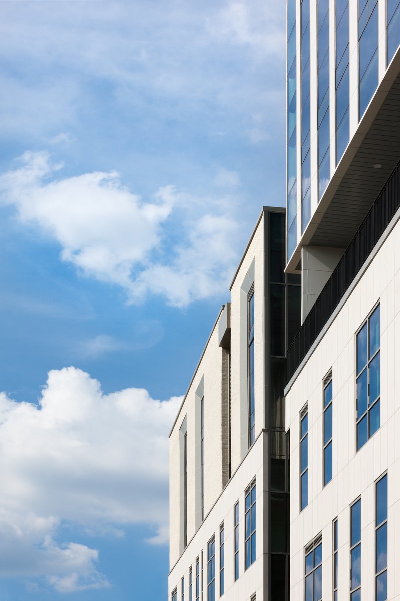
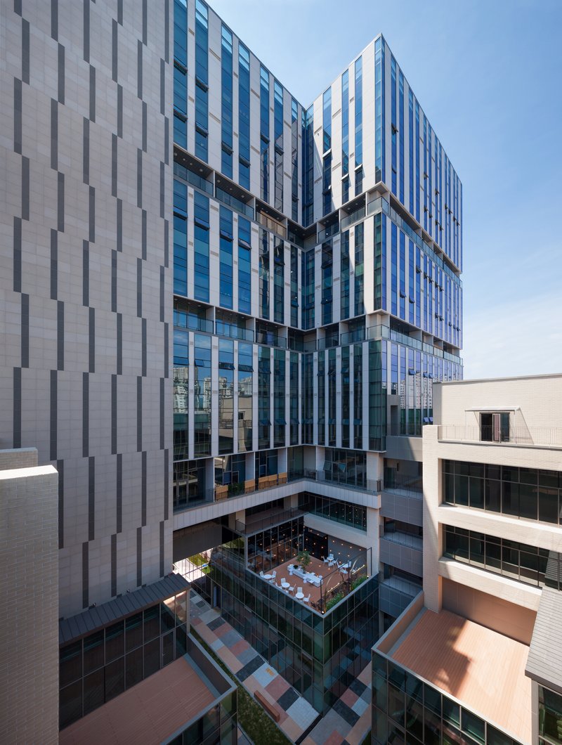
From the street, Re-summit reads as a series of stacked volumes differentiated by cladding rhythm. Vertical striping in alternating white and grey panels gives the tower a taut, almost textile quality, while the lower podium shifts to pale masonry that signals a different program inside. The massing steps back and forth at key moments, breaking what could have been a monolithic slab into something more legible. You can read the retail base, the transitional middle, and the office top as three distinct registers.
Because the site faces pedestrian-only roads and sits within an LH-supervised master plan, KARO had limited room to push volumetric drama outward. Instead, the drama is reserved for the interior split. From the street, the building appears restrained and civic. The tower's profile adjusts depending on the angle: slender from the side, broad and layered from the front, always hinting at the void running through its center.
The Red Canopy and Ground-Level Identity
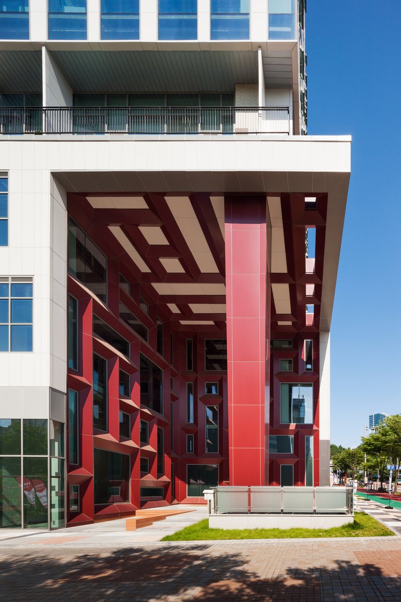
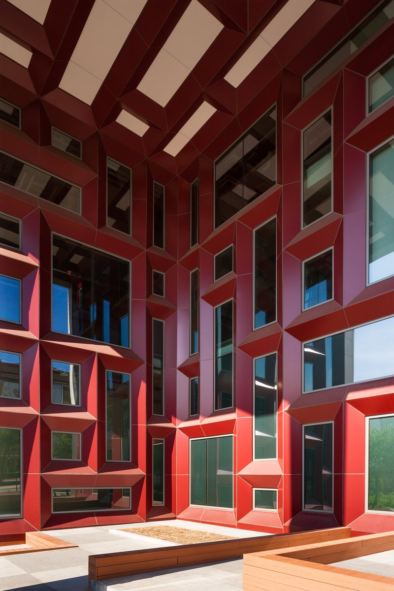
The most immediately recognizable detail is the red metal framework that wraps the ground-level entries. It functions as canopy, wayfinding device, and color accent all at once, pulling the eye down from the neutral tower above to the point where you actually enter. The geometry is angular and assertive, with projecting window frames in the courtyard creating a faceted pattern that catches light differently throughout the day.
Red is a loaded choice in Korean commercial architecture, often associated with signage clutter. Here it works because it is confined to structure rather than surface, used as a skeletal element that frames glass and air rather than filling in with branding. The canopy announces the transition from public street to semi-public courtyard, marking the threshold without blocking sightlines inward.
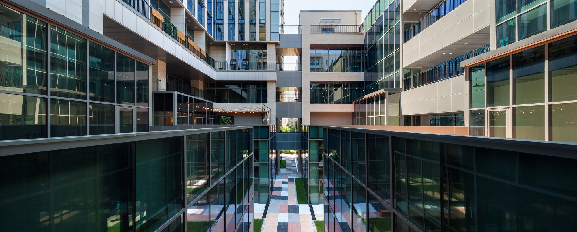
The Central Courtyard as Social Engine
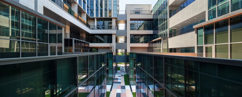
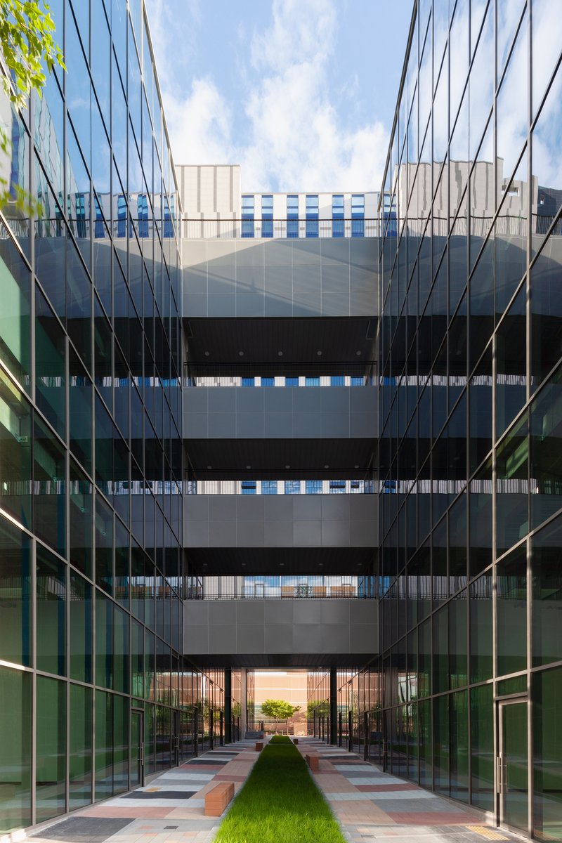
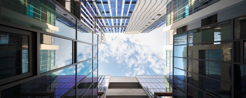
The courtyard is the project's core argument. Glazed walls on both sides rise multiple stories, and bridges span the gap at upper levels, creating a vertical atrium open to the sky. At dusk, when the office floors illuminate, the courtyard becomes a lantern visible from the street. During the day, a grass strip and paved terraces at the base provide a decompression zone between the retail volumes.
KARO's stated ambition was to design corridors that allow visual and auditory communication between office workers and the shopping activity below. The single-loaded office corridors, which line the north edge of the upper floors, look down into this space. It is an unusual proposition: most office tenants want silence and separation. Here the architects bet that ambient connection to commercial life would feel energizing rather than distracting. Whether tenants agree probably depends on the tenant, but the spatial generosity is undeniable.
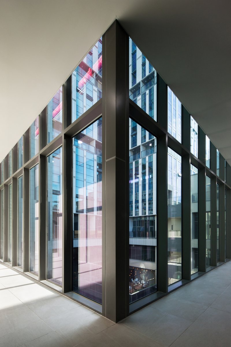
Materiality in the Atrium and Interior Corridors
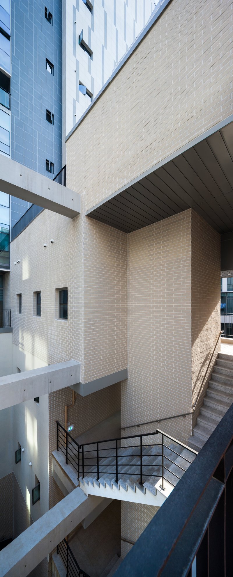
Inside, the palette shifts to pale brick, dark metal framing, and cantilevered volumes that create layered depth within the atrium. The brick surfaces feel grounded and warm compared to the slick panel facades outside. Metal stair railings and exposed structural edges keep the interiors from reading as finished corporate lobbies; there is a rawness here that suggests a building designed to age rather than to be replaced in fifteen years.
The interior corridors use floor-to-ceiling glass set in dark metal frames, with reflected pink and blue panels adding color where you might expect neutrality. It is a subtle move, but it gives the hallways a sense of place rather than treating them as disposable connective tissue. The architects clearly thought about these spaces as rooms, not leftover circulation.
Rooftop Landscapes
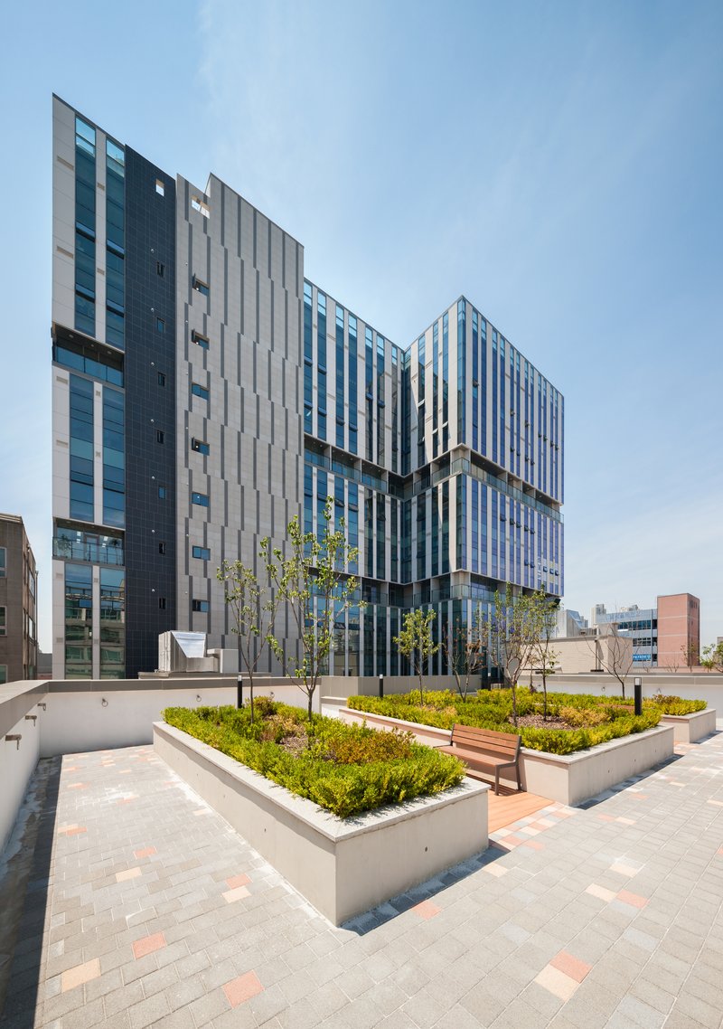
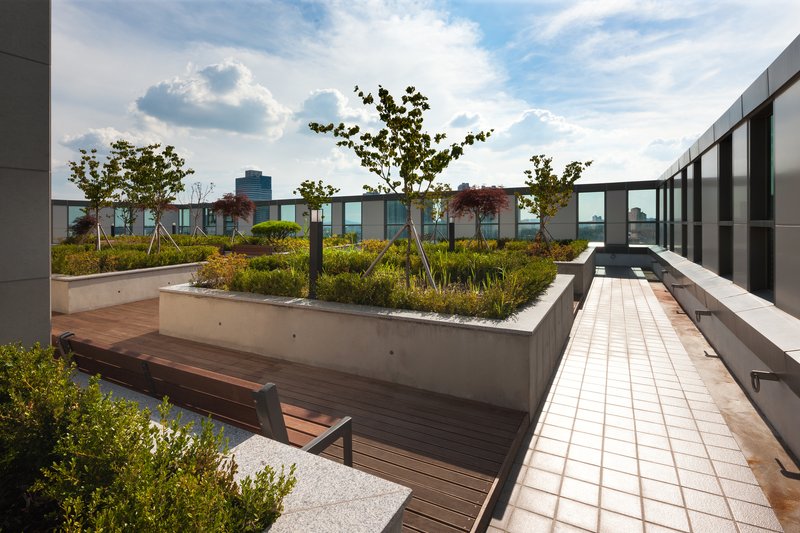
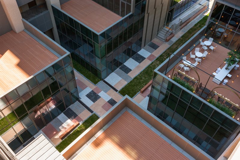
The rooftops of the lower volumes are treated as occupied gardens with raised concrete planters, timber benches, and deciduous trees still in their early growth. These terraces face the articulated rear facades of the tower, turning what would normally be a service elevation into a backdrop for outdoor gathering. The aerial view reveals how the courtyard, the planted strips, and the rooftop seating create a continuous landscape layer running through the building's midsection.
In new Korean development districts, where ground-level public space often amounts to paved setbacks, this kind of elevated landscape is valuable. It provides a shared amenity for both retail and office tenants without consuming leasable ground floor area. The trees will matter more in five years than they do now, and the success of these terraces will ultimately depend on whether building management maintains them. The bones, however, are right.
The Red Pergola Detail
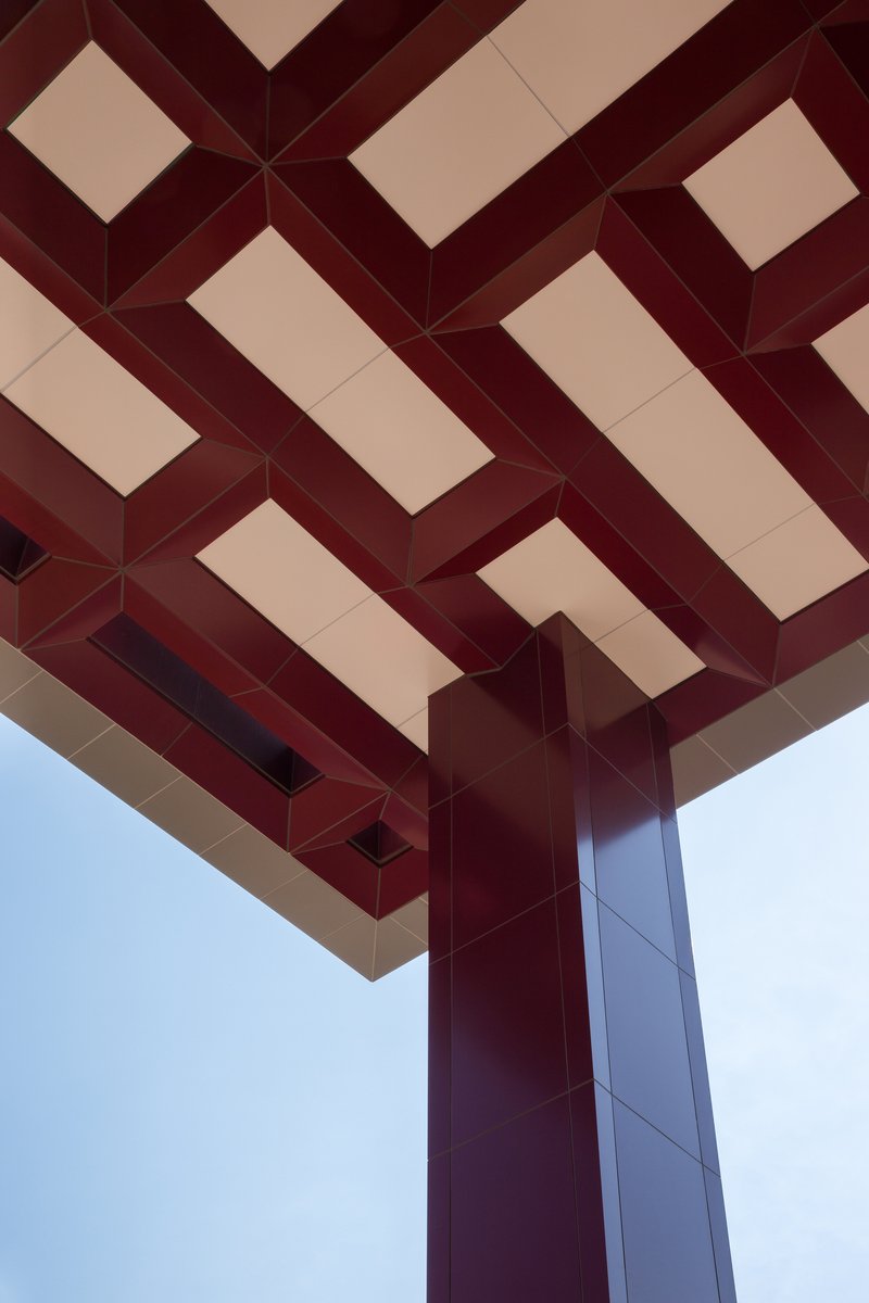
A woven beam pattern in the red metal pergola at the upper terrace level stands out as one of the building's most resolved details. The interlocking beams meet a single column with the kind of clarity that suggests the architects fought for it during value engineering. Given the acknowledged reality that construction company cost reductions prevented the full realization of some initial ideas, the survival of this element feels significant. It proves that when KARO could hold the line on craft, the results justified the effort.
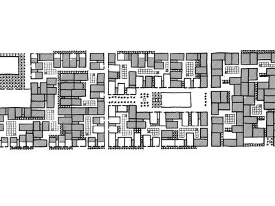
Plans and Drawings
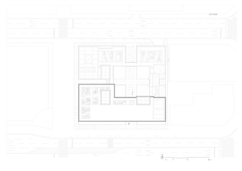
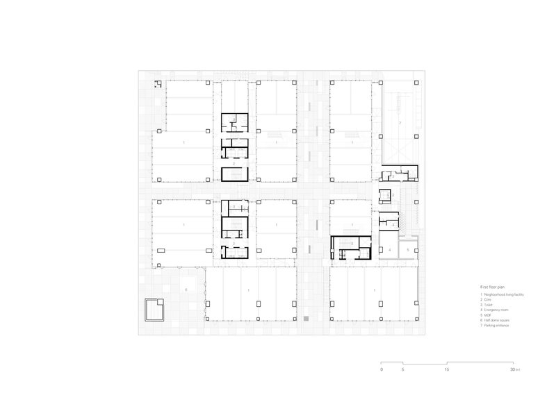
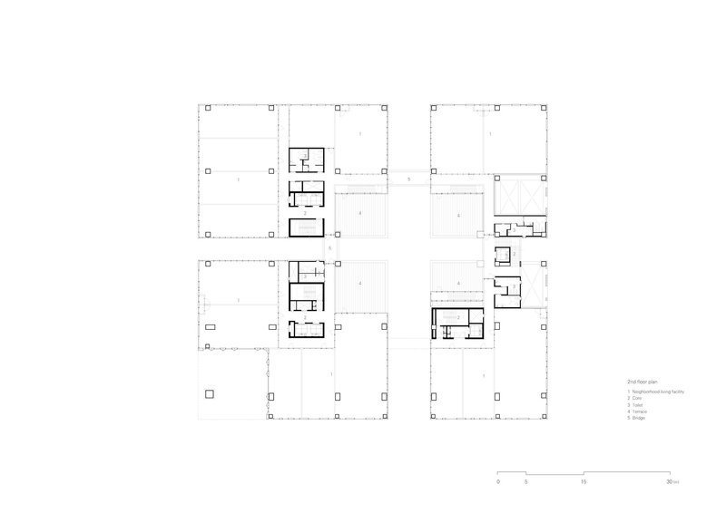
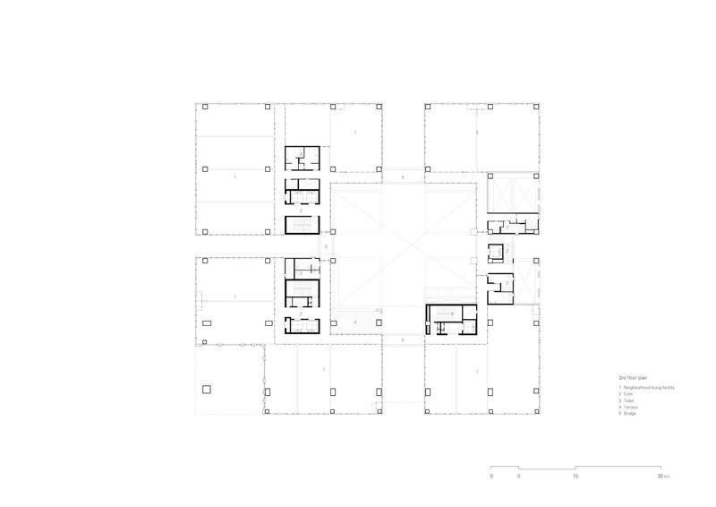
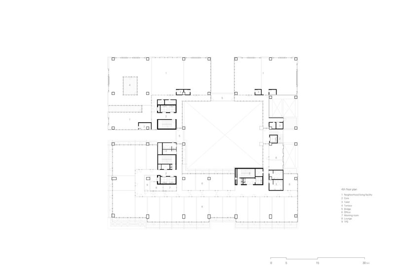
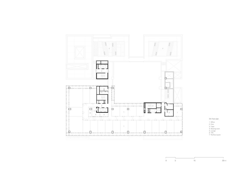
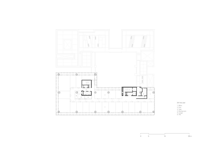
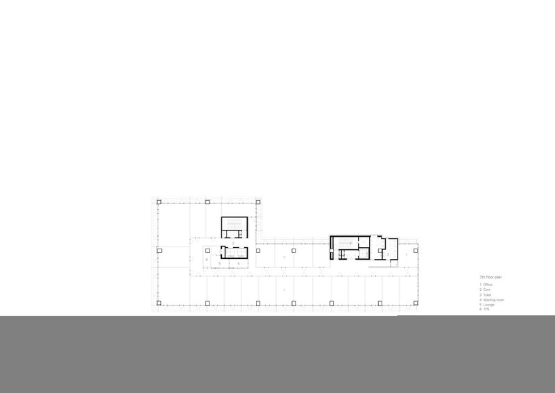
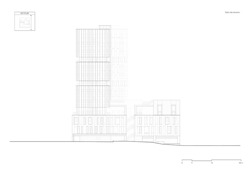
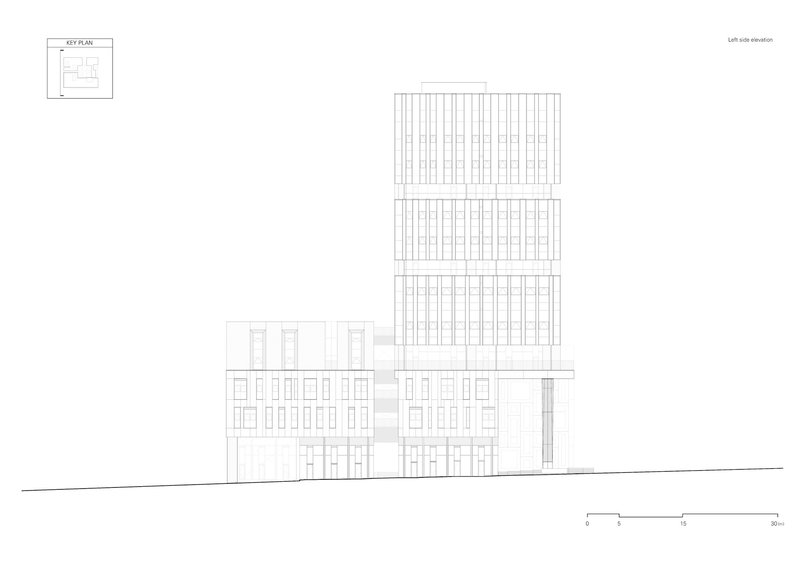
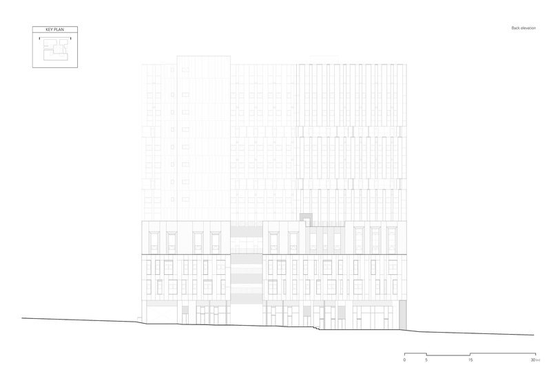
The site plan confirms the nearly square plot and the central courtyard that divides the building into two primary volumes. Floor plans at various levels show the structural grid with clustered service cores, open office plates on the upper stories, and retail units distributed around the courtyard at lower levels. The semicircular public space at the southeastern corner, required by the master plan, is legible in the site drawing as a civic gesture where the building gives ground back to the pedestrian street.
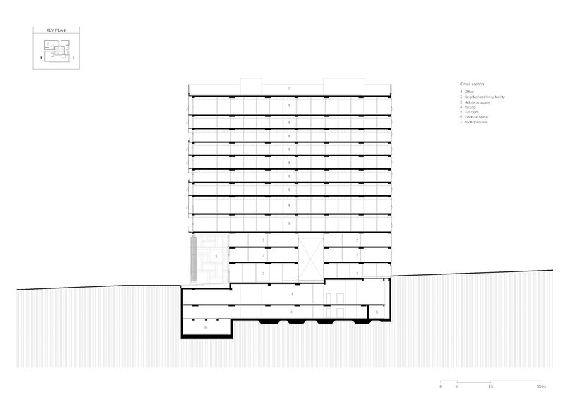
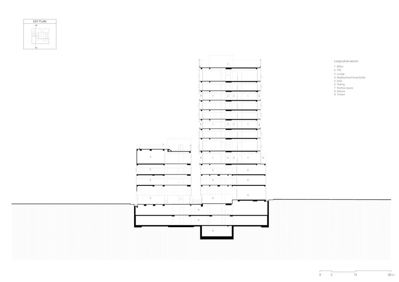
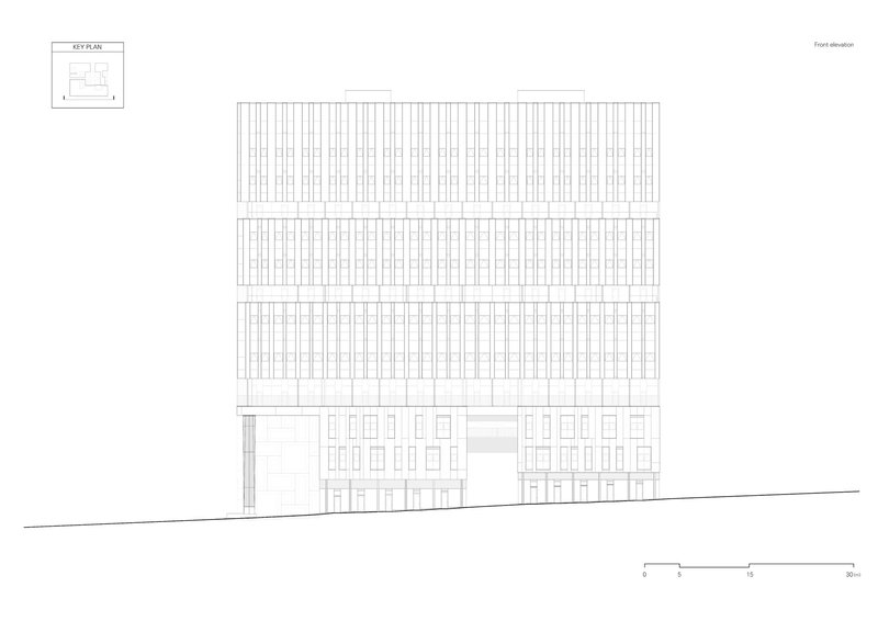
Sections and elevations reveal the stepped massing strategy most clearly. The tower rises to 12 stories while a lower volume at its base creates a datum that aligns with the surrounding context. The longitudinal section shows how the courtyard cut runs the full height of the building, confirming that this is not a superficial design gesture but a genuine organizational decision with structural and programmatic consequences. Elevations from all four sides demonstrate how the vertical facade striations unify the various volumes into a single reading from a distance, even as close inspection reveals distinct material zones.
Why This Project Matters
Re-summit Tower matters because it treats a speculative mixed-use development as a design problem worth solving with spatial intelligence rather than surface decoration. The courtyard, the single-loaded corridors, the rooftop gardens, and the red structural accents all emerge from a coherent logic: split the mass, connect the programs visually, and give every user in the building a relationship to something beyond their own floor plate. In a district where the default move is to maximize enclosed area and minimize shared space, KARO chose the opposite, and the building is measurably better for it.
The compromises are visible. Cost reductions clearly flattened some of the initial ambition, and the material palette outside the courtyard can feel generic in places. But the organizational idea, the building split open at its center to admit light, air, and social exchange, survives the construction process intact. That is the hardest thing to preserve in commercial development, and KARO managed it. For architects working within the constraints of Korean new-town planning, Re-summit offers a credible model: you can build to code, fill the allowed envelope, and still produce something that functions as more than a container.
Re-summit Tower by KARO Architects (lead architect Kim Kijoong). Yongin-si, South Korea. 23,947 m². Completed 2021. Photography by Park Myeongrae.
About the Studio
Share Your Own Work on uni.xyz
If projects like this are the kind of work you want to make, uni.xyz is a place to publish your own, find collaborators, and enter design competitions.

Popular Articles
Popular articles from the community
Foster + Partners Wraps a 200-Meter Shanghai Tower in Stainless Steel and Industrial Memory
The Suhe Centre Office Tower anchors a regenerated waterfront district in Shanghai with an all-steel structure that nods to local warehouse heritage.
Driss Kettani Carves a Private World from Concrete Boxes on a Tight Casablanca Plot
Villa Polo stacks perforated concrete volumes around courtyards and a rooftop pool to shield a family home from the dense urban fabric.
Three Studios Build 200 Affordable Units for Tulum's Displaced Hospitality Workers
Casa Selva embeds dark concrete housing blocks into Yucatán rainforest, offering dignified shelter to those priced out by the tourism they serve.
OMCM arquitectos Builds a Summer House in Paraguay from Quarry Waste Blocks and Three Sacred Trees
In the young hillside neighborhood of Altos, a 696-square-meter concrete volume hovers on six pillars around three preserved native Yvyraju trees.
Similar Reads
You might also enjoy these articles
127af Flips a Tiny Bagnolet Rowhouse Upside Down with a Handcrafted Roof Extension
A 55-square-meter terraced house on the edge of Paris gains a luminous upper living floor through lightweight timber and steel.
1.61 Design Workshop Wraps a 600-Square-Meter Café in Vietnam in Sculptural Burgundy Drama
Reden Café & Bistro pairs a helical staircase, mosaic floors, and deep red interiors to rethink Vietnamese hospitality space.
The Unbound Brain: A School Shaped by Cognitive Architecture
Cylindrical learning pods radiate like neurons from a central cortex, turning the floor plan into a spatial model of human thought.
Revival Vernacular Architecture: Rammed Earth Settlements for the Sahara
A modular desert community in Mauritania that fuses passive cooling techniques with earthen construction and local craftsmanship.

Explore Landscape Design Competitions
Discover active competitions in this discipline


The International Standard for Design Portfolios


The Global Benchmark for Architecture Dissertation Awards


The Global Benchmark for Graduation Excellence

Challenge to reimagine the Iron Throne
Comments (0)
Please login or sign up to add comments
No comments yet. Be the first to comment!