

Kidz Studio Wraps a Barcelona Coffee Shop in Burgundy Curves and Cinnamon-Roll Geometry
Cinnamood lands in El Born's medieval streets with a 89 square meter interior that treats brand identity as spatial architecture.


Carrer de l'Argenteria is one of those Barcelona streets where medieval stone walls and narrow sightlines make every shopfront a compression point. When you step inside, whatever awaits had better justify the transition. Kidz Studio understood this when designing Cinnamood, a specialty coffee and cinnamon roll franchise that now occupies roughly 89 square meters in the heart of El Born, just steps from the Basilica of Santa Maria del Mar. The result is an interior that takes the chain's high-energy branding and converts it into a genuine spatial sequence rather than wallpapering it onto a neutral box.
What makes the project worth studying is how it choreographs a customer journey through what is, by any measure, a tight floor plan. Existing structural columns, inherited from the 20th-century building, are not hidden behind drywall but painted burgundy and turned into navigational landmarks. The path leads visitors past merchandise displays, through a gradual reveal of the signature rolls, and finally to a curved ordering counter that functions as the spatial and programmatic core. Every surface decision, from acrylic stone countertops to gradient metal panels, serves the dual purpose of reinforcing brand identity and making a small room feel deliberate rather than cramped.
Borrowed Structure, Claimed Identity
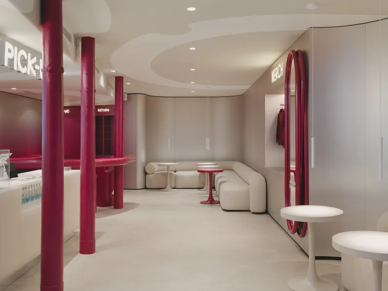
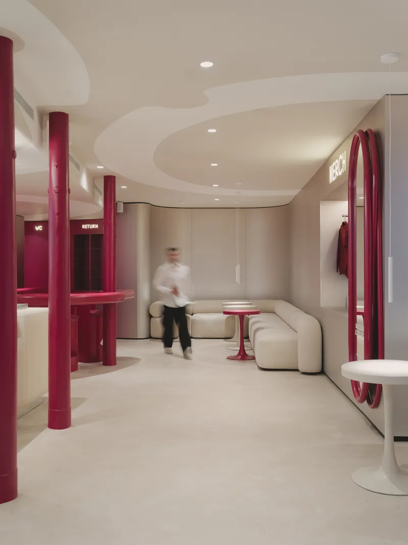
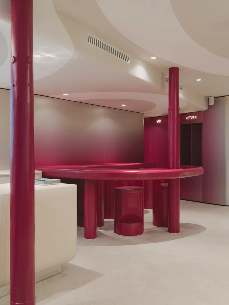
The burgundy structural columns are the most confident move in the entire project. Rather than disguising them or treating them as obstacles, Kidz Studio wrapped them in paint that matches the brand's palette, turning utilitarian concrete into a recurring motif. They partition the space without walls, separating the queue from the seating and creating rhythm in what could easily have been a single undifferentiated volume. A person walking between them experiences the room as a sequence of framed moments, not a single open plan.
The cream-toned sectional seating reads as deliberately calm against these deep-hued verticals. It is a smart contrast: the brand's intensity lives in the architecture, while the furniture invites lingering. Cloud-shaped ceiling cutouts with recessed lighting reinforce the sense that each zone has its own overhead identity, even when the floor is continuous.
The Counter as Spatial Anchor
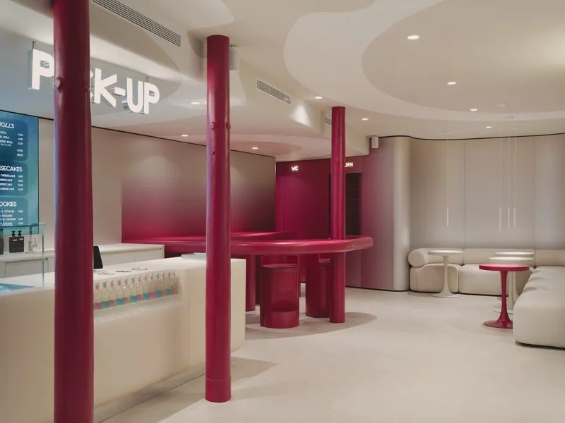
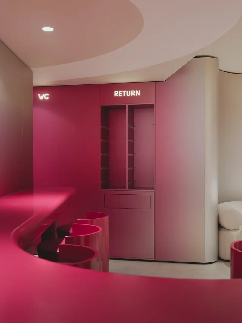
The circular counter is the room's gravitational center, and it earns that status. Built from acrylic stone with a glossy burgundy finish, it wraps around one of the structural columns and draws the eye from nearly every angle. Illuminated pickup signage is embedded flush with the millwork rather than hovering above it, which keeps the visual field clean and integrated. The effect is that the ordering and collection zone feels like architecture, not furniture with a sign taped to it.
Adjacent to the counter, a return station with integrated storage cubbies and a matching upholstered bench handles the less glamorous logistics of bussing trays and staging merchandise. Kidz Studio treated these back-of-house needs with the same material rigor as the front-facing elements, which is the kind of consistency that separates considered interiors from decorated ones.
Merchandise as Spatial Scenography
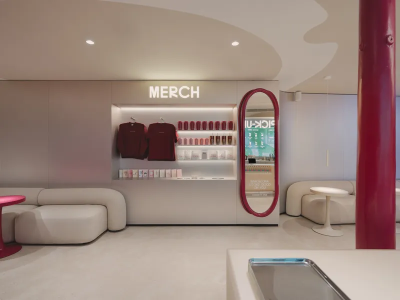
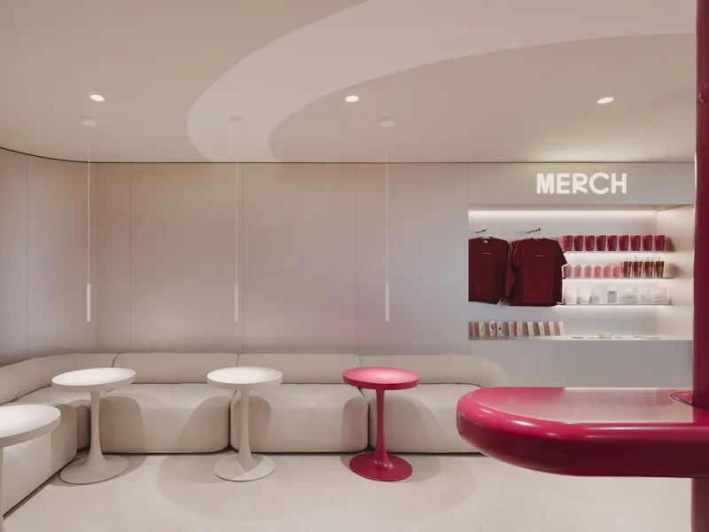
Retail zones in coffee shops tend to feel like afterthoughts: a shelf near the register, a tote bag hanging from a hook. Here, Kidz Studio carved out a full merchandise wall with backlit shelving and an oval mirror kiosk that doubles as a selfie station. It occupies a bypass area between the queue and the seating, so customers encounter it without being forced to interact. The curved soffit above acts as a visual boundary, signaling that this zone has a different purpose from the dining areas on either side.
Deeper into the space, an illuminated alcove beyond a curved banquette creates a second merchandise moment that rewards those who explore past the obvious seating. The white side tables and neutral upholstery here reinforce the project's strategy of concentrating brand saturation in built-in elements while keeping loose furniture subdued.
Material Intensity in Small Doses
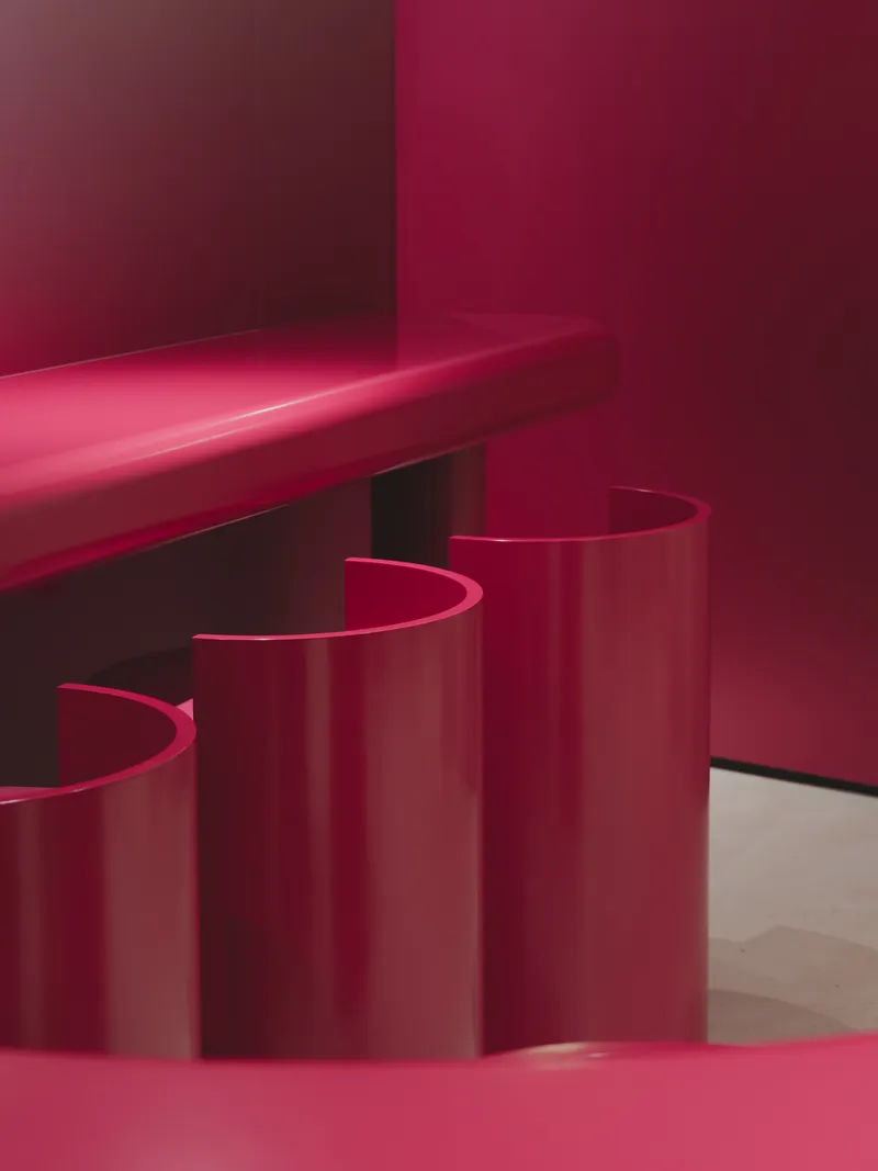
The glossy magenta tables and cylindrical stools are the project's most visually aggressive furniture pieces, and they are deployed sparingly. Placed beneath curved ceiling coffers with recessed lighting, they create pockets of heightened color that feel intentional rather than overwhelming. In a 89 square meter space, saturation has to be rationed, and Kidz Studio understood exactly where to spend it.
A close-up of the stools tucked beneath the counter reveals a deliberate material choice: the high-gloss finish catches the warm overhead lighting and bounces it back in soft reflections. These are not accent pieces thrown in for Instagram. They are calibrated to the room's light conditions, and they perform differently depending on the time of day. That kind of attention to reflectance is unusual in chain interiors and suggests a design team thinking about atmosphere rather than just color matching.
Softening the Grid
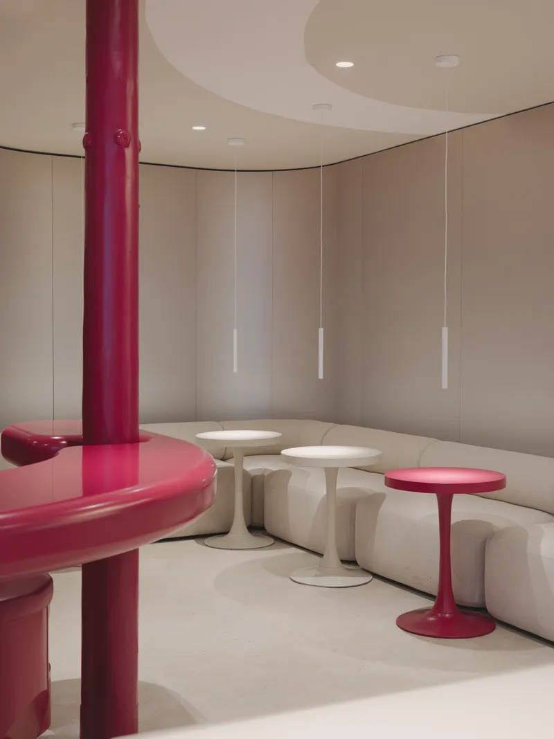
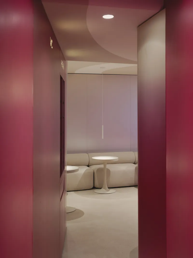
The curved wall of beige panels with white pendant lights overhead is the quietest move in the project, and possibly the most important. It defines the seating area's perimeter without creating hard edges, wrapping guests in a surface that reads as warm and absorptive. Modular seating and pedestal tables here are deliberately low-key, allowing this zone to function as a decompression chamber after the high-energy brand moments at the entrance and counter.
A view through the burgundy doorway into this seating area, with the cloud-shaped ceiling feature floating overhead, demonstrates how thresholds are used to create psychological transitions within a single room. You pass through a saturated frame and arrive in a lighter world. It is a simple trick, but it works because the color contrast is extreme enough to register and the ceiling geometry shifts at the same moment. The room changes mood in two steps.
Plans and Drawings
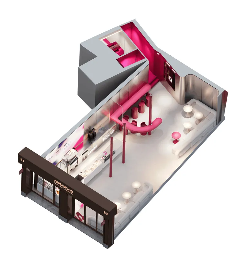
The axonometric cutaway reveals what the photographs only hint at: the full spatial logic of the plan. The curved magenta elements, counter, partitions, and display fixtures, create a looping circulation path that threads between existing columns and guides visitors from the storefront facade through the product reveal, past the ordering zone, and into the seating areas. What looks organic in photographs is actually tightly choreographed. Every curve corresponds to a functional requirement, whether that is sightline management, queue separation, or the simple need to get bodies around a column without bottlenecking.
Why This Project Matters
Chain interiors have a well-earned reputation for substituting brand guidelines for design thinking. The kit-of-parts approach, where a headquarters sends a color swatch and a logo file and the local team applies them to whatever box is available, produces spaces that feel interchangeable regardless of city. Kidz Studio's work for Cinnamood in El Born refuses that logic. The brand identity is present and unmistakable, but it is expressed through spatial decisions: column color, counter geometry, ceiling voids, circulation choreography. The room is not wearing a costume. It is built from the brand's DNA.
At 89 square meters in a dense medieval district, the project also demonstrates that constraint can sharpen design rather than limit it. The existing columns, the narrow frontage, and the modest area forced every element to justify its presence. Nothing is decorative for its own sake. When a franchise operation trusts its architects enough to let the space do the branding, the results tend to outlast whatever the current social media aesthetic demands. Cinnamood in Barcelona will still make sense after the next trend cycle because its logic is structural, not stylistic.
Cinnamood, Specialty Coffee by Kidz Studio. Located on Carrer de l'Argenteria, El Born, Barcelona, Spain. 89 m². Completed in 2026. Photography by Enric Badrinas.
About the Studio
Share Your Own Work on uni.xyz
If projects like this are the kind of work you want to make, uni.xyz is a place to publish your own, find collaborators, and enter design competitions.


Popular Articles
Popular articles from the community


ETEH Reworks the Shared Spaces of São Domingos School in Brazil Around Timber, Color and Hanging Plants
At São Domingos School in Brazil, 436 m² of hall, refectory and library are recast with timber joinery, a yellow and blue code and trailing greenery.


Manzana Morphosis: Stretching Barcelona's Grid into a Living Landscape for 2050
A radical reworking of the Eixample manzana turns density into a tool for generous public space, vertical ecology, and environmental performance.

Cube Design Draws an Ecological Corridor Between Two Shenzhen Hills with the Nankai Building
Beside Shenzhen's container docks, the Nankai Building pairs stacked balconies with a climbing green screen to connect two hillsides across its height.

Singing Woman: An Opera House That Performs Before the Curtain Rises
Ovidiu Cristian Pavel's conceptual opera house translates Estonia's choral identity into a sculpted waterfront landmark facing the Baltic Sea.

Similar Reads
You might also enjoy these articles

LAVA Architecten Gives Vocational Education a Sawtooth-Roofed Face on a Mechelen School Campus
In Mechelen, Belgium, a 2,053 m² STEM school on a 6×6 m grid turns workshops and classrooms into rooms that can be rearranged as teaching changes.

KEMA Studio Turns a Derelict Marvila Attic into a 60 m² Lighthouse Apartment Above Lisbon
In Lisbon's Marvila district, a rebuilt roof, four skylights and two plywood volumes turn an unlivable attic into a bright home facing the Tagus.

Pixel Gardens: One Repeated Module Stacked Into a Terraced Social Housing Tower for Famagusta
Salem Bader's shortlisted housing tower builds a vertical neighbourhood from one repeated module, offsetting units to carve terraces, light and air.

Bao Huynh Watercolor Atelier: A Serene Art Retreat in Hội An
Bao Huynh Watercolor Atelier in Hội An blends multifunctional art spaces, sustainable design, local materials, and family-friendly living in a serene environment.

Explore Coffee Chair Competitions
Discover active competitions in this discipline

Challenge to design luxury tourism on rails

VR headsets Storefront design competition

Designing a staircase for a client
Comments (0)
Please login or sign up to add comments
No comments yet. Be the first to comment!