

Architectkidd's My Front Yard Turns a Phuket Retail Block into a Neighborhood Living Room
Architectkidd's open-air commercial village in Phuket dissolves the shopping mall into a network of pavilions, walkways, and planted courtyards.


The conventional retail development in Southeast Asia tends toward introversion: sealed, air-conditioned volumes that shut out the climate they profit from. My Front Yard, a 5,000 m² commercial project by Architectkidd in Phuket, takes the opposite stance. Instead of one building, the scheme scatters a collection of white pavilions across a landscaped site, linking them with elevated walkways and open courtyards. The result feels less like a shopping center and more like a small village, one where the pathways between things matter as much as the things themselves.
What makes the project genuinely interesting is its refusal to treat circulation as leftover space. Every bridge, colonnade, and planted island is designed with the same care as the retail interiors. The architecture argues that the act of walking, pausing, and looking around is a form of commerce too, maybe the most durable one. In a tourism economy that often defaults to spectacle, Architectkidd has bet on something quieter: the pleasure of a well-made public ground.
A Campus, Not a Box
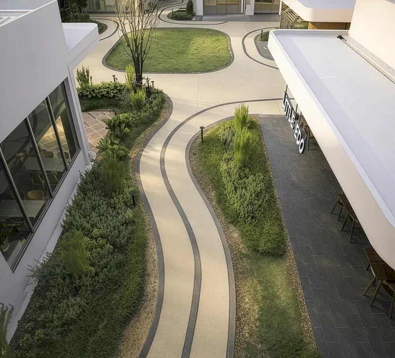

Seen from above, the project reads as a loose constellation. White roofed volumes of varying size sit among curving planted beds and paved pathways, with no single dominant structure claiming the center. The aerial views reveal a deliberate informality in the plan: buildings angle slightly off-axis, creating pockets and widened paths that invite lingering rather than directing traffic along a single spine.
The landscaping does serious spatial work here. Planted islands are not decorative buffers but active devices that break sightlines, create microclimates, and give each pavilion its own forecourt. The oval courtyard at the heart of the composition, visible in the site plan, acts as a communal anchor without the formality of a central plaza.
Elevated Walkways as Public Infrastructure
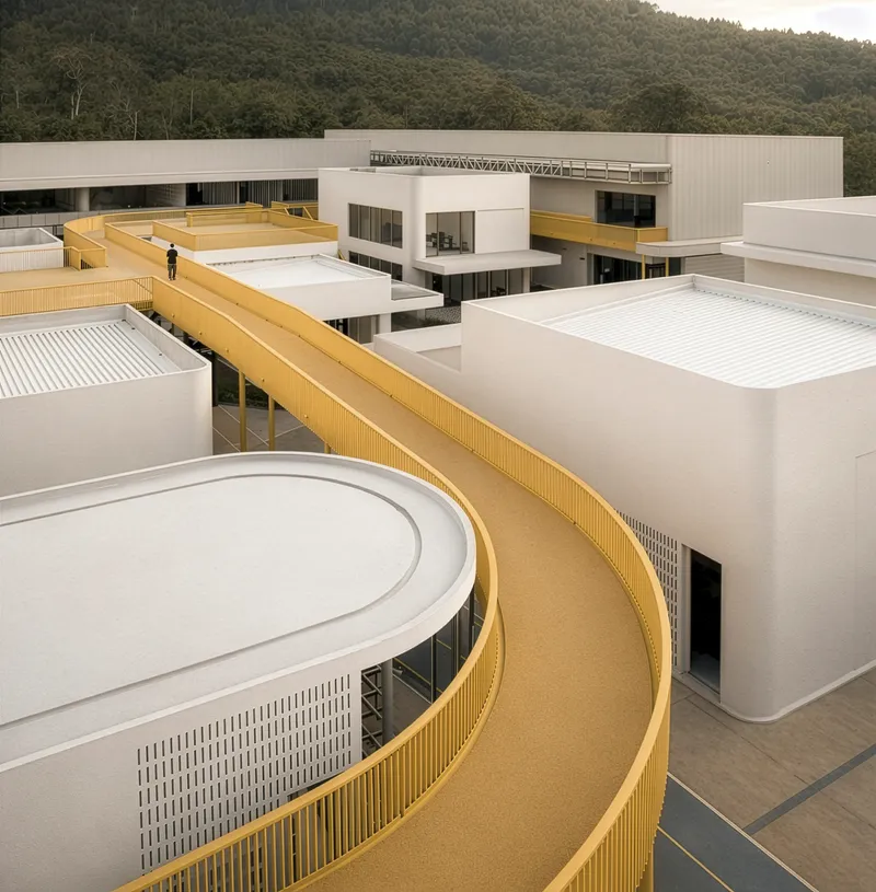
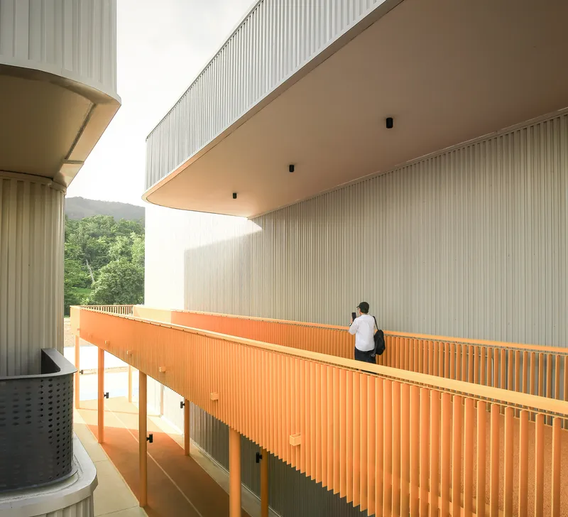
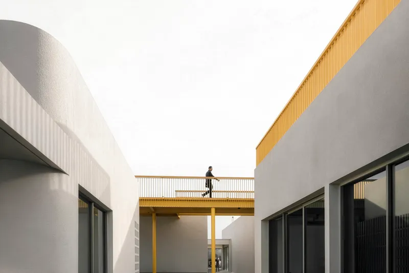
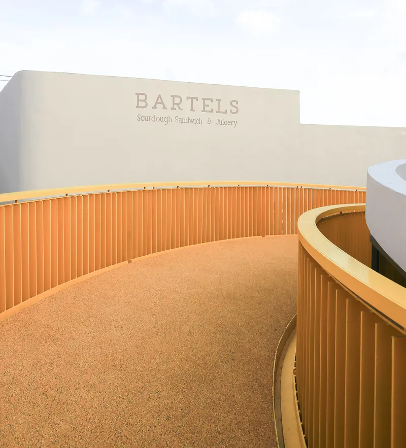
The yellow and orange metal railings of the elevated walkways are the project's most recognizable gesture, and they earn their prominence. These bridges do more than connect upper floors; they establish a second ground plane from which the entire site can be read. Wrapping around pavilion volumes and cutting across voids, they turn movement into a kind of spectatorship, offering constantly shifting views of the landscape below and the forested hillside beyond.
The bold color of the railings is worth noting. Against the project's otherwise restrained palette of white stucco and warm timber, the yellow and orange steel reads as deliberate civic signaling. It marks the walkways as shared territory, distinct from the private retail spaces they serve. It is a small but effective way to communicate that these paths belong to everyone.
Timber, Light, and the In-Between
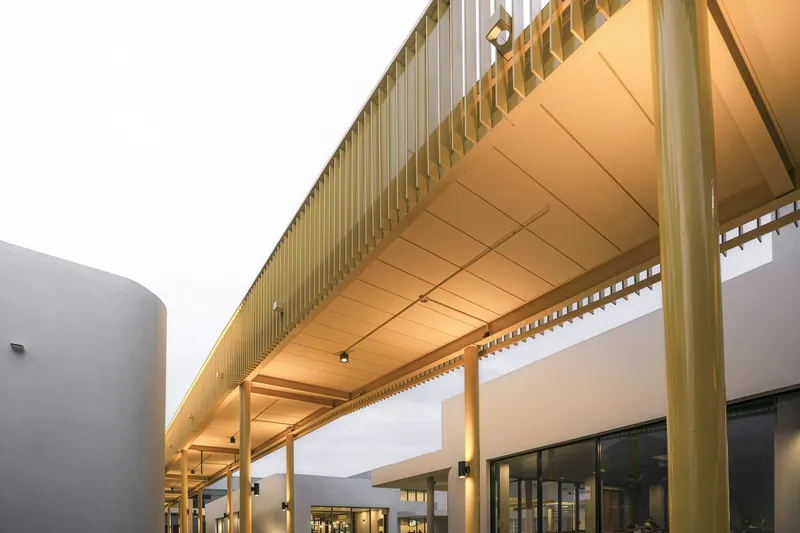
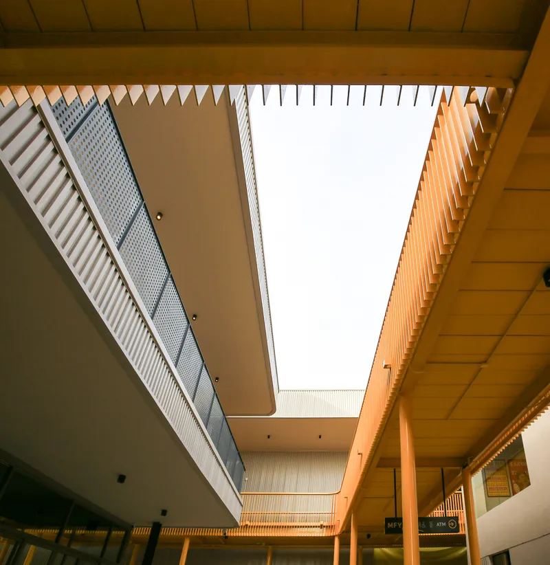

The covered walkways and colonnades reveal a material language calibrated for Phuket's tropical conditions. Timber slat canopies filter daylight into warm stripes, while corrugated metal and rectangular skylights manage rain and ventilation without sealing the space. The effect at dusk, when artificial light washes through the timber ceilings, is quietly theatrical.
White cylindrical columns anchor the nighttime colonnades, creating rhythmic depth that pulls visitors through the site. These transitional zones, neither fully interior nor fully exterior, are where the architecture performs best. They offer shade and shelter without the hermetic quality of enclosed retail, keeping occupants connected to the sounds and smells of the garden.
Pavilion Characters
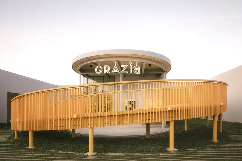
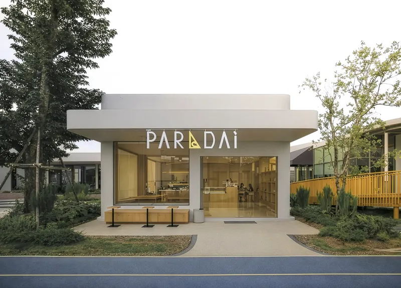
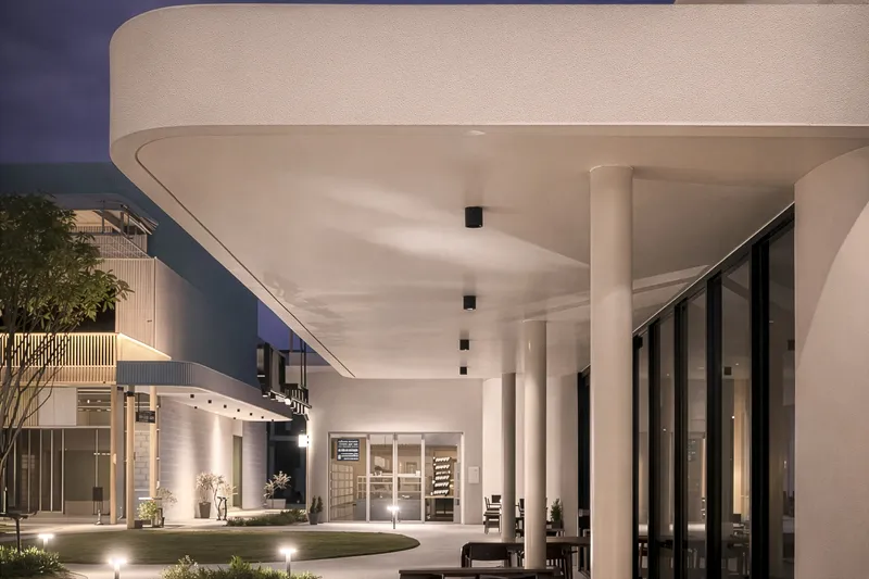
Each pavilion carries a distinct personality. The circular volume wrapped in vertical timber slats and capped with a glass dome feels almost ceremonial, a lantern on the site at dusk. Elsewhere, a recessed glazed entrance is framed by low planted beds and young trees, offering a more subdued threshold. The covered terrace with its circular soffit and cylindrical columns suggests a gathering space designed for conversation rather than consumption.
The variation matters because it gives tenants distinct identities without forcing them into branded boxes. The architecture provides character; the businesses inhabit it. That is a more generous model than the blank shell most commercial developers offer, and it implies a longer-term relationship between landlord, tenant, and place.
Retail at Twilight
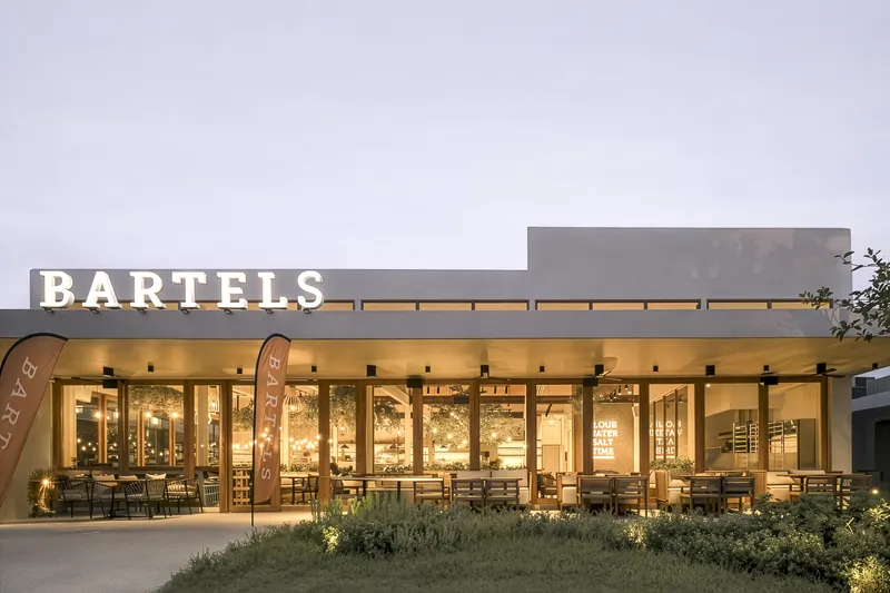
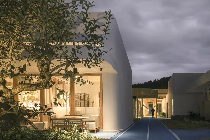

The project is clearly designed to peak at dusk, when interior lighting turns the glass-walled pavilions into glowing vitrines against the darkening landscape. A restaurant facade illuminated through a planted forecourt, tiled mosaic signage catching the last natural light, white volumes framed by a mature tree: these are composed scenes, not accidents. Architectkidd understands that in a hospitality-driven economy, atmosphere is as much a product as food or merchandise.
The signage strategy deserves mention. Tiled mosaics on white stucco walls sit comfortably beside garden beds, integrating branding into the material language of the architecture rather than bolting it on as an afterthought. It is a detail that reveals control over the overall experience, from wayfinding to the texture of a wall.
Interior Details
Inside, the material warmth continues. A curving service counter clad in vertical timber battens, set against cork flooring and a clean signage wall, demonstrates that the interior fitouts share the vocabulary of the exterior architecture. The consistency between inside and outside, timber slats here and timber slats there, reinforces the campus as a coherent whole rather than a collection of disconnected shells.
Plans and Drawings
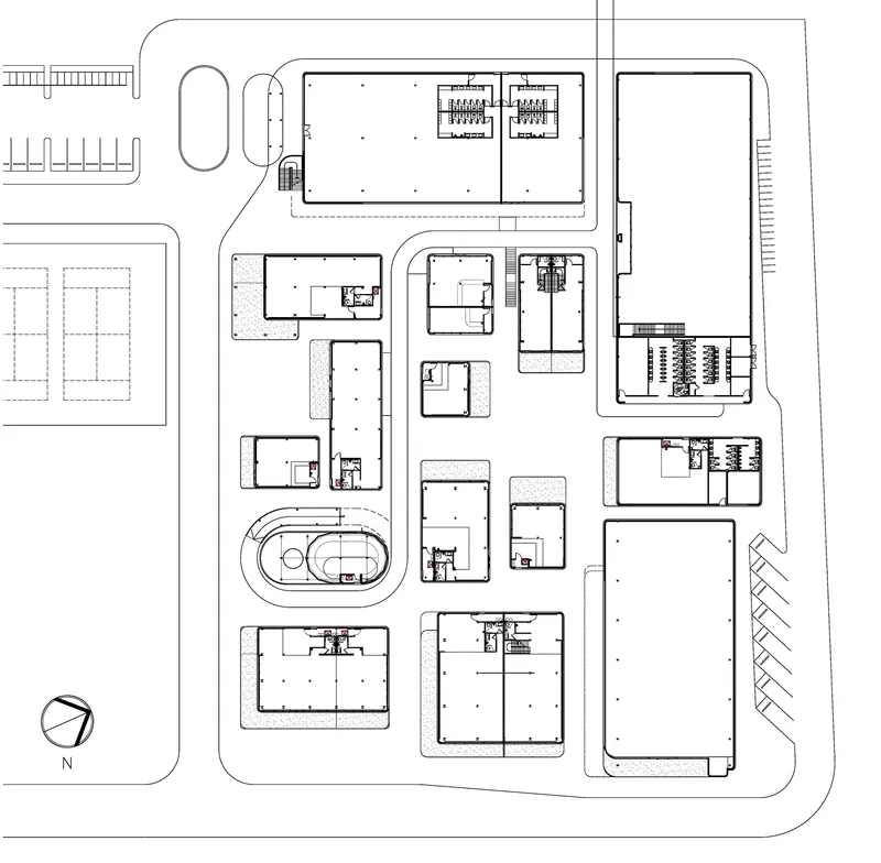
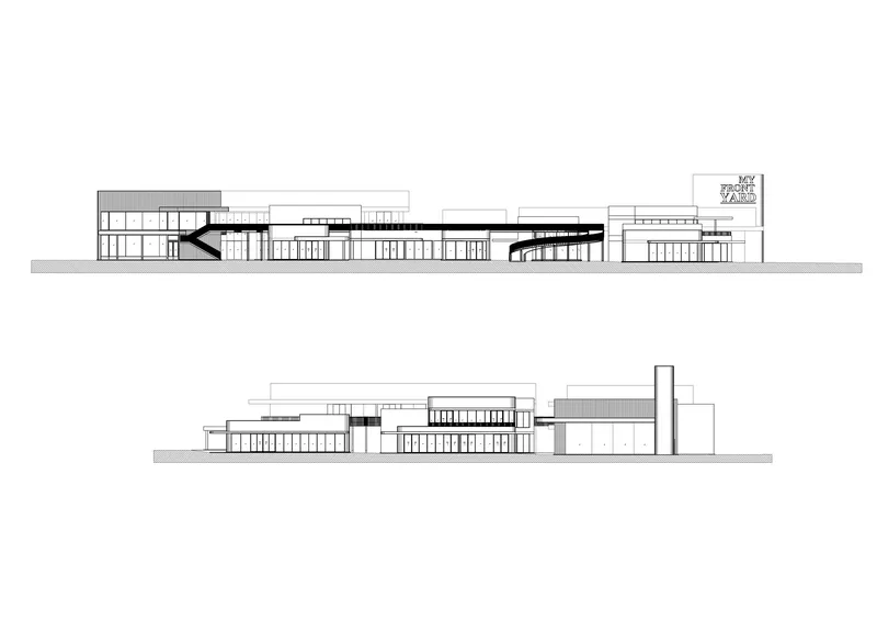
The site plan confirms what the aerial photos suggest: an intentionally irregular arrangement of rectangular buildings orbiting a central oval structure. Setbacks between volumes vary, generating wider and narrower passages that modulate the pedestrian experience. The elevation drawings reveal consistently low horizontal profiles punctuated by a single vertical tower element, keeping the project deferential to the surrounding hillside while providing one landmark moment.
The varying roof profiles visible in the elevations, some flat, some gently pitched, contribute to the village-like silhouette. Nothing here reads as monumental. The architecture keeps its head down, quite literally, letting the landscape and the social life of the courtyards do the talking.
Why This Project Matters
My Front Yard matters because it proposes a viable alternative to the enclosed shopping mall in tropical Asia, one that is climatically responsive, socially generous, and commercially legible all at once. Architectkidd has demonstrated that you do not need to seal people inside a box to get them to spend money. You can give them shade, a garden, a bridge with a view, and a well-lit colonnade, and they will stay longer than any air-conditioned corridor could hold them.
More broadly, the project joins a growing body of work across Southeast Asia that treats commercial development as an opportunity to build public life rather than extract from it. Phuket has no shortage of retail offerings; what it lacks are well-designed shared grounds. By framing a commercial program as a neighborhood rather than a destination, Architectkidd has made something that might actually outlast its tenants, and that is the hardest thing for any retail project to achieve.
My Front Yard by Architectkidd (lead architects: Jariyawadee Lekawatana, Luke Yeung, Korpong Sahana, Manassak Senachak). Phuket, Thailand. 5,000 m². Completed 2025. Photography by Korpong Sahana.
About the Studio
Share Your Own Work on uni.xyz
If projects like this are the kind of work you want to make, uni.xyz is a place to publish your own, find collaborators, and enter design competitions.


Popular Articles
Popular articles from the community


The Amber Palace Opera: A Geological Fiction Surfaces on Tallinn's Baltic Waterfront
Pierre Brillard reimagines a Baltic legend as a public landscape, opera house, and waterfront promenade rooted in Tallinn's coastal identity.

Singing Woman: An Opera House That Performs Before the Curtain Rises
Ovidiu Cristian Pavel's conceptual opera house translates Estonia's choral identity into a sculpted waterfront landmark facing the Baltic Sea.


FCC Arquitectura Expands a Portuguese Granite House with a Board-Marked Concrete Wing
In Portugal, JV House pairs a cleaned-up whitewashed and granite dwelling with a timber-shuttered concrete extension, courtyards and a garden pool.

Opera on the Sea: Driftwood Logic Shapes a Timber Opera House on Estonia's Coast
Trevor Orgill's opera house translates the entangled drift of floating timber into a civic building where wood, water, and music converge.

Similar Reads
You might also enjoy these articles

LAVA Architecten Gives Vocational Education a Sawtooth-Roofed Face on a Mechelen School Campus
In Mechelen, Belgium, a 2,053 m² STEM school on a 6×6 m grid turns workshops and classrooms into rooms that can be rearranged as teaching changes.

KEMA Studio Turns a Derelict Marvila Attic into a 60 m² Lighthouse Apartment Above Lisbon
In Lisbon's Marvila district, a rebuilt roof, four skylights and two plywood volumes turn an unlivable attic into a bright home facing the Tagus.

Pixel Gardens: One Repeated Module Stacked Into a Terraced Social Housing Tower for Famagusta
Salem Bader's shortlisted housing tower builds a vertical neighbourhood from one repeated module, offsetting units to carve terraces, light and air.

Bao Huynh Watercolor Atelier: A Serene Art Retreat in Hội An
Bao Huynh Watercolor Atelier in Hội An blends multifunctional art spaces, sustainable design, local materials, and family-friendly living in a serene environment.

Explore Streetscape Competitions
Discover active competitions in this discipline

Challenge to design a portable theatre

Challenge to design a portable music platform

Challenge to design public laboratory

Challenge to design an open learning module for the elderly
Comments (0)
Please login or sign up to add comments
No comments yet. Be the first to comment!