
Offhand Practice Carves a Cave-Like Gallery into a Former Shanghai Diner
On Yongkang Road in Shanghai's Xuhui district, a 60-square-meter street diner becomes a sequence of sculpted, grotto-like retail rooms.


No. 185 Yongkang Road was, until recently, a nondescript 60-square-meter street diner on a busy strip in Shanghai's Xuhui district. Offhand Practice found the space in November 2018 and recognized that its liabilities, a long, narrow plan chopped by immovable structural walls into four rooms at staggered levels, were actually an invitation. Rather than fight the existing bones, the studio leaned into them, treating the succession of small chambers as a geological sequence: a chain of caves, each with its own atmosphere, linked by arched thresholds that pull visitors deeper into what feels less like a retail interior and more like an excavation.
The project, completed in mid-2019 under the name Single Person, is a gallery and merchandise space where every wall intersection has been softened into a curve and every surface carries a different paint texture. Natural light enters only from the street entrance at the front and a small courtyard at the rear, so the architects introduced a row of deep-set skylights designed to mimic light boring through thick rock. The result is a place that feels ancient and deliberate despite occupying a footprint barely larger than a studio apartment.
Entering the Grotto

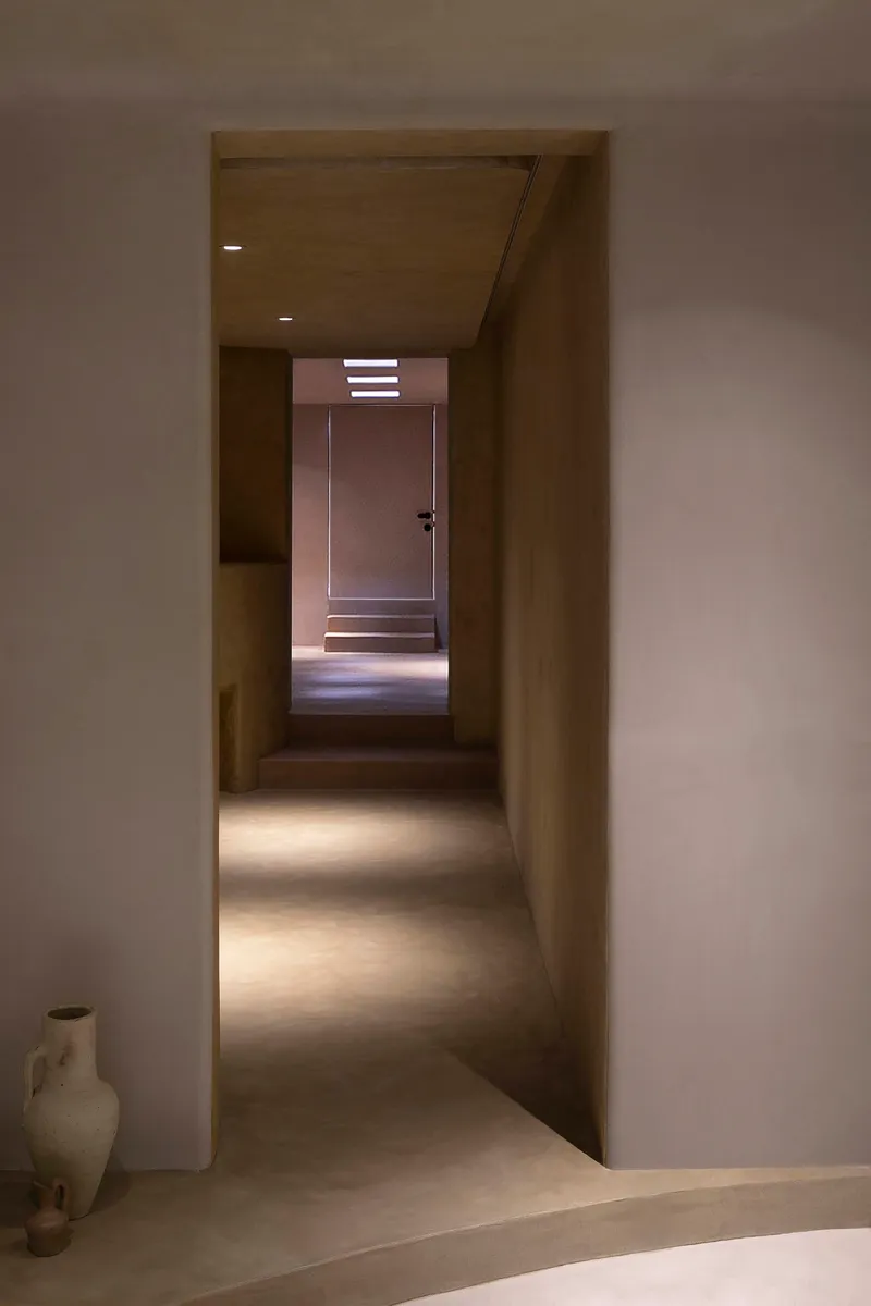
From the street, a deep-set arched doorway with a black metal frame signals that something unusual sits behind the plastered facade. The pebble-wash finish on the exterior is rough and mineral, as if the building's skin has been worn smooth by time rather than designed. Step through that arch and you confront a compressed corridor that funnels your attention toward a distant backlit door. The thresholds are staggered in height, so each room sits on a slightly different level, reinforcing the sensation of descending into the earth.
Offhand Practice developed this progression collaboratively with the client, whose sketch of a maze-like corridor gallery became the organizing diagram. The narrow plan, which would be a constraint in almost any other program, works here precisely because the gallery sells the experience of discovery. You cannot see the whole space at once. You have to walk through it.
Curved Walls, Curved Logic


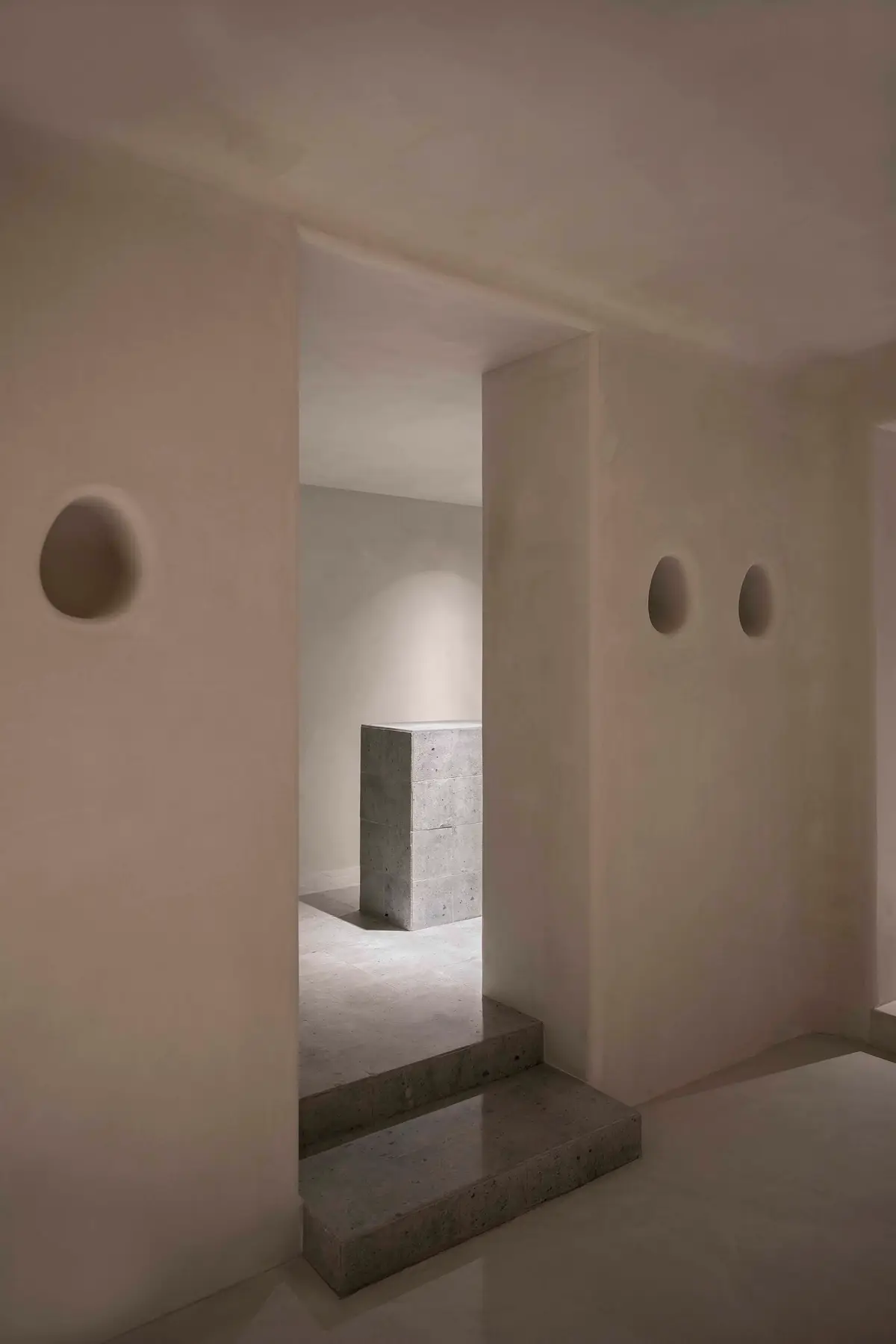
The most persistent detail across all four rooms is the elimination of right angles wherever wall meets wall or wall meets ceiling. Every intersection has been gradually rounded into a curve, and oval-shaped niches appear at seemingly irregular intervals. Some of these alcoves hold merchandise. Others contain shell-form sconces that cast warm pools of light. A few are simply empty, reading as erosion patterns rather than designed shelves. The effect is cumulative: by the third room, your eye has stopped looking for corners altogether.
Built-in curved plinths, shelves, and platforms function as both display furniture and architecture. In the centre gallery, a freestanding curved platform serves as an independent merchandise stand, its plaster surface continuous with the walls around it. The pebble-shaped ceramic door handles, sourced from an antique flea market in Berlin, are a small but telling gesture. Nothing here is precisely rectilinear. Nothing feels machined.
Borrowed Light and Invented Depth


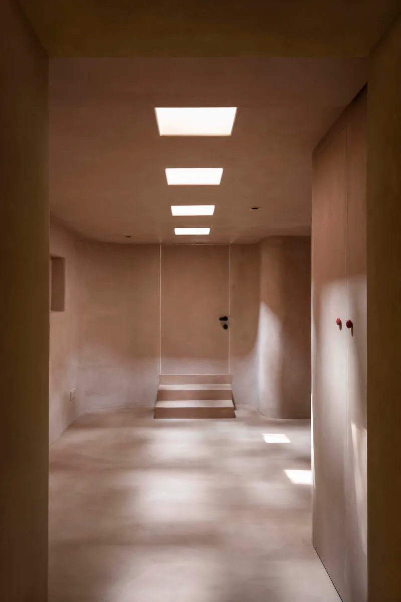
Light in this project is scarce and therefore precious. The only natural sources are the front entrance and a courtyard at the rear where a single tree grows, visible through the final doorway. Between those two endpoints, the interior would be entirely dark without intervention. Offhand Practice responded with a row of skylights given deliberate vertical depth: rectangular shafts cut into the ceiling that simulate the sensation of light penetrating through meters of stone. In image after image, these openings read as portals rather than fixtures, reinforcing the cave metaphor without resorting to theatrical dimness.
The circular wall sconces scattered through the rooms operate as counterpoints to the skylights. Where the overhead openings are sharp and directional, the sconces glow diffusely behind their plaster surrounds, like bioluminescent organisms embedded in a cave wall. Together, these two light strategies produce rooms that feel simultaneously dim and legible, moody without being oppressive.
Color as Gradient, Floor as Infiltration
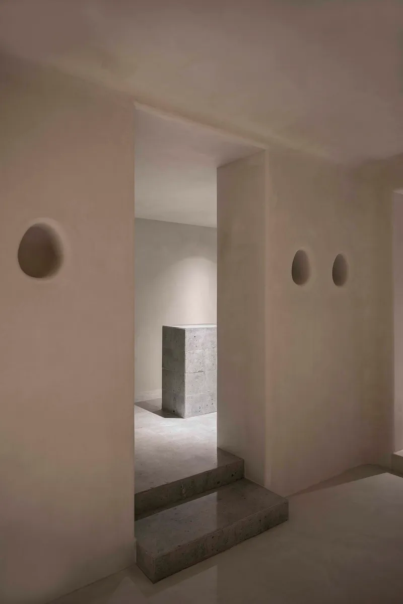


Each of the four rooms carries a slightly different paint texture and tone, executed in combinations of stone, cement, coating, and art paint. The transitions are never abrupt. Where rooms meet at their staggered thresholds, the flooring color of one space continues onto the steps that thrust into the adjacent space, creating what the architects describe as an infiltration gradient. It is a subtle move that has an outsized effect: rather than four discrete boxes, you read one continuous landscape that shifts in character as you move through it.
The terrazzo floor panel visible in one of the narrower rooms introduces a harder, more reflective surface that bounces the overhead light differently than the matte plaster elsewhere. These material shifts are calibrated to the room's proportions and light conditions. The architects understood that in 60 square meters, every surface is always in your peripheral vision, so every surface has to participate.
The Bathing Room and the Courtyard

One of the more unexpected moments in the sequence is a room that reads as a bathing chamber: an integrated tub and vanity sunk into pale plastered walls, lit from above by soft daylight. Whether this is a functional amenity or a display vignette is almost beside the point. It extends the cave logic into a domestic register, suggesting that life could actually happen in these rooms, not just commerce. The courtyard at the far end, with its tree and open sky, provides the release that the compressed corridor demands. After four rooms of enclosure, the sight of branches is genuinely cathartic.
Plans and Drawings

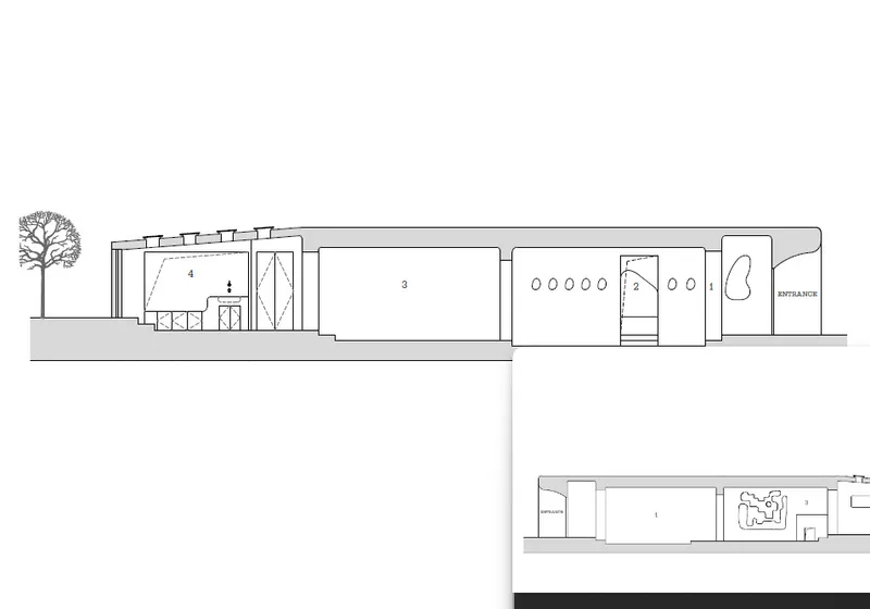
The two section drawings confirm what the body experiences: a linear sequence of four volumes at staggered heights, bookended by the street entrance and a courtyard with a tree. The clerestory openings are visible in profile, their vertical depth clearly proportioned to suggest thickness. What is most legible in section is the height variation between rooms. None of the level changes are dramatic, perhaps a step or two, but they accumulate, turning a flat commercial shell into a topographic interior.
Why This Project Matters
Single Person is a reminder that spatial invention does not require a generous site or an indulgent brief. Offhand Practice started with a narrow former diner, structural walls that could not be moved, and a client who wanted a gallery that felt like a labyrinth. Instead of demolishing and rebuilding, they treated every constraint as a formal cue: the immovable walls became cave partitions, the level changes became geological strata, the darkness became atmosphere. The project is a 60-square-meter argument for working with what you have.
It also demonstrates something often overlooked in retail design: that the journey through a space can be the product. No single room in this project contains an especially complex element. The arched niches, the plaster finishes, the recessed lights are all, individually, restrained. But the sequence of those rooms, the compression and release, the shifting color temperatures, the final glimpse of sky, builds an experience that no flat, open-plan showroom could match. In an era when physical retail has to justify its existence against a screen, this kind of spatial storytelling is not a luxury. It is a survival strategy.
Single Person by Offhand Practice, No. 185 Yongkang Road, Xuhui District, Shanghai, China. 60 m². Completed 2019. Photography by Yiqing Gao.
About the Studio
Share Your Own Work on uni.xyz
If projects like this are the kind of work you want to make, uni.xyz is a place to publish your own, find collaborators, and enter design competitions.


Popular Articles
Popular articles from the community


ETEH Reworks the Shared Spaces of São Domingos School in Brazil Around Timber, Color and Hanging Plants
At São Domingos School in Brazil, 436 m² of hall, refectory and library are recast with timber joinery, a yellow and blue code and trailing greenery.


Manzana Morphosis: Stretching Barcelona's Grid into a Living Landscape for 2050
A radical reworking of the Eixample manzana turns density into a tool for generous public space, vertical ecology, and environmental performance.

Aquadapt: An Underwater Habitat That Rewrites Its Rooms by the Hour
Curved modules ring the seabed while one shell shifts from breakfast room to cinema, farm and football pitch as residents' needs change.

Opera on the Sea: Driftwood Logic Shapes a Timber Opera House on Estonia's Coast
Trevor Orgill's opera house translates the entangled drift of floating timber into a civic building where wood, water, and music converge.

Similar Reads
You might also enjoy these articles

LAVA Architecten Gives Vocational Education a Sawtooth-Roofed Face on a Mechelen School Campus
In Mechelen, Belgium, a 2,053 m² STEM school on a 6×6 m grid turns workshops and classrooms into rooms that can be rearranged as teaching changes.

KEMA Studio Turns a Derelict Marvila Attic into a 60 m² Lighthouse Apartment Above Lisbon
In Lisbon's Marvila district, a rebuilt roof, four skylights and two plywood volumes turn an unlivable attic into a bright home facing the Tagus.

Pixel Gardens: One Repeated Module Stacked Into a Terraced Social Housing Tower for Famagusta
Salem Bader's shortlisted housing tower builds a vertical neighbourhood from one repeated module, offsetting units to carve terraces, light and air.

Bao Huynh Watercolor Atelier: A Serene Art Retreat in Hội An
Bao Huynh Watercolor Atelier in Hội An blends multifunctional art spaces, sustainable design, local materials, and family-friendly living in a serene environment.


Comments (0)
Please login or sign up to add comments
No comments yet. Be the first to comment!