
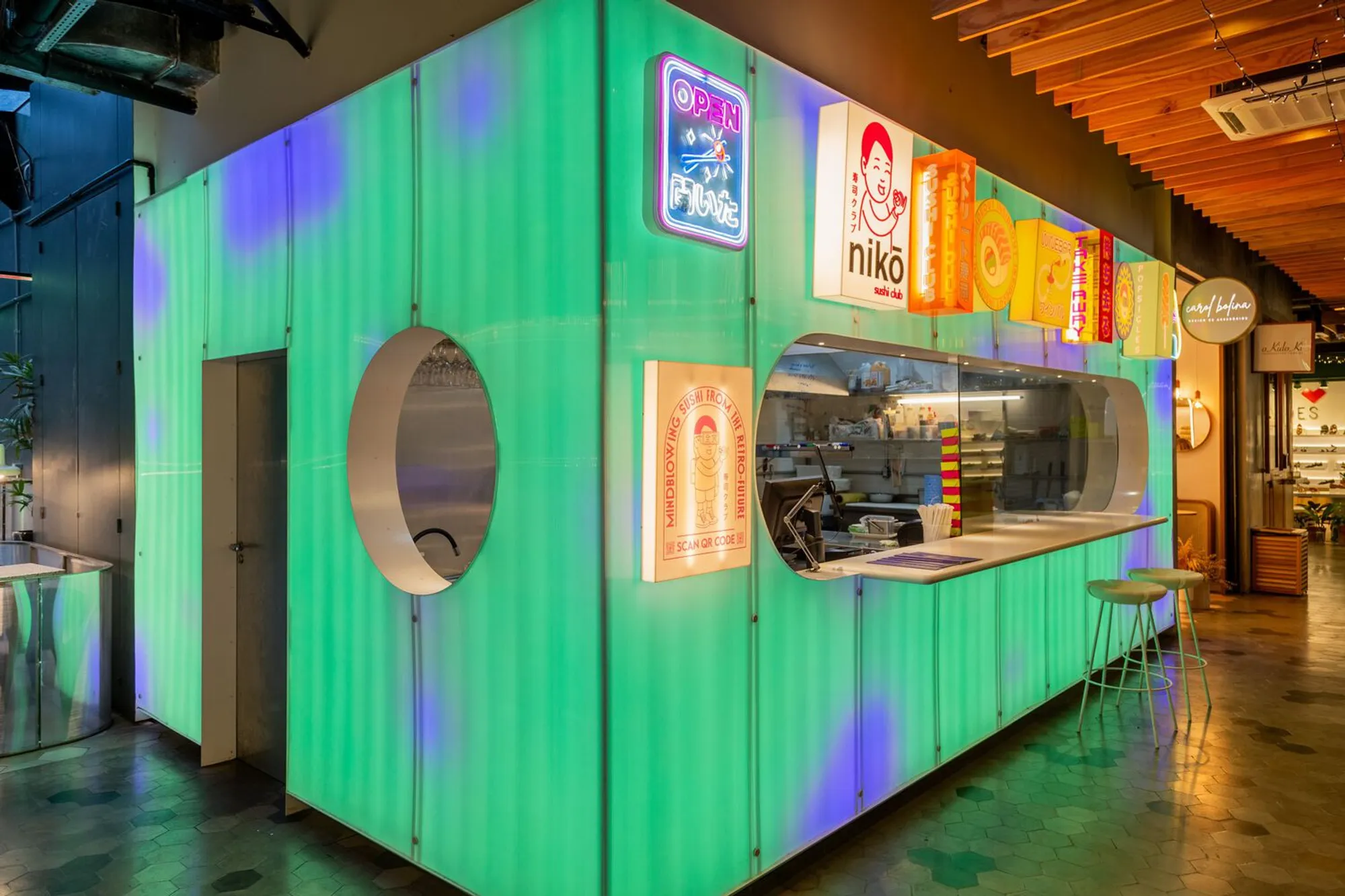
URBANODE Arquitetura Packs a Glowing Japanese Street Stall into 22 Square Meters
Restaurant Niko channels the visual energy of Tokyo's street culture through polycarbonate, LED light boxes, and deliberate disorder in Porto Alegre, Brazi


Twenty-two square meters is barely enough room for a parking space, let alone a restaurant that aspires to hold an entire design philosophy. Yet URBANODE Arquitetura has done precisely that with Restaurant Niko, a Japanese food counter nestled inside a shopping gallery in Porto Alegre, Brazil. Completed in 2023, the project takes the compressed format of a food kiosk and treats it as a laboratory for testing what happens when Japanese minimalism collides head-on with the visual overload of urban street commerce.
What makes the project genuinely interesting is not the smallness itself but the architects' willingness to sabotage their own clean lines. The polycarbonate facade, backlit by app-controlled LEDs, reads as a calm, luminous surface from a distance. Up close, deliberately misaligned light boxes and graphic signage panels introduce visual noise that disrupts the purity. URBANODE calls this the "over" aesthetic: an intentional clutter layered onto a minimalist chassis. The result is a compact object that pulses with the chaotic energy of a Tokyo side street while maintaining the spatial discipline the program demands.
A Luminous Object in the Gallery
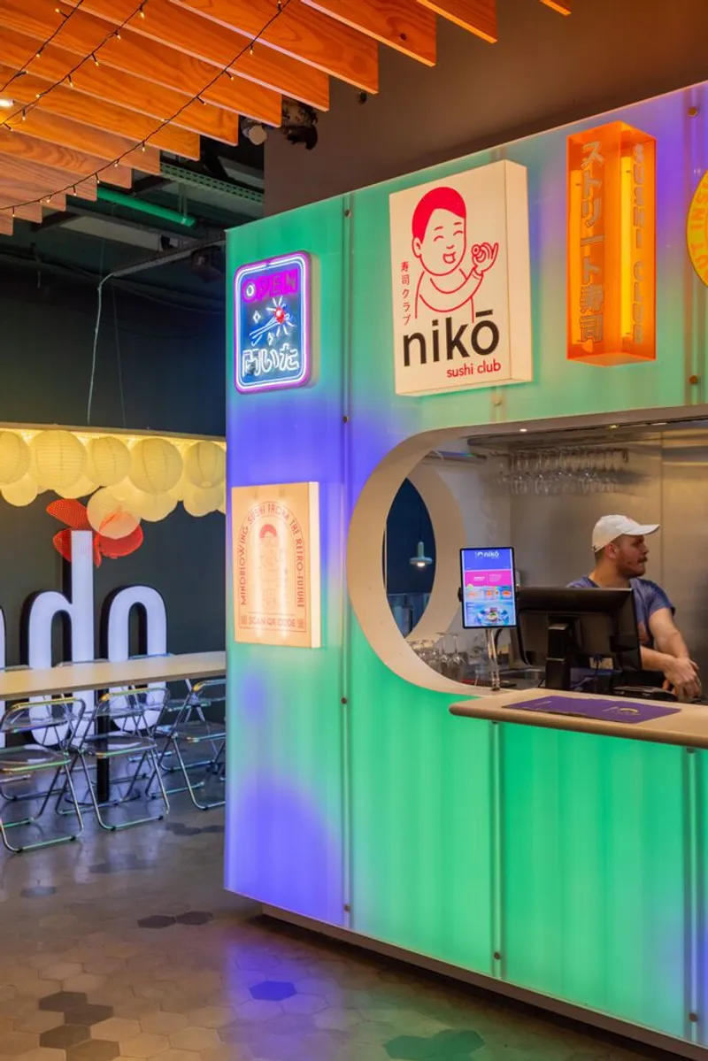
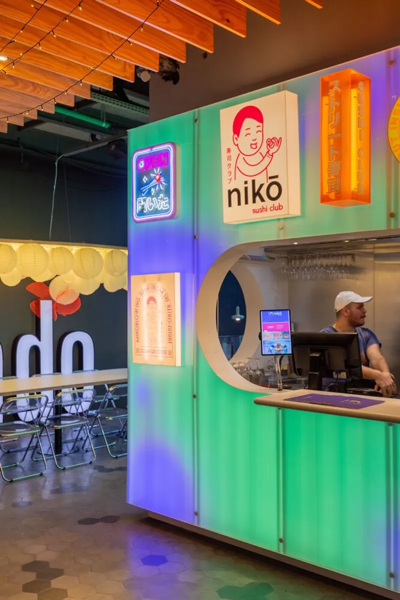
Seen from the gallery entrance, Restaurant Niko registers first as a glowing box. Corrugated polycarbonate sheets wrap the kiosk on two sides, forming an L-shaped closure built on a drywall frame with MDF on the exterior face. The translucency of the polycarbonate turns the entire facade into a lantern, its surface activated by concealed LED strips that can shift color and intensity through a mobile app. It is a neat trick: the architecture becomes signage, and the signage becomes architecture.
Fixed to this luminous skin are smaller illuminated panels carrying the restaurant's branding. These boxes are mounted on a system the architects liken to a television bracket, and they are pointedly not aligned with the polycarbonate module grid. The misalignment is the whole move. It introduces a layer of productive messiness that references the hand-painted signs, neon tubes, and competing logos that define street-level commerce in dense Asian cities.
The Oval Cutouts and the Circular Window
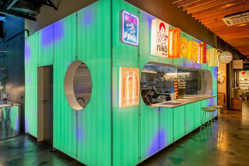
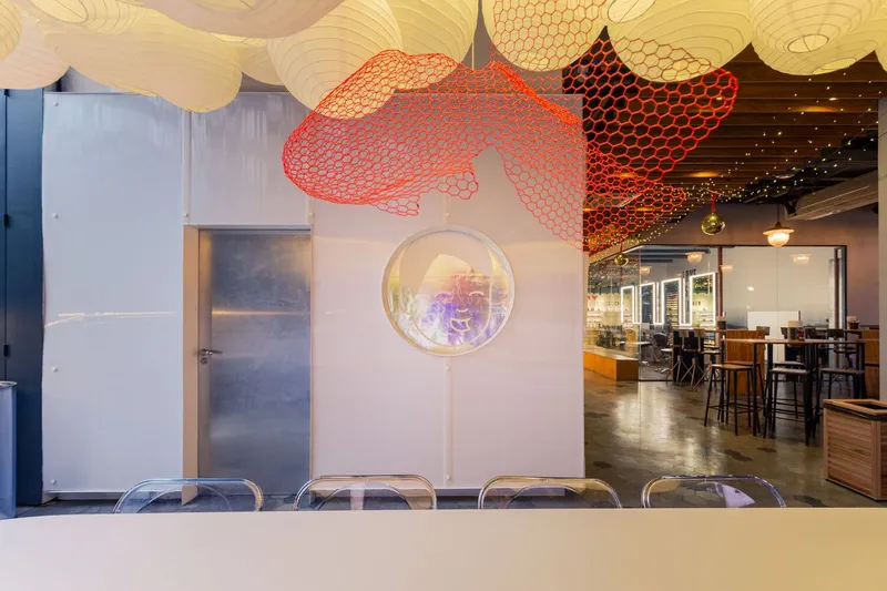
Two kinds of openings puncture the metallic shell. The main facade features an elongated horizontal slot that exposes the service counter and invites passersby to engage. On the secondary facade, an oval cutout serves as the employee entrance and creates a visual dialogue with the larger opening. These apertures do real work: they frame views into the kitchen, manage circulation, and provide the transparency a 22 square meter restaurant needs to avoid feeling like a sealed box.
A circular porthole window appears on an interior partition wall, separating the public gallery from the back-of-house zone. Paired with a suspended red mesh fish sculpture overhead, this moment has a playful, almost nautical quality that softens the metallic toughness of the exterior. It is a reminder that within the compressed plan, there are still pockets of whimsy.
Atmosphere and Ambient Light
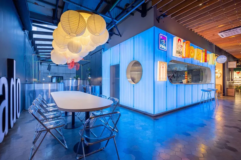
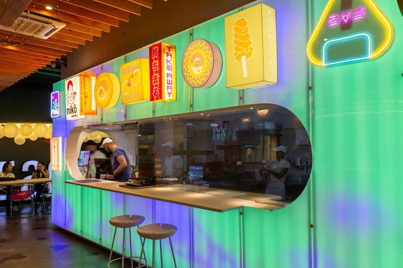
The gallery context matters. Restaurant Niko sits among other food vendors, and it competes for attention not with a louder sign but with a more considered atmosphere. A cluster of paper lanterns floats above the seating zone, casting warm light against the cool blue ambient glow at floor level. The contrast between warm overhead illumination and the cooler LED wash below creates a layered lighting condition that draws people in without screaming at them.
At the service counter, the backlit signage panels sit directly above the oval glass opening into the kitchen, so the customer simultaneously reads the menu and watches the food being prepared. Wooden bar stools line the corrugated metal base, grounding the high-tech shell with a tactile, domestic material. The filmed glass separating the kitchen from the dining side manages hygiene and acoustics while keeping the preparation process visible, reinforcing the street-food ethos of transparency and immediacy.
Material Logic at Micro Scale
Every material choice in a 22 square meter project is amplified. There is no room for filler. The polycarbonate sheets are held off the ground by custom metallic elements, giving the facade a floating quality and protecting the translucent panels from foot traffic and cleaning damage. Metal tubes with threaded lids serve as the fixing system, exposed rather than concealed. URBANODE treats these fasteners as ornament, a move that aligns with the project's broader strategy of turning functional details into visual features.
Inside, the palette shifts to tiles in the kitchen zone for obvious hygienic reasons, while the drywall structure receives plaster on its interior face. The restraint is deliberate: all the expressive energy is concentrated on the facade and lighting, while the interior stays clean and operational. It is a smart allocation of budget and visual weight for a project where every square meter has to earn its keep.
Plans and Drawings
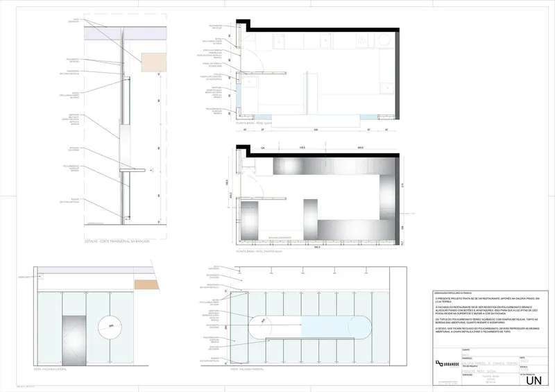
The technical drawing sheet reveals the compact L-shaped plan in section and plan views, annotated with dimensions that confirm just how tightly the program is packed. The service counter, kitchen, and employee access are organized along a simple linear sequence, with the filmed glass partition acting as the primary spatial divider. What the drawings make clear is that the design's apparent complexity is entirely a surface condition: the plan beneath is rational, almost diagrammatic. That clarity is what allows the facade to be so expressive without tipping the whole project into chaos.
Why This Project Matters
Restaurant Niko is a useful corrective to the idea that minimalism and visual intensity are opposites. URBANODE demonstrates that you can hold both impulses simultaneously if you are disciplined about where each one lives. The plan is minimal. The facade is maximal. The lighting bridges the two. For designers working on micro-scale hospitality projects, this is a strong case study in how to generate atmosphere and identity without relying on floor area.
More broadly, the project is an argument for treating small commercial fit-outs as serious architectural problems. At 22 square meters, it would have been easy to default to a branded wrap and move on. Instead, URBANODE designed every fixing, every light box, and every opening from scratch, producing a kiosk that holds its own against the gallery around it. That level of commitment to a tiny brief is what separates interior decoration from architecture.
Restaurant Niko by URBANODE Arquitetura. Porto Alegre, Brazil. 22 m². Completed 2023. Photography by Marcelo Donadussi.
About the Studio
Share Your Own Work on uni.xyz
If projects like this are the kind of work you want to make, uni.xyz is a place to publish your own, find collaborators, and enter design competitions.




Popular Articles
Popular articles from the community


Play: Fragments of Their World
Familiar architecture becomes modular playground design, creating safe spaces where displaced children can learn, connect, imagine and play.

The Ocean Hive: Sustainable Architecture for a Self-Sufficient Civilization at Sea
The Ocean Hive imagines sustainable architecture at sea, where modular habitats, algae, wave power and ocean waste sustain a growing colony.

Lunar Spiral: Space Architecture Shaped by the Mathematics of the Universe
Lunar Spiral reimagines space architecture through Fibonacci geometry, lunar regolith, levitating habitats, and self-sustaining Moon living.

Conexión: Biophilic Design Reimagines High-Rise Living in Hong Kong
Conexión reimagines high-rise living in Hong Kong through biophilic design, green facades, shared spaces, daylight, water and nature within.


Similar Reads
You might also enjoy these articles


Hodi-Mandai Geram
Project Function: Preservation and revitalization of the Intangible heritage and socio-spatial identity of the Hodi by Housing, Cultural Memory Center, Sacred Grove, landscape, local tourism economy

Olio Towers: A Mid-Rise for Performers That Fuses Housing, Rehearsal, and Stage
Located blocks from Houston's Theater District, this modular tower stacks living units around a central performance atrium.
Oasis: Modular Green Housing Carved into Dhaka's Urban Fabric
A shortlisted Plugin Housing entry reclaims unauthorized settlements in Dhaka with stepped concrete volumes, green roofs, and ventilation-driven design.

Black Hole: A Floating Megastructure for the Post-Physical Era
Emiliano Mazzarotto envisions a spherical, self-scaling arena where e-sports, digital hotels, and holographic stadiums replace traditional public space.
Explore Nio Architects Competitions
Discover active competitions in this discipline



Challenge to reimagine the Iron Throne


Photograph architecture without architects


Illustrate the lost glory of Angkor Wat - Render Challenge


Design challenge to reuse E-waste
Comments (0)
Please login or sign up to add comments
No comments yet. Be the first to comment!