
Simon Moosbrugger Builds a Joinery Workshop That Celebrates Wood at Every Scale
Set in an Austrian valley below forested cliffs, Rüscher Joinery turns a production facility into a statement about craft and material honesty.
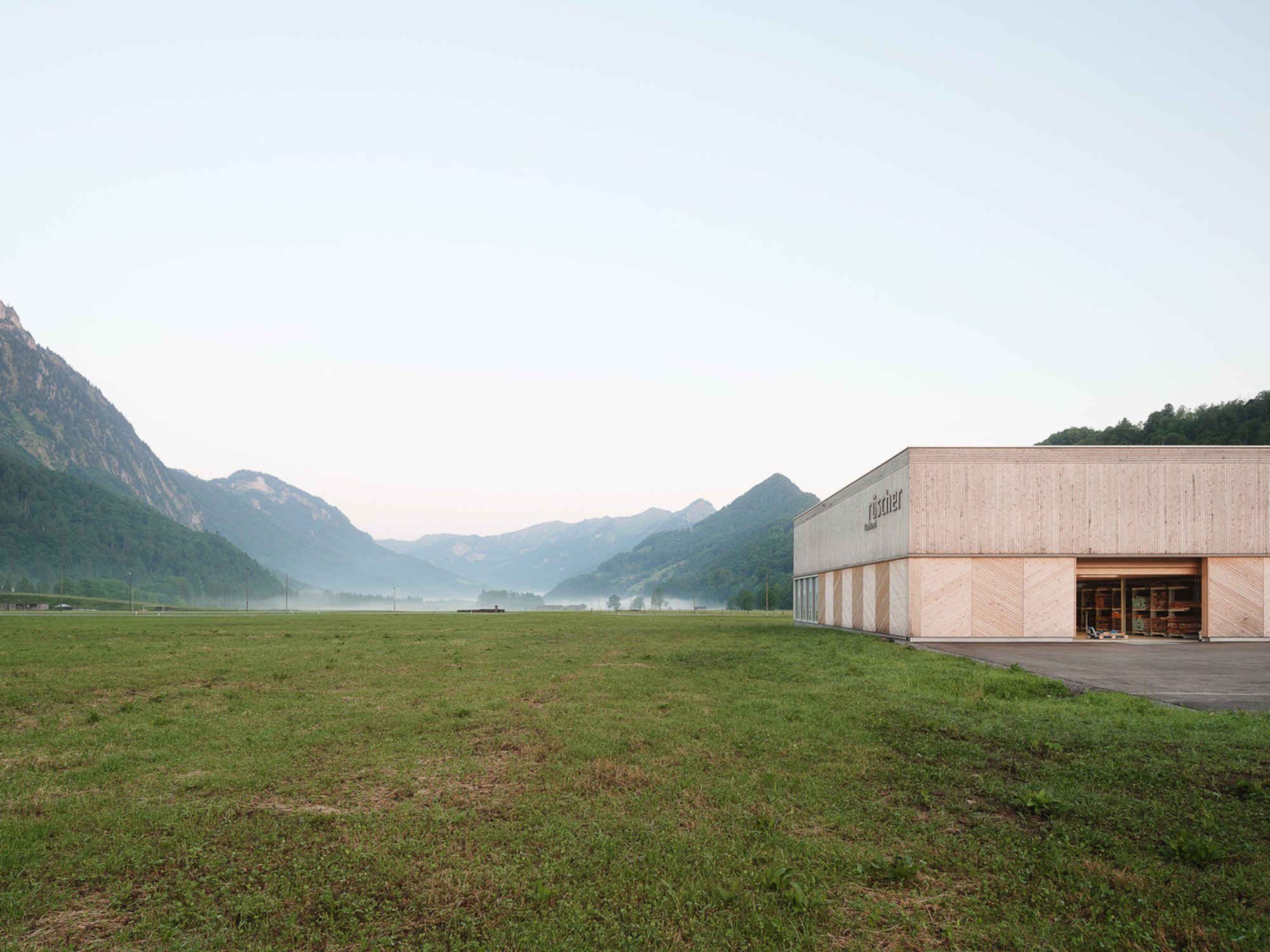
A joinery needs to work hard. It houses heavy machinery, fine dust, stacked timber, CNC routers, and people who spend long days shaping material by hand and by code. Most production buildings treat these demands with generic steel sheds and insulated panel facades. Simon Moosbrugger Architekt took the brief for Rüscher Joinery in Austria's Bregenzerwald region and turned it into something far more deliberate: a long, low building that reads as both an industrial shed and a crafted timber object, stretched across a meadow at the foot of forested mountains.
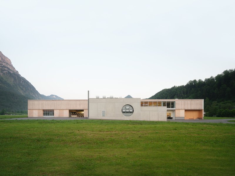
What makes this project worth studying is the way it treats the client's own material as the building's primary architectural argument. Timber cladding, timber structure, timber acoustic panels, timber furniture: the building is essentially a demonstration hall for the company that made it. But that self-referential loop never becomes gimmicky because Moosbrugger pairs the warmth of wood with concrete, glass, and corrugated metal in proportions that keep each material honest. The result is a workshop that feels rigorous rather than sentimental, and a workplace that makes production visible without putting it on a pedestal.
A Linear Logic in the Valley
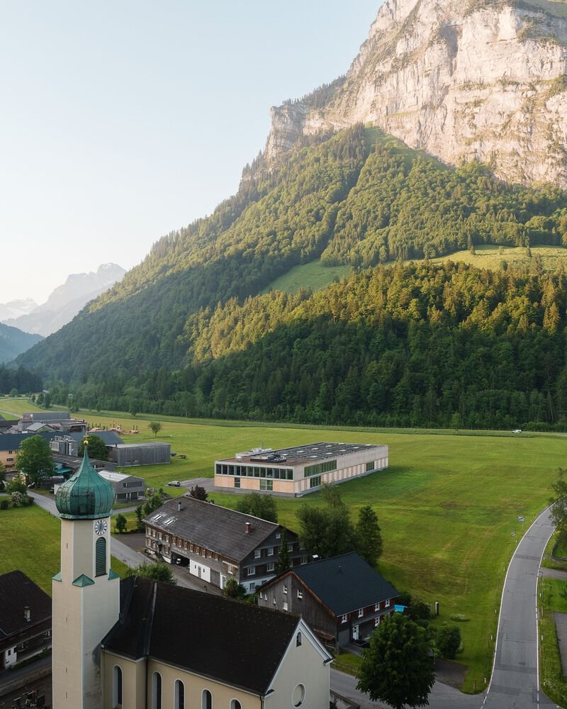
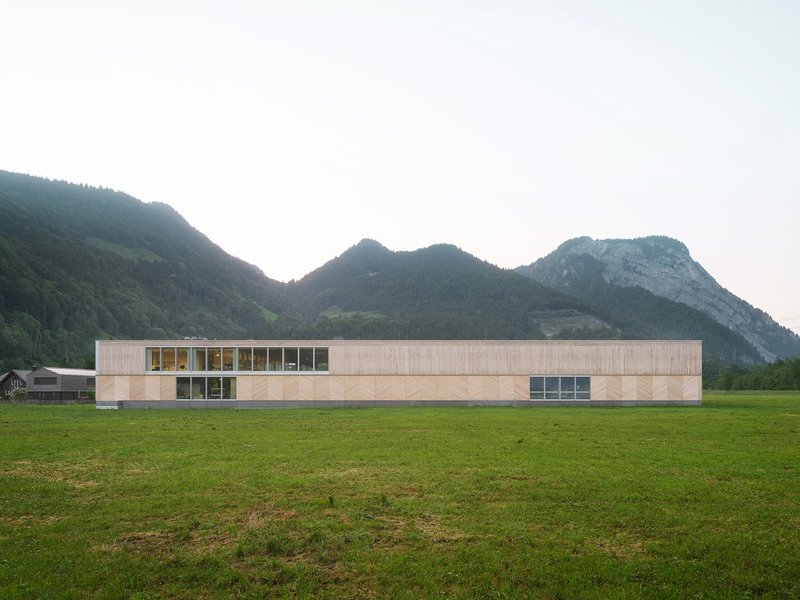
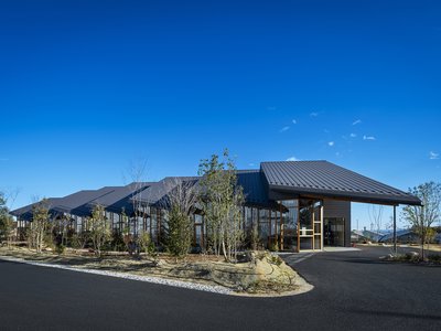
From above, the building's strategy is immediately legible. A long, narrow volume runs perpendicular to the valley slope, with clerestory windows punctuating the roofline to pull daylight deep into the workshops below. The massing is intentionally restrained in height, keeping the ridge well below the treeline so the building defers to the landscape rather than competing with it. At dusk, the ribbons of glazing glow along the facade like a lit shelf, signaling activity inside without shouting.
The horizontal emphasis does more than sit politely in the landscape. It organizes a clear sequence of program: production, assembly, finishing, administration, and reception all string out along a single axis. Circulation becomes intuitive. Materials flow from one end to the other without doubling back, a plan logic borrowed from industrial engineering but dressed in the spatial generosity of good architecture.
Facade as Catalogue
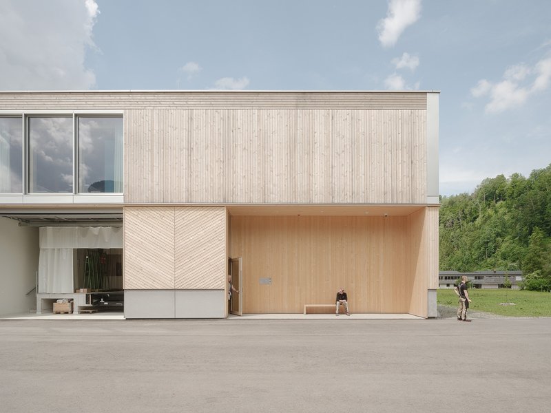
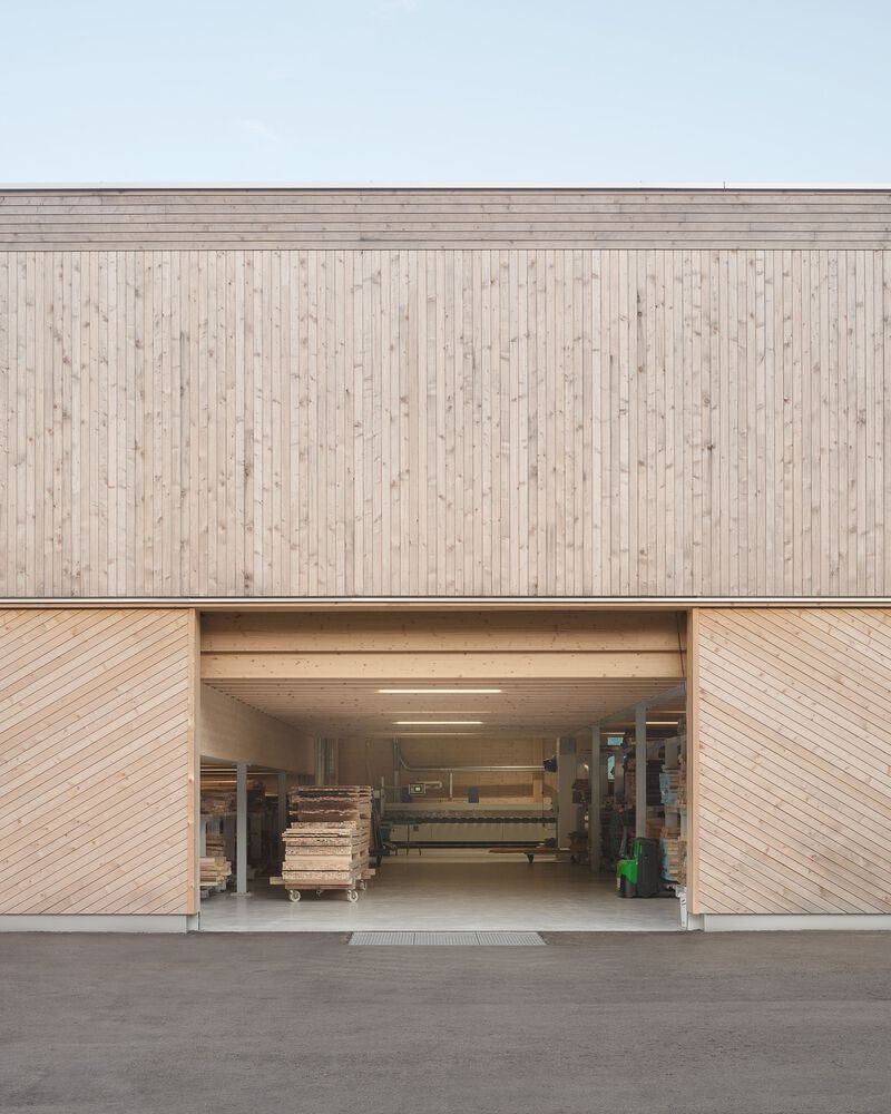
The elevations are where the building becomes most explicitly about joinery. Vertical timber planks, herringbone panels, and chevron-patterned doors all appear on the same facade, each suggesting a different woodworking technique. It is a sampling of what the workshop inside can produce, rendered at an architectural scale. The chevron doors flanking the central garage opening are especially effective: they frame the work entrance with a motif that is decorative without being ornamental, structural without being gratuitous.
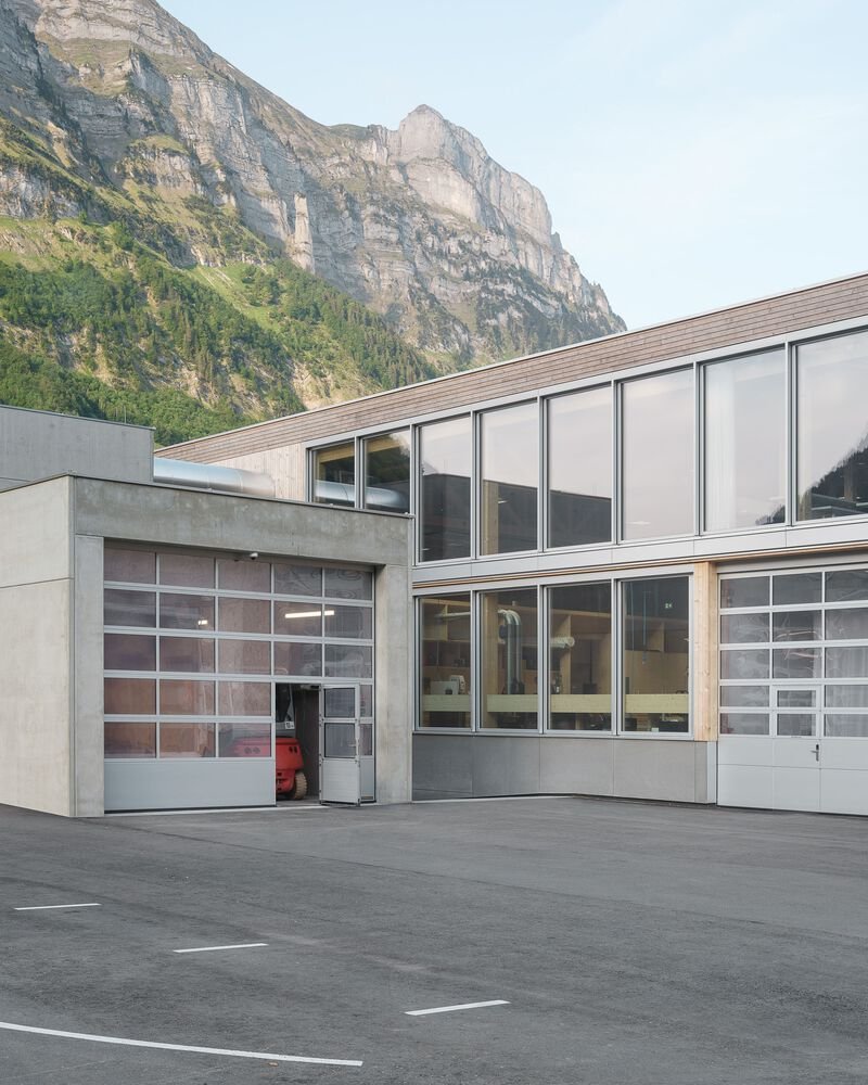
Against a rocky mountain backdrop, the translucent overhead doors on another elevation introduce a different material register entirely. Here the building shifts from opaque craft object to luminous screen, allowing the upper-level offices to borrow the drama of the scenery. Moosbrugger seems to understand that a single facade language would flatten the building's identity. By rotating through cladding strategies, he keeps the exterior active along its considerable length.
Thresholds and In-Between Spaces

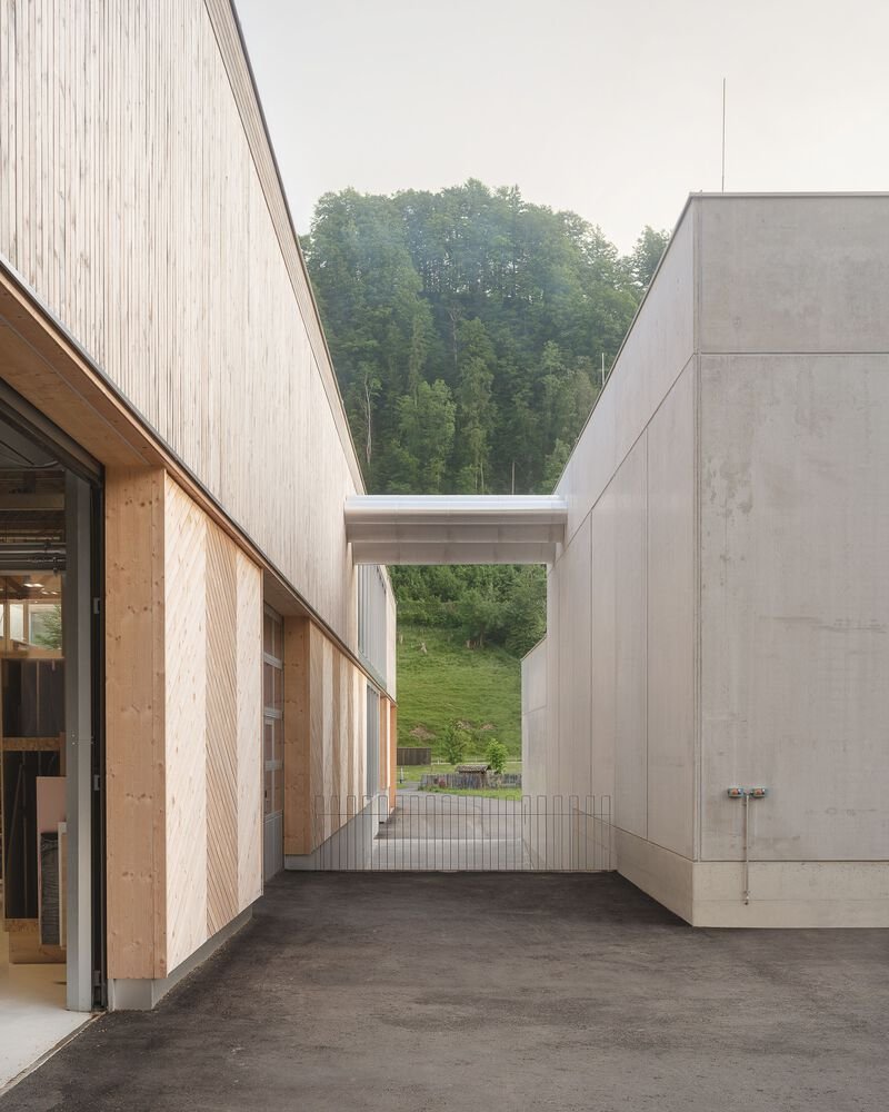
Some of the best moments in the project happen where inside meets outside. The entry canopy at the corner of the timber-clad volume creates a quiet threshold: dawn mist hangs over distant peaks, and the building pulls you in with understatement rather than spectacle. The exterior passageway between the timber workshop and an adjacent concrete volume frames a view toward forested hills, turning a service corridor into a landscape window.
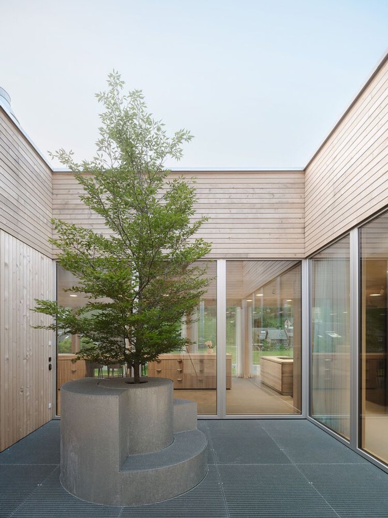
The interior courtyard, where a single tree grows from a curved concrete planter surrounded by timber-clad walls, is perhaps the project's most poetic move. It brings daylight, ventilation, and a sense of orientation to the center of a deep plan, while also offering workers a moment of green calm in a building dominated by sawdust and machine noise. The curved planter is a subtle counter to the building's relentless linearity.
The Working Floor
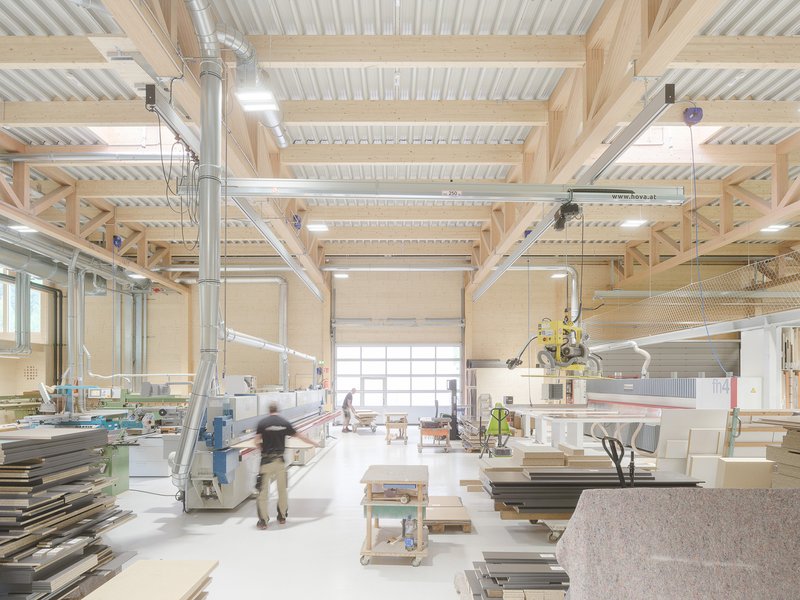
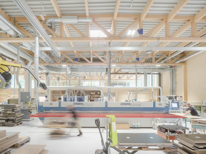
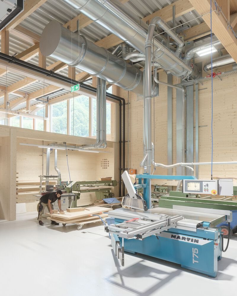
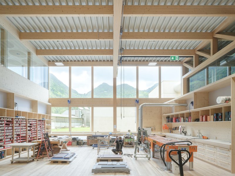
Inside the workshop, the architecture steps back and lets the machinery take center stage. Exposed timber beams span overhead, metal ducts snake along the ceiling, and floor-to-ceiling windows on one side wash the production floor with natural light. This is not a sanitized showroom version of craft. CNC routers hum alongside panel saws, and workers move through shafts of sunlight between stations. The honesty is welcome: the beams above are not decorative, they are the structure, and they happen to be made of the same material the shop below is cutting.
Corrugated metal on the ceiling planes provides acoustic dampening and reflects light without absorbing it. The ventilation system is fully exposed, which keeps maintenance costs down and avoids the false ceiling that would have buried the generous section height. Every decision here is functional, but the sum is architecturally rich because the proportions are right.
From Workshop to Workspace
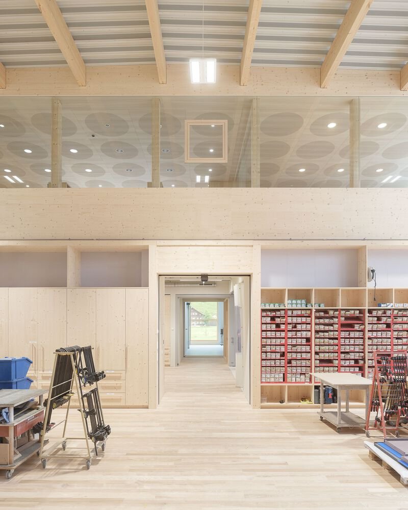
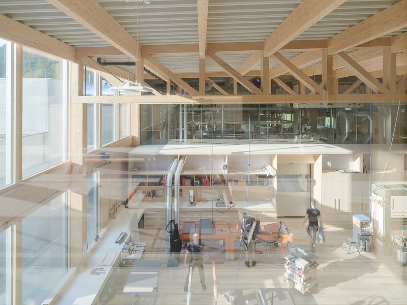
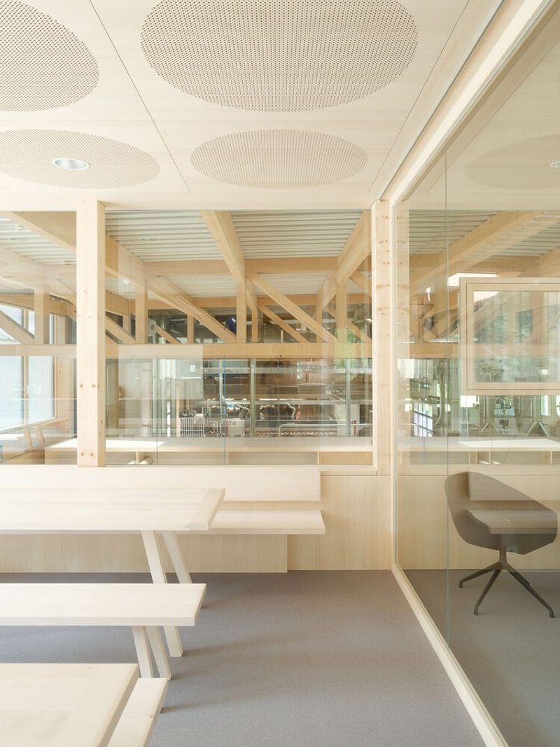
The transition from production zone to office and design area is handled through section rather than plan. A double-height workspace features a glass-enclosed mezzanine that overlooks the ground floor workstations below, creating a visual link between those who design and those who fabricate. Glass partitions and cross-laminated timber beams define zones without closing them off. Material storage shelving doubles as spatial dividers, so the library of samples and off-cuts becomes architecture in its own right.
The mountain panorama visible through the workshop's full-height glazing is not merely scenery. It grounds the work in place, reminding everyone in the building that the timber on their benches once stood on slopes much like the ones outside. That connection between raw material and finished landscape is something no amount of branding can manufacture.
Office Interiors and Acoustic Detailing
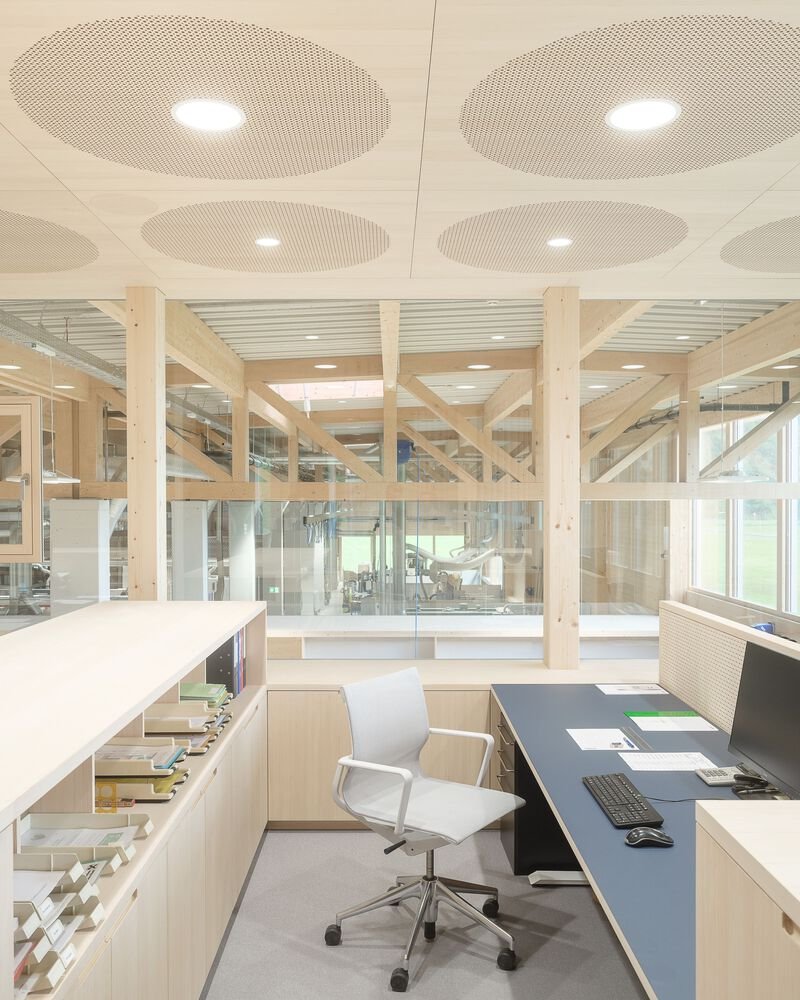
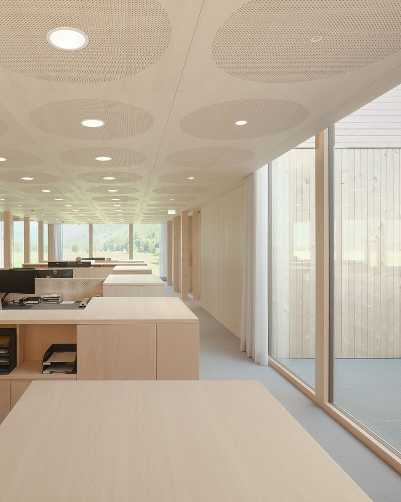
The administrative spaces reveal a quieter register of the same material palette. Perforated circular ceiling panels handle acoustics in open-plan offices, their round geometry a deliberate counterpoint to the orthogonal grid of beams and columns. Workstations are positioned along floor-to-ceiling windows, giving every desk access to daylight and views. Stepped desk platforms in one area introduce subtle level changes that break the monotony of a flat floor plan without requiring walls.
These are rooms where the joinery company's own products serve as finishes. Light timber desks, fluted timber kitchen islands, pale columns framing the glazed facade: the line between architecture and furniture dissolves. The effect is convincing because the quality of fabrication is genuinely high. When your client builds cabinetry for a living, every joint in the building becomes a test piece.
Supporting Spaces
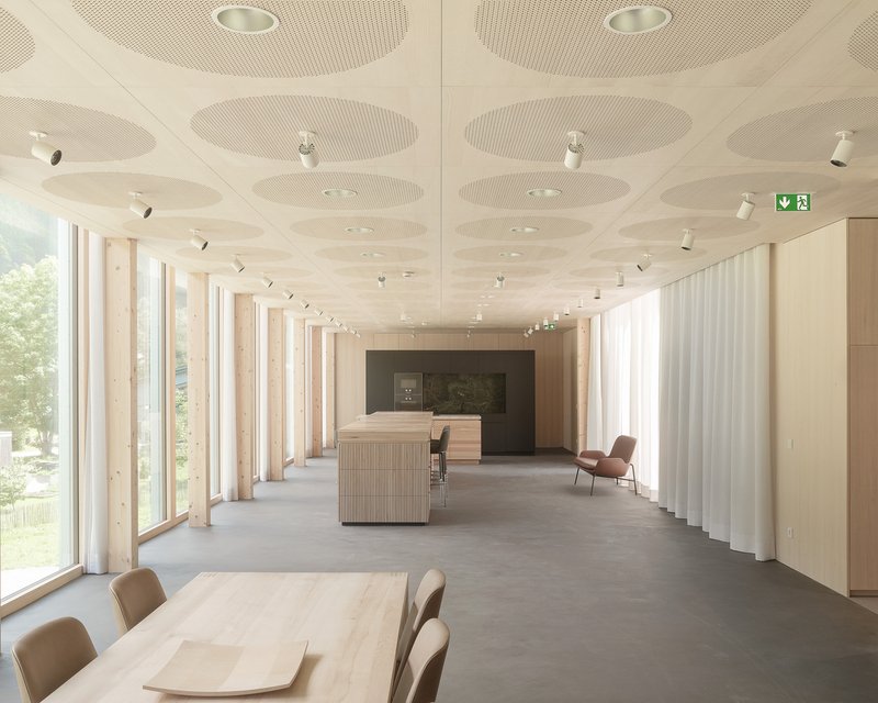
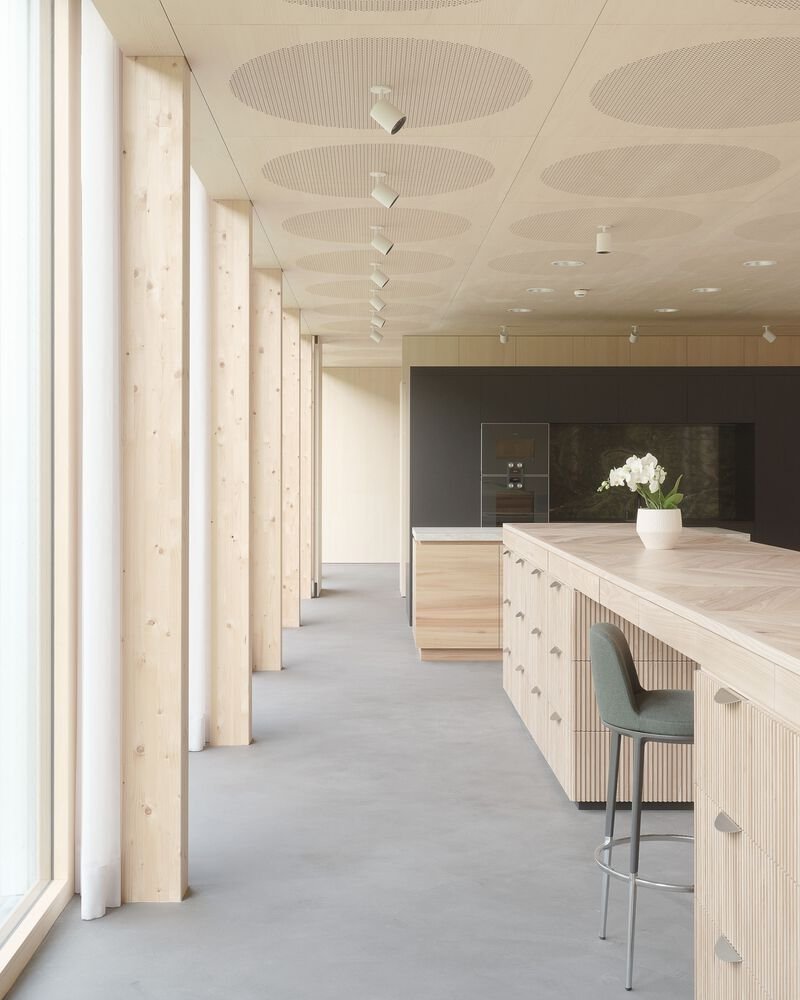
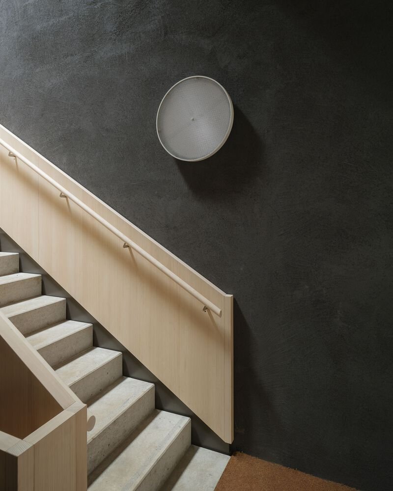
The reception area, with its polished concrete floor, white curtains, and timber columns, sets a tone of confident restraint. It is a showroom without show: the materials speak, and the curtains provide the only softness. Elsewhere, a kitchen island with a fluted timber base becomes a social anchor for the staff, positioned where it can borrow light from the glazed facade. Even the concrete staircase, paired with a pale timber handrail and a circular mesh speaker recessed into a dark wall, is detailed with the same precision that governs the public-facing spaces. Nothing is left to generic specification.
Below Grade
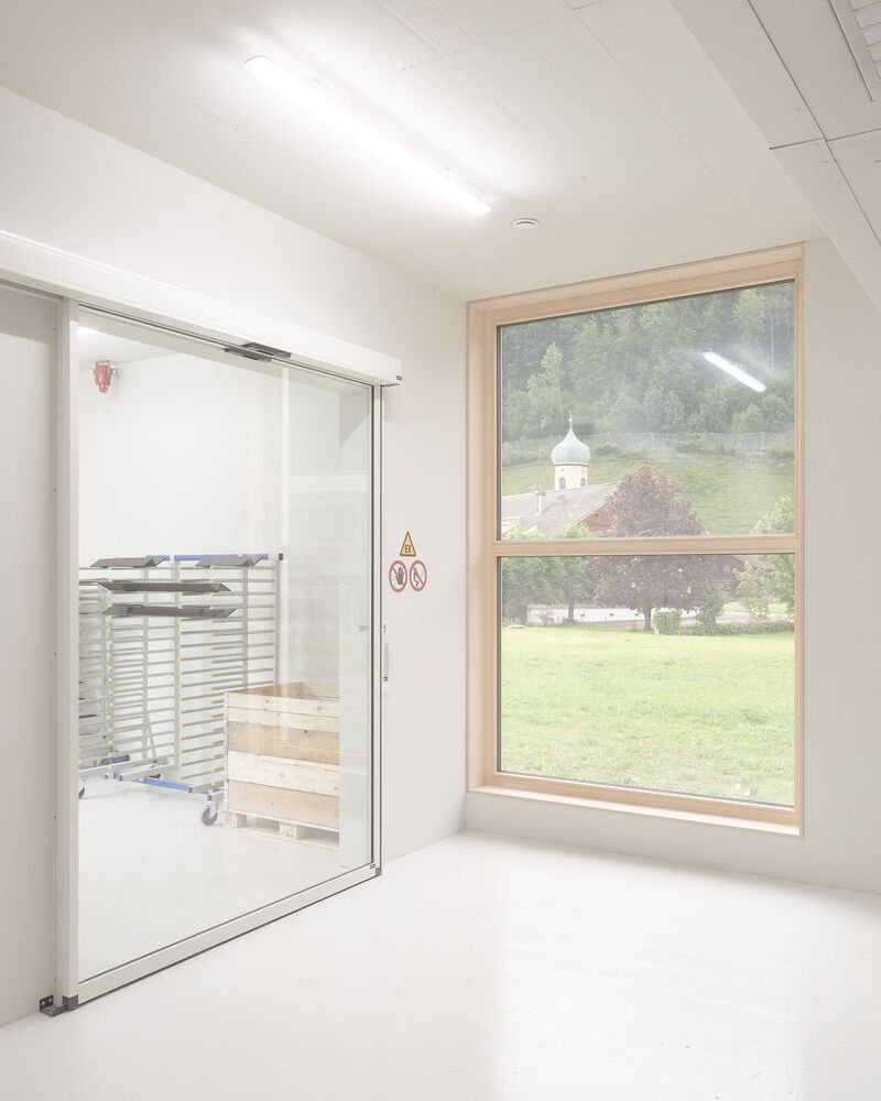
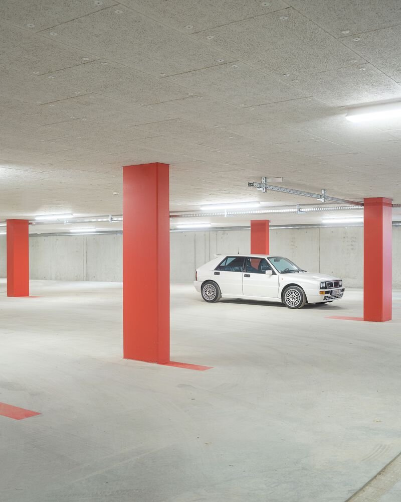
Underground, the parking garage trades timber warmth for raw concrete and red square columns under fluorescent light. It is unapologetically utilitarian, a reminder that not every square meter of a building needs to perform. Above, a white room with a timber-framed window overlooks a green lawn and a church spire beyond, connecting the building back to the village fabric. These peripheral moments round out the project, showing that Moosbrugger thought about the entire section, not just the hero shots.
Plans and Drawings
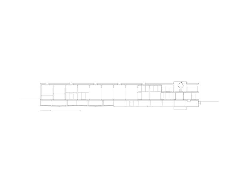
The section drawing confirms what the photographs suggest: the building exploits its linear plan to create a clear gradient from tall, open production bays down to more intimate office volumes. Level changes across the site are absorbed into the section so that the roofline remains nearly continuous, a disciplined move that keeps the exterior calm while allowing spatial variety inside. The clerestory windows visible in the aerial view register here as deliberate cuts in the roof plane, each one calibrated to bring light to the deepest parts of the plan.
Why This Project Matters
Industrial buildings rarely receive this level of architectural attention, and when they do, the result is often a slick shell wrapped around unchanged production logic. Rüscher Joinery succeeds because the architecture and the program are genuinely entangled. The timber structure is not a costume; it is the building, and it happens to be the same material the company works with every day. That circularity gives the project a coherence that no amount of cladding selection could achieve on its own.
For practices working on similar briefs, the lesson here is specificity. Moosbrugger did not design a generic workshop and then dress it in local materials. He designed a building whose plan, section, materiality, and detailing all derive from the same question: what does a joinery need, and what can it make for itself? The answer, stretched across a meadow in the Bregenzerwald, is quietly one of the more convincing pieces of production architecture we have seen in recent years.
Rüscher Joinery by Simon Moosbrugger Architekt, Bregenzerwald, Austria. Photography by Simon Oberhofer.
About the Studio
Share Your Own Work on uni.xyz
If projects like this are the kind of work you want to make, uni.xyz is a place to publish your own, find collaborators, and enter design competitions.


Popular Articles
Popular articles from the community
20 Most Popular Office Building Projects of 2025
From biophilic workspaces in India to net-positive energy offices in New Delhi, 20 office building projects that defined architecture in 2025.
20 Most Popular Furniture Design Projects of 2025
Modular street systems, parametric benches, and insect hotels: the furniture design projects that captivated architects on uni.xyz in 2025.
HCCH Studio Wraps a Shanghai High-Rise Office in Curved Walls of Translucent Glass
A 1,000 square meter fit-out in Lujiazui replaces the typical tech-office palette with layered glass, micro-cement, and quiet rigor.
YOAP Architects Round a Corner in Yeongcheon with a Cylindrical Community Hub
A 197-square-meter brick and ribbed-clad tower turns a forgotten alley corner in South Korea into a public garden with a low threshold.

Similar Reads
You might also enjoy these articles
Olio Towers: A Mid-Rise for Performers That Fuses Housing, Rehearsal, and Stage
Located blocks from Houston's Theater District, this modular tower stacks living units around a central performance atrium.
Oasis: Modular Green Housing Carved into Dhaka's Urban Fabric
A shortlisted Plugin Housing entry reclaims unauthorized settlements in Dhaka with stepped concrete volumes, green roofs, and ventilation-driven design.

Black Hole: A Floating Megastructure for the Post-Physical Era
Emiliano Mazzarotto envisions a spherical, self-scaling arena where e-sports, digital hotels, and holographic stadiums replace traditional public space.
Compact & Sustainable Living in Piraeus: A Four-Level Family Home Built Around Light and Air
A narrow townhouse in one of Greece's densest port cities uses a central atrium and passive strategies to house three generations under one roof.

Explore Architecture Competitions
Discover active competitions in this discipline


The International Standard for Design Portfolios


The Global Benchmark for Architecture Dissertation Awards


The Global Benchmark for Graduation Excellence


Challenge to reimagine the Iron Throne
Comments (0)
Please login or sign up to add comments
No comments yet. Be the first to comment!