


Architectural Graphics
SKLVisual communication techniques for presenting architectural ideas, designs, and concepts through drawings, diagrams, and digital media.
Architectural graphics is the visual language architects use to explain buildings before, during and after they exist: plans, sections and elevations, axonometrics and perspectives, diagrams, renderings, collages and the boards and sheets that hold them together. It works through shared conventions of projection, line weight, hatching, scale and annotation, so that a drawing can be read the same way by a jury, a client and a builder.
What is architectural graphics?
Architectural graphics covers every image an architect makes in order to communicate. At one end sit technical drawings, governed by rules about what a line means and how big it is. At the other end sit atmospheric images that try to convey light, material and use. A plan proves that the building works; a perspective persuades someone that it is worth building.
The Wikipedia article on architectural drawing lists the purposes these drawings serve: developing a design idea into a coherent proposal, communicating concepts, showing clients the merits of a design, guiding a contractor, recording planned development and documenting buildings that already exist. It also notes that they follow a set of conventions covering views, sheet sizes, units, scales, annotation and cross referencing. Graphics is not decoration added at the end; it is how an architectural idea becomes legible to other people.
The field overlaps with neighbouring ones without being the same thing. Graphic design for print and screen supplies typography, grids and colour theory (see graphic design). Photorealistic rendering is now a specialism of its own (see 3D visualization). Architectural graphics is the wider discipline that decides which drawing a project needs, how it should be drawn and how it sits beside the others.
"An elevation is a picture of the front of a building, set upright and properly drawn in the proportions of the contemplated work."
Vitruvius, The Ten Books on Architecture, Book I, Chapter II (Morris Hicky Morgan translation, 1914)

A short history of architectural graphics
The basic toolkit is ancient. In the first book of his treatise, Vitruvius named the three forms of expression of an architectural design as groundplan, elevation and perspective, and described the groundplan as made by the proper use of compasses and rule. Two thousand years later, the same three views still form the core of most drawing sets.
What changed over the following centuries was the geometry behind them. According to the Wikipedia entry on descriptive geometry, the earliest known publication on the technique was Albrecht Dürer's treatise of 1525, the architect Guarino Guarini developed it further in the seventeenth century, and Gaspard Monge (1746 to 1818) is usually credited with its invention as a system. Descriptive geometry gives a draughtsman a rigorous way to derive one view of an object from another, which is exactly what an orthographic set asks for.
By the late eighteenth century, architects were combining views on a single sheet to explain complex buildings, as in the Panopticon drawing above, which sets elevation, section and plan side by side. Rendering became an art in its own right. In 1830 Sir John Soane exhibited Joseph Michael Gandy's huge watercolour of his Bank of England at the Royal Academy, roofs lifted away to show the plan of rooms beneath.

"It is, in technical terms, a cutaway axonometric and it imaginatively conflates conventions of the Renaissance aerial cutaway perspective with the eighteenth-century Piranesian ruinscape."
Sir John Soane's Museum, curatorial note on A Bird's-eye view of the Bank of England
Drawing was also used to record. The Historic American Buildings Survey, begun in 1933 by the National Park Service, the Library of Congress and the American Institute of Architects, established documentation methods that are now standard practice in the field. The twentieth century then moved the drawing board into the computer. Ivan Sutherland's Sketchpad thesis, submitted to MIT in January 1963, let a user draw directly on a display with a light pen and change a symbol everywhere at once. AutoCAD followed in December 1982, and today most architectural drawings are created with CAD software.

Hand techniques have not disappeared. AMFIPUCES, entered in the Salut Paris competition, is presented as a homage to the École des Beaux-Arts and its history, and its tinted sections show how much a single wash of colour can do once the line work is right.
Key principles of architectural graphics
Orthographic views: plan, section, elevation
Orthographic drawings project a building onto a flat plane without perspective, so every dimension parallel to that plane can be measured. A floor plan is technically a horizontal section, conventionally cut at about 1.2 metres above the floor; anything above the cut, such as a beam, is shown dashed. An elevation is a flat view of one side, and a section is a vertical cut that reveals how levels relate.
Line weight, line type and poché
Line weight tells the reader what is near and what is far. The convention, as the Wikipedia article on architectural drawing puts it, is that everything cut by the section plane is drawn with a bold line, often with a solid fill, while anything seen beyond is drawn thinner. Architects call that solid fill poché, the same black mass that makes a figure-ground plan readable at urban scale. Dashed lines mark what is hidden or overhead; chain lines mark centre lines and grids.

The plan of CON/TEXT/THEATER shows the hierarchy at work. The cut walls carry a solid grey fill, shelving and seating are drawn in fine line, and a numbered legend replaces labels that would clutter the drawing.
Scale, dimensions and annotation
Scale decides how much a drawing can say. At 1:100, walls are usually simple outlines of their overall thickness; at 1:20, the layers of the wall construction appear; details are drawn at 1:10, 1:5 or full size. Because copying introduces small errors, dimensions are written on the drawing rather than measured from it. Annotation, from room numbers to section markers and level datums, turns a picture into an instruction.

The structural board of Game Division, a Reboot competition entry, is a compact lesson in this. Circles on the two sections key into details at 1:10, and leader lines name each layer of the build-up.
Colour, tone and collage
Presentation drawings, the Wikipedia article notes, may use tones or hatching to distinguish materials while remaining diagrams rather than realistic images. Restraint usually reads better than a full palette: one accent colour can carry circulation, a programme or a phase. Collage and photomontage go further, setting a drawn or rendered building into a photograph taken from the same viewpoint.

The Hollow Project, a co-housing scheme near Istanbul's historical wall entered in the Visualization '20 competition, draws its cutaway axonometrics in one coral hue. Walls, stairs and figures are separated by tone alone. For layered construction views of the same kind, see exploded axonometric.
Rendering, typography and the board
Rendering adds surface texture and shadow so a scheme can be judged as an experience. On the sheet itself, typography and a consistent grid hold everything together. Two member journals by Nick AJ make the case from the graphic designer's side: one reads a typeface as a structural skeleton, the other argues that a design system builds consistency without repetition.
Architectural graphics on uni.xyz
Competition boards on uni.xyz are where these principles are tested in public, often by students drawing under a deadline. A handful of projects and journals show the range.
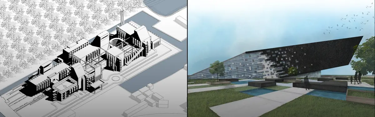
PXL Gaming by Ibtihal Mkouboi, Menatallah Aly and Sumaia AlShamsi received an Institutional Excellence Award in the Reboot competition. Its tagline, "Sharpen the gaming resolution", is carried into the graphics: the elevations set a black volume with a pixelated glazed face against a pale sky, and the sections cut through in heavy black with level datums down the side.

Tectonic Variation by Sara AlJaljuli and Habiba Mohamed also received an Institutional Excellence Award, in the Cultural Conserve competition. The project sets out to show the traditions of Shirakawa-go on a wooden tectonic facade that connects back to the village. Its sections at 1:200 are drawn over greyscale photographs of the mountains, with lettered grid lines rising above the roofs, and the elevations are photomontages in the valley.

CON/TEXT/THEATER by Alicja Nalikowska, whose plan appears above, was entered in the Reader's Space competition, where it received the People's Choice Award. The pavilion is meant to popularise the book and reading culture, and the project describes a modular system that can grow by adding modules as local needs change. Its four elevations are drawn as quiet line studies, so the rhythm of the facade does the talking.
The journals add commentary. Garden of Reconciliation reviews Jay Shah's scheme, shortlisted in UnIATA '19, for a shared lawn ringed by timber-framed buildings on stone bases in Kashmir. The review reads the drawing as the argument: the roof, timber trusses and floor plates are lifted away layer by layer until the lawn and the people on it are left as the real subject.
"The exploded axonometric is the project's clearest argument."
UNI Editorial, Garden of Reconciliation: Stone, Timber and a Shared Lawn as Common Ground in Kashmir
Illusory Space looks at an installation by Dorothy Chou in which black and white vinyl strips run from wall to floor and into black and white wooden structures, producing Moiré patterns that shift as a visitor moves. The Role of Digital Tools in Enhancing Competition Board Presentations by Hratsin Danielyan argues that a board should narrate a project from first idea to final vision and convey its core concepts rather than simply display the design.
Challenges and future directions
The biggest risk in architectural graphics today is that images get easier to make faster than they get easier to read. A board crowded with photoreal renders can hide the fact that the plan does not work. A board with fewer, clearer drawings and a strong hierarchy usually communicates more.
The second challenge is consistency. When plans and sections are generated from a building information model, the views agree with each other by construction, but the default line weights and hatches of the software can flatten the hierarchy that a hand draughtsman would have built in. Setting up line styles, cut fills and annotation standards is now part of the design work.
Third, the audience has changed. Boards are now often viewed on screens, including phones, where text that works on an A1 sheet can vanish. Sheets that survive both have one dominant image, legible titles and drawings that read at thumbnail size.
Finally, there is the question of what to keep from hand drawing. Freehand sketches still allow ideas to be tried quickly before a design is committed to a scale drawing, and many of the most memorable boards mix hand line and digital precision.

THE COMMUNITY INSTALLATION by Gihan Malshan, a community-centred design process for an urban informal settlement in Sri Lanka, is a reminder of what the hand still offers: handwritten notes beside the structure, small plans in soft colour and a street scene full of people.
Architectural graphics for students and designers
Graphics improves every project at once. Exercises that pay off quickly:
- Redraw one plan and one section of a building you admire at 1:100, using only three line weights, then add poché and compare.
- Make a single board for a past project with one hero drawing, one supporting drawing and no more than fifty words of text.
- Test a colour rule: one accent colour, used for one idea only, across every drawing in the set.
- Set a section against a photograph of its landscape, as Tectonic Variation does, and check that the horizon and scale agree.
For a thesis, representation itself can be the subject: a study of how a building type has been drawn over time, or a project whose argument is carried by one new kind of drawing. To build a body of work, read our pages on the architectural portfolio and enter open architecture competitions, where a board has to explain a project without its designer in the room.
Frequently asked questions
What are the main types of architectural drawings?
The standard views are the floor plan, site plan, elevation and section, supported by axonometric and perspective views and by detail drawings at large scale. Drawings are also classed by purpose: sketches and diagrams for developing ideas, presentation drawings for explaining a scheme, and working drawings for construction.
What is line weight in architectural drawing?
Line weight is the thickness of a line, used to show depth and importance. Elements cut by the plan or section plane are drawn boldest, often with a solid fill, while elements seen beyond the cut are drawn progressively thinner. Hidden or overhead elements are usually dashed.
What scale should an architectural drawing be?
It depends on what the drawing needs to show. Plans and sections of a building are often drawn at 1:100 or 1:200, where walls appear as outlines. Construction layers appear at 1:20, and details are drawn at 1:10, 1:5 or full size.
What is poché in architecture?
Poché is the solid fill applied to elements cut by a plan or section, such as walls and floor slabs. It separates solid from void at a glance. In urban drawings the same idea produces the figure-ground plan, where buildings are black and open space is white.
What makes a good architecture presentation board?
A clear hierarchy: one main drawing that states the idea, supporting drawings that prove it works, consistent line weights and colours, and short legible text. The board should tell the story of the project in the order a reader needs it.
References and further reading
- Architectural drawing, Wikipedia
- Vitruvius, The Ten Books on Architecture (trans. Morris Hicky Morgan), Project Gutenberg
- Descriptive geometry, Wikipedia
- A Bird's-eye view of the Bank of England, Joseph Michael Gandy, Sir John Soane's Museum
- Historic American Buildings Survey, National Park Service
- Sketchpad: A man-machine graphical communication system, Ivan E. Sutherland, University of Cambridge Department of Computer Science and Technology
- AutoCAD, Wikipedia


Popular projects
View all 77 projects


Latest journals
View all 44 journals
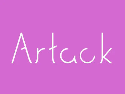
Blueprint of a Letterform: Artack Regular and the Architecture of Type
Exploring the shared language of structure, space, and functionality through Danting Li’s award-winning Artack Regular typeface.

Design Systems for Architects: What Graphic Designers Know That Architects Can Borrow
Exploring how the systems-thinking behind graphic design can help architects create more coherent, adaptable, and human-centered built environments.


Beyond the Portfolio: Building a Digital Brand for Architecture Studios
Why leading architecture studios now design two experiences, one online and one in the physical world, and how to communicate expertise long before the first client meeting.

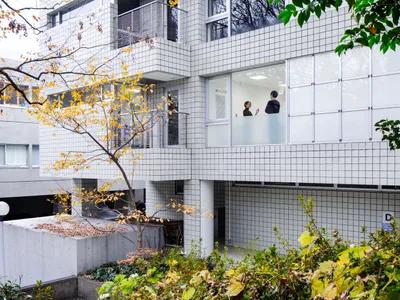
GRAPH Tokyo Head Office by G architects studio + Ryohei Tanaka — Minimalist Interior Design in a Historic Architectural Context
GRAPH Tokyo Head Office by G architects studio + Ryohei Tanaka features minimalist white interiors, honoring Fumihiko Maki’s architectural legacy.


