
AntiStatics Architecture Wraps a Beijing Activewear Store in Fabric-Inspired Curves
Red Vicutu's 350-square-meter concept store on Beijing's northeast ring road turns the logic of textile weaving into architecture.
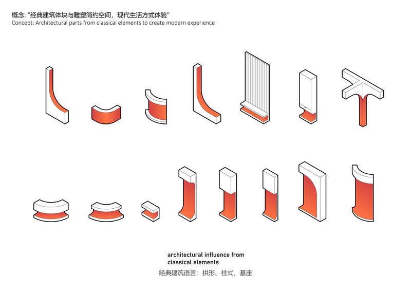
Fashion retail tends to oscillate between two extremes: the austere white box that defers entirely to the garment, or the maximalist spectacle that overwhelms it. AntiStatics Architecture charts a middle path with the Red Vicutu Concept Store in Beijing, a 350-square-meter space for the brand's active wear line that uses curvilinear geometry not as decoration but as a spatial argument about how fabric becomes clothing.
Situated along the northeastern Fourth Ring Road within a larger shopping cluster, the store needed to pull passersby away from adjacent retail. The architects' answer is an interior architecture that borrows directly from textile production: aluminum sheets bent into double-curved surfaces, 3D-printed sculptural elements that echo draped fabric, and a floor plan organized around continuous flowing circulation rather than right angles. The result is a space that feels active and kinetic, appropriate for a brand built on movement, while remaining clean enough to foreground the product.
A Facade That Signals Without Shouting
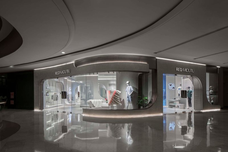
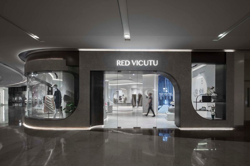
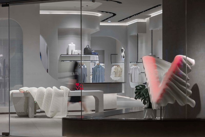
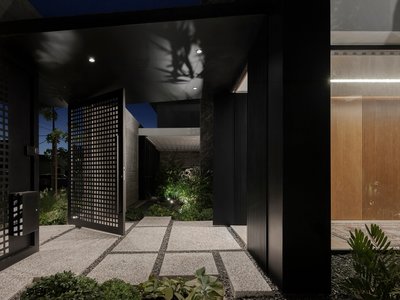
The storefront is a glass curtain wall set within a grey stone surround, its curved vitrine bulging outward just enough to break the flat plane of the mall corridor. Louvers modulate the transparency, offering controlled views of mannequins and sculptural displays staged behind the glass. The polished dark floor of the mall picks up reflections, effectively doubling the facade and making the store footprint appear larger than it is.
The move is restrained but effective. Where many concept stores resort to oversized signage or LED theatrics, AntiStatics lets the curved glass and the carefully lit interior do the work. The facade is a preview of the spatial logic inside: everything bends, nothing snaps.
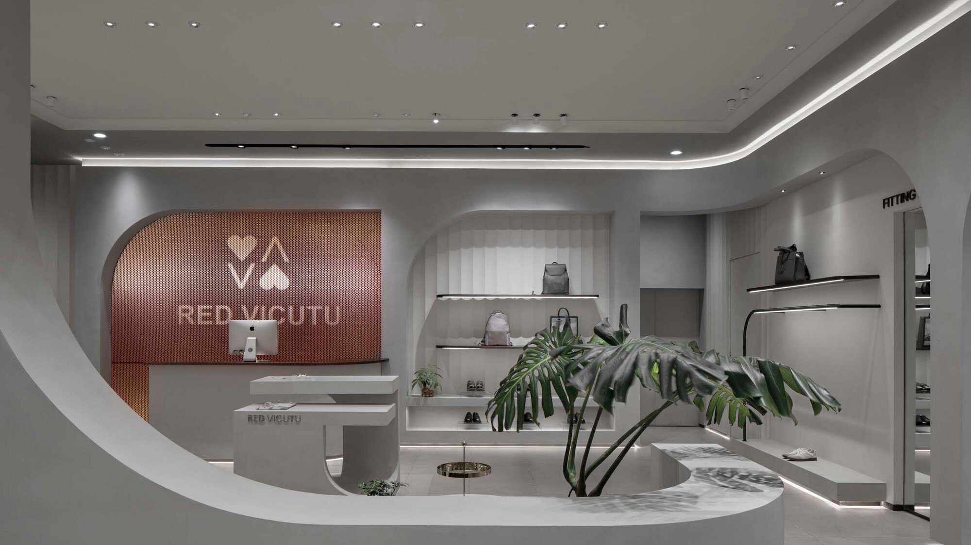
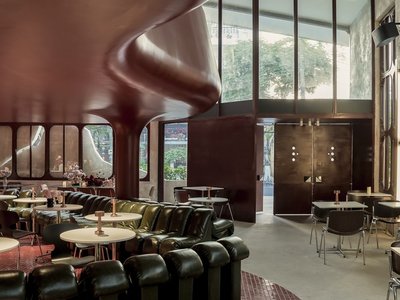
Ceiling as Primary Architecture
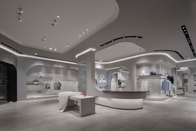
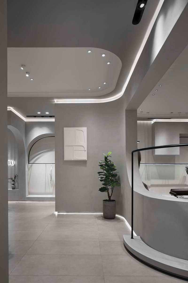
Walk inside and the eye goes up immediately. The ceiling is the dominant architectural surface: flowing planes of white material curve and dip to create coves, soffits, and canopies that delineate different retail zones without the need for walls. Recessed linear lighting follows each curve, reinforcing the sense of continuous motion overhead.
This approach solves a practical problem. In a 350-square-meter store that needs to house display platforms, seating areas, a reception desk, and circulation, vertical partitions would eat precious floor area. By shifting the spatial definition upward, AntiStatics keeps the ground plane open and legible while still giving each zone a distinct character. Beneath one soffit you find display plinths; beneath another, a seating alcove. The ceiling does the zoning.
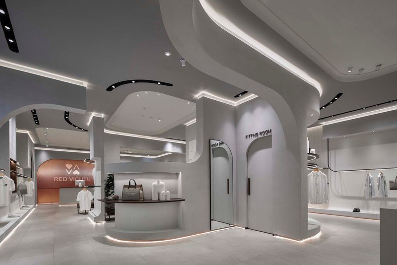
Archways and Thresholds
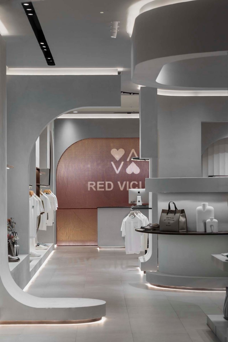
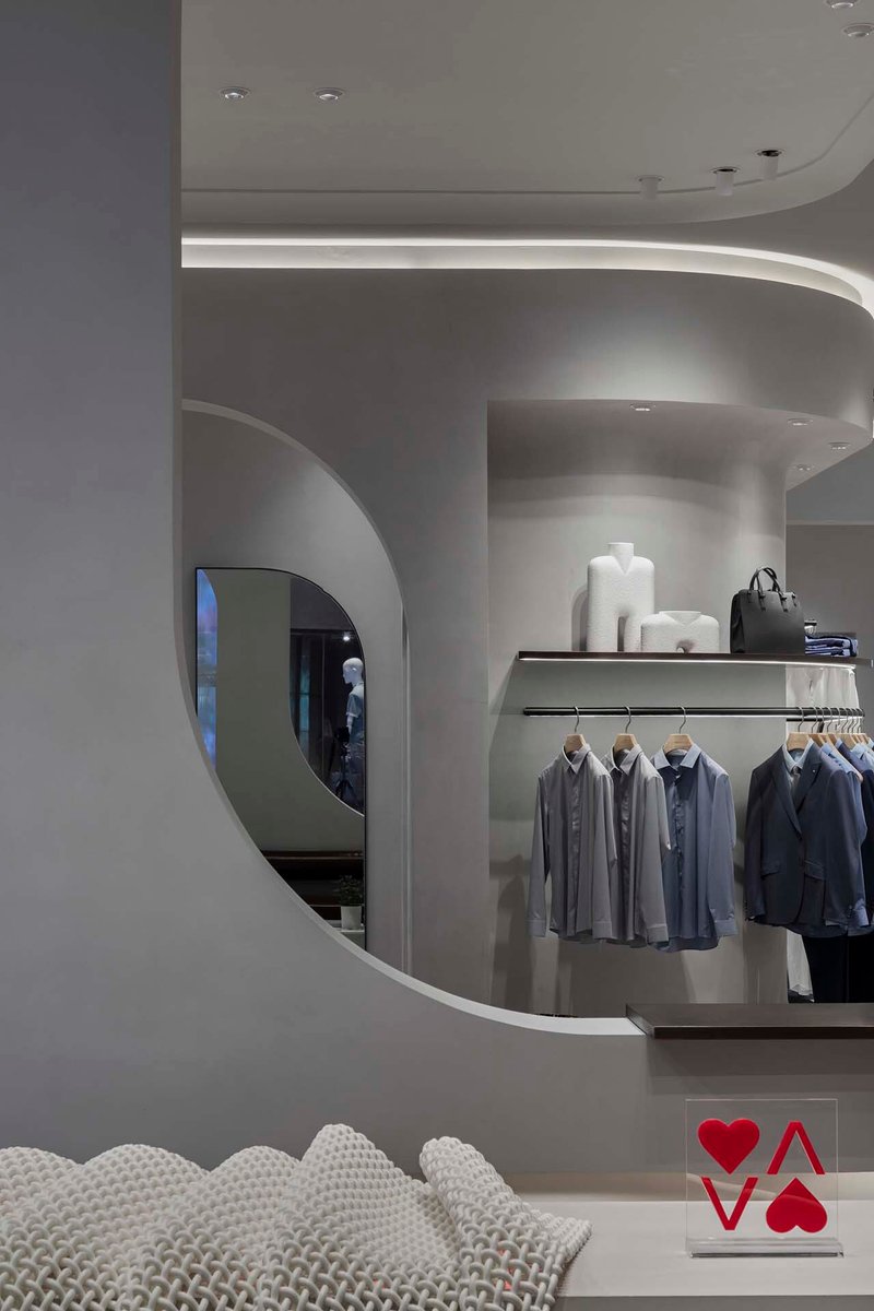

The store uses arched portals to connect its retail zones, and the effect is surprisingly warm for a commercial interior. One archway features a copper mesh screen as a backdrop, filtering light and views in a way that feels more like a boutique hotel lobby than a clothing store. Others frame merchandise displays within rounded niches, lending each garment the status of a curated object rather than inventory on a rack.
These thresholds slow you down. Rather than the open-plan sprint through merchandise that characterizes most activewear retail, the arched openings create a sequence of reveals. You move from zone to zone with a sense of procession, which is exactly the kind of dwell time a concept store needs to convert a browser into a buyer.
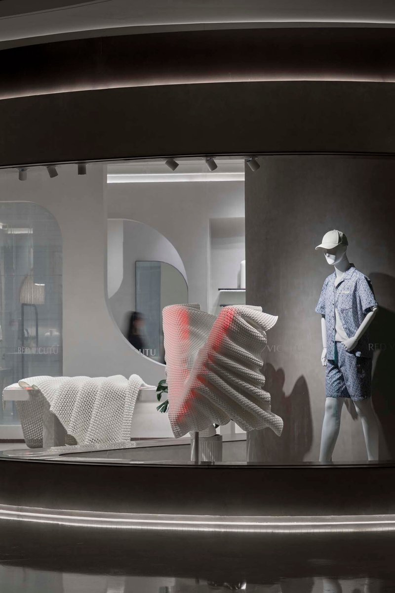
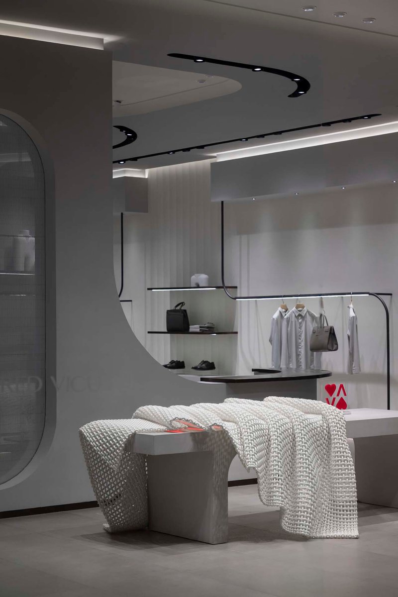
Textile Logic in Hard Materials
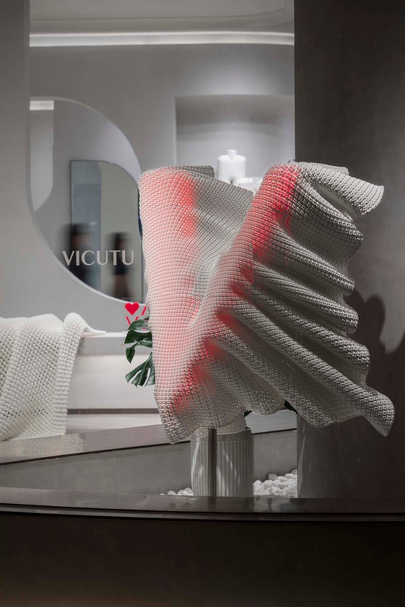
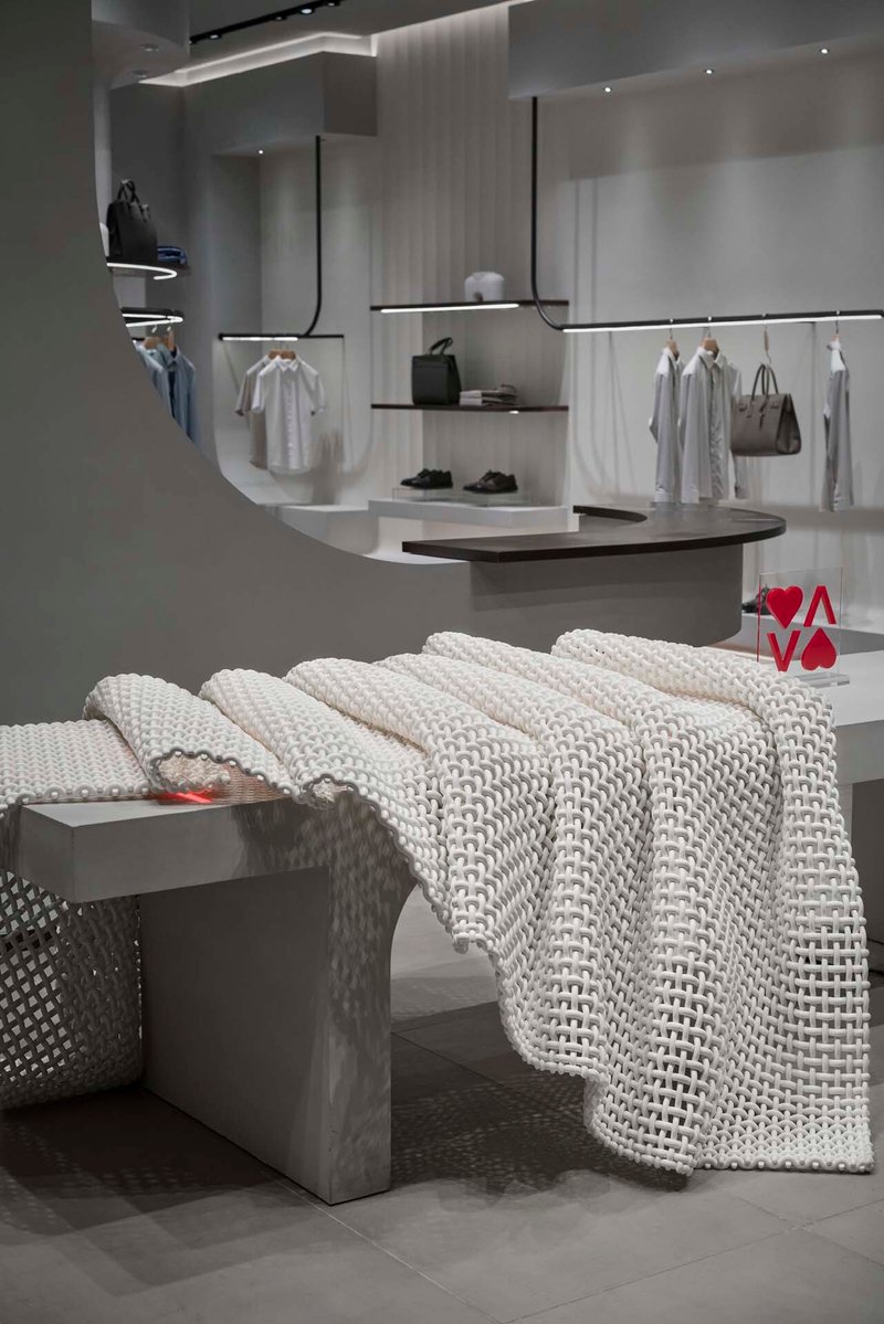
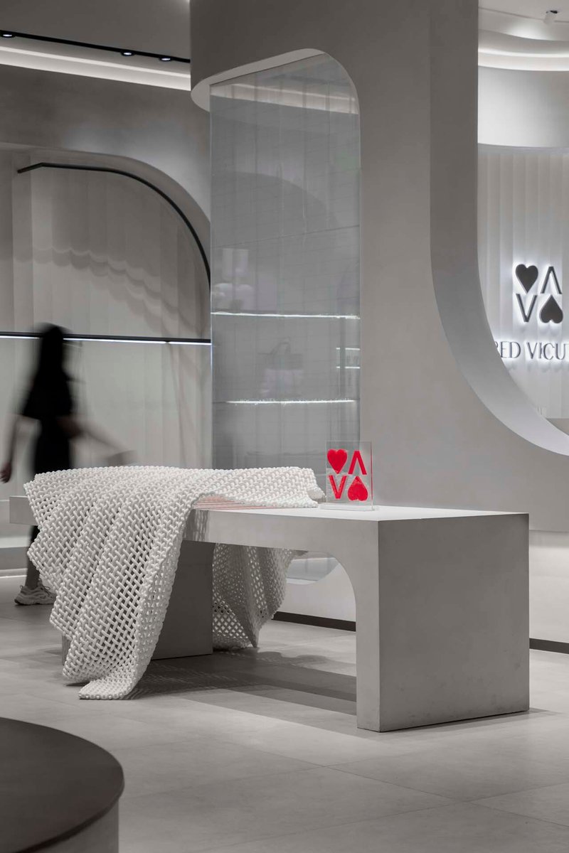
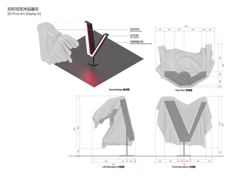
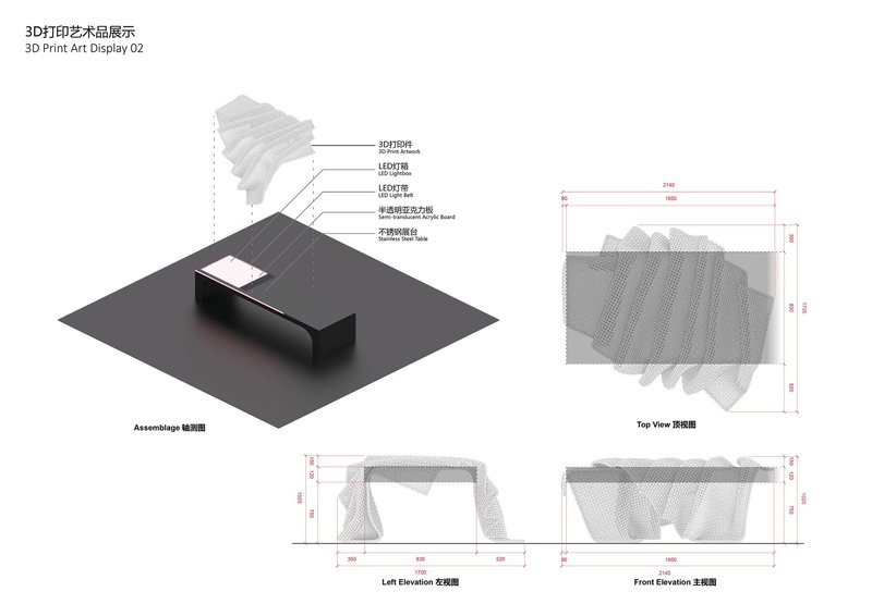
The most conceptually ambitious element is the use of 3D-printed sculptural objects, fabricated by Wenzhou Zaomeng Technology, that simulate draped and woven fabric in rigid material. These appear on display tables, beside seating areas, and as freestanding installations. One piece, a red and grey mesh form, sits on a glass table beside a circular mirror; another takes the shape of a knitted throw draped over a concrete bench.
The gesture makes the design thesis legible. AntiStatics used advanced fabric simulation software during the design process, and these printed objects literalize that digital workflow. They are the architectural facade's logic scaled down to the object: aluminum sheets bent into double-curved geometries at the building scale, and 3D-printed mesh at the furniture scale, both drawing from the same vocabulary of textile production. It is a consistent argument, not a stylistic flourish.
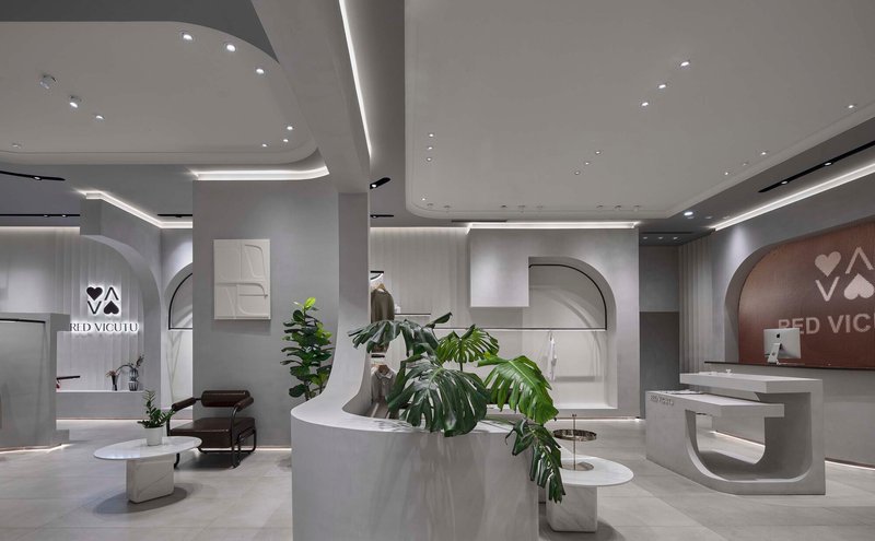
Material Palette and Lighting
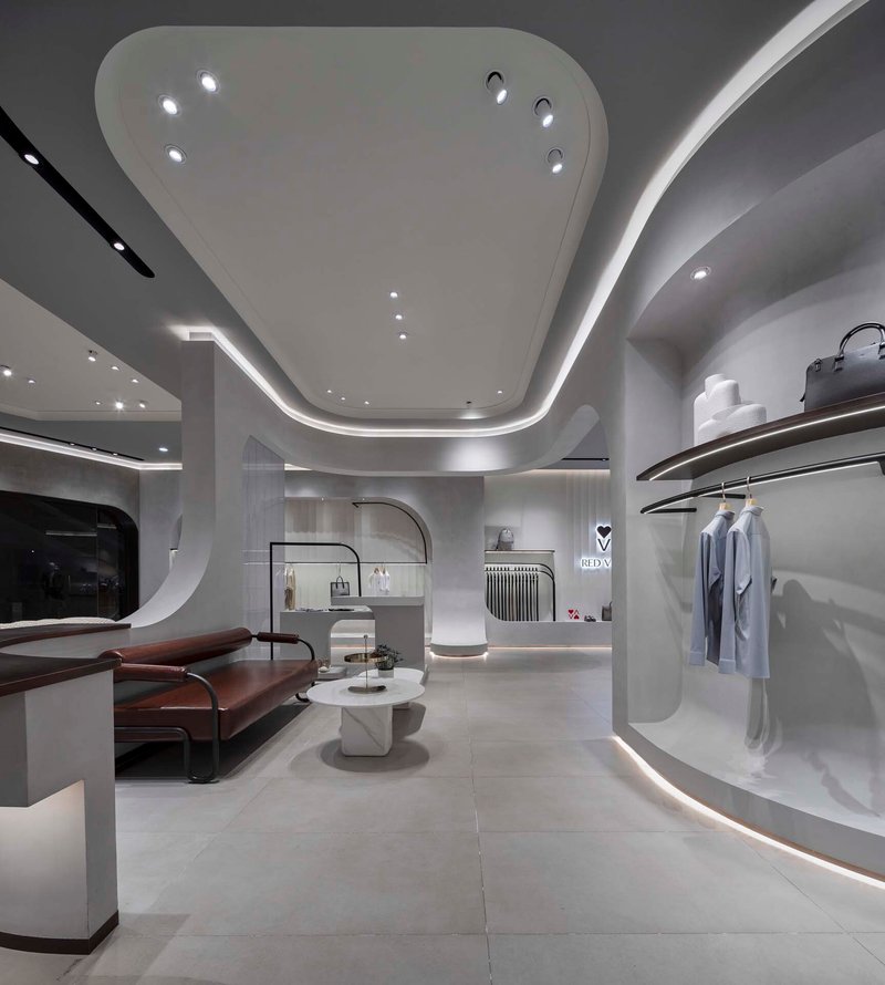
Terrazzo flooring by Sterrazzo grounds the space with a muted, speckled surface that contrasts the white curves above. Textured cement walls add a raw counterpoint, preventing the interior from tipping into the clinical. Wood panels appear at the reception wall, introducing warmth at the points of human interaction: checking out, greeting, consulting.
The lighting, managed by an HDL intelligent control system, is tuned to enhance material perception rather than flood the space. Cove lighting washes the curved ceilings to accentuate their geometry, while focused spots pick out garments and display objects. The result is a layered luminance that changes character as you move through the store, making each zone feel calibrated rather than generically bright.
Reception and Central Spine
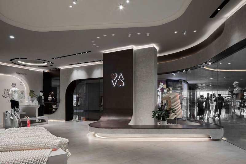
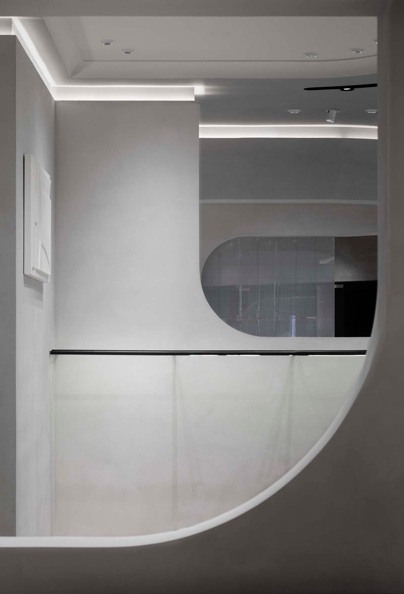
The curved reception desk sits along the central spine, backlit signage announcing the brand with quiet confidence. A black metal rail runs beneath horizontal strip lighting, giving the desk a crisp profile against the surrounding white volumes. From this vantage point, the store's plan logic becomes clear: a flowing central corridor feeds into peripheral display alcoves, much like a river with tributaries.
Potted fiddle-leaf figs and tropical plants punctuate the circulation path, adding biological softness to an otherwise highly controlled geometry. It is a small touch, but it keeps the space from feeling like a gallery. This is still a store, and people need to feel invited to touch things.
Detail Zones and Display Strategy
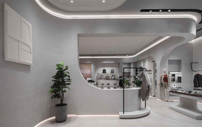
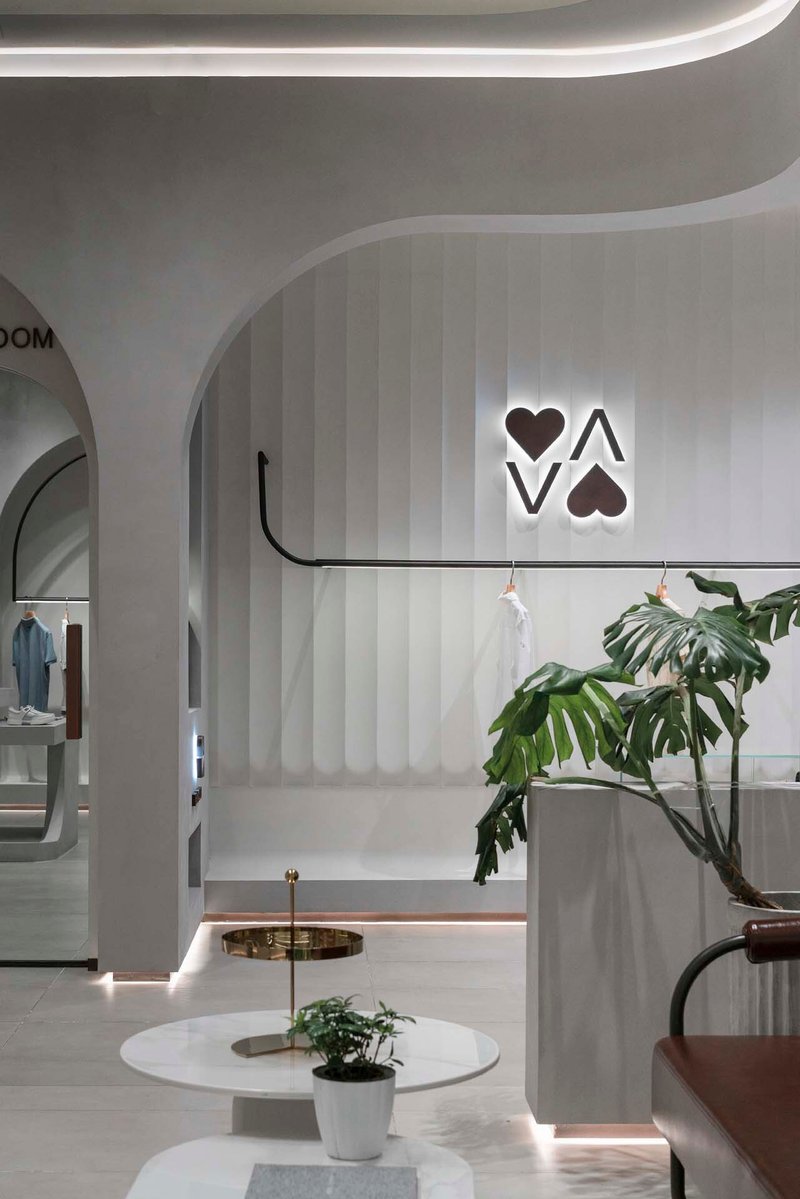
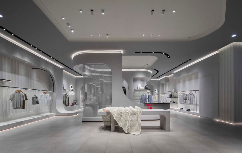
Vertical striped wall panels with a backlit logo frame arched openings into merchandise displays, creating a branded but not heavy-handed identity layer. The clothing itself is displayed sparingly: a single rack within a niche, a folded garment on a plinth. The density is deliberately low. Red Vicutu is positioning its active wear line as premium, and the spatial generosity reinforces that message.
White cantilevered platforms and curved display volumes organize the product into curated groupings. Rather than the grid-based merchandising typical of sportswear retail, each display reads as a composition: garment, sculptural object, plant, light. The store becomes a series of vignettes, each legible on its own but connected by the continuous ceiling plane overhead.
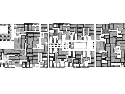
Plans and Drawings
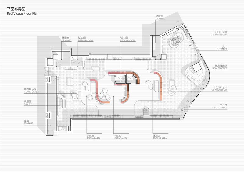
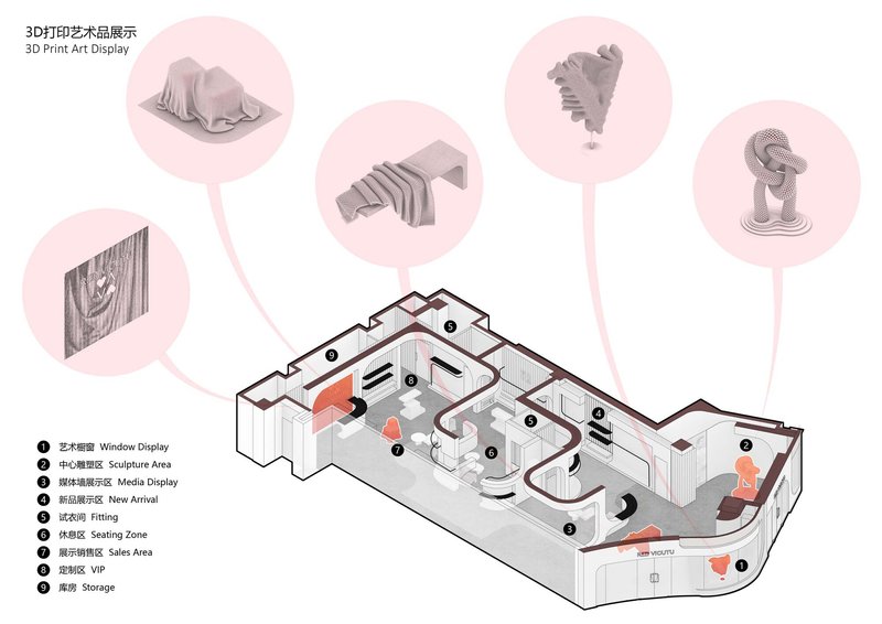
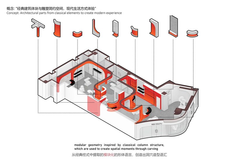
The floor plan reveals the red curved circulation elements threading through the space, confirming that the organic geometry is not an afterthought but the generative logic of the entire layout. Seating areas, exhibition spaces, and display zones are organized around these flowing lines. The axonometric diagrams highlight the various curved and vertical profiles, showing how each element, from the ceiling soffits to the display plinths, belongs to a family of related forms.
Particularly revealing are the assembly drawings for the 3D-printed fabric sculptures, which show how a draped textile simulation is supported by a vertical LED element on a display plinth. These details confirm that the digital fabrication is integrated into the architectural thinking from the outset, not applied as an art installation after the fact. The modular red elements in the axonometric drawing suggest a system that could, in theory, be reconfigured for different collections or seasonal rotations.
Why This Project Matters
Retail interiors have a short shelf life, and most concept stores are designed to be photographed once and renovated within three years. What distinguishes the Red Vicutu store is the coherence of its central idea: the entire space is an argument about the relationship between textile and architecture, pursued from facade to furniture to fabrication method. That consistency gives the project intellectual weight that transcends its modest footprint.
AntiStatics also demonstrates that 3D printing and fabric simulation software can produce architecture that feels warm and inviting rather than coldly futuristic. The store does not fetishize its technology; it uses it to achieve forms that would be prohibitively expensive or simply impossible with conventional fabrication. For a 350-square-meter retail space to carry this level of conceptual ambition without sacrificing commercial function is a genuine achievement, and one worth studying for anyone designing in the increasingly blurred territory between fashion and architecture.
Red Vicutu Concept Store Design by AntiStatics Architecture. Beijing, China. 350 m². 2022. Photography by UK Studio.
About the Studio
Share Your Own Work on uni.xyz
If projects like this are the kind of work you want to make, uni.xyz is a place to publish your own, find collaborators, and enter design competitions.


Popular Articles
Popular articles from the community
Constanti Architects Builds a Fortress of Privacy in Nicosia with House 345
A concrete and timber residence in Cyprus reinterprets the traditional introverted courtyard house for a new urban landscape.
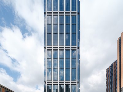
Foster + Partners Wraps a 200-Meter Shanghai Tower in Stainless Steel and Industrial Memory
The Suhe Centre Office Tower anchors a regenerated waterfront district in Shanghai with an all-steel structure that nods to local warehouse heritage.
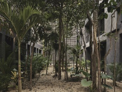
Three Studios Build 200 Affordable Units for Tulum's Displaced Hospitality Workers
Casa Selva embeds dark concrete housing blocks into Yucatán rainforest, offering dignified shelter to those priced out by the tourism they serve.
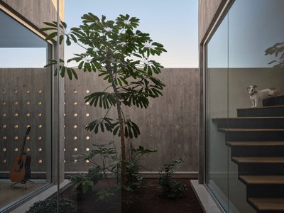
Driss Kettani Carves a Private World from Concrete Boxes on a Tight Casablanca Plot
Villa Polo stacks perforated concrete volumes around courtyards and a rooftop pool to shield a family home from the dense urban fabric.


Similar Reads
You might also enjoy these articles
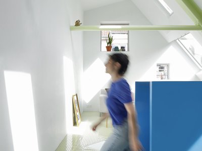
127af Flips a Tiny Bagnolet Rowhouse Upside Down with a Handcrafted Roof Extension
A 55-square-meter terraced house on the edge of Paris gains a luminous upper living floor through lightweight timber and steel.
1.61 Design Workshop Wraps a 600-Square-Meter Café in Vietnam in Sculptural Burgundy Drama
Reden Café & Bistro pairs a helical staircase, mosaic floors, and deep red interiors to rethink Vietnamese hospitality space.
The Unbound Brain: A School Shaped by Cognitive Architecture
Cylindrical learning pods radiate like neurons from a central cortex, turning the floor plan into a spatial model of human thought.
Revival Vernacular Architecture: Rammed Earth Settlements for the Sahara
A modular desert community in Mauritania that fuses passive cooling techniques with earthen construction and local craftsmanship.


Explore Commercial Buildings Competitions
Discover active competitions in this discipline


The Global Benchmark for Architecture Dissertation Awards


Challenge to design luxury tourism on rails


VR headsets Storefront design competition

Designing a staircase for a client
Comments (0)
Please login or sign up to add comments
No comments yet. Be the first to comment!