
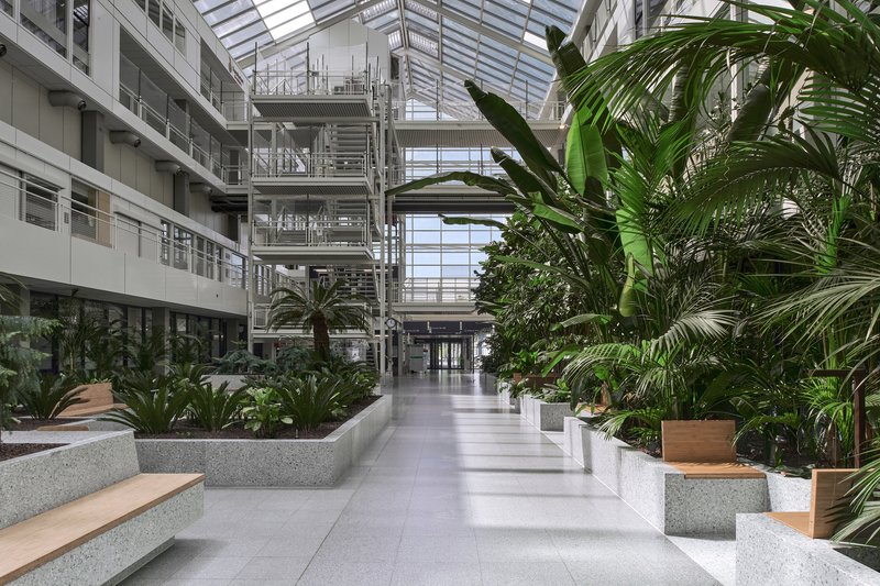
Bureau Ira Koers and Studio Roelof Mulder Transform a 1980s Dutch Hospital into an Indoor Jungle
A sky-lit atrium in Purmerend gets terrazzo planters, tropical foliage, and bamboo seating that blur the line between hospital and garden.
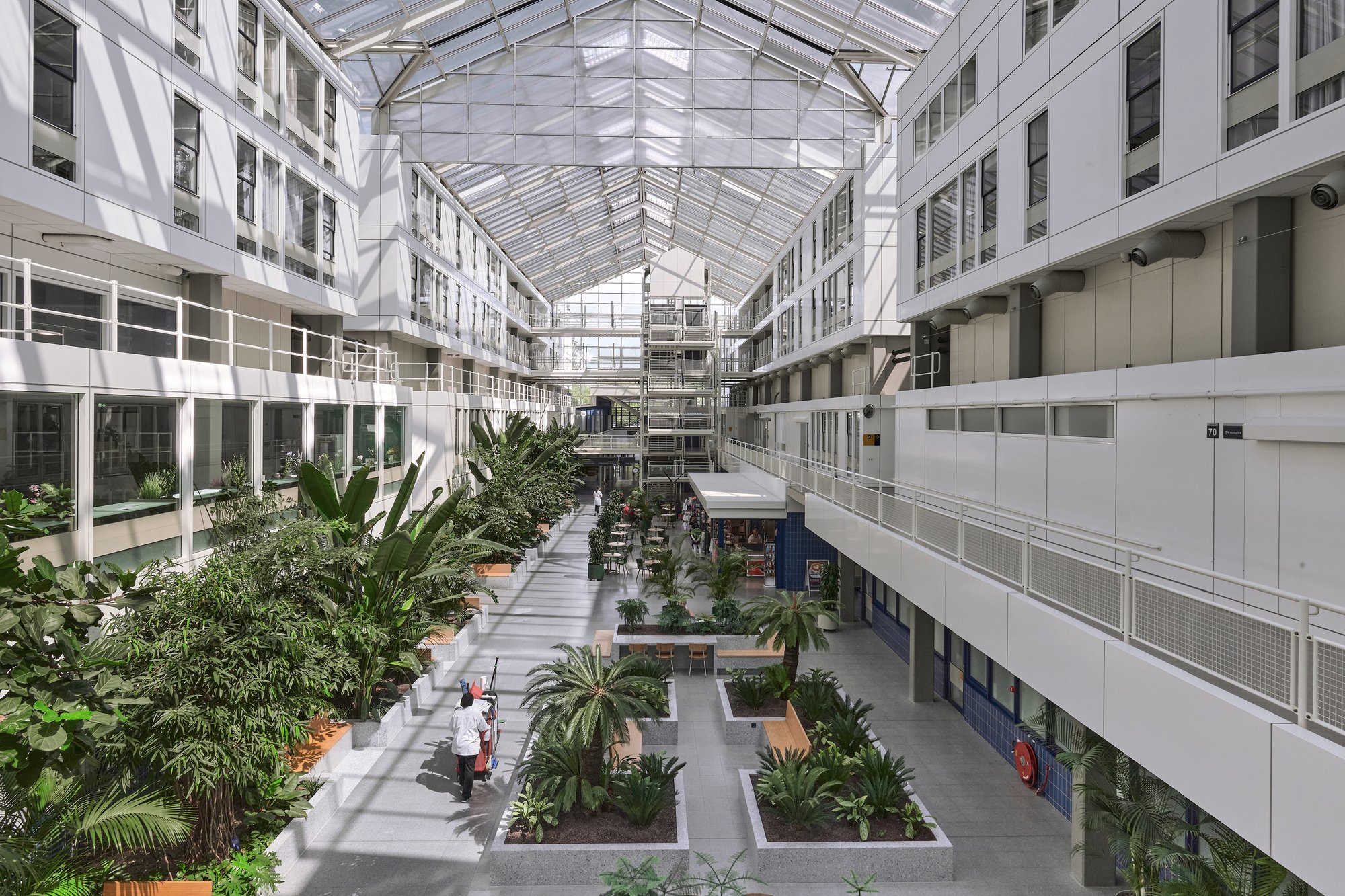
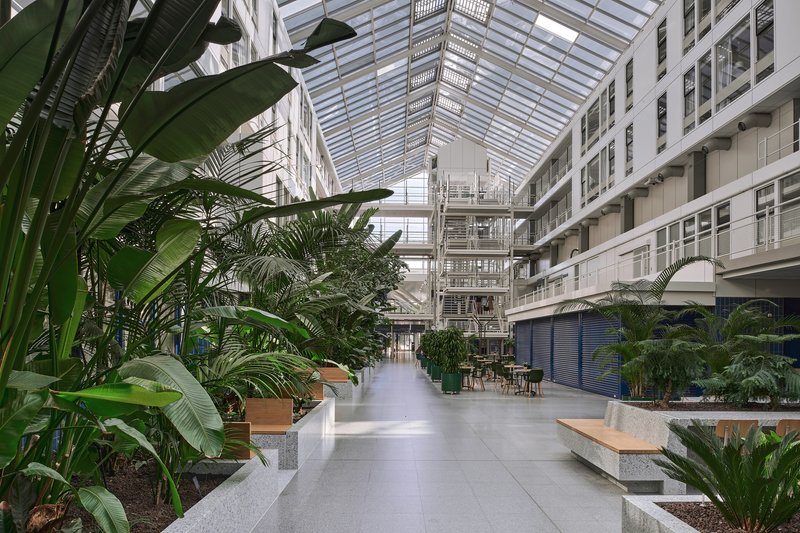
Hospitals rarely age well. The fluorescent corridors and vinyl surfaces that felt modern in the 1980s tend to calcify into environments that feel clinical in the worst sense of the word. The Dijklander Hospital in Purmerend, originally designed by Jan Tennekes in 1982 as the Waterland Hospital, was a notable exception in concept if not in upkeep. Tennekes imagined the building as a "passage hospital," organizing four T-shaped wings along a generous glass-covered hall complete with street lamps, benches, and strips of greenery. It was urban design brought indoors. Four decades later, bureau Ira Koers and Studio Roelof Mulder were brought in not to erase that ambition but to fulfill it.
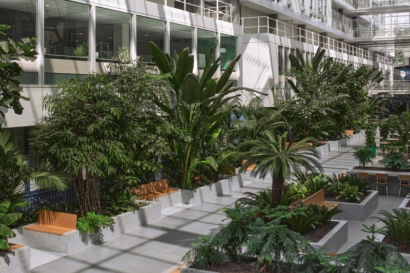
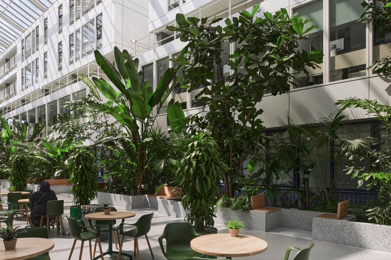
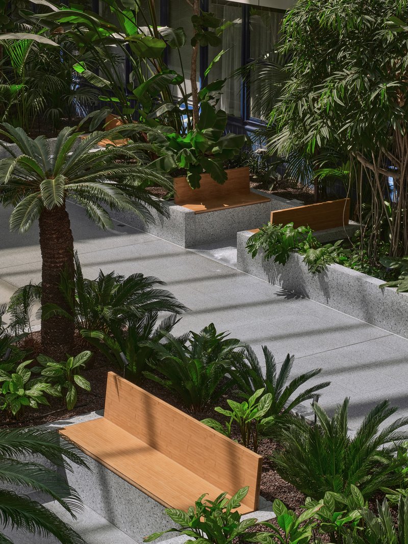
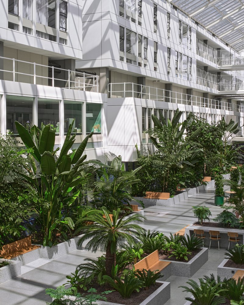
What makes this 1,780 square meter revitalization interesting is its posture toward the existing building. Rather than gutting and reskinning, the designers treated Tennekes's original layout as young heritage worth preserving. The clear circulation spine remains. The sky-lit hall remains. What changes is the density and quality of life within those bones. Sparse planters give way to raised terrazzo beds overflowing with palms, banana plants, and ferns. Bamboo seats nestle into the greenery. Red accent islands with sofas and a concert grand piano punctuate the corridor. The result is less renovation than rewilding.
A Corridor That Behaves Like a Street
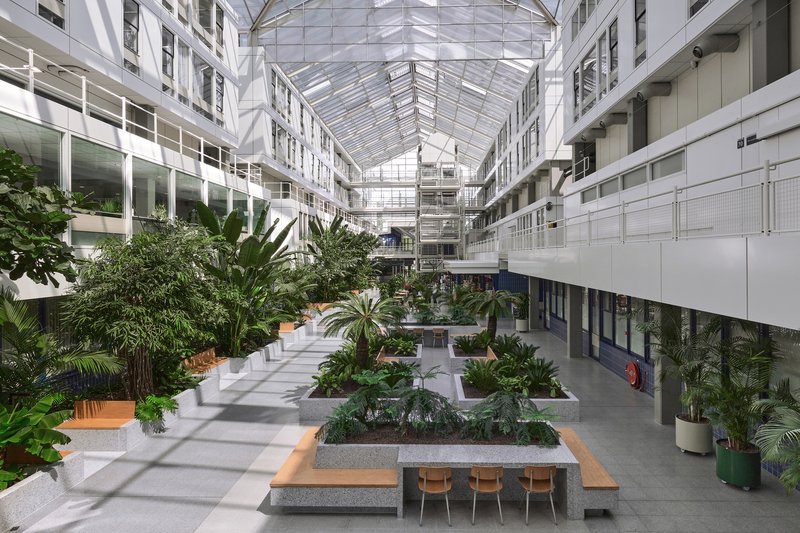
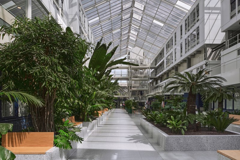
Tennekes's original conceit, an indoor street connecting hospital wings, was a genuinely strong idea hampered by timid planting and the inevitable budget squeeze. Bureau Ira Koers and Studio Roelof Mulder take the same parti and turn up the volume. The central corridor now reads as a genuine promenade: stepped terrazzo planters line both sides, palms reach toward the glazed roof several stories above, and the polished floor catches shifting patterns of light filtered through leaves. The routing is still legible at a glance. You know where you are and where you are going. But the journey itself has become something patients and visitors might actually want to linger on.
The architects introduce shortcuts through the greenery without cluttering the main axis, giving repeat visitors faster paths while preserving the generous processional quality for first-timers. It is a small but telling decision: the design serves both wayfinding clarity and everyday comfort, recognizing that a hospital corridor serves very different users at different emotional registers.
Terrazzo and Timber: A Material Palette That Earns Its Keep
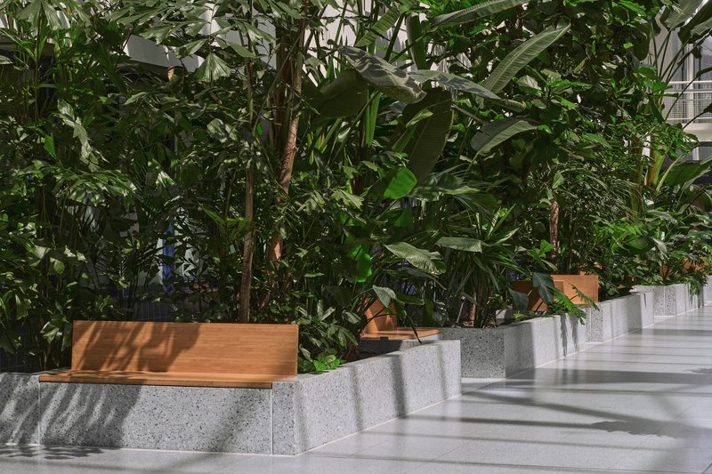
Hospital interiors must withstand relentless cleaning, heavy foot traffic, and the occasional collision with a gurney. The material palette here is restrained but durable. Terrazzo walls define the raised planting beds, their aggregate surface lending a warmth that poured concrete alone would not. Timber coping caps the planters and extends into integrated benches, offering a tactile counterpoint to the stone. The combination reads as civic rather than institutional, more public park than waiting room.
The terrazzo elements, produced by Tomaello BV, give the planters a sense of permanence that portable pots never achieve. These are not decorative afterthoughts but architectural elements that shape how people sit, lean, and orient themselves. A concrete bench integrated into a planting bed becomes a workspace for someone with a laptop. A timber seat backing against a blue-tiled column becomes a moment of rest beside a storefront. The furniture does not float in the space; it grows out of it.
Tropical Density Under a Northern Sky
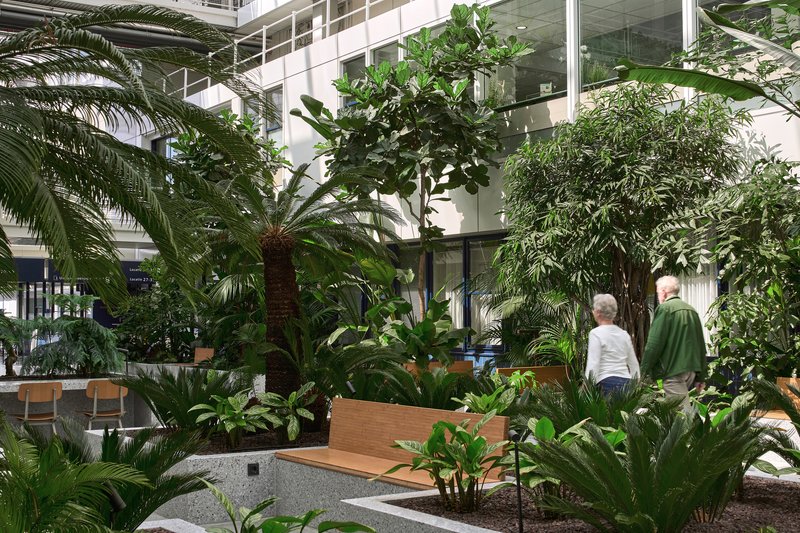
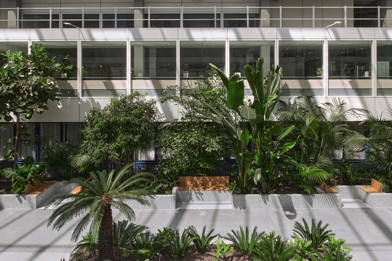
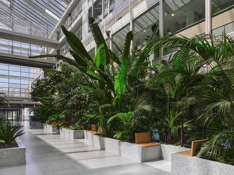
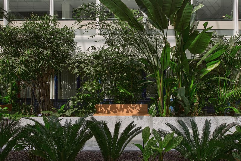
The planting design, developed by Ton Hilhorst of Artis, is the project's most visceral move. Where the original hall had scattered greenery that read as garnish, the new scheme packs banana palms, fan palms, ferns, and bamboo into layered compositions dense enough to create genuine microclimates. The foliage screens patient rooms on the ground floor from the public gaze while giving upper levels a canopy to look down upon. Privacy and spectacle, delivered by the same plants.
The risk with lush indoor planting in a healthcare setting is always maintenance and perception. Fallen leaves, standing water, and the suggestion of uncontrolled nature can undermine the hygiene narrative a hospital depends on. Here the raised beds and crisp terrazzo edges keep the jungle legible as designed landscape. The dappled shadows across the floor are beautiful, but they are also evidence that someone thought carefully about species selection, orientation, and the quality of light falling through a north-European atrium roof.
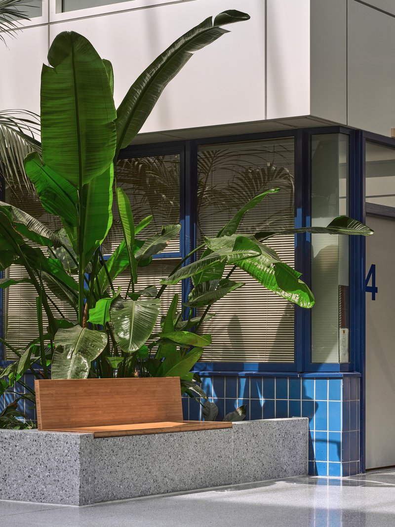
Blue Facades and Red Accents
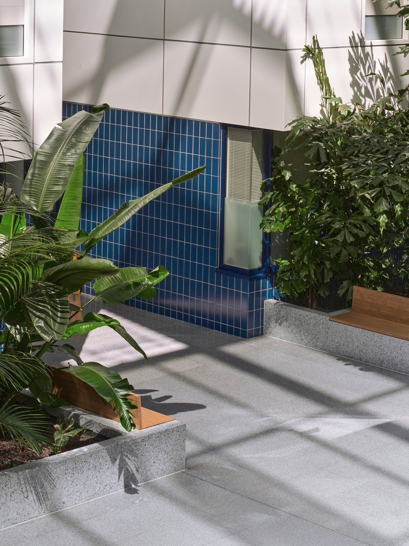
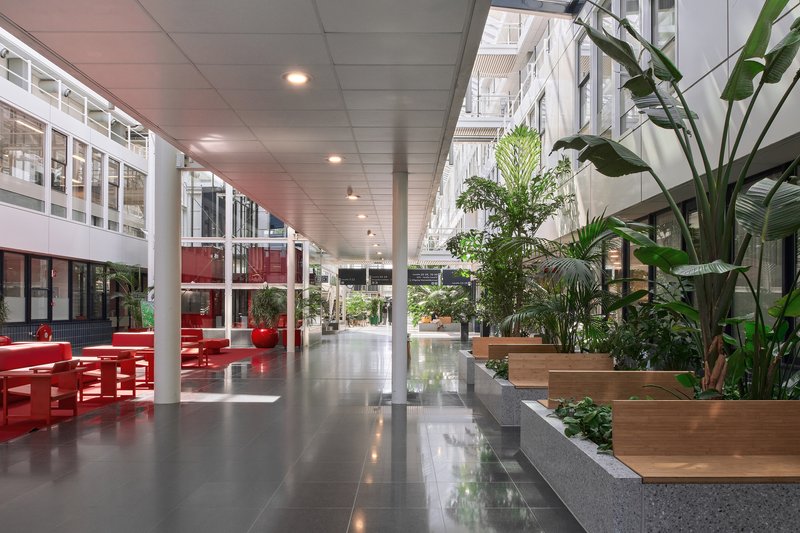
Color does targeted work in the scheme. The existing blue mosaic tile panels along the hall facades are retained and celebrated, their saturated hue serving as a backdrop against which palm shadows play. On the opposite register, red lifts are accentuated by new red islands carrying sofas and, notably, a concert grand piano. The red is deliberate provocation in a context that usually defaults to pastels and motivational graphics. It says: this is a public room, not a holding pen.
The cafeteria, shop, patient service point, and hairdresser are all housed within the blue plinth course of the facades flanking the hall. By embedding everyday services into the architectural datum rather than scattering kiosks through the space, the designers keep the central corridor free for movement and rest. The hall remains a garden; commerce happens at its edges.
Sitting Among the Plants
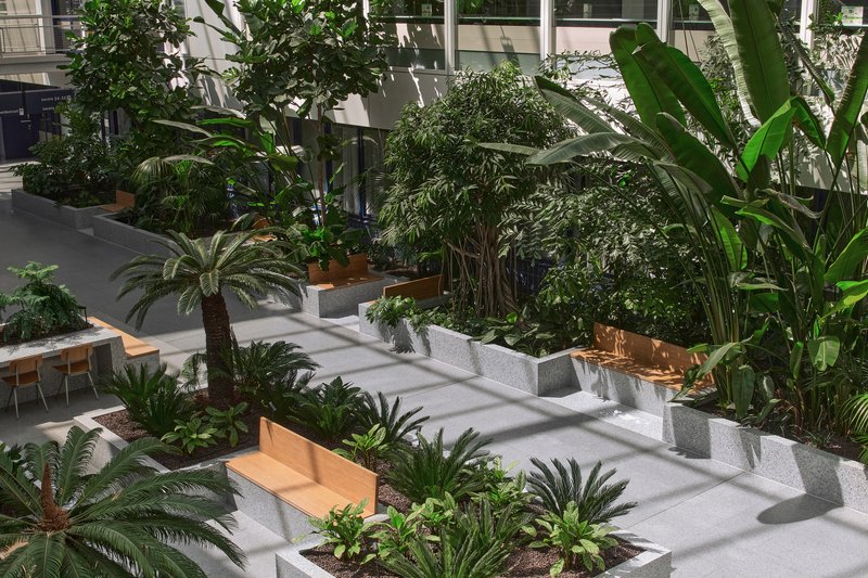
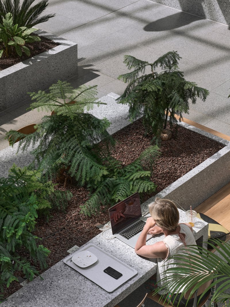
The seating strategy is worth examining on its own terms. Bamboo and timber benches are not placed beside the planters but embedded within them, so that sitting down means being surrounded by foliage at shoulder height. The effect is semi-private enclosure without walls or screens. For a hospital visitor waiting for news, or a patient taking a first walk after surgery, that degree of sheltered exposure matters enormously. You are visible but not exposed.
The variety of seating types, from long communal benches to individual perches to round timber tables ringed by potted plants, suggests the designers observed how people actually use hospital common areas before drawing furniture plans. Not everyone wants the same posture or the same degree of company. The atrium accommodates solitude and congregation equally, which is harder than it sounds.
Light From Above
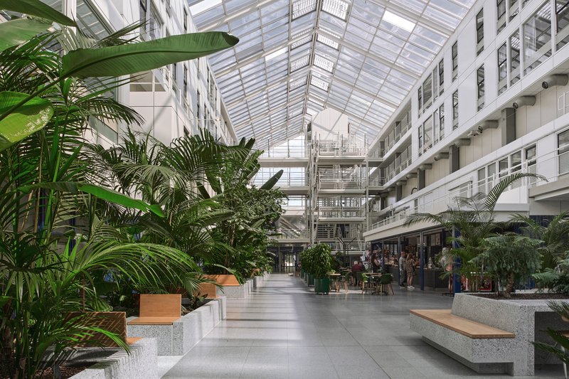
The glazed atrium roof is inherited infrastructure, but the revitalization makes it perform differently. With dense planting below, the daylight that floods the hall is immediately broken into patterns by leaves and fronds. The multi-story section means that visitors on the ground floor experience a cathedral of green while those on upper balconies look across a canopy toward the opposite wing. White facade balconies catch direct light and throw it deeper into adjacent departments. The building breathes vertically in a way that flat-ceilinged hospitals never can.
Critically, the skylight also sustains the planting. Natural light is not just ambiance here; it is irrigation for a living system. The species selection responds to the specific lux levels and seasonal variations of a Dutch atrium, and the stepped planter geometry ensures that shorter species at the base still receive adequate light beneath the taller palms. Form follows photosynthesis.
Plans and Drawings
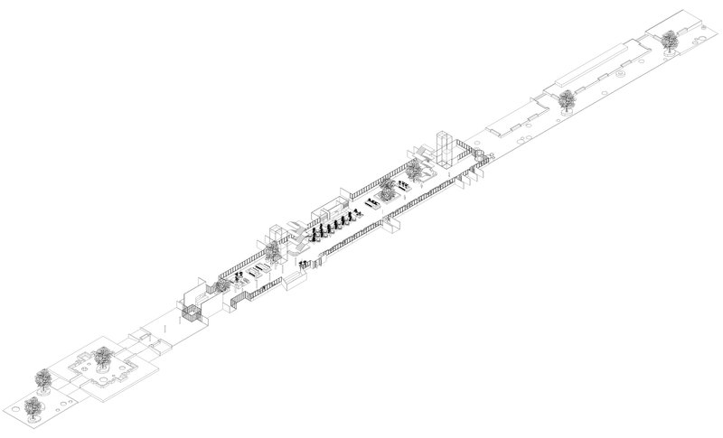
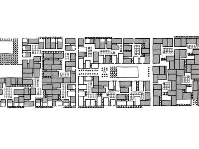
The axonometric drawing reveals what photographs cannot: the disciplined linearity of the whole composition. Four T-shaped wings sit on either side of the central hall like ribs off a spine. The planted courtyards visible in the drawing hint at the outdoor extension of the garden, realized in 2023, where the same bamboo seating and greenery strategy continues over a newly raised dyke. A footpath winds around the building between green spaces in the parking lot that double as storm water attenuation, under trees, and along the reedy edges of the Gors. The interior garden is not a sealed terrarium; it is the first chapter of a landscape that keeps going.
Why This Project Matters
Healthcare architecture is flooded with new-build projects that trumpet biophilic design from the competition render stage onward. What bureau Ira Koers and Studio Roelof Mulder demonstrate here is that the more difficult and arguably more relevant challenge is retrofitting existing hospitals with the same ambition. The Dijklander revitalization works within a steel and concrete frame from 1982, respects a routing diagram that was already sound, and deploys a relatively modest 1,780 square meters of intervention to shift the entire atmosphere of the building. The investment is in soil, terrazzo, and plants rather than structural gymnastics.
The project also models something increasingly rare: genuine respect for recent architectural heritage. Tennekes's passage hospital was a good idea realized with limited means. Rather than treating the 1980s fabric as embarrassing legacy, the designers read it as incomplete promise and then completed it. That generosity toward a predecessor's intentions, combined with the pragmatic intelligence of the planting and material strategy, makes the Dijklander Hospital a quiet case study in how to make existing buildings not just functional but genuinely humane.
Dijklander Hospital Revitalization, by bureau Ira Koers and Studio Roelof Mulder. Purmerend, The Netherlands. 1,780 m². Completed 2022. Photography by MWA Hart Nibbrig Plant.
About the Studio
Share Your Own Work on uni.xyz
If projects like this are the kind of work you want to make, uni.xyz is a place to publish your own, find collaborators, and enter design competitions.


Popular Articles
Popular articles from the community
Takeshi Hosaka Architects Suspends a Concrete Cross Above a Yokohama Cemetery
A 28-square-meter burial renovation in Yokohama lifts the symbol of resurrection into the sky so mourners see it against heaven.
20 Most Popular Office Building Projects of 2025
From biophilic workspaces in India to net-positive energy offices in New Delhi, 20 office building projects that defined architecture in 2025.
HCCH Studio Wraps a Shanghai High-Rise Office in Curved Walls of Translucent Glass
A 1,000 square meter fit-out in Lujiazui replaces the typical tech-office palette with layered glass, micro-cement, and quiet rigor.
Rojkind Arquitectos and Think Parametric Build a Glueless Pavilion from 67 Interlocking Panels
A serpentine fiber-cement installation in Chapultepec Park celebrates a decade of architectural media in Mexico City.


Similar Reads
You might also enjoy these articles
127af Flips a Tiny Bagnolet Rowhouse Upside Down with a Handcrafted Roof Extension
A 55-square-meter terraced house on the edge of Paris gains a luminous upper living floor through lightweight timber and steel.
1.61 Design Workshop Wraps a 600-Square-Meter Café in Vietnam in Sculptural Burgundy Drama
Reden Café & Bistro pairs a helical staircase, mosaic floors, and deep red interiors to rethink Vietnamese hospitality space.
The Unbound Brain: A School Shaped by Cognitive Architecture
Cylindrical learning pods radiate like neurons from a central cortex, turning the floor plan into a spatial model of human thought.
Revival Vernacular Architecture: Rammed Earth Settlements for the Sahara
A modular desert community in Mauritania that fuses passive cooling techniques with earthen construction and local craftsmanship.


Explore Architecture Competitions
Discover active competitions in this discipline


The International Standard for Design Portfolios


The Global Benchmark for Architecture Dissertation Awards


The Global Benchmark for Graduation Excellence


Challenge to re-imagine a department store in present times
Comments (0)
Please login or sign up to add comments
No comments yet. Be the first to comment!