
Coffee Machine Bakery: A Study in Modern Cafe Interior Design
A modern cafe interior design that transforms a narrow urban space into a dynamic bakery experience through material contrast and spatial flow.
The Coffee Machine Bakery, designed by Сергей Питерский, redefines modern cafe interior design within the constraints of a narrow urban footprint. Located in the historic center of the city, this flagship space represents the brand’s first major street retail project, marking a shift from conventional formats toward a more experiential and spatially expressive environment.
Recognized as a People's Choice Award entry in Interiors '20, the project stands as a precise response to spatial limitation, circulation complexity, and brand identity translation into built form.
Spatial Strategy: Designing Within a Linear Constraint
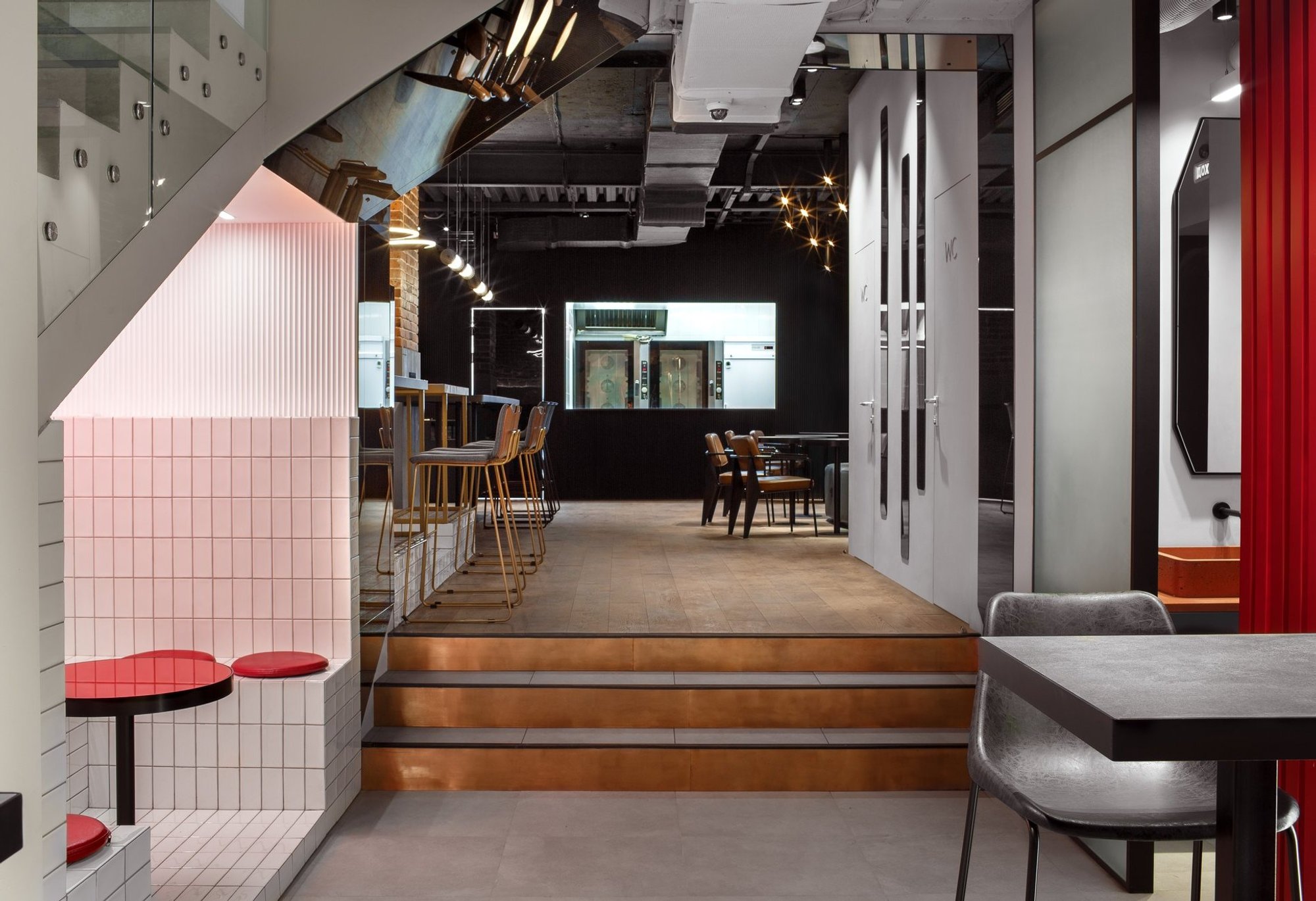
The most defining architectural condition of the project is its elongated, linear plan. The cafe stretches deep into the building, with the entrance functioning as a transitional zone that also accommodates vertical circulation via a staircase leading to upper-level institutions.
This dual-use entry condition demands a careful orchestration of movement. The design resolves this by maintaining a clear central axis for circulation while distributing seating and functional zones along the perimeter. The result is a seamless coexistence of transient and static users, where customers, visitors, and passersby navigate the space without friction.
Zoning and Programmatic Clarity
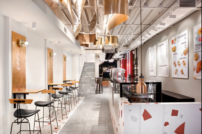
The interior is divided into distinct yet visually connected zones. The front section operates as a quick-service cafe, characterized by high stools, compact counters, and immediate visual access from the street. This area encourages short stays and high turnover.
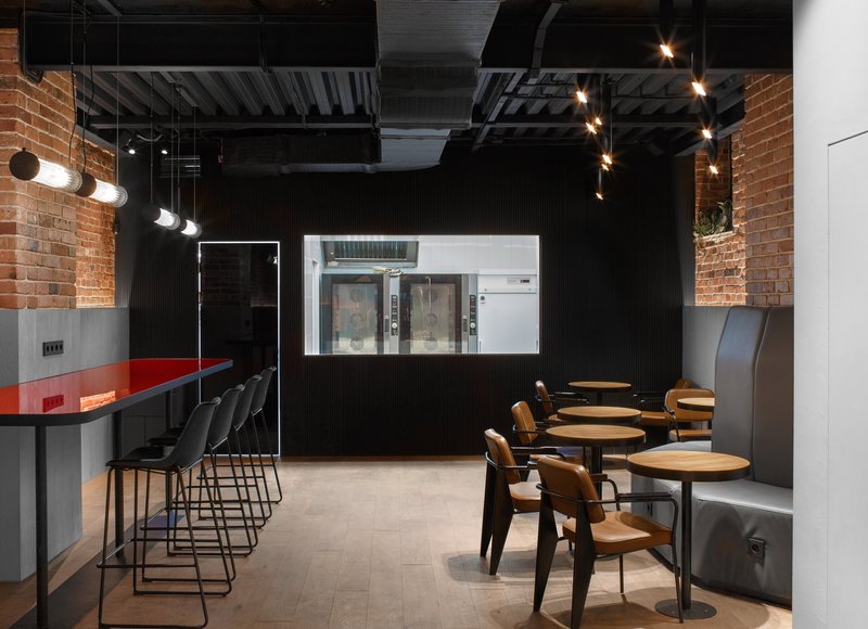
As one moves deeper, the program transitions into a more immersive bakery and dining environment. A change in material palette and lighting intensity subtly signals this shift. The rear zone, darker and more enclosed, accommodates longer बैठing durations, creating a contrast between the energetic front and the intimate back.
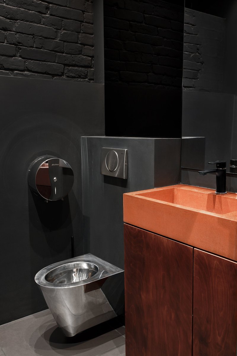
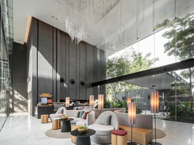
Material Language: Copper as Identity
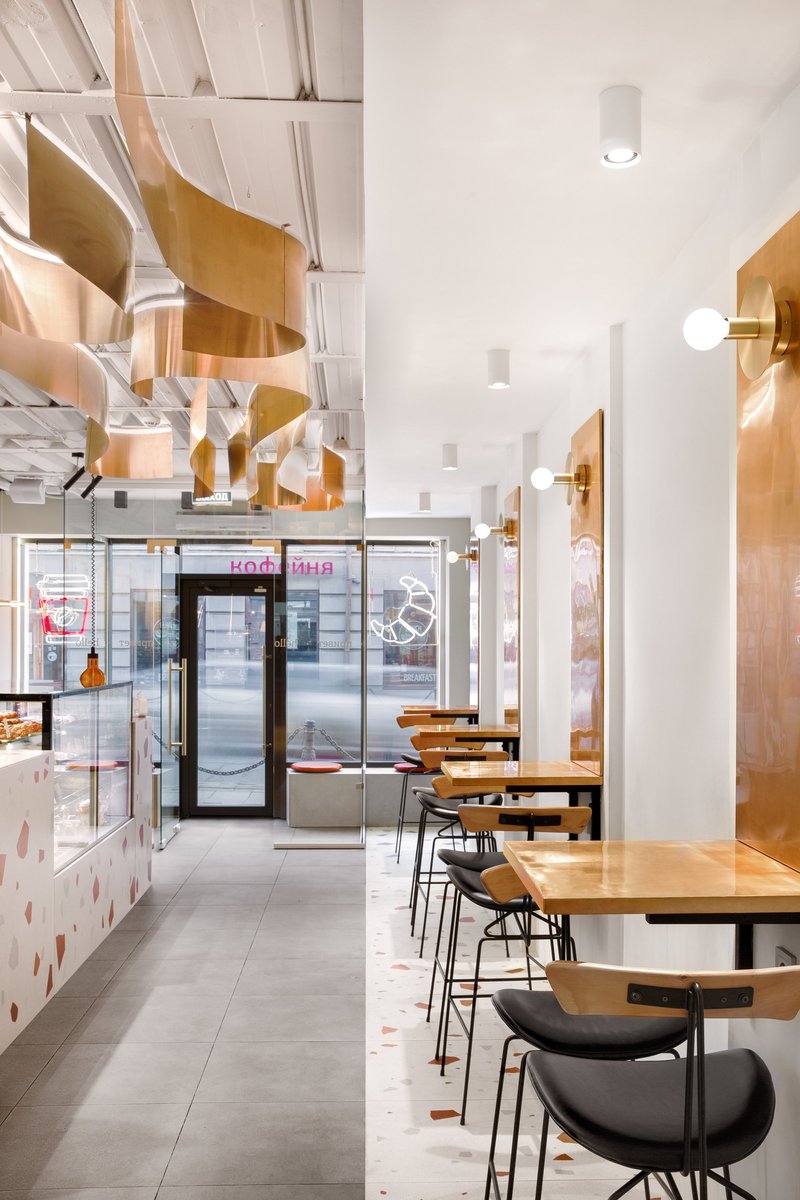
A defining feature of this modern cafe interior design is the extensive use of copper surfaces. Vertical wall panels, lighting fixtures, and sculptural ceiling installations employ copper not only as a finish but as a spatial device.
The reflective quality of copper amplifies light within the narrow volume, preventing visual compression. At the same time, its warm tone introduces a sense of richness and tactility, elevating the everyday experience of a coffee shop.
The ceiling installation, composed of fluid, ribbon-like copper elements, acts as a visual anchor. It breaks the linear monotony of the space while guiding the eye along the length of the cafe.
Contrast and Composition
The project relies heavily on contrast as a compositional strategy. Clean white walls serve as a neutral backdrop against which copper elements stand out with clarity. Terrazzo flooring introduces a subtle graphic layer, while black furniture adds structural sharpness.
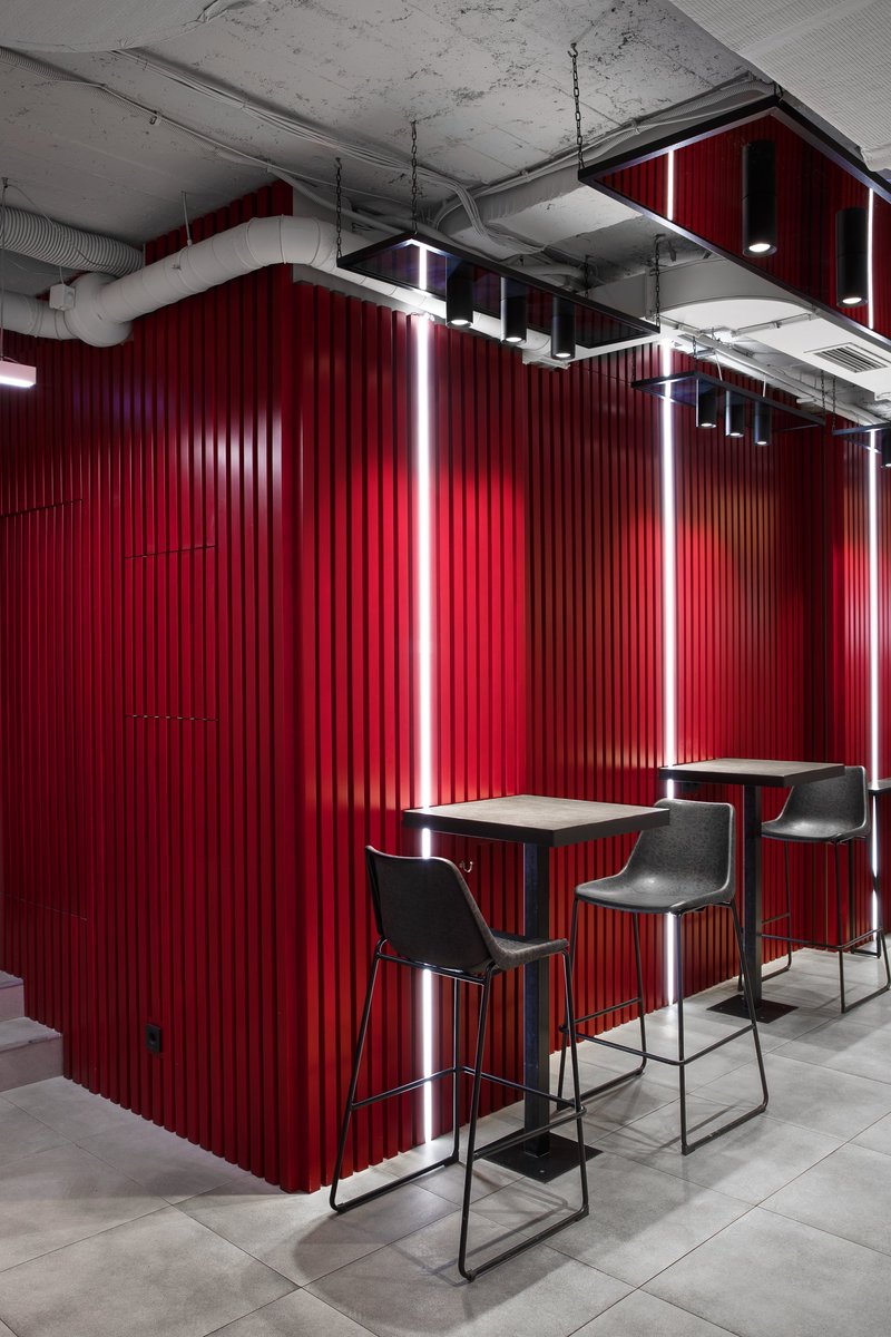
In the rear section, the palette shifts dramatically. Deep reds, dark finishes, and controlled lighting create a more theatrical atmosphere. This deliberate contrast enhances the spatial narrative, offering multiple experiences within a single continuous volume.
Lighting as Spatial Definition
Lighting plays a critical role in reinforcing zoning and mood. In the front area, evenly distributed, soft white lighting ensures clarity and openness. Wall-mounted fixtures integrated with copper panels provide localized illumination, enhancing intimacy at individual seating points.
Toward the back, lighting becomes more directional and dramatic. Linear light elements and focused fixtures highlight key surfaces and volumes, contributing to a sense of depth and enclosure.
The integration of lighting within architectural elements, rather than treating it as an afterthought, reflects a mature approach to modern cafe interior design.
Furniture and Ergonomics
The furniture selection aligns with the spatial logic of the project. Slim-profile stools and compact tables maximize seating efficiency without obstructing movement. Their lightweight visual presence ensures that the architecture remains the primary focus.
In contrast, the rear dining area introduces more substantial seating arrangements, supporting longer dwell times. This variation in furniture typology reinforces the programmatic zoning of the space.
Brand Integration and Identity
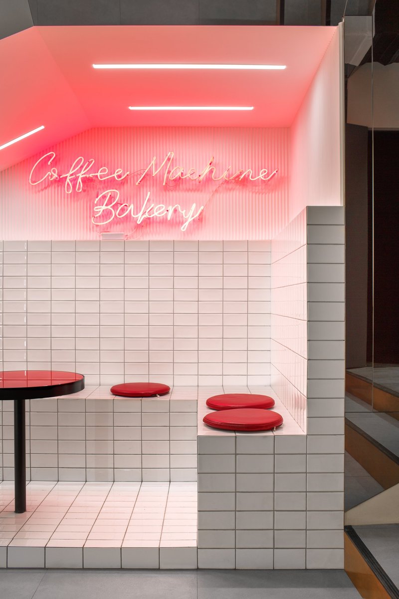
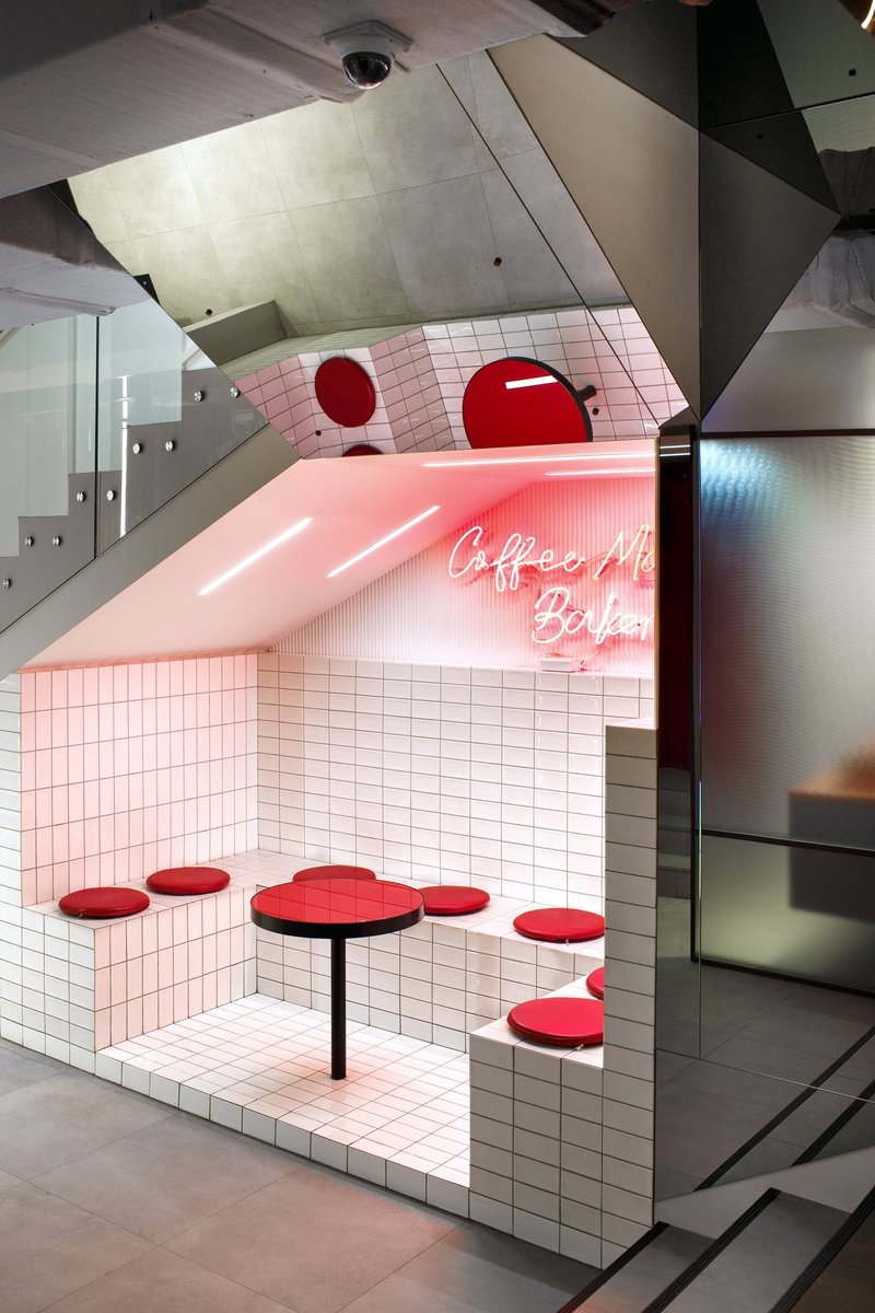
The project successfully translates the Coffee Machine brand into a physical environment. The integration of neon signage, bold color accents, and precise detailing contributes to a cohesive identity that is both contemporary and memorable.
Rather than relying on overt branding, the design embeds identity within materials, spatial sequences, and sensory experience. This approach aligns with current trends in retail and hospitality design, where authenticity and atmosphere take precedence over graphic dominance.
Coffee Machine Bakery exemplifies how modern cafe interior design can transform spatial constraints into opportunities for innovation. Through a careful balance of materiality, lighting, and spatial sequencing, the project delivers a layered and engaging user experience.
By addressing circulation challenges, integrating brand identity, and creating distinct yet connected zones, Сергей Питерский’s design establishes a new benchmark for compact urban hospitality spaces. It demonstrates that even within a narrow footprint, architecture can achieve richness, clarity, and lasting impact.


Popular Articles
Popular articles from the community
Constanti Architects Builds a Fortress of Privacy in Nicosia with House 345
A concrete and timber residence in Cyprus reinterprets the traditional introverted courtyard house for a new urban landscape.
Indiesalon Carves a Plywood Cave into a Seoul Bistro's Second Floor
Munhwa Bistro's second Seongsu branch wraps diners in a laminated timber vault laced with colored light and mirror illusions.
BLDUS Turns a 250-Square-Foot Screened Porch into a Pine Forest Temple in East Hampton
A gabled cedar pavilion mimics the rhythm of surrounding pines, anchoring a 1990s wooded home to its hollow in Long Island.
IDIN Architects Wraps a Hua Hin Hotel Around a Private Courtyard to Escape the City
Dusit D2 Hua Hin turns an urban infill site in Thailand's family vacation heartland into a self-contained resort through courtyard planning.


Similar Reads
You might also enjoy these articles

Urban Forest: A Vertical Ecosystem for 5,000 Workers in Singapore's Changi Business Park
Radially stacked pods and layered green decks turn a 7-acre plot into 47 acres of ecological workspace projected for 2040.
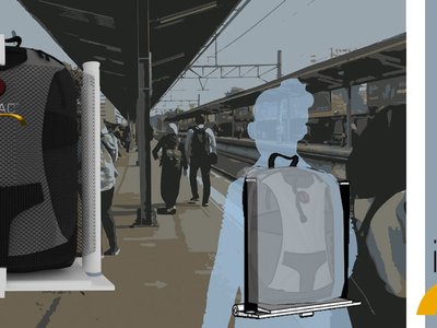
interACT: A Wearable Transit Object That Turns Commuting Into Social Infrastructure
A backpack-mounted foldable device transforms walking, waiting, and riding into moments of shared comfort across Jakarta's transit network.
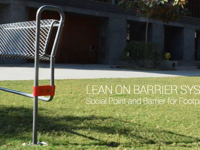
Lean On Barrier System: Where Traffic Safety Meets Chai Culture in Ahmedabad
A modular steel barrier doubles as informal seating and lean-on furniture at one of Ahmedabad's busiest intersections, keeping vendors in place.

The Black Bagh: A Living Monument Built from Water, Light, and Memory
On the banks of the Yamuna, two designers replace the myth of a marble mausoleum with a regenerative landscape of reflection and ritual.


Explore Interior Design Competitions
Discover active competitions in this discipline


The International Standard for Design Portfolios


The Global Benchmark for Architecture Dissertation Awards


The Global Benchmark for Graduation Excellence

Design a brochure to showcase the effects of the technosphere
Comments (0)
Please login or sign up to add comments
No comments yet. Be the first to comment!