
CUBE Architecten Tucks a Steep-Gabled Extension Behind a 1934 Amsterdam House
A split-level rear addition in dark vertical cladding doubles the living space while keeping the street facade untouched.
From the street, very little has changed. A steeply pitched brick gable with white trim sits comfortably among its neighbors, looking every bit the 1934 original it is. Walk through the house, however, and the story shifts dramatically. CUBE Architecten has grafted a tall, dark-clad extension onto the rear of this Amsterdam property, nearly doubling its footprint while preserving the domestic character of the original street facade. It is a project that takes the old Dutch strategy of building deep into the block and sharpens it into something precise.
What makes the KDW 199 House Extension genuinely interesting is its split-level maneuver. Rather than trying to flatten the relationship between old and new, the architects dropped the kitchen and dining area two steps below the original living room. That seemingly modest move does a lot of spatial work: it separates zones without walls, creates a taller ceiling in the new volume, and establishes a gentle visual descent toward the garden. The result is a home that reads as one continuous interior, even though its two halves were built nearly ninety years apart.
Two Faces, One House
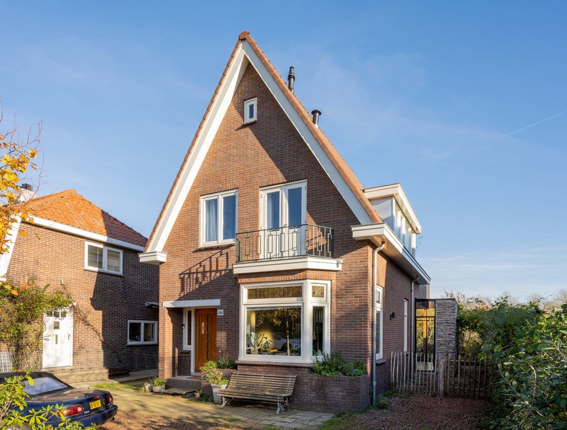
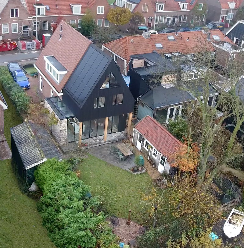
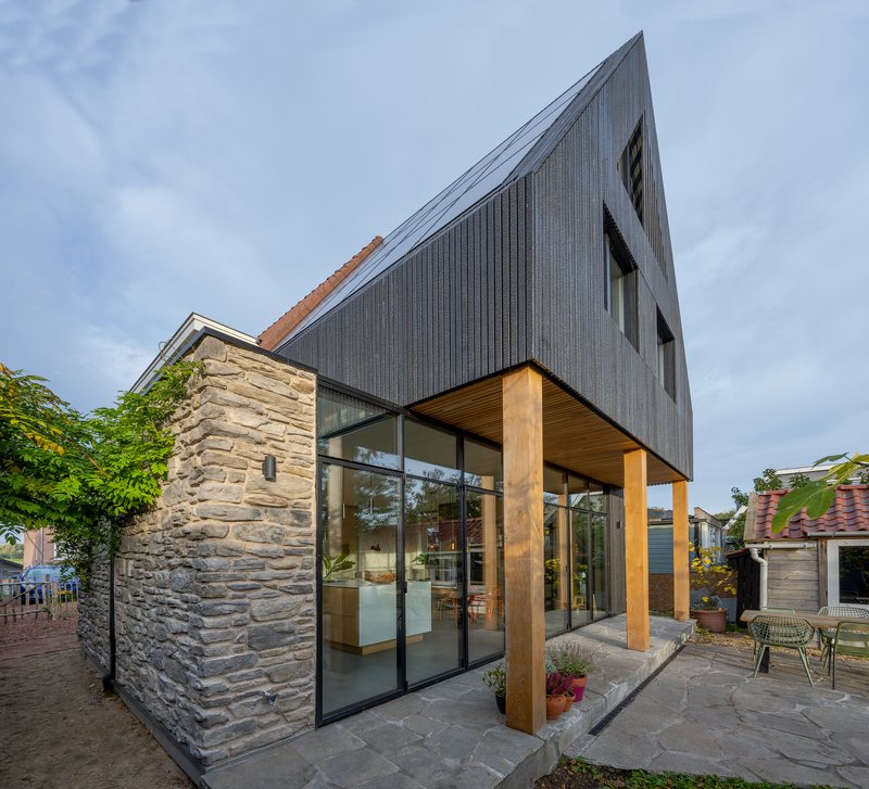
The contrast between front and back is the organizing idea. The street facade is brick, symmetrical, and reassuringly pre-war. The rear extension, visible in the aerial shot nestled among red-tiled rooftops, announces itself with dark vertical cladding and a steeply pitched gable that echoes the original silhouette without mimicking it. CUBE Architecten has clearly decided that the new work should be legible as new, but it borrows enough of the proportional language to avoid the jarring collision that lesser additions produce.
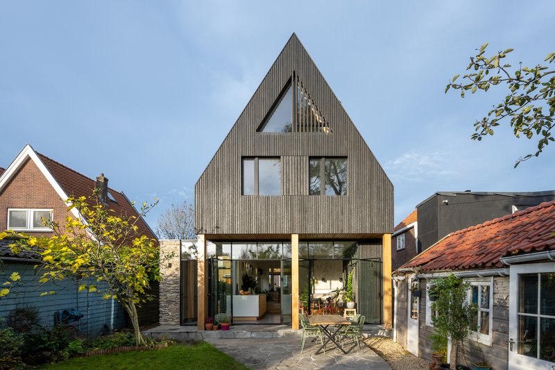
From the garden, the full height of the addition becomes apparent. The gable rises sharply, clad in dark panels, with a generous timber-framed canopy sheltering the ground floor glazing below. It is bold, but the pitch keeps it from feeling out of scale with the neighborhood. The dark finish also helps it recede visually, reading as shadow rather than mass against the lighter masonry of the original walls.
The Covered Threshold
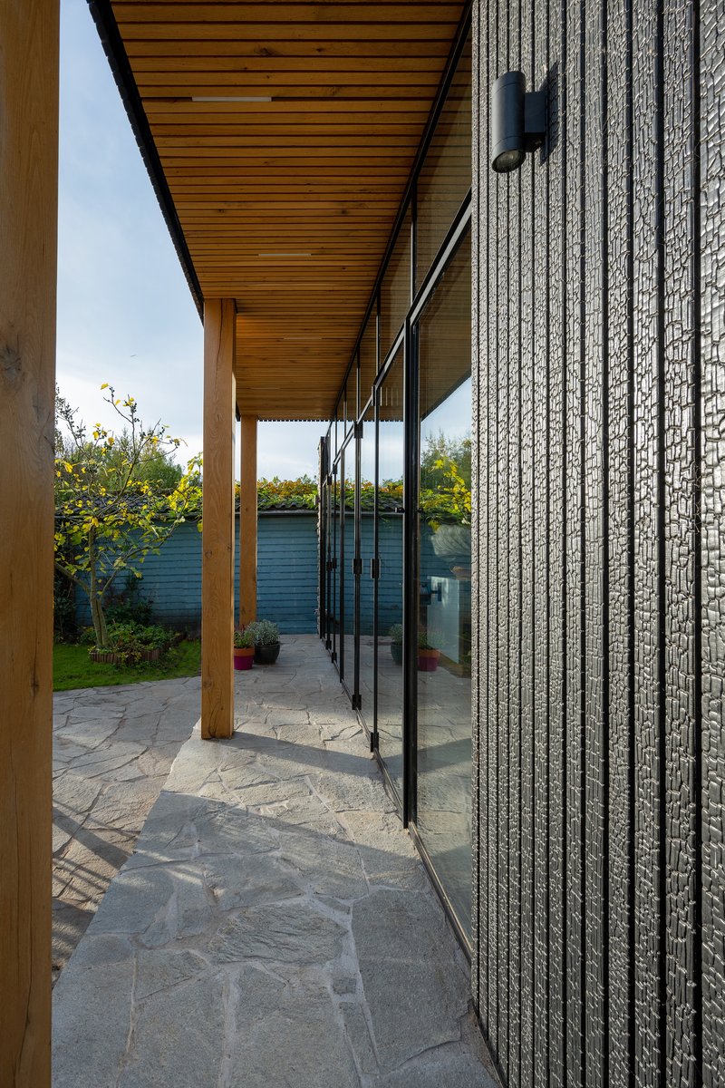
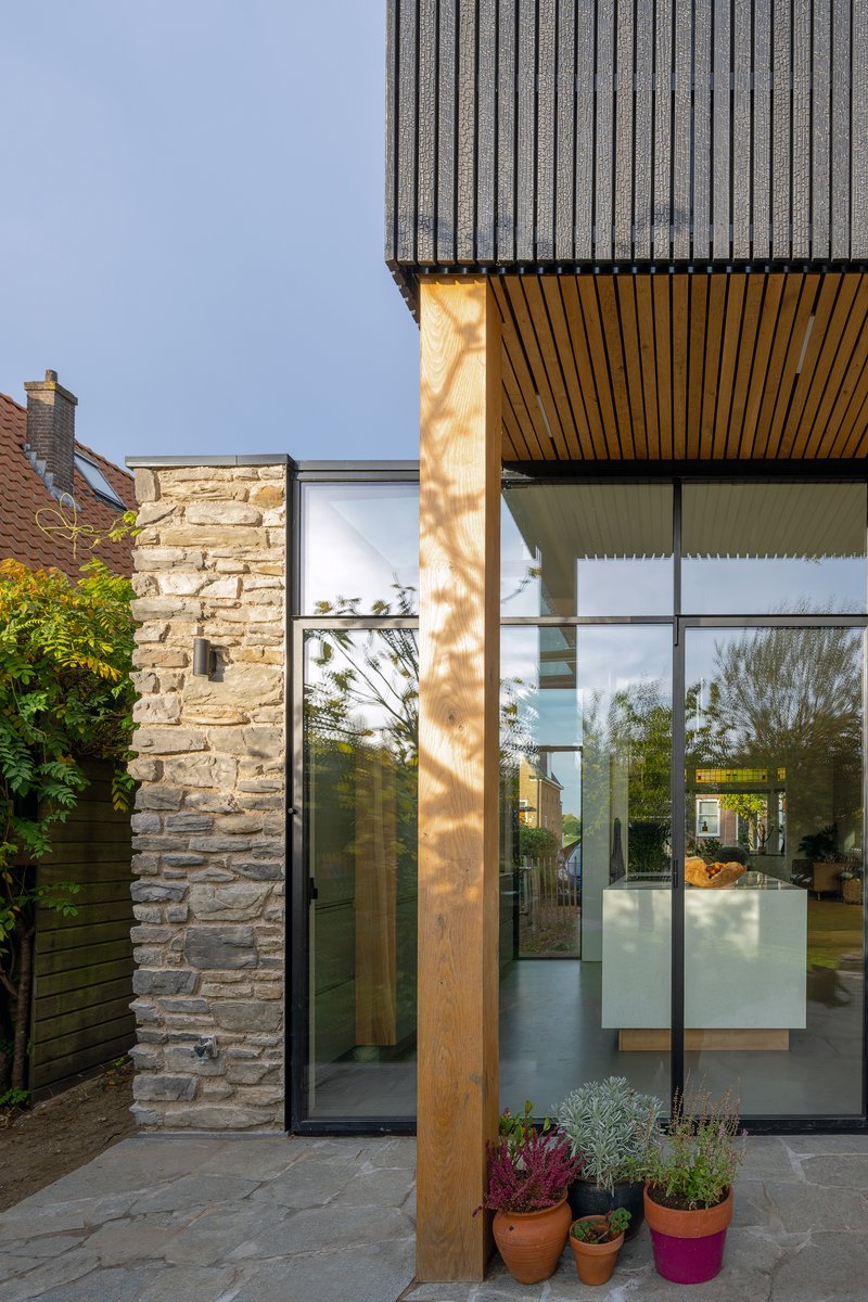
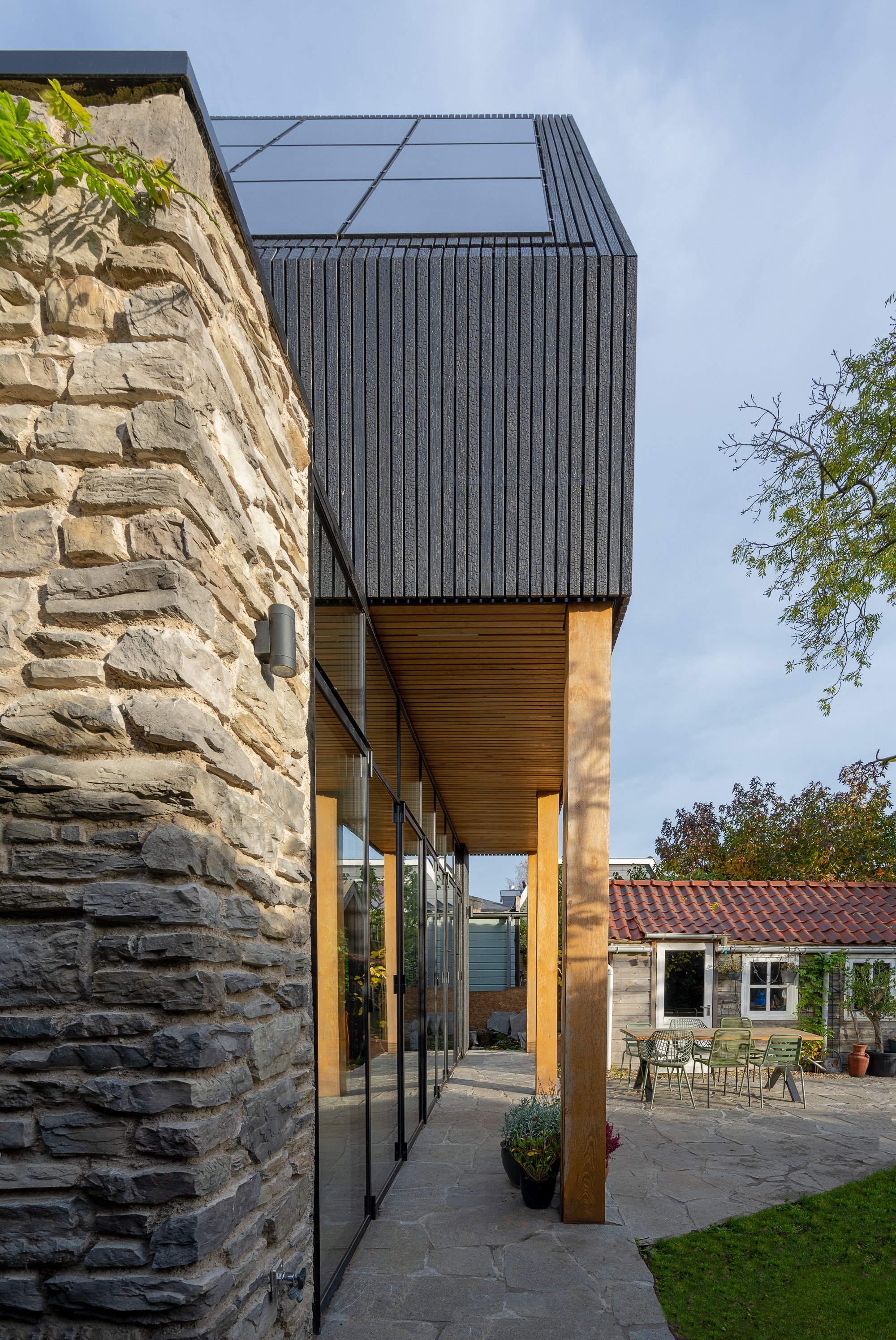
The junction between old and new is handled with care. A covered terrace, framed by timber posts and a continuous timber soffit, runs alongside the textured brick wall of the original house. This intermediate zone does more than provide shade. It gives the transition a physical depth, so that moving from the 1930s living room into the contemporary kitchen feels like a journey rather than a doorway. Floor-to-ceiling glazing along this edge floods the interior with light while framing views of the garden.
The cantilevered soffit over the glazed ground floor is a quietly sophisticated detail. It projects beyond the stone masonry wall just enough to create a sheltered zone at the glazed corner entry, where a timber column catches afternoon sun. Potted plants accumulate here naturally, reinforcing the sense that this is a threshold zone between domestic interior and garden.
Kitchen as Centerpiece
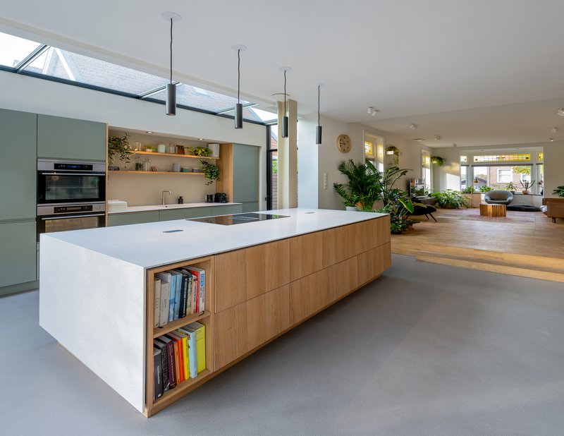
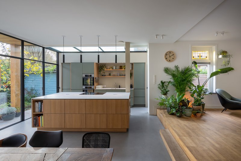
The kitchen island is the spatial anchor of the entire extension. Finished in light timber with a white stone top, it sits beneath a skylight that pours daylight directly onto the work surface. From the island, sightlines run in every direction: back toward the living room through the split-level transition, sideways through full-height glazing to the garden, and forward into the dining area. It is a classic open-plan arrangement, but the split-level drop and the controlled placement of the skylight give it a spatial richness that pure open plans often lack.
Pendant lighting over the island provides warm task light for evenings, and the timber base gives the piece enough weight to hold its own against the generous volume overhead. Black shelving walls on one side add graphic contrast, while the garden glazing ensures the space never feels enclosed.
Skylight Slots and the Galley
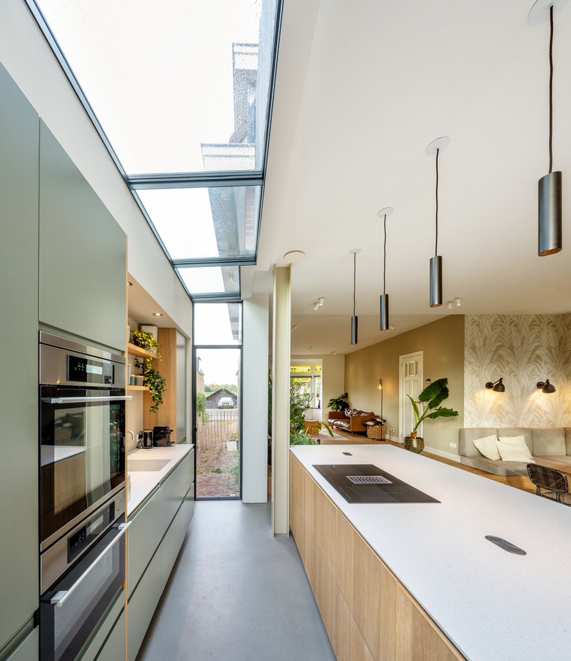
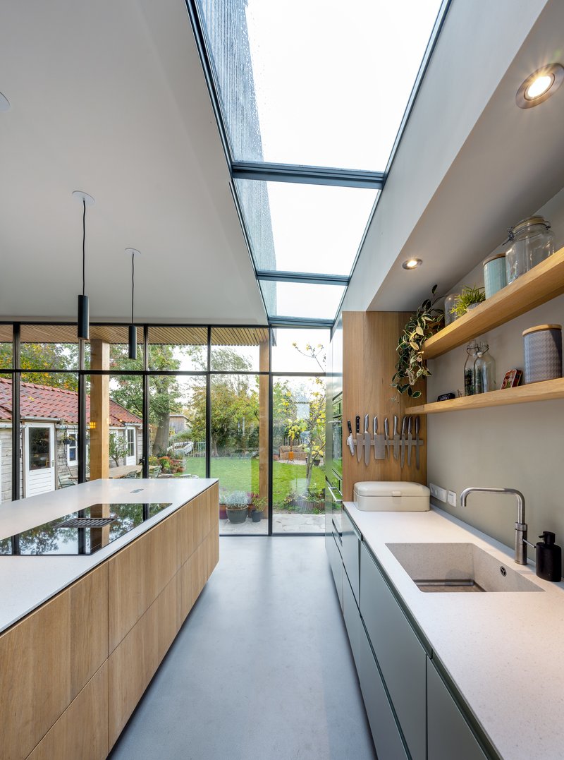
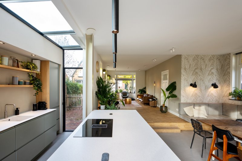
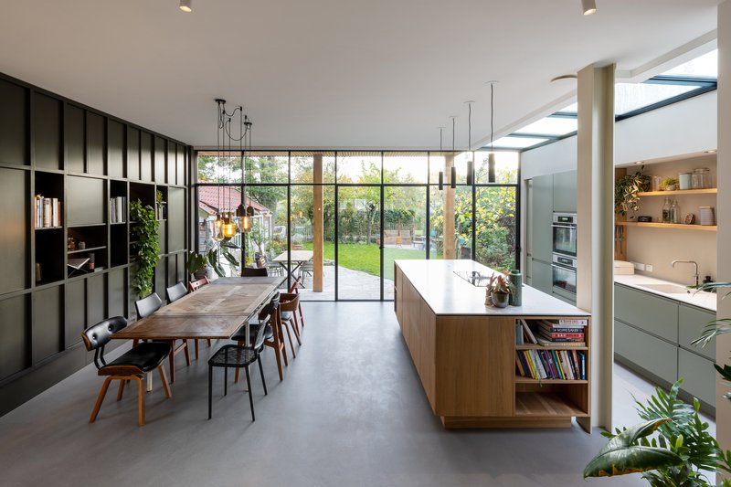
The narrower galley kitchen runs perpendicular to the main island volume, and CUBE Architecten has solved its inherent darkness problem with continuous skylight slots that run along its full length. The effect is striking: pale countertops glow under a strip of sky, and timber shelving at the far end catches dappled light from the planted courtyard beyond. It is a space that could easily have felt cramped, but the overhead light and the visual connection to greenery open it up.
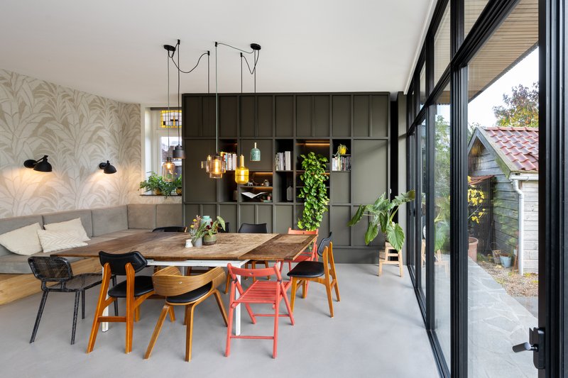
The dining area sits between the galley and the garden wall, anchored by a wallpapered feature wall and furnished with the kind of deliberately mismatched chairs that suggest the owners actually live here. A grid storage wall provides practical display and keeps the visual texture high without tipping into clutter.
Interior Character
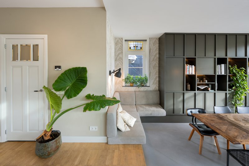
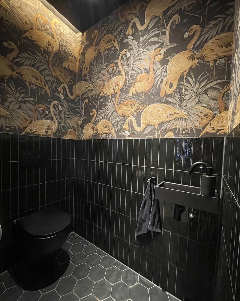
Throughout the house, CUBE Architecten has balanced restraint with personality. The living space in the original house retains its white paneled doors and is furnished with modular grey shelving and tropical plants, a quiet nod to the building's age without fetishizing it. The powder room, by contrast, goes all in: black vertical tile wainscoting beneath a gold flamingo-patterned wallpaper mural. It is a deliberate tonal shift, contained within a small room where theatricality is welcome.
These moments of expressive decoration work because the architectural envelope is disciplined. Clean timber, white walls, and consistent proportions provide a neutral canvas that absorbs the wallpaper and the plants and the mismatched furniture without losing coherence.
Wet Rooms
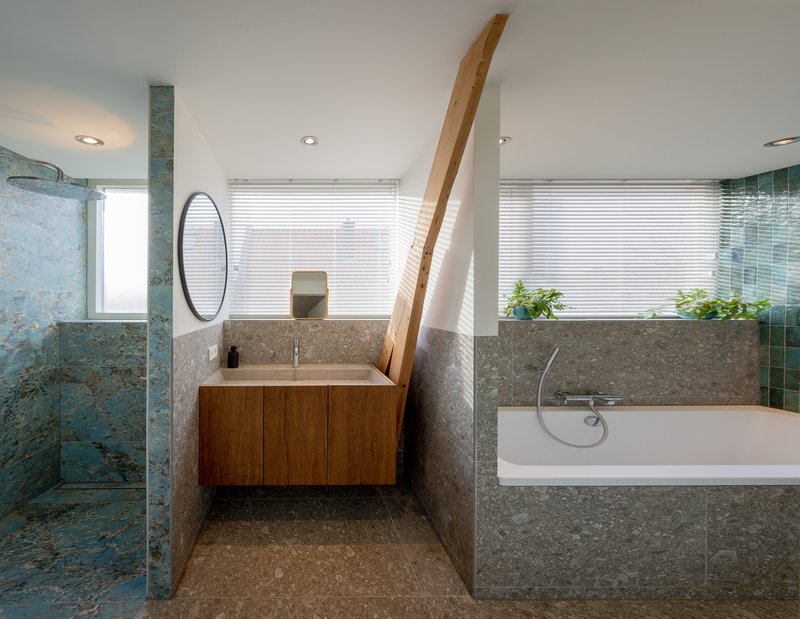
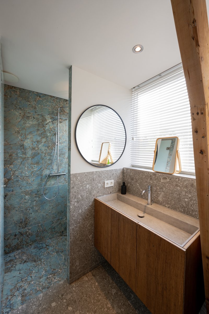
The bathrooms continue the project's material confidence. An exposed timber beam spans the main bathroom, paired with terrazzo wall cladding and a tiled shower enclosure screened by horizontal blinds. The vanity corner uses a round mirror and timber cabinetry alongside a textured blue-green tile shower wall that catches natural light from above. These rooms feel considered rather than simply specified, with enough material variety to create warmth without visual noise.
Plans and Drawings
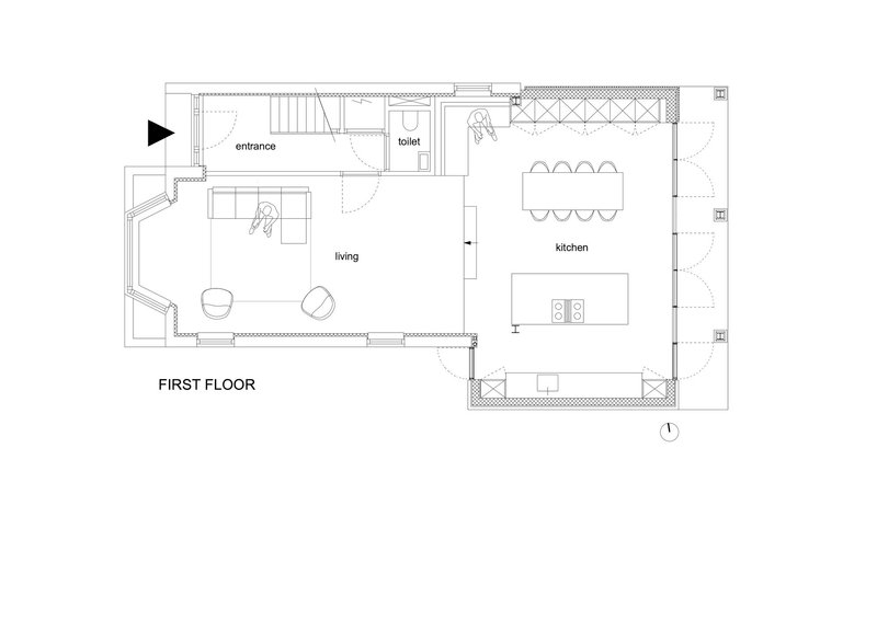
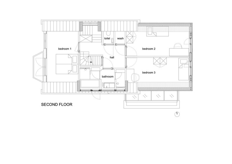
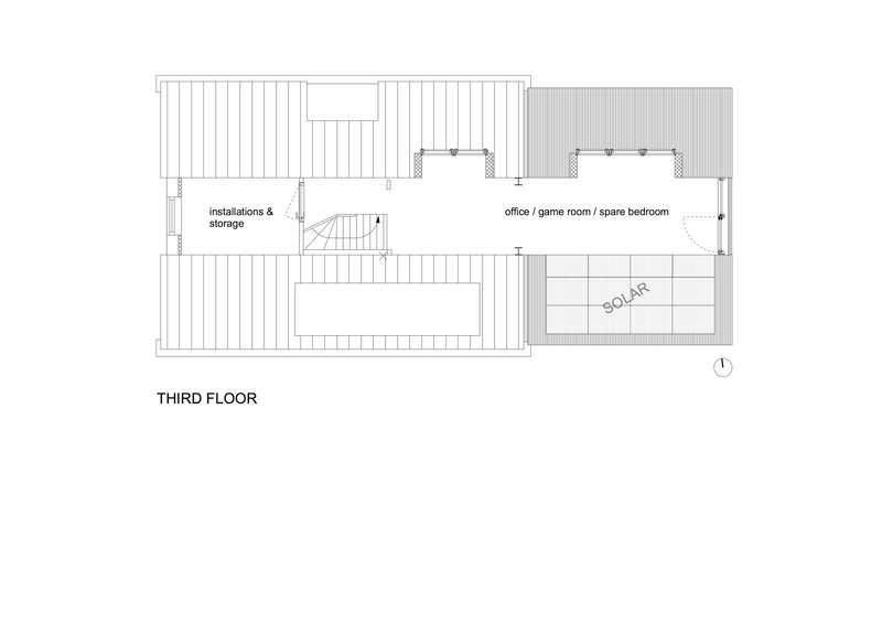
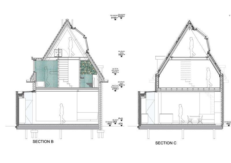
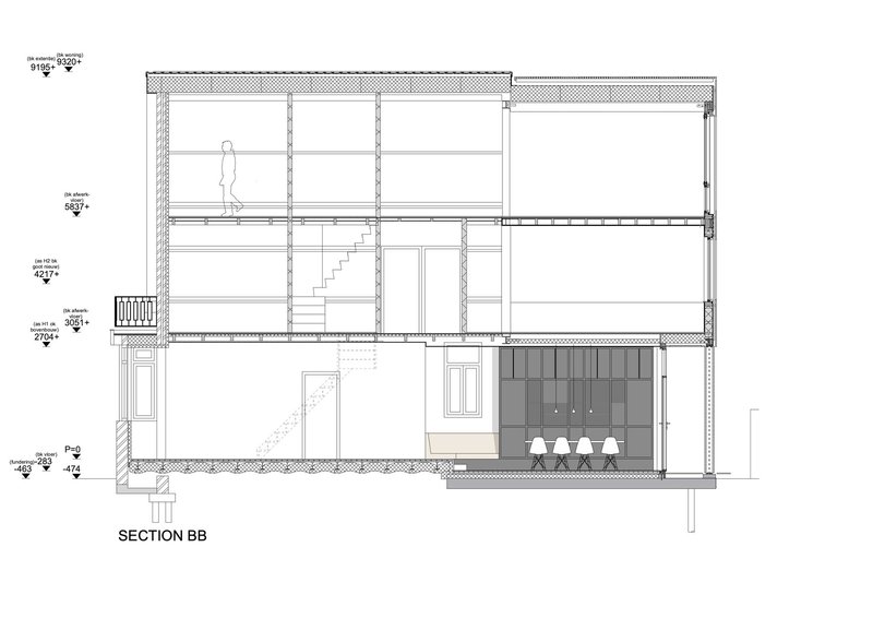
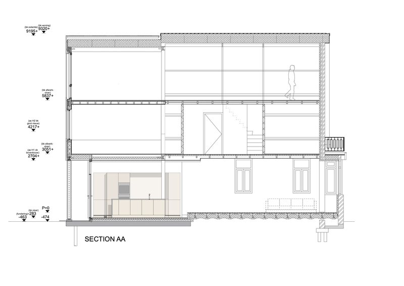
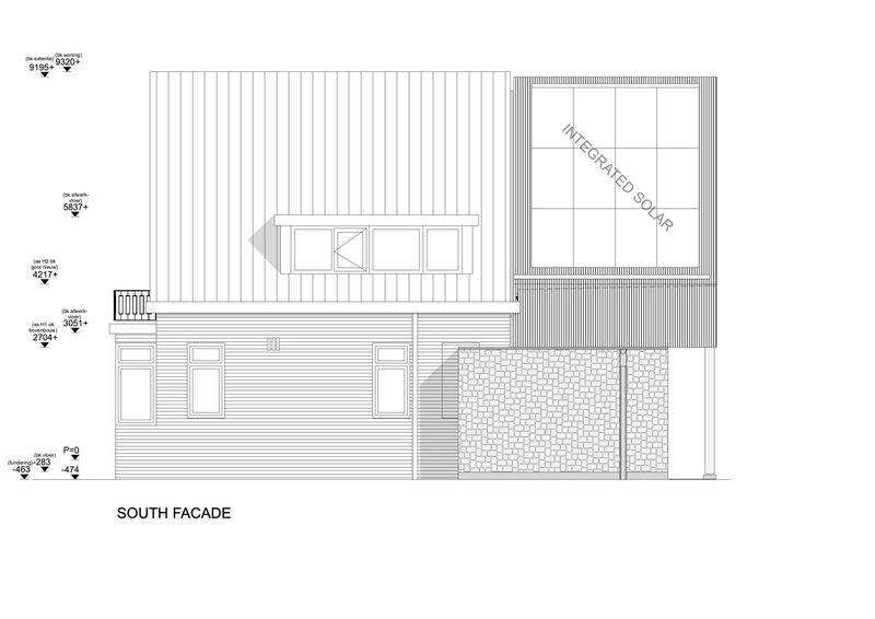
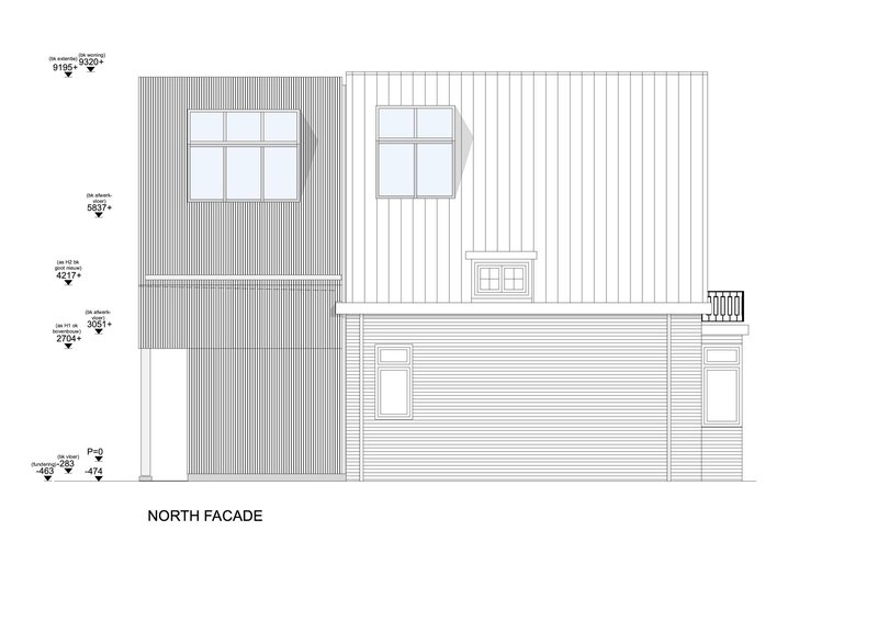
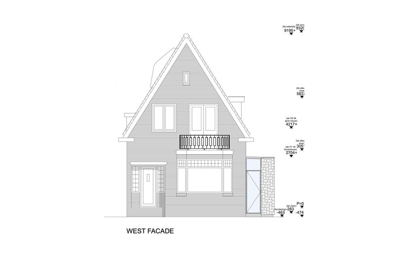
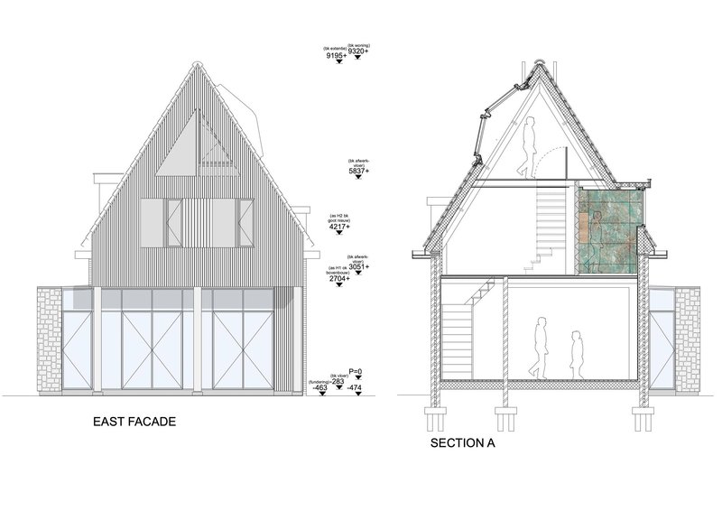
The floor plans reveal the project's three-level organization clearly. The ground floor places the entrance and living area in the original house, with the kitchen, island, and dining table occupying the new extension behind. The first floor distributes three bedrooms, a bathroom, and a balcony extension across the full depth of the plot. The upper level, tucked into the steep pitch, accommodates a multipurpose office room, storage, and an integrated solar panel zone on the roof.
The section drawings are particularly revealing. They show how the steep pitch generates usable volume at every level and how the split-level connection between old and new works structurally. The double-height ground floor space in the extension is visible, as is the central staircase that stitches the three floors together. The elevation drawings confirm the material strategy: vertical cladding dominates the rear volumes, with horizontal siding wrapping the west facade and solar panels integrated seamlessly into the upper roof plane.
Why This Project Matters
Amsterdam's pre-war housing stock is under enormous pressure to perform better, both thermally and spatially. Families need more room, energy bills need to come down, and the city's heritage character needs to survive the process. The KDW 199 House Extension demonstrates that these goals are not in conflict. By concentrating all visible change at the rear and borrowing the proportional logic of the original gable for the new volume, CUBE Architecten has produced an addition that is unambiguously contemporary yet contextually grounded.
The split-level strategy deserves particular attention. It is a small architectural move with outsized consequences for the way the house is experienced. Rather than erasing the threshold between old and new, it articulates it, turning what could be a seam into a spatial event. That kind of precision, where a two-step change in floor level reshapes the entire interior logic, is what separates a good extension from a merely competent one.
KDW 199 House Extension by CUBE Architecten, Amsterdam, The Netherlands. 222 m². Completed 2022. Photography by Roos Alderhoff fotografie.
About the Studio
Share Your Own Work on uni.xyz
If projects like this are the kind of work you want to make, uni.xyz is a place to publish your own, find collaborators, and enter design competitions.


Popular Articles
Popular articles from the community
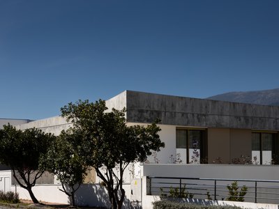
PLATAFORMArq Folds a Concrete Roof Over the Portuguese Mountains in House #474
A 220-square-meter residence in Teixoso, Portugal, wraps board-formed concrete into an angular canopy that frames the Serra da Estrela foothills.
Kerry Kounnapis Packs 800 Daily Coffees into a 43-Square-Metre Melbourne Laneway Bar
Palace Coffee channels Pellegrini's and European standing bars through oxide-red steel and spotted gum timber in a Ridgway Place sliver.
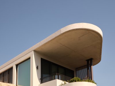
Stanton Architects Sculpts a Curving Family Home into Sydney's Inner West Fabric
Five Dock House uses cantilevers, curved concrete, and layered courtyards to carve out privacy on a tight suburban lot in Sydney.
Kaffeebühnen: Coffee Shop Architecture Designed as a Civic Stage Between Vienna’s City and Park
Kaffeebühnen turns coffee shop architecture into a civic stage, linking Vienna’s park edge, urban life, warm timber yards, and coffee craft.


Similar Reads
You might also enjoy these articles
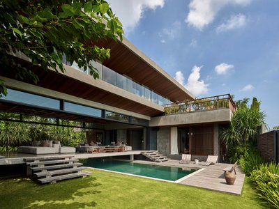
Freebird Residence by Alexis Dornier: A Tropical Modernist Sanctuary in Bali
Floating living pavilion above pool anchors H-shaped tropical villa, blending Japanese minimalism, sustainable strategies, lush landscape, and sculptural interiors.
127af Flips a Tiny Bagnolet Rowhouse Upside Down with a Handcrafted Roof Extension
A 55-square-meter terraced house on the edge of Paris gains a luminous upper living floor through lightweight timber and steel.
1.61 Design Workshop Wraps a 600-Square-Meter Café in Vietnam in Sculptural Burgundy Drama
Reden Café & Bistro pairs a helical staircase, mosaic floors, and deep red interiors to rethink Vietnamese hospitality space.
The Unbound Brain: A School Shaped by Cognitive Architecture
Cylindrical learning pods radiate like neurons from a central cortex, turning the floor plan into a spatial model of human thought.

Explore Landscape Design Competitions
Discover active competitions in this discipline


The Global Benchmark for Architecture Dissertation Awards

Challenge to design mud housing for contemporary communities
Comments (0)
Please login or sign up to add comments
No comments yet. Be the first to comment!