
F.O.G. Architecture Peels Back 280 Years of History to Reveal a Siheyuan's Skeleton in Beijing
A mid-Qing dynasty courtyard house on Guozijian Street becomes a fragrance flagship where old timber, clay brick, and white volumes coexist.
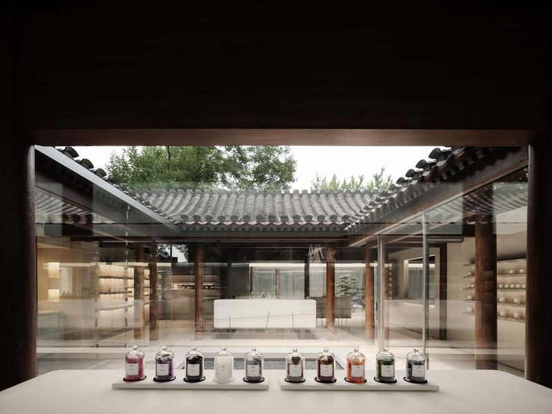
On Guozijian Street, one of Beijing's most culturally loaded corridors, a 280-year-old Siheyuan courtyard house has been carefully stripped down to its bones. F.O.G. Architecture, led by Yu Zheng and Di Zhan, spent a full year removing accumulated layers of interior walls and decorative additions to expose the original timber skeleton of the complex, then threaded a contemporary retail program through its courtyards. The result is the new Beijing flagship for fragrance brand ToSummer, a 500-square-meter space where mid-Qing dynasty roof trusses and wooden columns frame white display volumes, gravel gardens, and preserved century-old trees.
What makes the project genuinely compelling is its refusal to treat heritage as scenography. Rather than applying a conservation gloss over a conventional retail interior, F.O.G. performed something closer to architectural archaeology, peeling the building back to its structural logic and then inserting new program as a series of discrete objects that never compete with the host. The courtyard typology, with its inherent sequence of thresholds and open-air rooms, becomes the organizational engine for a store that feels less like shopping and more like moving through a private collection.
Arriving at Guozijian Street
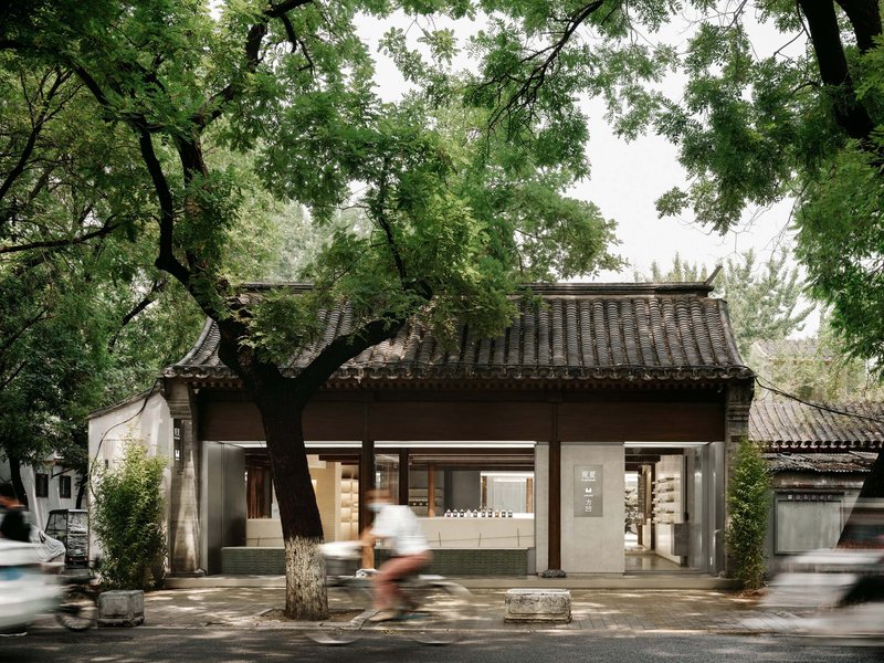
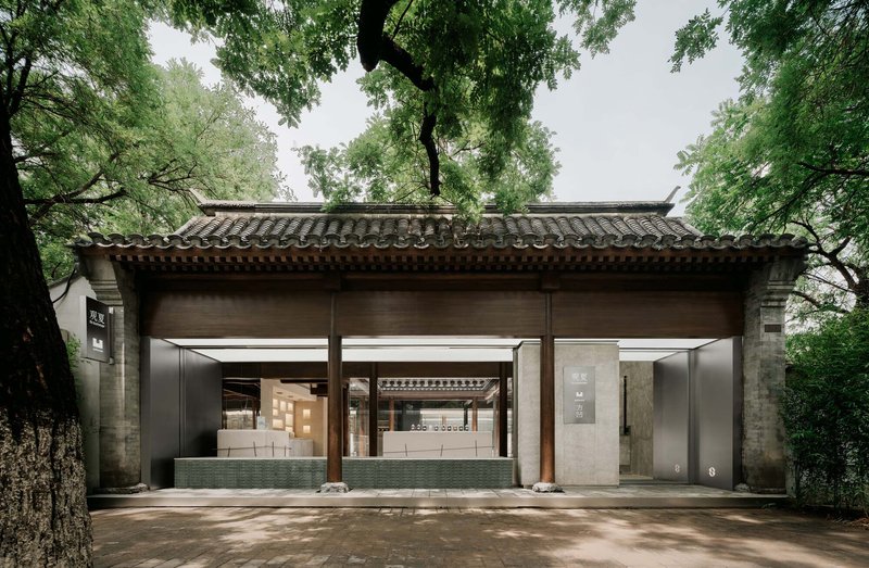
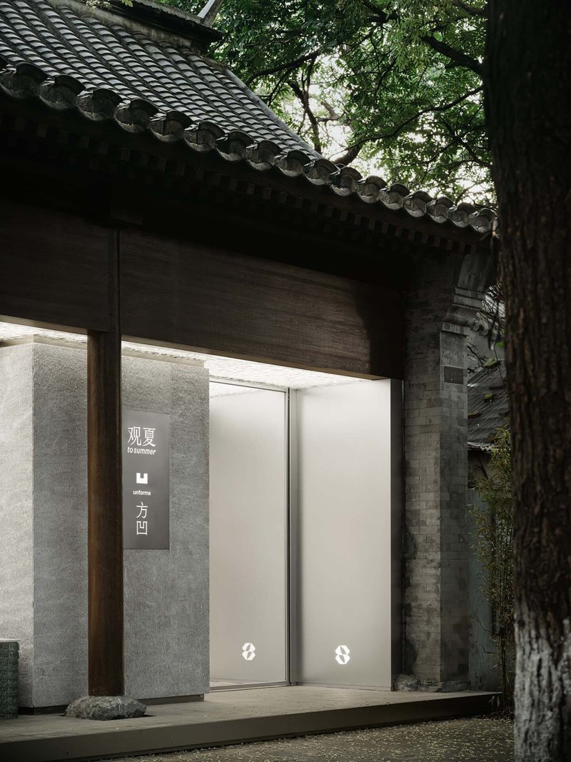
The street-facing pavilion sets up the project's central proposition immediately: traditional curved tile eaves and exposed timber beams sit above a ground plane that has been opened and clarified. Concrete columns and glass doors replace what was likely a more closed facade, but the roof remains unmistakably of its era. The building reads as both invitation and artifact. Mature trees frame the entrance, grounding the composition in its hutong context while allowing light and air to pass freely beneath the eaves.
The restraint is notable. There are no branded signage theatrics, no retail choreography visible from the sidewalk. The architecture does the work of announcing the program, and it does so through silence rather than spectacle.
Courtyards as Organizing Principle
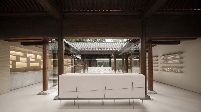
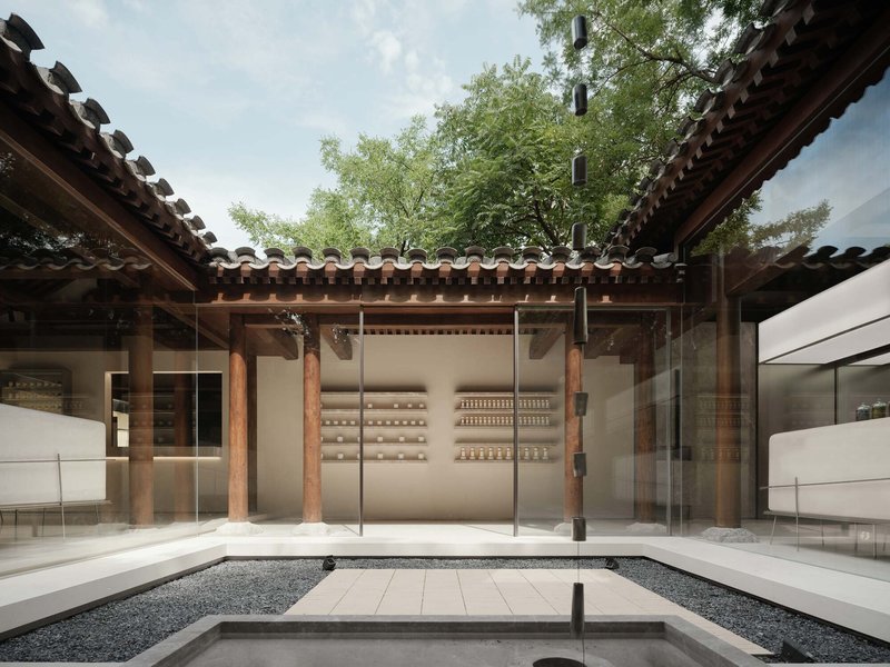
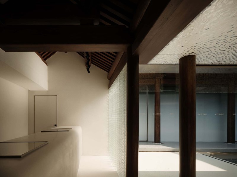
The Siheyuan's three courtyards are the true protagonists. F.O.G. broke down the original closed spatial system into a series of interconnected zones that unfold around these outdoor rooms. Display areas on the ground level wrap around the first courtyard like concentric rings, with no rigid circulation path dictating movement. You are free to wander, and the architecture rewards that freedom. Each threshold between inside and out, between one courtyard and the next, offers a different framing of light, material, and merchandise.
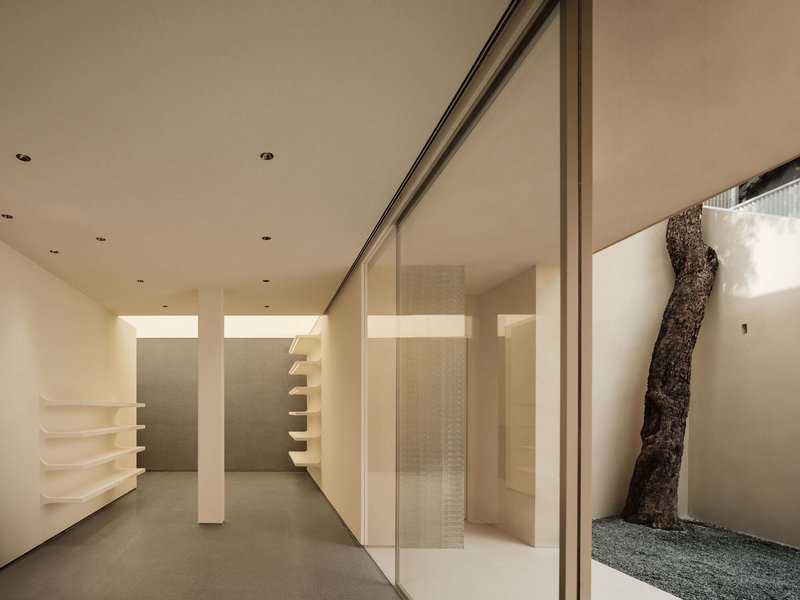
Gravel floors, bonsai trees, and preserved trunks populate these voids, transforming what might have been leftover space into moments of genuine contemplation. A bridge connecting the second and third courtyards serves as a traffic spine, but the overall effect is closer to a garden promenade than a retail floor.
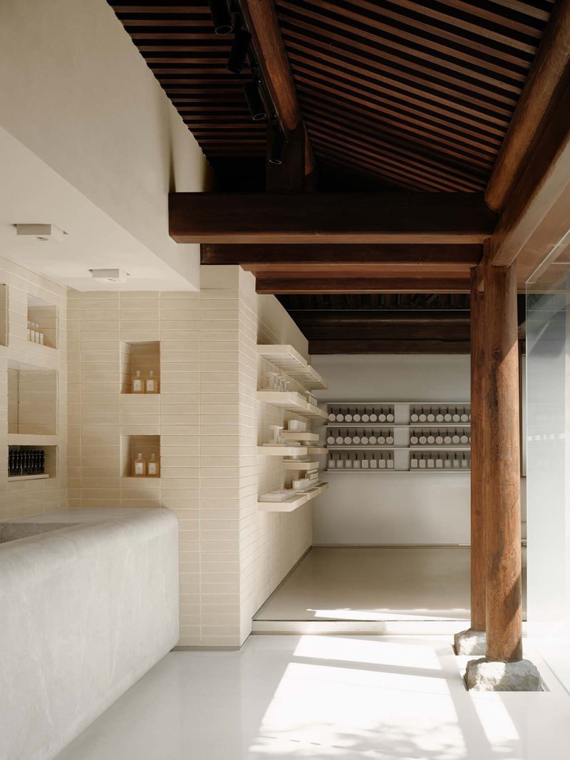
The Exposed Skeleton
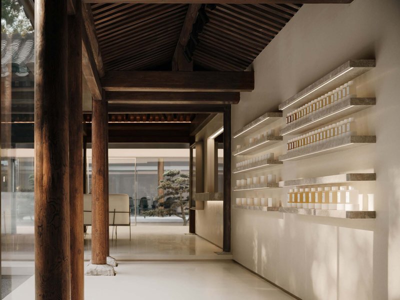

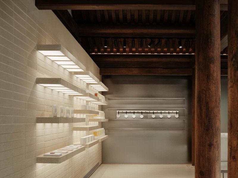
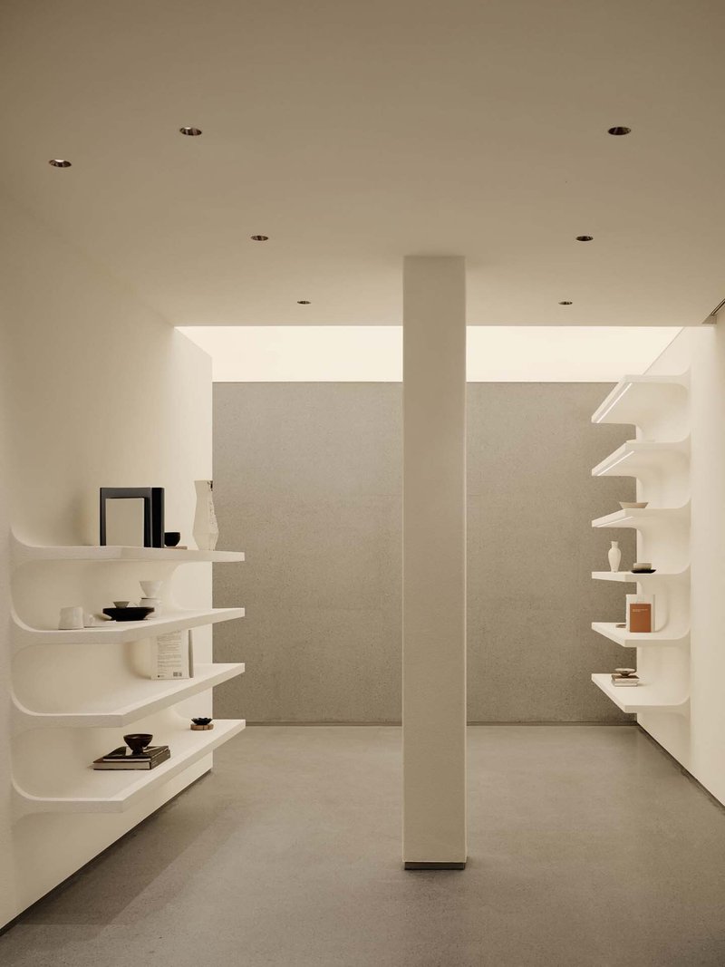
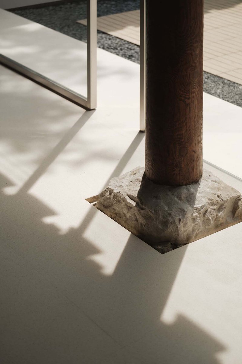
Stripping the building to its structural bones was the defining design decision. The triangular timber roof trusses and the field of wooden columns that support them became the visual center of gravity, organizing every interior view around their rhythmic presence. New white display shelving and slatted ceiling panels are inserted as clearly contemporary elements, their clean geometry drawing a precise line between what is old and what is new. There is no attempt to mimic or blend.
The columns do double duty, functioning structurally while also defining spatial boundaries without walls. Product shelves wrap around them, glowing softly against the dark timber above. It is one of the more convincing demonstrations of how a column field can replace partitions in a retail context, offering enclosure through rhythm rather than enclosure through mass.
Clay Brick and Material Dialogue
Grey brick tiles salvaged from the original building were meticulously restored, and their craftsmanship finds a contemporary echo in the new clay brick cladding applied to interior walls. The dialogue between old and new brickwork is quiet but legible. Original bricks carry the patina of centuries; the new clay brick shares their tonal range while exhibiting the regularity of modern production. F.O.G. treats this contrast as a form of honesty rather than a problem to resolve.
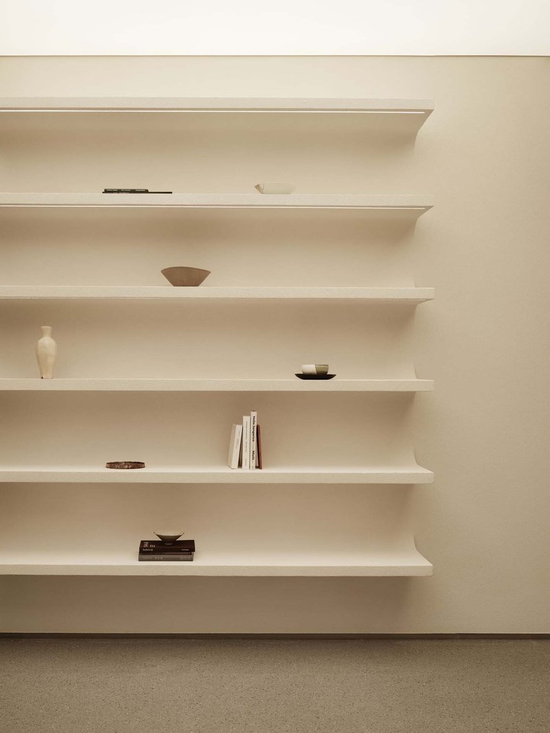
Curved white shelving units, mounted directly to walls and columns, display ceramics and books with the sparse precision of a gallery. The material palette across the interiors is deliberately limited: white plaster, warm timber, grey brick, terrazzo. Each surface is given room to register against the others, and the merchandise becomes a layer within that composition rather than the dominant visual.
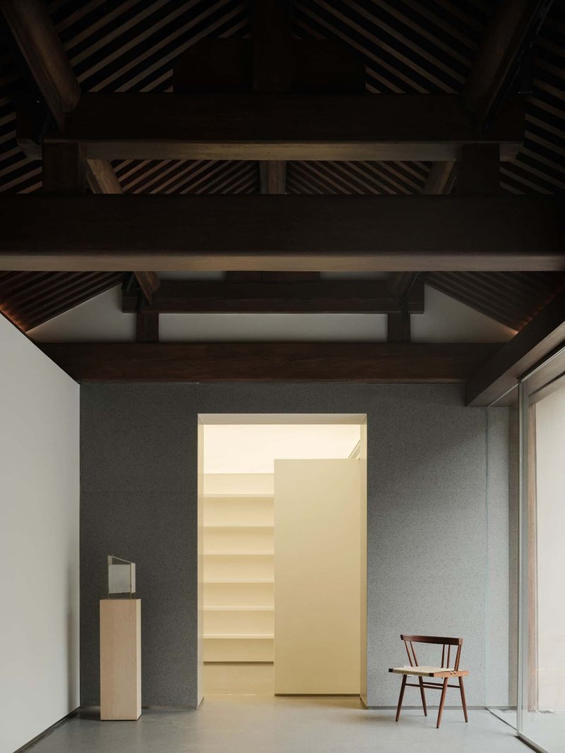
Preserving What Cannot Be Rebuilt
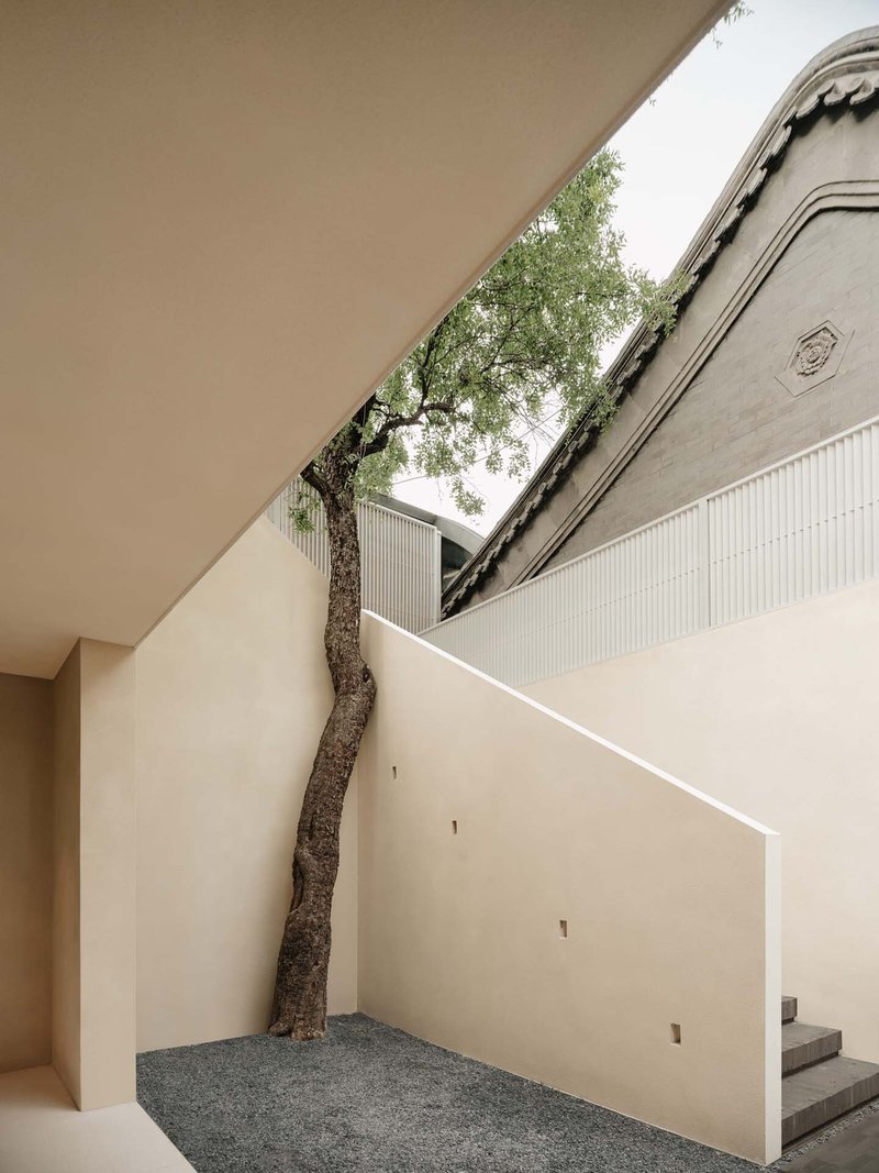
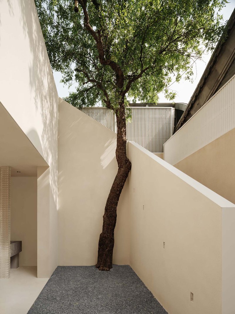
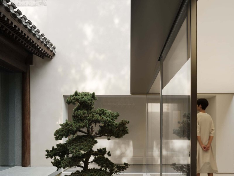
Several existing trees were kept in place, their trunks emerging through terrazzo floors and puncturing white stucco courtyard walls. Diagonal skylight openings were carved specifically to accommodate their canopies, creating moments where the building appears to yield to biology. These are not decorative gestures. They establish a hierarchy: the living thing was here first, and the architecture defers.
Similarly, a hundred-year-old well, reportedly the only sweet water well on Guozijian Street, was excavated and preserved during the renovation. A rain chain hung from the roof directs water down to it, reactivating its original function. In a project full of careful editorial choices about what to keep, remove, and add, the well stands as the most telling: it serves no retail purpose, but it anchors the building in a history deeper than commerce.
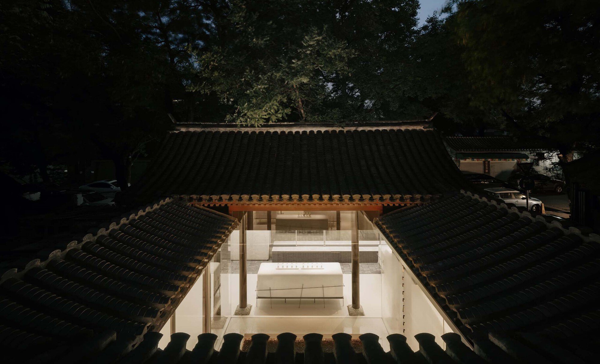
Night and Dusk: The Building Illuminated

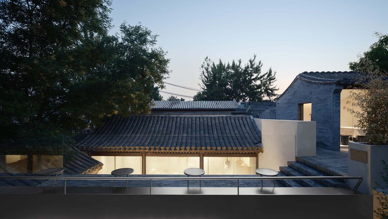
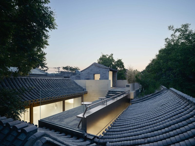
At dusk, the project reveals a second register. Glazed facades glow beneath traditional eaves, and the layered tile roofs read as dark silhouettes against the white volumes they shelter. The rooftop view at twilight is particularly striking, showing the complex as a miniature city within the dense neighborhood fabric: dark ceramic planes floating over luminous courtyards, punctuated by tree canopies and glass skylights. The reflecting pool beside one of the glass-walled volumes catches and doubles the warm interior light, extending the spatial experience outward.
The lighting strategy avoids theatrical washing. Interior illumination comes primarily from the display shelving and from ambient sources that graze the timber structure, allowing the building's material texture to remain present even after dark.
Interior Details and Display Rooms
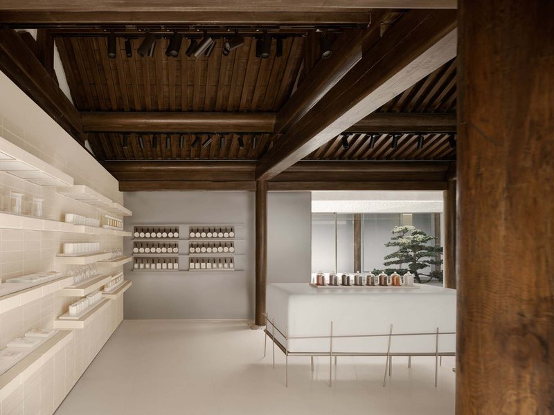
The product display zones across the first and second courtyards host ToSummer's fragrance lines, while the third courtyard is designated for the newer child brand Fang Ao. A reception tea room and viewing terrace sit on the second floor, offering an elevated perspective back over the courtyards below. The spatial sequence from ground-level retail to upper-level hospitality mirrors the traditional Siheyuan progression from public to private.
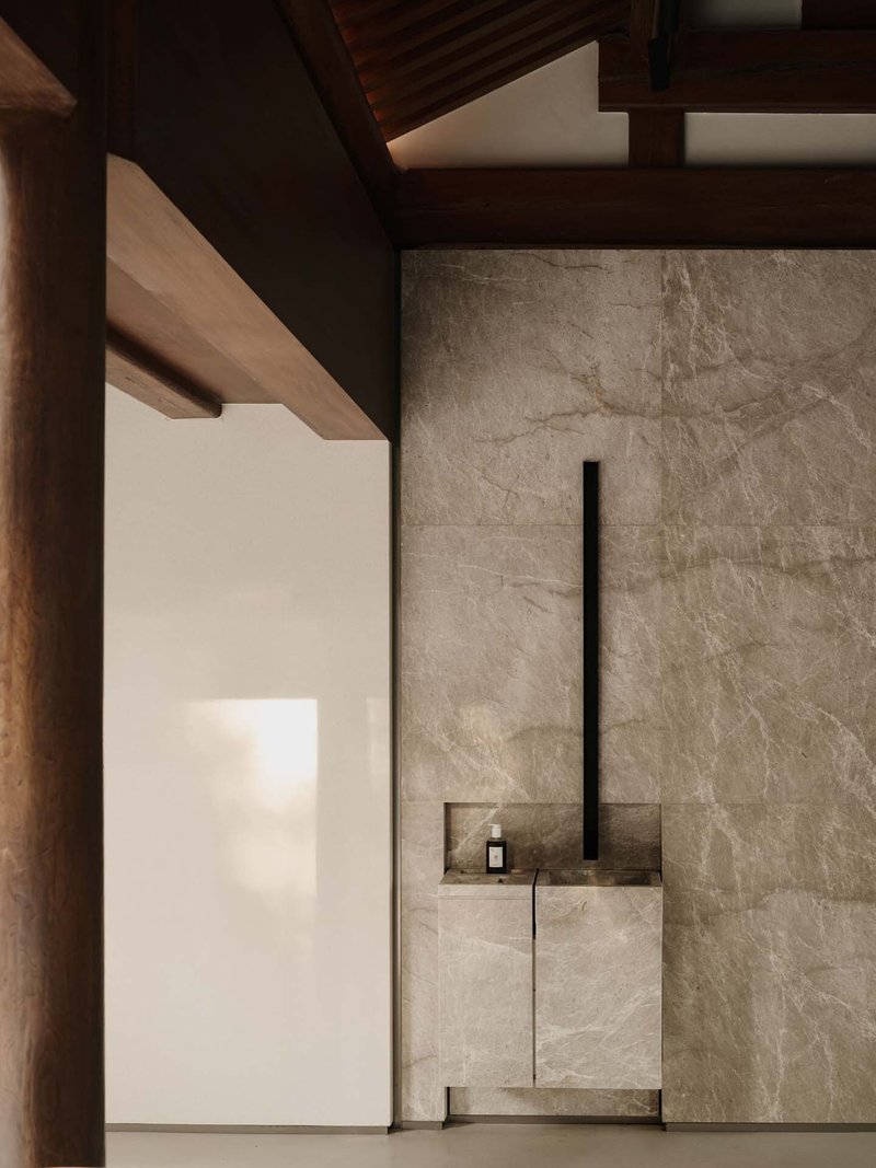
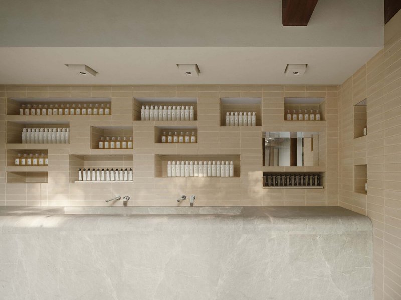
Even the secondary spaces, the bathroom areas and private consultation rooms, maintain the project's material discipline. Marble surfaces and recessed niches for product display continue the language of restrained luxury, but the timber ceiling overhead keeps the heritage structure visible at every moment. No room in the building lets you forget where you are.
Plans and Drawings
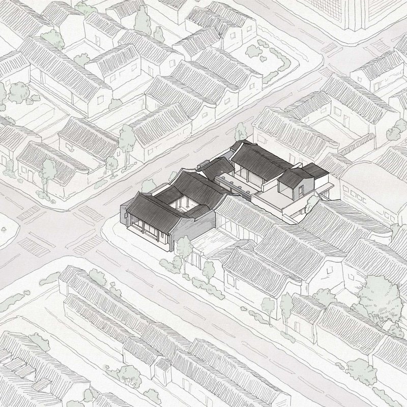
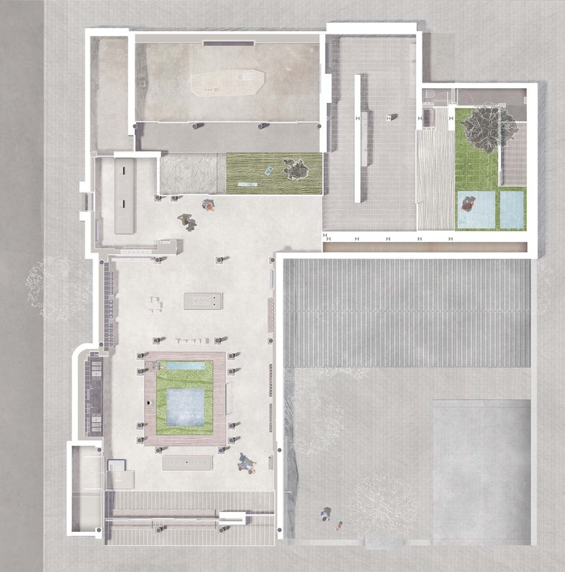
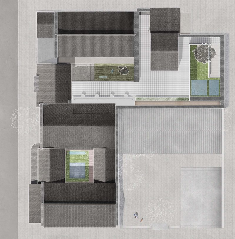
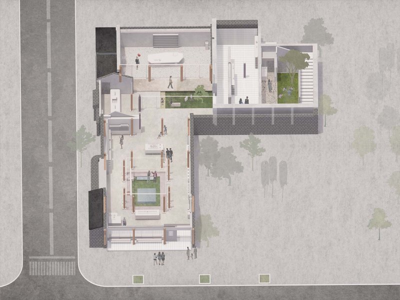
The axonometric drawing is the most revealing representation: it shows the tiled roof volumes as a continuous protective canopy, beneath which courtyards, planted areas, and water features are carved out. The floor plan confirms the L-shaped courtyard arrangement and the column field that organizes the ground-level program. The roof plan reads almost as an inverse figure-ground, with dark ceramic surfaces surrounding luminous voids. The aerial site plan situates the project within the tight grain of the hutong, making clear how much spatial generosity the courtyard typology can produce within an extremely constrained urban footprint.
Why This Project Matters
Heritage retail conversions in Chinese cities have become a genre unto themselves, and many default to a familiar formula: preserve the exterior, gut the interior, insert a branded experience. F.O.G. Architecture's work on Guozijian Street operates from a fundamentally different premise. The building's structure is not backdrop; it is the design. By removing additions rather than adding new spectacle, the architects produced a space where the 280-year-old timber frame is more legible now than it has been in generations. The retail program exists within that legibility, not in spite of it.
The project also offers a convincing argument that the Siheyuan courtyard typology has untapped potential as a commercial format. The sequence of outdoor rooms, the absence of a single dominant axis, and the permeability between inside and outside create a shopping experience that is genuinely spatial, not just decorative. For a brand built around scent and sensory nuance, it is hard to imagine a more appropriate host than a building that asks you to slow down, move through thresholds, and pay attention to what is already there.
ToSummer Store Beijing, designed by F.O.G. Architecture (lead architects Yu Zheng and Di Zhan), Beijing, China. 500 m², completed 2022. Photography by InSpace Architecture Photography.
About the Studio
Share Your Own Work on uni.xyz
If projects like this are the kind of work you want to make, uni.xyz is a place to publish your own, find collaborators, and enter design competitions.


Popular Articles
Popular articles from the community
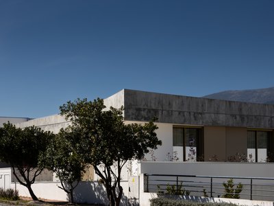
PLATAFORMArq Folds a Concrete Roof Over the Portuguese Mountains in House #474
A 220-square-meter residence in Teixoso, Portugal, wraps board-formed concrete into an angular canopy that frames the Serra da Estrela foothills.
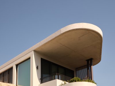
Stanton Architects Sculpts a Curving Family Home into Sydney's Inner West Fabric
Five Dock House uses cantilevers, curved concrete, and layered courtyards to carve out privacy on a tight suburban lot in Sydney.
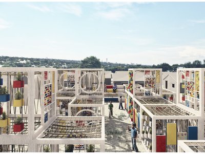
The Faith: Modular Architecture for Play, Learning, and Hope in Kutupalong Refugee Camp
A modular playground architecture project in Bangladesh where play, learning, safety, and hope rebuild childhood inside a refugee camp anew.
Reincarnation Weaves a Three-Story Retreat into the Green Landscape of Rural Bangladesh
Ara Manor in Narsingdi dissolves the line between domestic architecture and its lush surroundings through screens, courtyards, and planted rooftops.


Similar Reads
You might also enjoy these articles
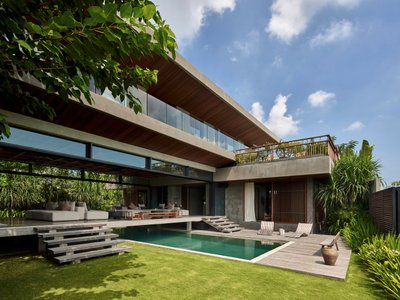
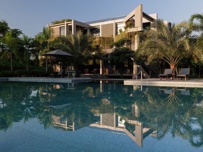
Freebird Residence by Alexis Dornier: A Tropical Modernist Sanctuary in Bali
Floating living pavilion above pool anchors H-shaped tropical villa, blending Japanese minimalism, sustainable strategies, lush landscape, and sculptural interiors.
127af Flips a Tiny Bagnolet Rowhouse Upside Down with a Handcrafted Roof Extension
A 55-square-meter terraced house on the edge of Paris gains a luminous upper living floor through lightweight timber and steel.
1.61 Design Workshop Wraps a 600-Square-Meter Café in Vietnam in Sculptural Burgundy Drama
Reden Café & Bistro pairs a helical staircase, mosaic floors, and deep red interiors to rethink Vietnamese hospitality space.
The Unbound Brain: A School Shaped by Cognitive Architecture
Cylindrical learning pods radiate like neurons from a central cortex, turning the floor plan into a spatial model of human thought.


Explore Installations Competitions
Discover active competitions in this discipline


The Global Benchmark for Architecture Dissertation Awards


Challenge to design a portable theatre


Challenge to design a portable music platform

Challenge to design an open learning module for the elderly
Comments (0)
Please login or sign up to add comments
No comments yet. Be the first to comment!