
LYCS Architecture Wraps a 300-Meter U around Pocket Parks for a Quzhou Primary School
A 37,000-square-meter campus in eastern China treats scale as a design problem, nesting small courtyards inside a single continuous perimeter.
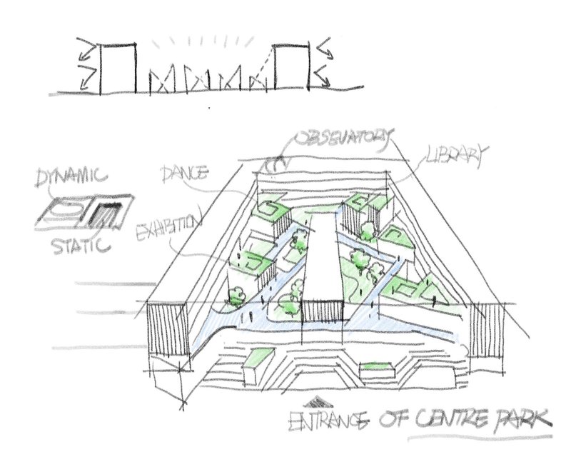
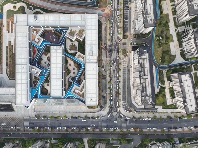
Designing a school for 48 classes of young children inside a nearly 37,200-square-meter building is, at bottom, a problem of scale. The structure has to be large enough to consolidate an ambitious program, yet intimate enough that a six-year-old feels at home. At Quzhou Xinhua No. 2 Primary School, LYCS Architecture resolves this tension with a strategy the firm calls "big city, small courtyard": a single U-shaped perimeter, roughly 300 meters long, wraps a constellation of pocket parks, elevated running tracks, and rooftop gardens that break the interior down into child-scaled rooms without walls.
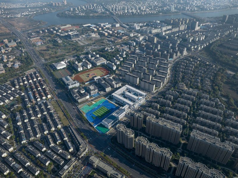
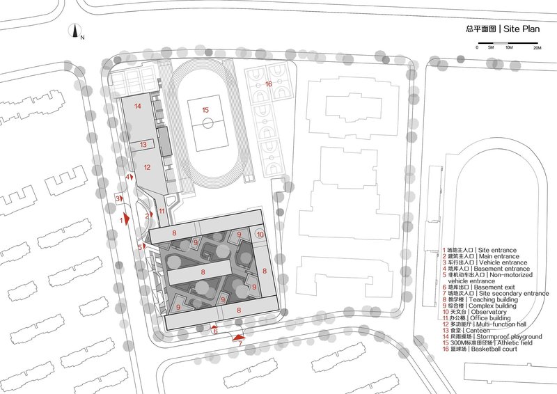
The campus sits in Quzhou's Smart New Town, a rapidly developing district in Zhejiang province where the school pushes into the surrounding residential fabric like a peninsula. Its north side faces a playground and sports fields shared with the community on a time-sharing basis; its south side gathers all general classrooms behind a continuous south-facing facade. Between these two poles, the courtyard system creates a three-dimensional landscape: corridor bridges and pocket parks at ground level, outdoor corridors on the second floor, and garden boxes on the roof. The result is a school that reads as a single civic object from the air yet dissolves into a chain of intimate episodes on the ground.
A Perimeter That Makes a City
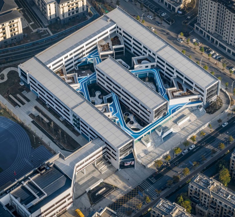
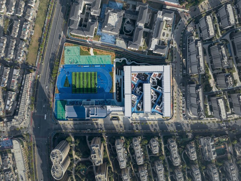
From the air the logic is immediate. The U-shaped building encloses the site with a continuous two-story wall of horizontally striped facades, turning its back on traffic and opening a protected interior world. The athletic track sits on the north end, blue surfacing punching against the white cladding, while residential towers crowd in on three sides. The fourth edge connects to Quzhou's Cultural and Educational District, lining the school up with a sequence of institutions rather than isolating it.
What makes the perimeter block work here, rather than feeling institutional or fortress-like, is its modulation. The 100-meter street frontage is broken by shifts in height, material, and setback that keep the building from reading as a single slab. It is closer to a walled neighborhood than a conventional school, and that analogy is deliberate.
Pocket Parks and the Ground Plane
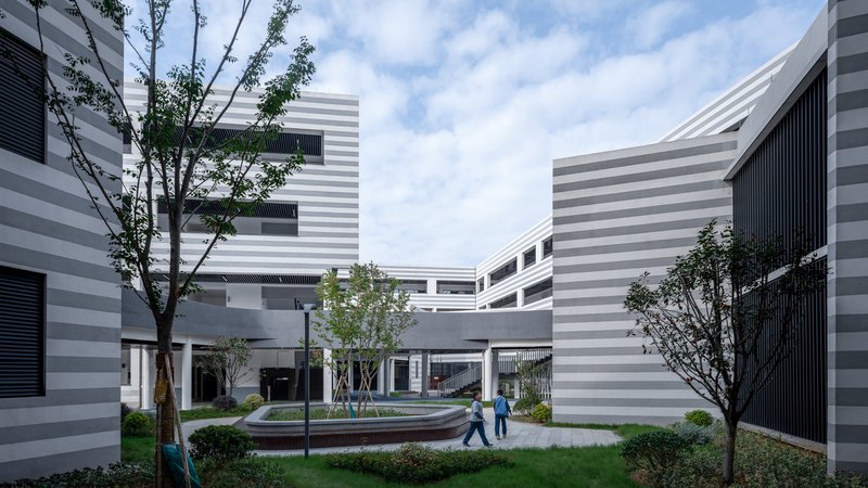
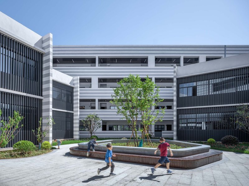
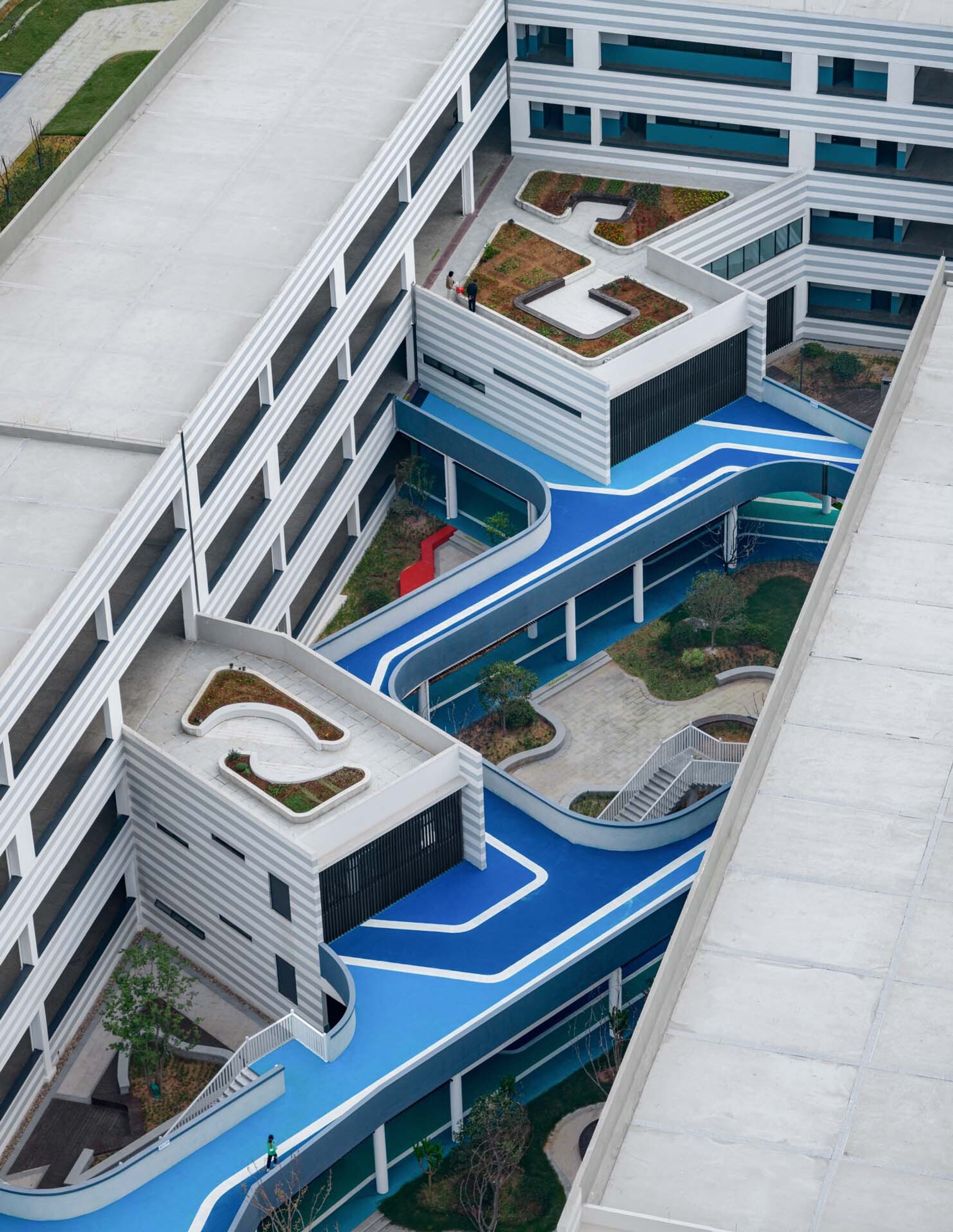
Inside the perimeter, small boxes and corridors divide the large courtyard into a series of pocket parks of different sizes. Some are paved, some planted, some furnished with circular seating elements and fountains. The variation matters: children self-select into the spaces that suit their mood, which is a more respectful reading of how young people actually use a campus than the standard all-purpose playground.
Timber decks, lawn patches, and tiered planters with young trees give each courtyard a distinct character. The horizontal striped facades that frame these spaces provide visual continuity, so you always know you are inside the same school, but the ground plane keeps shifting underfoot. It is a smart way to make 37,000 square meters feel navigable to someone who is four feet tall.
Blue Bridges and Elevated Circulation
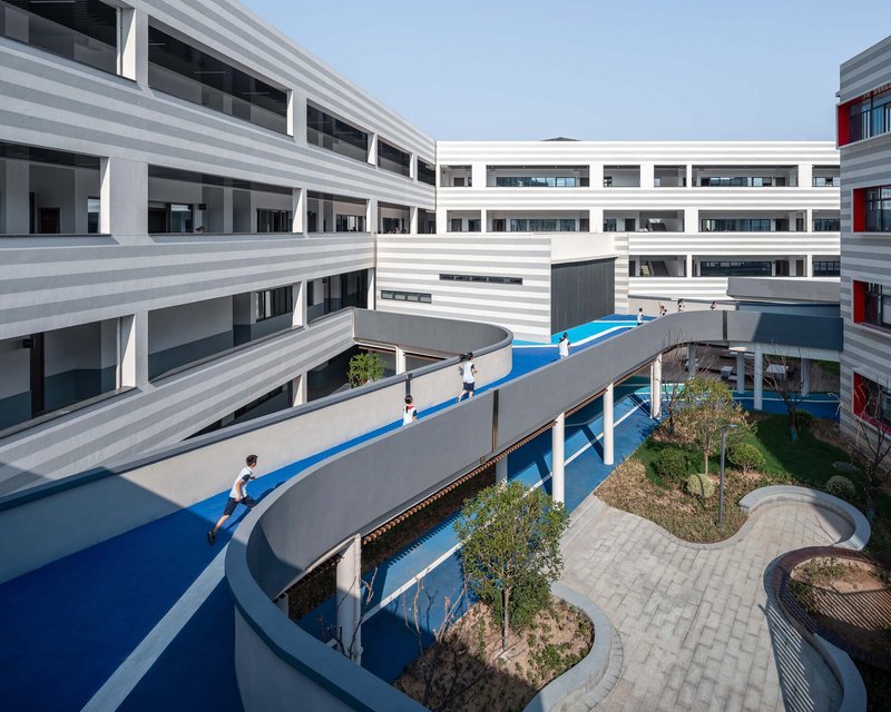
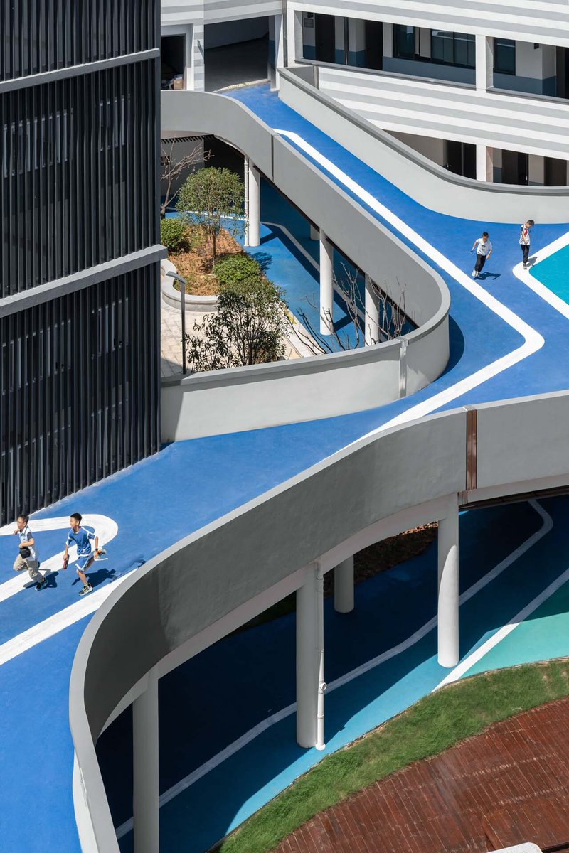
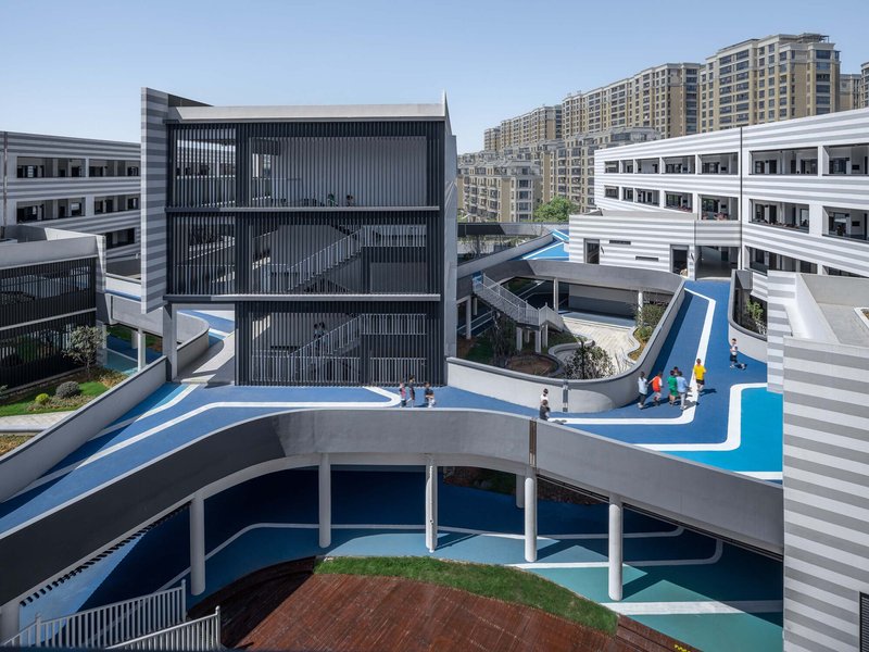
The most photogenic element of the project is the network of elevated running tracks and pedestrian bridges finished in bright blue safety surfacing. These bridges curve between buildings at the second level, threading through planted beds and casting long shadows on the courtyards below. They serve a dual purpose: connecting wings that the U-shape would otherwise separate, and giving children a continuous loop for running and play that does not compete with quieter ground-level spaces.
The three-level organization is key. At ground level, corridor bridges and pocket parks. At the second floor, outdoor corridors and the blue running tracks. On the roof, garden boxes. Each layer peels back a different relationship between building and landscape, and children can experience the campus from fundamentally different vantage points depending on how high they climb. It is vertical urbanism applied to a primary school, and it works because the building never exceeds a comfortable two-story scale at any given point.
Rooftops as a Third Ground
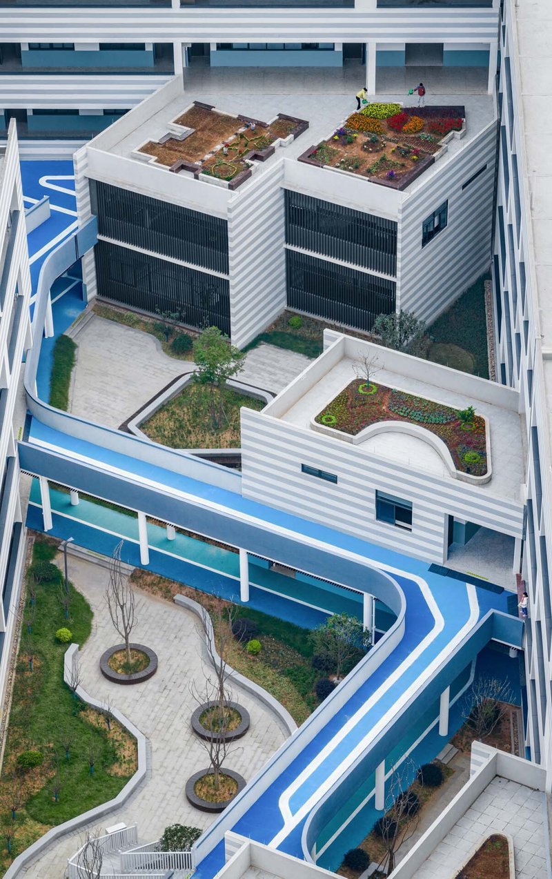
The rooftop gardens are not an afterthought. Blue safety surfacing continues up here, and students gather freely on what amounts to a second playground in the sky. Green roof terraces alternate with hard-surface play areas, extending usable outdoor space well beyond the footprint of the courtyards below. In a dense urban context where land is expensive and residential towers press in on all sides, treating the roof as a genuine amenity rather than a mechanical penthouse is a meaningful decision.
Facade Language: Stripes, Louvers, and Red Frames
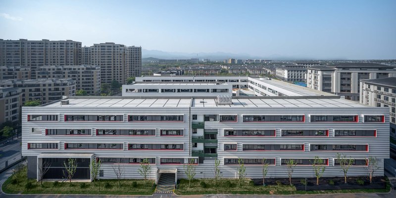
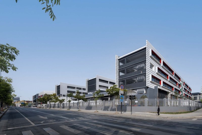
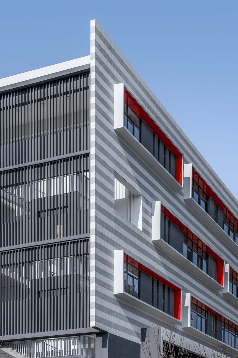
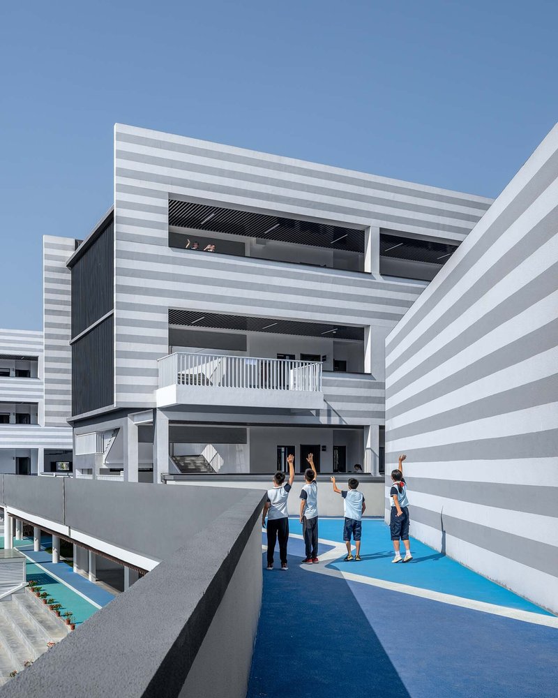
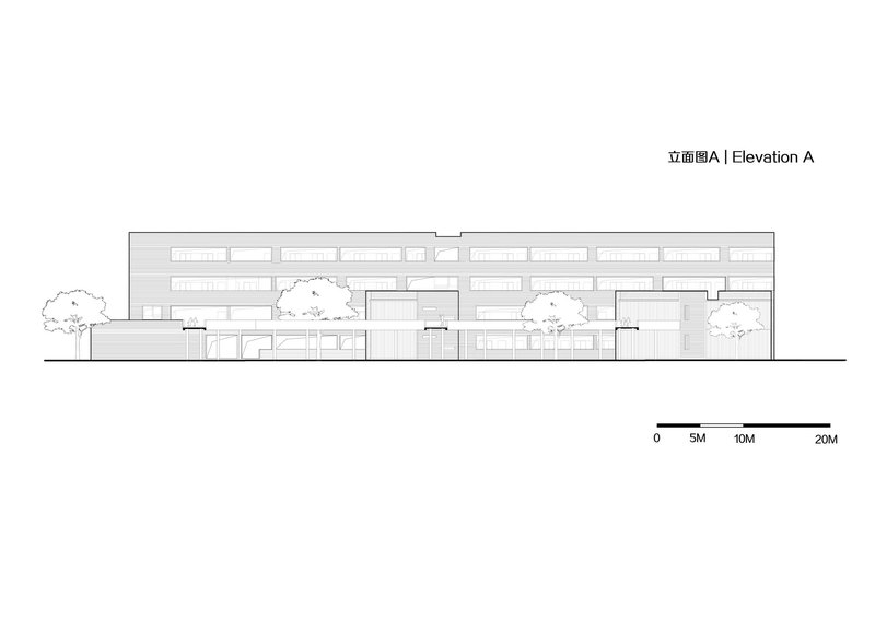
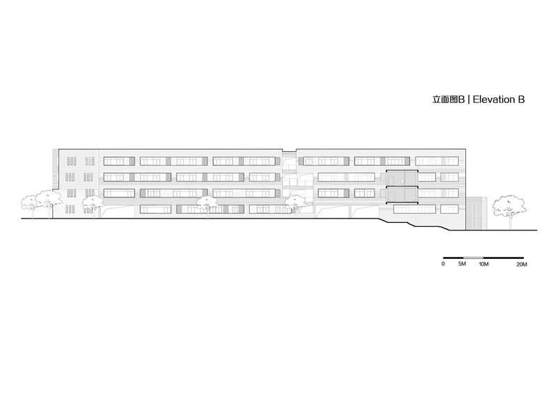
The exterior wraps itself in alternating bands of gray and white stone paint, a zebra-patterned motif that is playful without tipping into cartoon territory. Red-framed windows punctuate the stripes, giving the facade a rhythm that feels almost musical. Vertical louver screens appear at certain bays, adding depth and modulating daylight where needed. The palette is restrained, three colors and two textures, but the constant variation in stripe width and window placement keeps it from becoming monotonous over 300 meters.
At the street level, the facade steps back behind young trees and wide sidewalks, softening the boundary between school and city. The corner condition, where the horizontal banding wraps around to meet a darker gray base, is handled cleanly. It is not a groundbreaking material strategy, but it is disciplined, and discipline over this length of facade is its own achievement.
Interiors That Deserve Their Own Architects
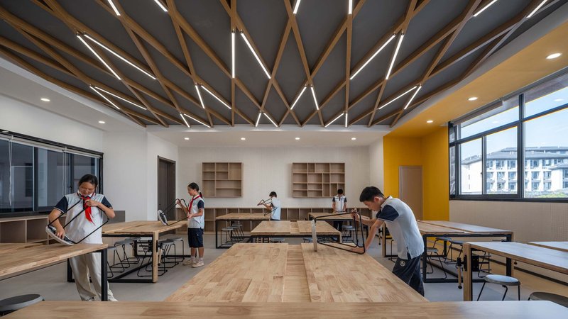
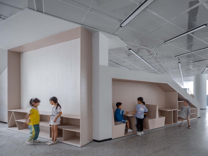
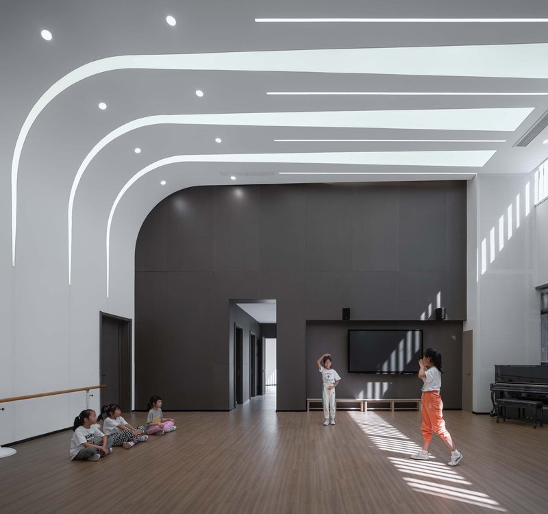
The interior spaces show real ambition. Classrooms feature diagonal timber ceiling beams with integrated linear lighting, a detail that lifts them above the fluorescent-tube norm. The library uses pale wood alcoves with translucent screens under a perforated metal ceiling, creating reading nooks that feel almost domestic. A multi-purpose hall deploys arched white ceiling ribs and timber flooring, striped afternoon sunlight streaming through high windows to animate the space.
One standout moment is a curved white staircase spiraling upward beneath a sculptural skylight, a piece of spatial generosity that rewards the student who discovers it. These interiors suggest that LYCS Architecture treated each room as a design problem in its own right, not just a box to be filled with furniture after the urban strategy was settled.
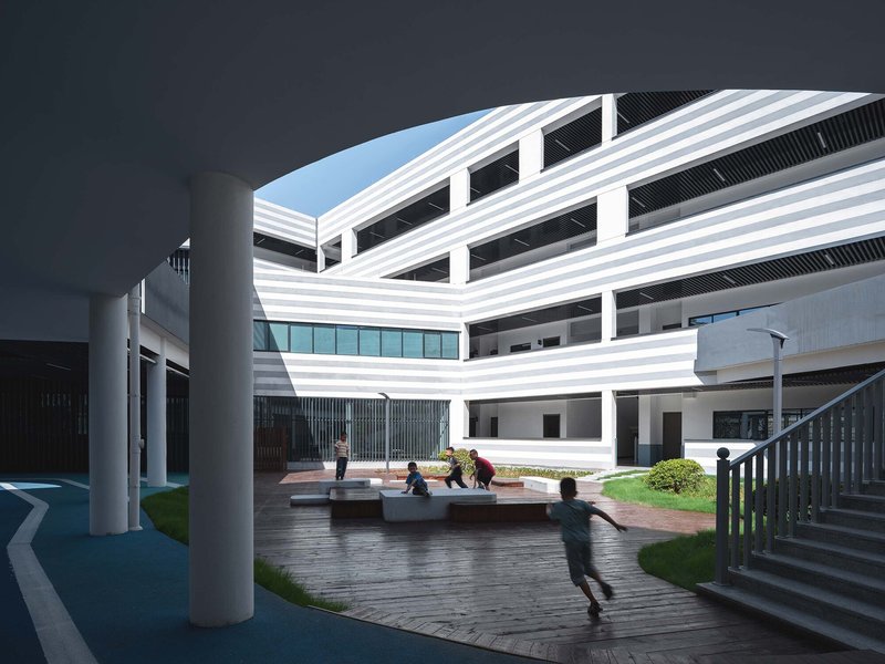
Thresholds and Covered Walkways
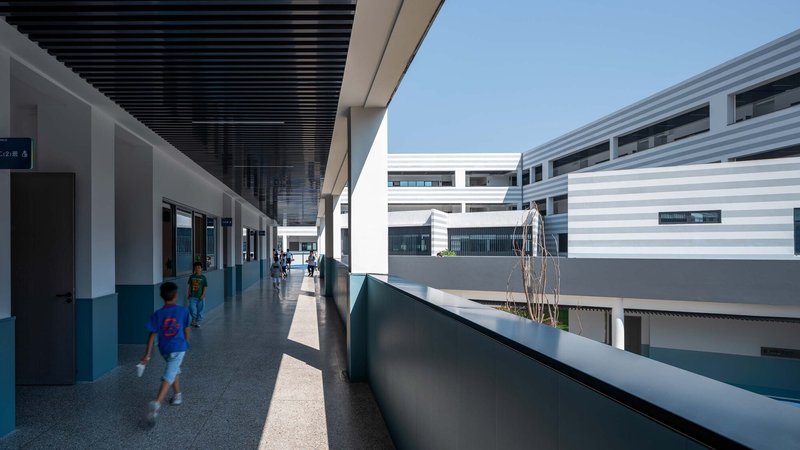
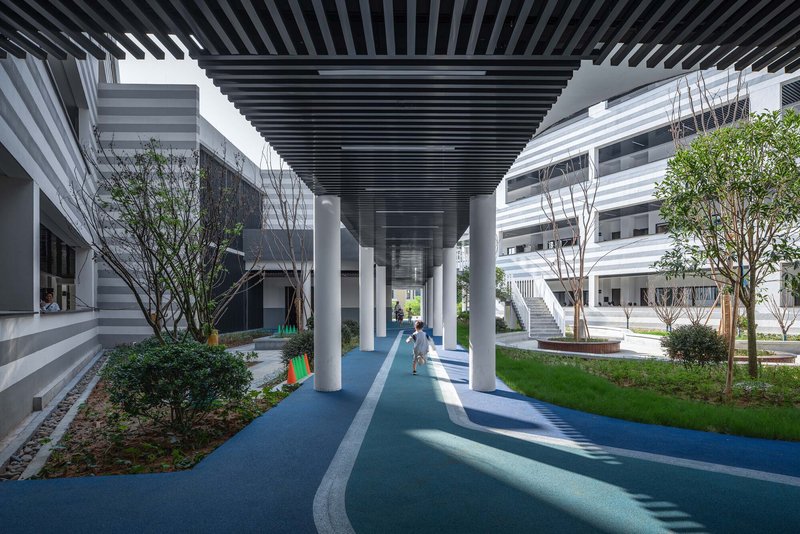
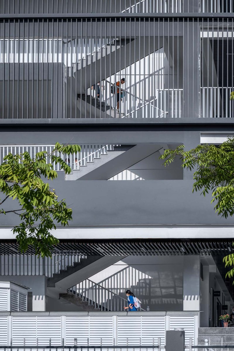
The transitional spaces between indoors and outdoors are where the school's design philosophy becomes most legible. Slatted black ceilings cast rhythmic shadows on blue and gray paving. Covered walkways lined with trees create semi-outdoor corridors that function in rain or shine. Stacked exterior staircases with vertical metal screening generate shadow patterns that shift throughout the day, turning circulation into a sensory experience.
These thresholds matter because young children spend enormous amounts of time moving between activities. If the in-between spaces are dull, the campus feels like a series of disconnected rooms. Here, every corridor and staircase has been given enough architectural attention to make the journey itself pleasurable.
Plans and Drawings
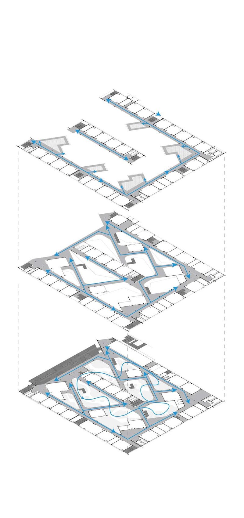
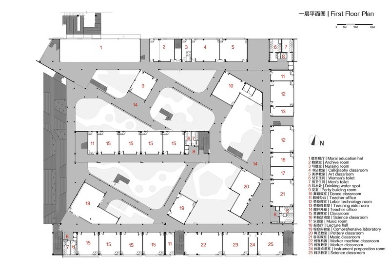
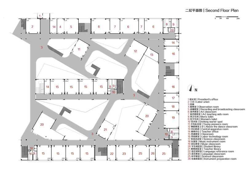
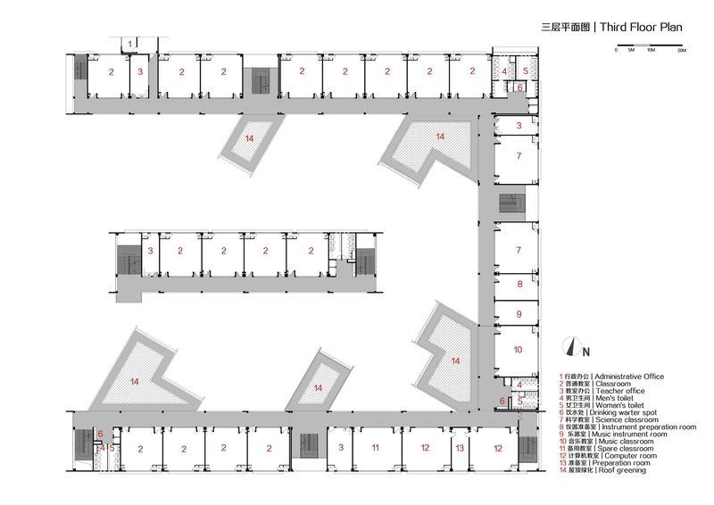
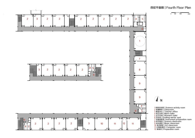
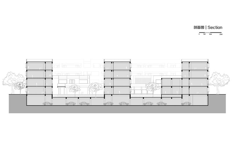
The floor plans reveal how classrooms are arranged around angular interior courtyards, with circulation paths weaving through double-height voids that connect levels visually even when they are separated functionally. The axonometric drawing is particularly telling: three stacked floor plates with blue circulation paths threading through each level, making explicit the three-dimensional landscape strategy that the photographs only hint at. Sections show tower volumes of varying heights connected by lower linking elements, with trees planted between them to reinforce the reading of the campus as a collection of buildings rather than a single monolith.
Why This Project Matters
The default mode for large-scale school construction in rapidly developing Chinese cities is the slab and podium: stack classrooms, attach a gymnasium, pave a playground, and move on. Quzhou Xinhua No. 2 Primary School refuses that template. By investing in the space between buildings, in pocket parks, elevated loops, and rooftop gardens, LYCS Architecture has produced a campus where the outdoor experience is as designed as the indoor one. The time-sharing arrangement for the sports park is a small but significant gesture toward civic generosity, acknowledging that a school in a dense neighborhood should give something back to its surroundings.
More broadly, the project demonstrates that the perimeter block, a typology more commonly associated with European housing, can be productively adapted for educational use in an entirely different context. The U-shape creates shelter, orientation, and identity in a single move, while the internal fragmentation into courtyards keeps the scale human. It is not a radical building. It is a deeply competent one, and in educational architecture, competence at this scale is rarer than it should be.
Quzhou Xinhua No. 2 Primary School by LYCS Architecture. Quzhou, China. 37,182 m². Completed 2022. Photography by Qingshan Wu.
About the Studio
Share Your Own Work on uni.xyz
If projects like this are the kind of work you want to make, uni.xyz is a place to publish your own, find collaborators, and enter design competitions.

Popular Articles
Popular articles from the community
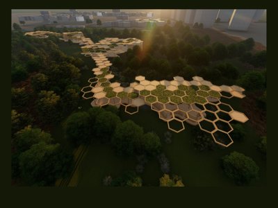
Eco Chapel: A Green Architecture Pavilion Designed in Symbiosis with the Forest
Eco Chapel uses green architecture to weave prayer, learning and reuse into a forest pavilion shaped by modular hexagonal canopies for life.
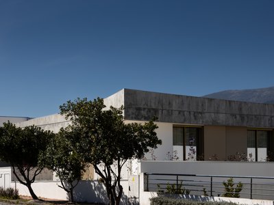
PLATAFORMArq Folds a Concrete Roof Over the Portuguese Mountains in House #474
A 220-square-meter residence in Teixoso, Portugal, wraps board-formed concrete into an angular canopy that frames the Serra da Estrela foothills.
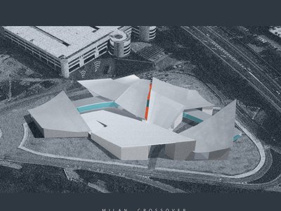
Milan Crossover: Sustainable Architecture for a New Fashion Culture in Milan
Milan Crossover transforms fashion culture through sustainable architecture, linking material libraries, remake studios, and public runways.
Reincarnation Weaves a Three-Story Retreat into the Green Landscape of Rural Bangladesh
Ara Manor in Narsingdi dissolves the line between domestic architecture and its lush surroundings through screens, courtyards, and planted rooftops.


Similar Reads
You might also enjoy these articles
Freebird Residence by Alexis Dornier: A Tropical Modernist Sanctuary in Bali
Floating living pavilion above pool anchors H-shaped tropical villa, blending Japanese minimalism, sustainable strategies, lush landscape, and sculptural interiors.
127af Flips a Tiny Bagnolet Rowhouse Upside Down with a Handcrafted Roof Extension
A 55-square-meter terraced house on the edge of Paris gains a luminous upper living floor through lightweight timber and steel.
1.61 Design Workshop Wraps a 600-Square-Meter Café in Vietnam in Sculptural Burgundy Drama
Reden Café & Bistro pairs a helical staircase, mosaic floors, and deep red interiors to rethink Vietnamese hospitality space.
The Unbound Brain: A School Shaped by Cognitive Architecture
Cylindrical learning pods radiate like neurons from a central cortex, turning the floor plan into a spatial model of human thought.

Explore Educational Building Competitions
Discover active competitions in this discipline


The Global Benchmark for Architecture Dissertation Awards


The Global Benchmark for Graduation Excellence


Challenge to design a barrier free sports center


Challenge to design an outdoor ice-rink and park
Comments (0)
Please login or sign up to add comments
No comments yet. Be the first to comment!